Skip to content

Teleporting in Vue 3

Teleporting in Vue 3

1 Part Series

Teleporting is a new feature brought by the release of Vue 3, inspired by React Portals. The Vue team added this feature with the help of a third-party plugin named Portal-Vue.

Teleporting, as its name suggests, allows you to move an object from one place to another. In Vue JS terms, it allows you to define a component in one place, and render it in a different position in the DOM tree, even outside the scope of the Vue app.

In this article, I will introduce Teleporting, explain the need for it, and finally share a running example to see it in action.

What is Teleporting?

A Component in Vue JS is a first-class citizen. It's encouraged to encapsulate UI, and related logic, into smaller components. These can be reused and nested, one inside another, to build a tree of components that make up your app UI.

Whereas some UI components are better placed towards the end of the <body> element, these require fixed or absolute positioning and management of their z-index. Modal Dialog, Notification UI or Popup UI are an example of this.

The motive behind placing them there is to simplify their styling, eliminate the need to write complex styles, and to deal with z-index Stacking Context behavior.

This is where Vue 3 Teleporting comes to the rescue, and reconciles between the two contradicting approaches forementioned. It allows you to maintain a nested tree of UI Components by letting you physically define a nested component inside one another. It works its magic to render the same component in a different position (different from where it was initially defined) in DOM, satisfying the best practices stated in the latter approach.

You can read more on Teleporting Use Cases on the official RFC page for this feature.

Teleporting can also render components in DOM outside the scope of the app. This opens the door to a number of possibilities that it can help with. For instance, Vue is used to build a certain section of the Page. With Teleporting, you can dynamically inject components into the DOM in other sections of the Page not belonging to the jurisdiction of the app. Think of it like Dashboards with widgets!

Now that you have an idea of what Teleporting is, let’s move on.

Teleport Component

Vue 3 provides the <teleport> component, which creates all the magic behind Teleporting. This component has two useful properties:

to: This required property specifies the location in DOM where it renders the content of the <teleport> component. The value can be any of the following variations below:

  • ID Selector: <teleport to="#location-in-dom">...</teleport>
  • Class Selector: <teleport to=".location-in-dom">...</teleport>
  • Data-Attr Selector: <teleport to="[data-location-in-dom]">...</teleport>
  • Reactive Property: <teleport :to="locationInDom">...</teleport>

disabled: This optional property, when assigned a value of true, disables the state of the <teleport> component. In a disabled state, its content is rendered in the same location where it's defined. Only when the disabled property is assigned a value of false, which is the default, the content is rendered in the DOM location specified in the to property.

One important side-effect to mention in this context is when the disabled property is bound to a reactive property. Switching the value between false and true causes the component to render in two different DOM locations. While doing so, the state of the rendered content is preserved. For example, a <teleport> component hosts a Video player. When the <teleport> component is disabled, the video starts playing in its place. When the disabled property is switched to false, the video continues playing in the new DOM location.

Finally, when you want the <teleport> component to be disabled but not rendering anything to the DOM, you may use v-if, the Vue JS Directive, to hide it and prevent it from rendering.

Vue 3 Modal Component

In this section, we will build a Vue Modal component. It will be used in the next section when I demonstrate the Teleporting feature.

There are countless numbers of Modal components out there. Instead of building ourselves a new one, I will make use of a Modal UI built by Chris Coyier, and introduced in his article on Considerations for Styling a Modal. This article is a valuable reference for building Modals as it explains every decision taken when building such a UI.

Here's a running example of the Modal UI on CodePen - Modal

Let's wrap it in a Vue JS component!

First of all, create a new Vue JS app by running these steps:

Step 1: Install @vue/cli NPM package

Open a terminal window and run the following command:

npm install -g @vue/cli

Step 2: Create a new Vue app

vue create vue-teleporting

Select the default preset when prompted.

Step 3: Run the app

Run the app to make sure it's working properly:

cd vue-teleporting
npm run serve

You should have a running app now!

Step 4: Build the Modal Component

Inside the /src/components/ folder, add a new Vue component named Modal.vue. Replace its content with the following:

<template>
  <div>
    <div class="modal-overlay" id="modal-overlay"></div>
    <div
      class="modal"
      id="modal"
      role="dialog"
      aria-labelledby="modal-header"
      aria-describedby="modal-body"
    >
      <button
        class="close-button"
        id="close-button"
        aria-label="Close modal"
        @click.prevent="closeModal"
      >X</button>
      <div class="modal-container">
        <header class="modal-header" id="modal-header">
          <slot name="header">Header goes here ...</slot>
        </header>

        <section class="modal-body" id="modal-body">
          <slot name="body">Body goes here ...</slot>
        </section>

        <footer class="modal-footer">
          <slot name="footer">Footer goes here ...</slot>
        </footer>
      </div>
    </div>
  </div>
</template>

<script>
export default {
  name: "Modal",
  methods: {
    closeModal() {
      this.$emit("close-modal");
    },
  },
};
</script>

I've made a few changes to convert this UI component to a Vue component. The additions include:

Three new sections representing the header, body, and footer of the Modal component.

The use of <slot> components to add flexibility.

You can read more about Slots in Vue JS by checking my article on Content Distribution in Vue JS.

The use of a few new styling tags to cater for the new sections.

Making the Modal accessible by introducing a few aria attributes. For instance, the use of role="dialog" helps assistive software identify the Modal component as being a Dialog or Window that's separated from the rest of the app UI.

You can read more about page accessibility by checking Daniel Marin's article, Make it Accessible: Better Layout with HTML

The Close button now emits the modal-close event to send a request to the parent component hosting this Modal to eventually close it.

Let's embed this new component inside the App.vue and run the app.

<template>
  <Modal @close-modal="closeModal">
    <template #body>
      <p>Lorem ipsum dolor sit amet, consectetur adipisicing elit. Repudiandae expedita corrupti laudantium aperiam, doloremque explicabo ipsum earum dicta saepe delectus totam vitae ipsam doloribus et obcaecati facilis eius assumenda, cumque.</p>
      <p>Lorem ipsum dolor sit amet, consectetur adipisicing elit. Repudiandae expedita corrupti laudantium aperiam, doloremque explicabo ipsum earum dicta saepe delectus totam vitae ipsam doloribus et obcaecati facilis eius assumenda, cumque.</p>
    </template>
  </Modal>
</template>

__Figure 1__ below shows the app running with the Modal component open.
vue-teleporting-1

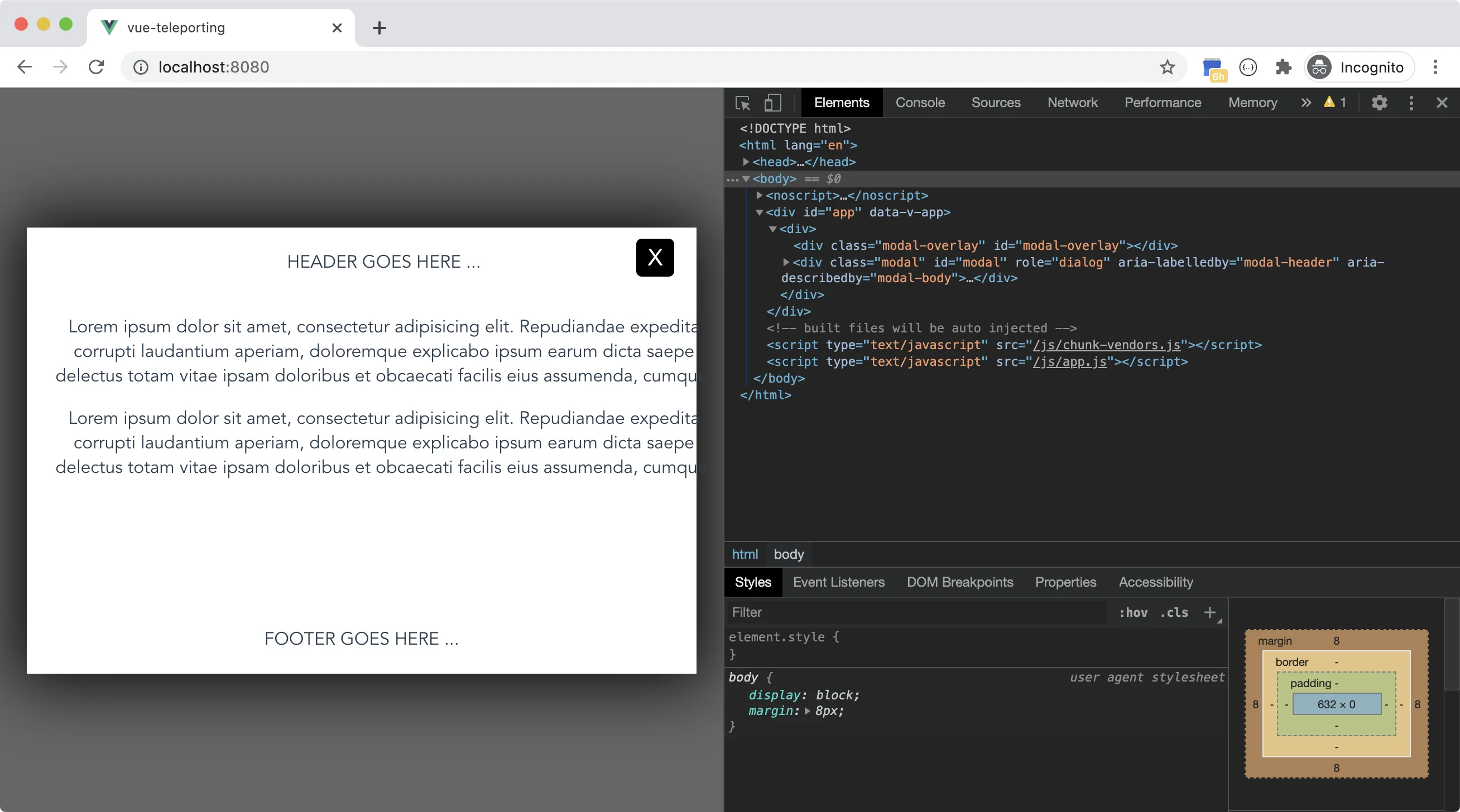
That's it! Now we have a Modal Vue component.

Let's make use of this component in the next section.

Teleporting in Action

So far we have been using Vue 2 to build a Modal component. Now it's time to add the Vue 3 bits into our app and use Teleporting!

Open a terminal window and navigate to the root folder of our app. Then, run the following command to convert our Vue 2 app into a Vue 3 one.

vue add vue-next

Open the `/package.json` file and make sure the `dependencies` and `dev-dependencies` sections are similar to this below:
 "dependencies": {
    "core-js": "^3.6.5",
    "vue": "^3.0.0-rc.5"
  },
  "devDependencies": {
    "@vue/cli-plugin-babel": "~4.4.0",
    "@vue/cli-plugin-eslint": "~4.4.0",
    "@vue/cli-service": "~4.4.0",
    "@vue/compiler-sfc": "^3.0.0-rc.5",
    "babel-eslint": "^10.1.0",
    "eslint": "^6.7.2",
    "eslint-plugin-vue": "^7.0.0-alpha.0",
    "vue-cli-plugin-vue-next": "~0.1.3"
  },

The __vue-next__ package automatically converts it for you.

Switch back to the App.vue and replace its content with:

<template>
  <div>
    <h1>Demonstrating Teleporting in Vue 3</h1>
    <teleport to="#modal-area">
      <Modal @close-modal="closeModal">
        <template #body>
          <p>Lorem ipsum dolor sit amet, consectetur adipisicing elit. Repudiandae expedita corrupti laudantium aperiam, doloremque explicabo ipsum earum dicta saepe delectus totam vitae ipsam doloribus et obcaecati facilis eius assumenda, cumque.</p>
          <p>Lorem ipsum dolor sit amet, consectetur adipisicing elit. Repudiandae expedita corrupti laudantium aperiam, doloremque explicabo ipsum earum dicta saepe delectus totam vitae ipsam doloribus et obcaecati facilis eius assumenda, cumque.</p>
        </template>
      </Modal>
    </teleport>
  </div>
</template>

<script>
import Modal from "./components/Modal.vue";

export default {
  name: "App",
  components: {
    Modal,
  },
  methods: {
    closeModal() {},
  },
};
</script>

The component now uses a `` component to wrap the Modal component. The `to` property is now pointed to a `
` element located in the `/public/index.html` file.

Replace the contents of the /public/index.html file with the following:

<!DOCTYPE html>
<html lang="en">

<head>
  <meta charset="utf-8">
  <meta http-equiv="X-UA-Compatible" content="IE=edge">
  <meta name="viewport" content="width=device-width,initial-scale=1.0">
  <link rel="icon" href="<%= BASE_URL %>favicon.ico">
  <title><%= htmlWebpackPlugin.options.title %></title>
</head>

<body>
  <noscript>
    <strong>We're sorry but <%= htmlWebpackPlugin.options.title %> doesn't work properly without JavaScript enabled.
      Please enable it to continue.</strong>
  </noscript>
  <div id="app"></div>
  <div id="modal-area"></div>
  <!-- built files will be auto injected -->
</body>

</html>

Let's run the app and see it in action!

Figure 2 below shows the Vue 3 app running. vue-teleporting-2

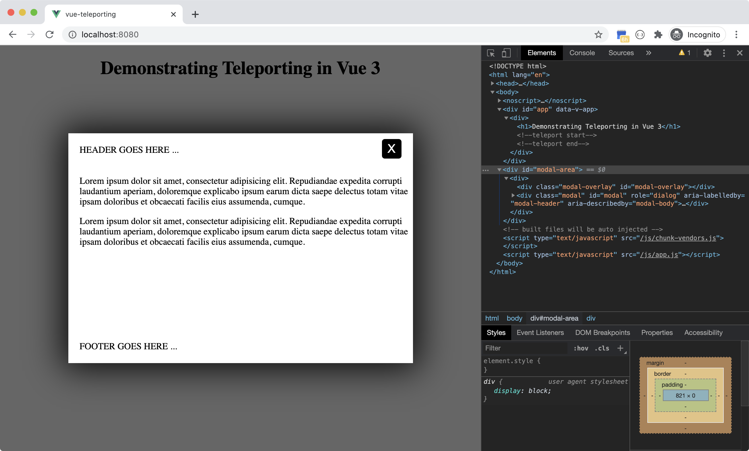
The Modal component is now rendered inside the <div id=”modal-area”/> outside the scope of the Vue 3 app and inside the <body> element of the index.html page.

You are nesting the Modal component inside the App.vue and Vue 3 will render it inside the <body> tag. Have your cake and eat it too!

How to close the Modal and remove its content from the DOM?

Let's make use of the disabled property of the <teleport> component and also the v-if Vue directive to close the Modal, and remove the component from the DOM.

<template>
  <div>
    <h1>Demonstrating Teleporting in Vue 3</h1>
    <teleport to="#modal-area" :disabled="shouldClose" v-if="!shouldClose">
      <Modal @close-modal="closeModal">
        <template #body>
          ...
        </template>
      </Modal>
    </teleport>
  </div>
</template>

<script>
import Modal from "./components/Modal.vue";

export default {
  name: "App",
  components: {
    Modal,
  },
  data() {
    return {
      shouldClose: false,
    };
  },
  methods: {
    closeModal() {
      this.shouldClose = true;
    },
  },
};
</script>

The code introduces a new reactive property named `shouldClose`. This property is assigned a value of `true` by default.

The code assigns the shouldClose property to the disabled property on the <teleport> component :disabled=”shouldClose”. As long as the value of shouldClose is false, the <teleport> component won't be disabled, hence it will render its content to the DOM.

When the user clicks the Close button, the button's event handler sets the value of shouldClose property to true. The <teleport> reactively stops rendering inside the <body> tag. However, it tries to render the Modal component in the position where it was originally defined- that is, inside the App.vue component.

Our goal is to prevent the <teleport> component from rendering anything to the DOM. We can achieve that by using the v-if=”!shouldClose” directive expression on the <teleport> component. This instructs the <teleport> component not to render its content anywhere inside the DOM.

That's all!

Conclusion

This article introduced the Teleporting feature coming along with Vue 3.

I hope you appreciate the importance and value of such an addition on the Vue framework. This will allow building app UIs to the standards and best practices of both the Vue framework, as well as UI building and design.

This Dot Labs is a development consultancy that is trusted by top industry companies, including Stripe, Xero, Wikimedia, Docusign, and Twilio. This Dot takes a hands-on approach by providing tailored development strategies to help you approach your most pressing challenges with clarity and confidence. Whether it's bridging the gap between business and technology or modernizing legacy systems, you’ll find a breadth of experience and knowledge you need. Check out how This Dot Labs can empower your tech journey.

You might also like

Bun v1.0 cover image

Bun v1.0

On September 8, 2023, Bun version 1 was released as the first production-ready version of Bun, a fast, all-in-one toolkit for running, building, testing, and debugging JavaScript and TypeScript. Why a new JS runtime You may ask, we already have Node and Deno, so why would we need another javascript runtime, Well yes we had Node for a very long time, but developers face a lot of problems with it, and maybe the first problem is because it’s there for a very long time, it has been changing a lot between different versions and one of the biggest nightmares for JavaScript developers these days is upgrading the node version. Also, Node lacks support for Typescriptt. Zig programming language One of the main reasons that Bun is faster than Node, is the programming language it has been built with which is Zig. Zig is a very fast programming language, even faster than C) (here is some benchmarks), it focuses on performance and memory control. The reasons it’s faster than C is because of the LLVM optimizations it has, and also the way it handles the undefined behavior under the hood Developer Experience Bun delivers a better developer experience than Node on many levels. First, it’s almost fully compatible with Node so you can use Node packages without any issues. Also, you don’t need to worry about JS Common and ES Modules anymore, you can use both in the same file, yup you read that right, for example: `js import { useState } from 'react'; const React = require('react'); ` Also, it has a built-in test framework similar to Jest or Vitest in the project so no need to install a different test framework with different bundler in the same project like Webpack or Vite `js import { describe, expect, test, beforeAll } from "bun:test"; ` Also, it supports JSX out-of-the-box `bash bun index.tsx ` Also, Bun has the fastest javascript package manager and the most efficient you can find as of the time of this post `bash bun install ` Bun Native APIs Bun supports the Node APIs but also they have fun and easy APIs to work with like `Bun.serve()` : to create HTTP server `Bun.file()` : to read and write the file system `Bun. password.hash()`: to hash passwords `Bun.build()`: to bundle files for the browser `Bun.FileSystemRouter()`: a file system router And many more features Plugin system Bun also has an amazing plugin system that allows developers to create their own plugins and add them to the Bun ecosystem. `js import { plugin, type BunPlugin } from "bun"; const myPlugin: BunPlugin = { name: "Custom loader", setup(build) { // implementation }, }; ` Conclusion Bun is a very promising project, and it’s still in the early stages, but it has a lot of potential to be the next big thing in the JavaScript world. It’s fast, easy to use, and has a lot of amazing features. I’m very excited to see what the future holds for Bun and I’m sure it will be a very successful project....

Angular 17: Continuing the Renaissance cover image

Angular 17: Continuing the Renaissance

Angular 17: A New Era November 8th marked a significant milestone in the world of Angular with the release of Angular 17. This wasn't just any ordinary update; it was a leap forward, signifying a new chapter for the popular framework. But what made this release truly stand out was the unveiling of Angular's revamped website, complete with a fresh brand identity and a new logo. This significant transformation represents the evolving nature of Angular, aligning with the modern demands of web development. To commemorate this launch, we also hosted a release afterparty, where we went deep into its new features with Minko Gechev from the Angular core team, and Google Developer Experts (GDEs) Brandon Roberts, Deborah Kurata, and Enea Jahollari. But what exactly are these notable new features in the latest version? Let's dive in and explore. The Angular Renaissance Angular has been undergoing a significant revival, often referred to as Angular's renaissance, a term coined by Sarah Drasner, the Director of Engineering at Google, earlier this year. This revival has been particularly evident in its recent versions. The Angular team has worked hard to introduce many new improvements, focusing on signal-based reactivity, hydration, server-side rendering, standalone components, and migrating to esbuild and Vite for a better and faster developer experience. This latest release, in particular, marks many of these features as production-ready. Standalone Components About a year ago, Angular began a journey toward modernity with the introduction of standalone components. This move significantly enhanced the developer experience, making Angular more contemporary and user-friendly. In Angular's context, a standalone component is a self-sufficient, reusable code unit that combines logic, data, and user interface elements. What sets these components apart is their independence from Angular's NgModule system, meaning they do not rely on it for configuration or dependencies. By setting a standalone: true` flag, you no longer need to embed your component in an NgModule and you can bootstrap directly off that component: `typescript // ./app/app.component.ts @Component({ selector: 'app', template: 'hello', standalone: true }) export class AppComponent {} // ./main.ts import { bootstrapApplication } from '@angular/platform-browser'; import { AppComponent } from './app/app.component'; bootstrapApplication(AppComponent).catch(e => console.error(e)); ` Compared to the NgModules way of adding components, as shown below, you can immediately see how standalone components make things much simpler. `ts // ./app/app.component.ts import { Component } from '@angular/core'; @Component({ selector: 'app-root', templateUrl: './app.component.html', styleUrls: ['./app.component.css'], }) export class AppComponent { title = 'CodeSandbox'; } // ./app/app.module.ts import { NgModule } from '@angular/core'; import { BrowserModule } from '@angular/platform-browser'; import { AppComponent } from './app.component'; @NgModule({ declarations: [ AppComponent ], imports: [ BrowserModule ], providers: [], bootstrap: [AppComponent] }) export class AppModule { } // .main.ts import { platformBrowserDynamic } from '@angular/platform-browser-dynamic'; import { AppModule } from './app/app.module'; platformBrowserDynamic() .bootstrapModule(AppModule) .catch((err) => console.error(err)); ` In this latest release, the Angular CLI now defaults to generating standalone components, directives, and pipes. This default setting underscores the shift towards a standalone-centric development approach in Angular. New Syntax for Enhanced Control Flow Angular 17 introduces a new syntax for control flow, replacing traditional structural directives like ngIf` or `ngFor`, which have been part of Angular since version 2. This new syntax is designed for fine-grained change detection and eventual zone-less operation when Angular completely migrates to signals. It's more streamlined and performance-efficient, making handling conditional or list content in templates easier. The @if` block replaces `*ngIf` for expressing conditional parts of the UI. `ts @if (a > b) { {{a}} is greater than {{b}} } @else if (b > a) { {{a}} is less than {{b}} } @else { {{a}} is equal to {{b}} } ` The @switch` block replaces `ngSwitch`, offering benefits such as not requiring a container element to hold the condition expression or each conditional template. It also supports template type-checking, including type narrowing within each branch. ```ts @switch (condition) { @case (caseA) { Case A. } @case (caseB) { Case B. } @default { Default case. } } ``` The @for` block replaces `*ngFor` for iteration and presents several differences compared to its structural directive predecessor, `ngFor`. For example, the tracking expression (calculating keys corresponding to object identities) is mandatory but offers better ergonomics. Additionally, it supports `@empty` blocks. `ts @for (item of items; track item.id) { {{ item.name }} } ` Defer Block for Lazy Loading Angular 17 introduces the @defer` block, a dramatically improving lazy loading of content within Angular applications. Within the `@defer` block framework, several sub-blocks are designed to elegantly manage different phases of the deferred loading process. The main content within the `@defer` block is the segment designated for lazy loading. Initially, this content is not rendered, becoming visible only when specific triggers are activated or conditions are met, and after the required dependencies have been loaded. By default, the trigger for a `@defer` block is the browser reaching an idle state. For instance, take the following block: it delays the loading of the calendar-imp` component until it comes into the viewport. Until that happens, a placeholder is shown. This placeholder displays a loading message when the `calendar-imp` component begins to load, and an error message if, for some reason, the component fails to load. `ts @defer (on viewport) { } @placeholder { Calendar placeholder } @loading { Loading calendar } @error { Error loading calendar } ` The on` keyword supports a wide a variety of other conditions, such as: - idle` (when the browser has reached an idle state) - interaction` (when the user interacts with a specified element) - hover` (when the mouse has hovered over a trigger area) - timer(x)` (triggers after a specified duration) - immediate` (triggers the deferred load immediately) The second option of configuring when deferring happens is by using the when` keyword. For example: `ts @defer (when isVisible) { } ` Server-Side Rendering (SSR) Angular 17 has made server-side rendering (SSR) much more straightforward. Now, a --ssr` option is included in the `ng new` command, removing the need for additional setup or configurations. When creating a new project with the `ng new` command, the CLI inquires if SSR should be enabled. As of version 17, the default response is set to 'No'. However, for version 18 and beyond, the plan is to enable SSR by default in newly generated applications. If you prefer to start with SSR right away, you can do so by initializing your project with the `--ssr` flag: `shell ng new --ssr ` For adding SSR to an already existing project, utilize the ng add` command of the Angular CLI: `shell ng add @angular/ssr ` Hydration In Angular 17, the process of hydration, which is essential for reviving a server-side rendered application on the client-side, has reached a stable, production-ready status. Hydration involves reusing the DOM structures rendered on the server, preserving the application's state, and transferring data retrieved from the server, among other crucial tasks. This functionality is automatically activated when server-side rendering (SSR) is used. It offers a more efficient approach than the previous method, where the server-rendered tree was completely replaced, often causing visible UI flickers. Such re-rendering can adversely affect Core Web Vitals, including Largest Contentful Paint (LCP), leading to layout shifts. By enabling hydration, Angular 17 allows for the reuse of the existing DOM, effectively preventing these flickers. Support for View Transitions The new View Transitions API, supported by some browsers, is now integrated into the Angular router. This feature, which must be activated using the withViewTransitions` function, allows for CSS-based animations during route transitions, adding a layer of visual appeal to applications. To use it, first you need to import withViewTransitions`: `ts import { provideRouter, withViewTransitions } from '@angular/router'; ` Then, you need to add it to the provideRouter` configuration: `ts bootstrapApplication(AppComponent, { providers: [ provideRouter(routes, withViewTransitions()) ] }) ` Other Notable Changes - Angular 17 has stabilized signals, initially introduced in Angular 16, providing a new method for state management in Angular apps. - Angular 17 no longer supports Node 16. The minimal Node version required is now 18.13. - TypeScript version 5.2 is the least supported version starting from this release of Angular. - The @Component` decorator now supports a `styleUrl` attribute. This allows for specifying a single stylesheet path as a string, simplifying the process of linking a component to a specific style sheet. Previously, even for a single stylesheet, an array was required under `styleUrls`. Conclusion With the launch of Angular 17, the Angular Renaissance is now in full swing. This release has garnered such positive feedback that developers are showing renewed interest in the framework and are looking forward to leveraging it in upcoming projects. However, it's important to note that it might take some time for IDEs to adapt to the new templating syntax fully. While this transition is underway, rest assured that you can still write perfectly valid code using the old templating syntax, as all the changes in Angular 17 are backward compatible. Looking ahead, the future of Angular appears brighter than ever, and we can't wait to see what the next release has in store!...

Nuxt.js for Complete Beginners cover image

Nuxt.js for Complete Beginners

The Vuejs Amsterdam online conference was held at the end of February in 2021. It brought together Vue.js enthusiasts and community members from around the world. Many interesting topics were presented and covered. The focus, of course, was on Vue.js 3. In addition, the creators of Nuxt.js had the opportunity to showcase it from the current standpoint in development, to their intentions for it down the track. They even demonstrated a pre-alpha version of Nuxt.js 3, that’s based on Vue.js 3. This article will start by briefly covering general Nuxt.js concepts, creating a new Nuxt.js app using the create-nuxt-app** CLI, and finally, going through the different files and folders that Nuxt.js auto-generates for us. Let’s start! Nuxt.js Concepts Nuxt.js is a web development framework that builds on top of the Vue.js framework. It allows you to use your Vue.js skills to build a more confident, structured, SEO friendly website purely in Vue.js. Remember when you had to mess with the Vue.js SSR module and the Vue Meta module to build a SEO friendly website? On top of that, you had to install and use Vuex and Vue Router too! Well, Nuxt.js takes care of that! No more chaotic setup and scaffolding to start a new Vue.js app. With the help of the create-nuxt-app** CLI, you can scaffold a Nuxt.js app in no time. What’s remarkable about Nuxt.js is its capacity to enforce convention over configuration. This means, you write less configuration files by sticking to a specific directory structure that makes Nuxt.js happy and saves you a ton of time! Apps supported by Nuxt.js Nuxt.js supports building a variety of web apps, including the following: Server-Side Rendering (SSR)** SSR apps are also known as Universal Apps. The app gets rendered on the server-side before it is sent to the client-side, and is displayed in the browser. This is the best option when working on an SEO friendly website written in Vue.js. You can read the full documentation for the SSR apps here: SSR Apps Single Page Apps (SPA)** This is what you’ve been doing so far with Vue.js. The app is compiled into a few JS and CSS files. When the user requests the app, the files are downloaded to the client-side, and the Vue.js engine takes over rendering and displaying the app. Static Site Generation (SSG)** Nuxt.js can pre-render your app at build time. This means the entire app will be converted to simple static HTML files that can be hosted and served over a Content Delivery Network (CDN). The SSG option makes an app a legal JAMStack app. You can read the full documentation for the Static Site Generation here: Static Site Generation. File System Routing Nuxt.js automatically generates all the Vue.js Routes in your app based on the folder structure inside the pages* folder. For example, consider having this folder structure: `bash pages/ --| user/ -----| index.vue --| index.vue ` Nuxt.js automatically generates the following route configuration: `js router: { routes: [ { name: 'index', path: '/', component: 'pages/index.vue' }, { name: 'user', path: '/user', component: 'pages/user/index.vue' }, ] } ` You can read about File System Routing* here: File System Routing. Data Fetching Inside a Nuxt.js app, you can still use the old techniques you kmow when developing Vue.js apps. However, we have a new player here! Server-side rendering. Nuxt.js provides a new set of data-hooks that you can implement so that Nuxt.js can prefetch data when generating the app at the server-side. Here are two data-hooks offered by Nuxt.js: fetch() hook** This hook was introduced with Nuxt.js 2.12+ release. It can be used inside Vue.js components stored in the pages* folder and *components* folder. asyncData() hook** This hook has been around for a while now, and can be used only** inside the Vue.js components stored in the *pages* folder. You can read more about Data Fetching* hooks here: Data Fetching. Meta Tags and SEO Nuxt.js makes it so intuitive to add SEO support to your SSR app. You can add Metadata to your app at two different levels: - Globally using the nuxt.config.js* file - Locally inside a Nuxt.js Page You can read about Meta Tags and SEO* hooks here: Meta Tags and SEO. Create our first Nuxt.js app Let’s use the create-nuxt-app** CLI, and create our first Nuxt.js app! Before you start, you want to make sure you have all the perquisites required before you can install and run the CLI. For this article, I am going to use npx. However, you can also use npm, or feel free to use yarn. Step 0 Start by running the following command: `bash npx create-nuxt-app my-first-nuxt ` This command uses the create-nuxt-app tool, and specifies the name of the project- in this case my-first-nuxt-app*. The CLI will ask you a few questions that are important to scaffold the new Nuxt.js app based on your own preferences and decisions. Here’s what to expect. Step 1 First, let’s confirm the project name as shown in the Figure 1**. Give the app a name and hit Enter. **Figure 1**: Specify project name_ Step 2 You’ve got to choose whether you want to develop your app with TypeScript or JavaScript. I will select JavaScript* as shown in **Figure 2**. **Figure 2**: Programming language_ Step 3 Next, you need to choose between Npm or Yarn. I will select Npm* as shown in **Figure 3**. **Figure 3**: Package manager_ Step 4 In this step, you’ve got to select the UI framework you are going to use in the app. I will select Tailwind CSS* as shown in **Figure 4**. Even if you skip this step, you can add any UI framework you want later. **Figure 4**: UI framework_ Step 5 Nuxt.js offers a set of modules that you can use right away in your apps. For this app, I will pick the Axios* module. **Figure 5** shows the selection. **Figure 5**: Nuxt.js modules_ Step 6 The CLI makes it super intuitive to integrate linters in your app. I will pick up both ESLint* and *Prettier*. **Figure 6** shows the selection. **Figure 6**: Linting tools_ Step 7 Now it’s time to select a testing framework. For the sake of this article, I will select None*. Feel free to add any. **Figure 7** shows the selection. **Figure 7**: Testing framework_ Step 8 By default, Nuxt.js supports two rendering modes. SSR/SSG and SPA. I will pick SSR/SSG* to take advantage of the Server-side rendering. **Figure 8** shows the selection. **Figure 8**: Rendering mode_ Step 9 The deployment target depends on our selection in Step 8. In this case, we have two options to select from. Server (using a Node.js server hosting) or Static (CDN/JAMStack hosting). I will select the Server* deployment target as shown in **Figure 9**. **Figure 9**: Deployment target_ Step 10 For the development tools, I will keep it simple and select the jsconfig.json* option as shown in **Figure 10**. **Figure 10**: Development tools_ Step 11 I won’t be using any continuous integration for this app. I will simply select None* as shown in **Figure 11**. **Figure 11**: Continuous integration_ Step 12 Finally, the CLI asks whether you want to use any version control system. A version control system is always recommended when doing any kind of development. I will select Git* as shown in **Figure 12**. **Figure 12**: Version control system_ These twelve questions are enough for the CLI to start scaffolding and generating your app based on your preferences. It takes a few seconds to have everything ready for you. If all goes well, you should see the following as in Figure 13**. **Figure 13**: create-nuxt-app new app instructions_ The CLI gives you instructions on how to run and build the app. Step 13 Let’s run the app by following the steps highlighted in Figure 13. Run the following commands: `bash cd my-first-nuxt npm run dev ` The CLI compiles both the client and server parts of the app and starts the Node.js server on port 3000 as shown in Figure 14**. **Figure 14**: App is running_ Step 14 Open a browser instance and navigate to the URL http://localhost:3000/* and you should see the default Nuxt.js app rendering. **Figure 15** shows the app running in a browser. **Figure 15**: App rendering in a browser_ That’s all you need to get started on your first Nuxt.js app. Enjoy! Nuxt.js Directory Structure Let’s quickly go through the different folders the CLI generated for us. I will start by opening the new app inside Visual Studio Code. Figure 16** shows the app open inside the editor. **Figure 16**: App folders and files_ Let’s go through each folder, and explain their roles briefly. .nuxt The .nuxt* folder is (re-)generated by the CLI every time you run or build the app. It has all the automatically generated files that Nuxt.js uses to run your app. You can read more about the .nuxt* folder here: .nuxt. assets The assets* folder contains all of your uncompiled files such as Sass files, images, or font files. Nuxt.js makes use of Webpack to load all the files inside this folder. You can read more about the assets* folder here: assets. components This folder holds all of your Vue.js components. Nuxt.js components are not different from any other Vue.js component. Read more about the components* folder here: components. layouts This folder contains all of your layout components. These are Vue.js components with placeholders for content. At run time, the component and the layout it uses get merged together into a single component. Layouts in Nuxt.js allows you to define fixed UI sections in your app instead of having to repeat things over and over. You can read more about the layouts* folder here: layouts. pages This folder also holds Vue.js components. It is unique because Nuxt.js converts this folder structure (components with sub-folders) into actual Vue.js Routes. You can read about the pages* folder here: pages. plugins This folder contains global JavaScript functions that you want to run before Nuxt.js instantiates the root Vue.js app. These functions are called Plugins*. They can take multiple forms. For instance, you create a Nuxt.js Plugin to load a Vue.js Plugin to your app. You can also install, and make use of a third-party Nuxt.js Plugin. You can read more about the plugins* folder here: plugins. static The name of this folder says it all! This folder is directly mapped to the server root. You can place any file in this folder that you do not want Webpack to process. For example, you can place a favicon file, any CSS files, and many other such files. You can read more about the static* folder here: static. store The store* folder holds all the Vuex store files. Nuxt.js comes with the Vuex module installed, but keeps it disabled. In order to enable the Vue store in your Nuxt.js app, create an *index.js* file inside this folder, and Nuxt.js will automatically enable it for you. You can read more about store* folder here: store. nuxt.config.js As I mentioned, Nuxt.js prefers convention over configuration. However, at some times you may need to tweak the configuration a little. Nuxt.js provides the nuxt.config.js* file to allow for custom configuration settings on the app level. Read more about nuxt.config* file here: nuxt.config. That’s just a quick overview of what folders are generated by the Nuxt.js CLI. There are more you can read up on. You can find all the information you need on Nuxt.js Documentation website. Conclusion In this article, you were introduced to Nuxt.js and took a few baby steps towards creating your first Nuxt.js app. In the coming articles, we will immerse ourselves in the Nuxt.js world, and explore this fresh and promising web development framework together. You can follow me on Twitter to see more of my work....

Testing a Fastify app with the NodeJS test runner cover image

Testing a Fastify app with the NodeJS test runner

Introduction Node.js has shipped a built-in test runner for a couple of major versions. Since its release I haven’t heard much about it so I decided to try it out on a simple Fastify API server application that I was working on. It turns out, it’s pretty good! It’s also really nice to start testing a node application without dealing with the hassle of installing some additional dependencies and managing more configurations. Since it’s got my stamp of approval, why not write a post about it? In this post, we will hit the highlights of the testing API and write some basic but real-life tests for an API server. This server will be built with Fastify, a plugin-centric API framework. They have some good documentation on testing that should make this pretty easy. We’ll also add a SQL driver for the plugin we will test. Setup Let's set up our simple API server by creating a new project, adding our dependencies, and creating some files. Ensure you’re running node v20 or greater (Test runner is a stable API as of the 20 major releases) Overview `index.js` - node entry that initializes our Fastify app and listens for incoming http requests on port 3001 `app.js` - this file exports a function that creates and returns our Fastify application instance `sql-plugin.js` - a Fastify plugin that sets up and connects to a SQL driver and makes it available on our app instance Application Code A simple first test For our first test we will just test our servers index route. If you recall from the app.js` code above, our index route returns a 501 response for “not implemented”. In this test, we're using the createApp` function to create a new instance of our Fastify app, and then using the `inject` method from the Fastify API to make a request to the `/` route. We import our test utilities directly from the node. Notice we can pass async functions to our test to use async/await. Node’s assert API has been around for a long time, this is what we are using to make our test assertions. To run this test, we can use the following command: By default the Node.js test runner uses the TAP reporter. You can configure it using other reporters or even create your own custom reporters for it to use. Testing our SQL plugin Next, let's take a look at how to test our Fastify Postgres plugin. This one is a bit more involved and gives us an opportunity to use more of the test runner features. In this example, we are using a feature called Subtests. This simply means when nested tests inside of a top-level test. In our top-level test call, we get a test parameter t` that we call methods on in our nested test structure. In this example, we use `t.beforeEach` to create a new Fastify app instance for each test, and call the `test` method to register our nested tests. Along with `beforeEach` the other methods you might expect are also available: `afterEach`, `before`, `after`. Since we don’t want to connect to our Postgres database in our tests, we are using the available Mocking API to mock out the client. This was the API that I was most excited to see included in the Node Test Runner. After the basics, you almost always need to mock some functions, methods, or libraries in your tests. After trying this feature, it works easily and as expected, I was confident that I could get pretty far testing with the new Node.js core API’s. Since my plugin only uses the end method of the Postgres driver, it’s the only method I provide a mock function for. Our second test confirms that it gets called when our Fastify server is shutting down. Additional features A lot of other features that are common in other popular testing frameworks are also available. Test styles and methods Along with our basic test` based tests we used for our Fastify plugins - `test` also includes `skip`, `todo`, and `only` methods. They are for what you would expect based on the names, skipping or only running certain tests, and work-in-progress tests. If you prefer, you also have the option of using the describe` → `it` test syntax. They both come with the same methods as `test` and I think it really comes down to a matter of personal preference. Test coverage This might be the deal breaker for some since this feature is still experimental. As popular as test coverage reporting is, I expect this API to be finalized and become stable in an upcoming version. Since this isn’t something that’s being shipped for the end user though, I say go for it. What’s the worst that could happen really? Other CLI flags —watch` - https://nodejs.org/dist/latest-v20.x/docs/api/cli.html#--watch —test-name-pattern` - https://nodejs.org/dist/latest-v20.x/docs/api/cli.html#--test-name-pattern TypeScript support You can use a loader like you would for a regular node application to execute TypeScript files. Some popular examples are tsx` and `ts-node`. In practice, I found that this currently doesn’t work well since the test runner only looks for JS file types. After digging in I found that they added support to locate your test files via a glob string but it won’t be available until the next major version release. Conclusion The built-in test runner is a lot more comprehensive than I expected it to be. I was able to easily write some real-world tests for my application. If you don’t mind some of the features like coverage reporting being experimental, you can get pretty far without installing any additional dependencies. The biggest deal breaker on many projects at this point, in my opinion, is the lack of straightforward TypeScript support. This is the test command that I ended up with in my application: I’ll be honest, I stole this from a GitHub issue thread and I don’t know exactly how it works (but it does). If TypeScript is a requirement, maybe stick with Jest or Vitest for now 🙂...