Skip to content

Plugin Architecture for Angular Libraries using Dependency Injection

The plugin architecture is a well-known software design pattern used for its flexibility, extensibility, and isolation. It consists of a core system and several separate plugin modules.

We will cover how to create a plugin-based architecture in Angular using its Dependency Injection system and why this is an excellent tool to have in our Engineers belt.

Plugin Architecture

The Plugin Architecture concept is simple: the Core System manages the essential functionalities and orchestrates the Plugins, but it is agnostic of its behavior. The Plugins implement the use-case-specific functionalities, and they are agnostic of other plugins and the system behavior.

The Core System is responsible for defining the contract used by itself and the Plugins to communicate.

Plugin Architecture -- Dependency flow

Plugins aren't necessarily designed for a particular Core System, but in those cases, an adapter is required to make the Plugins follow the contract. 

The main principles related to this kind of Architecture are the Inversion of Control (IoC) Principle and the Dependency Inversion Principle (DIP, the D from the SOLID principles)

While the Plugins follow the IoC by extracting behavior and control from the main flow or Core System, the DIP is necessary for avoiding coupling and establishing the contract.

Dependency Injection is not the only design pattern that allows building a Plugin Architecture or follow the IoC Principle; callbacks, schedulers, event loops, and message queues are also valid options.

If you are interested in learning more about Plugin Architecture, check the following links

Plugin-based Angular Libraries

The Angular community is big and healthy, every day, new packages get published, and our favorite tools get renewed.

In this constellation, not all libraries are built using a Plugin Architecture, and with a good reason. This pattern is NOT a silver bullet, and you should not try to design all your libraries using Plugins.

But there are some scenarios where the Plugin Architecture provides outstanding flexibility and relief maintainers from creating all possible features for a given domain. For example, in Components libraries, using content projection is a great way to achieve IoC. From there, it is pretty easy to build plugins that extend your core Component functionality or customize the UI.

In this article, we will focus on another of the design patterns implemented in Angular, the Dependency Injection (DI) pattern.

Implementing a Plugin Architecture with Dependency Injection

As described previously, the Plugin Architecture has two components. The Core System and the Plugins.

The Plugins depend on the Core System, but not the other way around. Therefore, we should start designing the Core System first.

The minimum elements we are going to need are 

  • PluginContract, this is the contract that our Plugins will implement and that the Core System uses for communication.
  • PluginInjectionToken, in some technologies, the 
  • PluginContract would be used as the injection token. Still, since interfaces are not genuine artifacts in typescript and they disappear at build time, we have to define an additional token. It is good to notice that this splitting also contributes to the separation of concerns.
  • OrchestrationService will gather all the plugins, orchestrate their behavior, and provide error resolution.

We will also have some configuration elements, optional for small and straightforward systems but instrumental in building flexible libraries.

  • PluginConfiguration contains information about the integration of the Plugin with the Core system. The OrchestrationService uses it to identify if it should execute a Plugin and how. The Plugin can extend it to configure internal Plugin behavior. The core system can provide a default configuration for the Plugins.
  • PluginConfigurationToken, injection token for the PluginConfiguration
  • CoreConfiguration provides configuration at a Core level, makes the overall system execute in a certain way.
  • CoreConfigurationToken, injection token for the CoreConfiguration

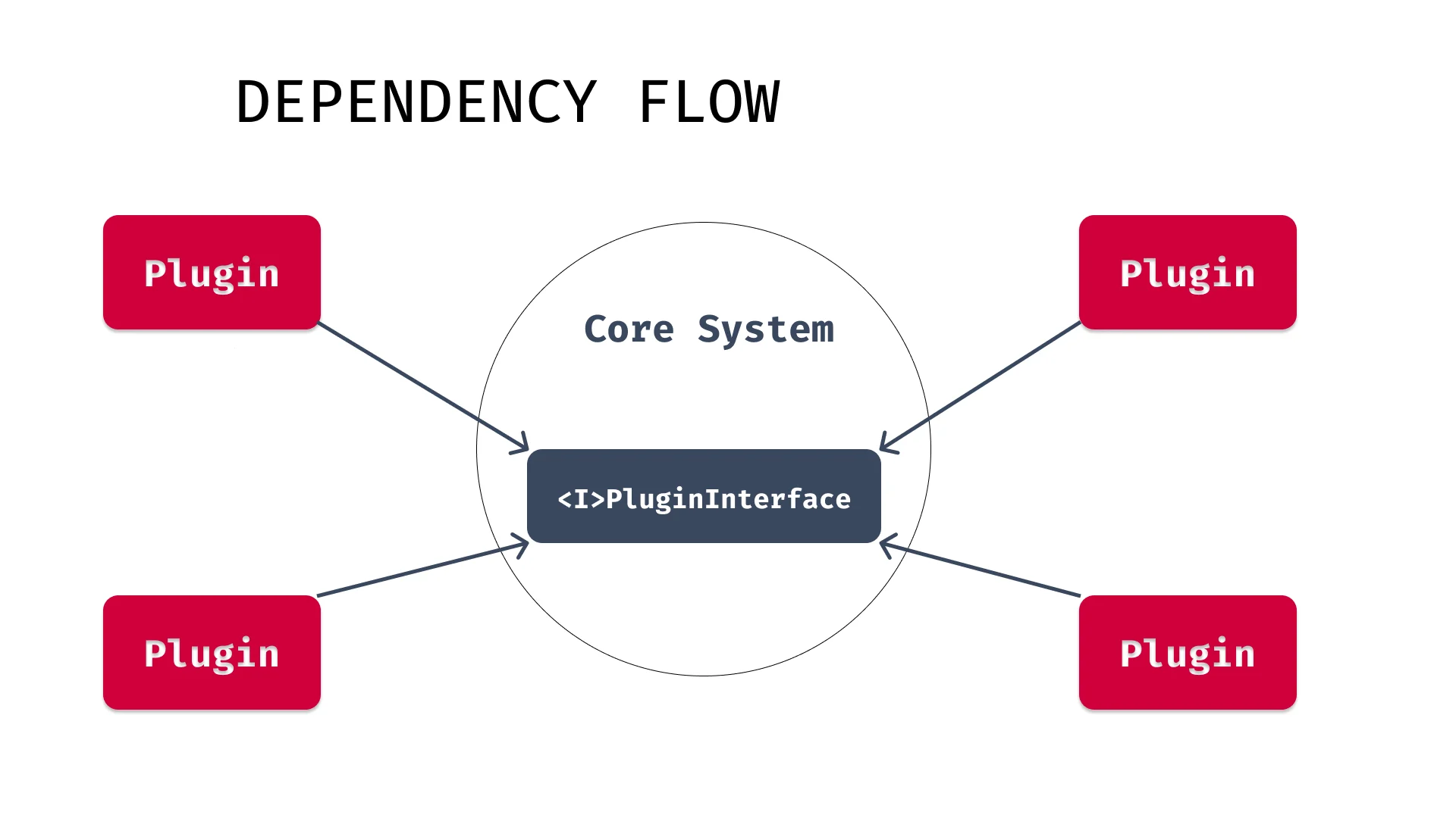
The dependency flow would look like Fig.2.

Plugin Architecture -- Dependency Flow Extended

The Angular code

Now that we have a big picture of our architectural design let's jump into the details and learn how to implement our library following this pattern.

The core system

The first thing we need is the contract that our plugins need to implement to communicate with the core system.

import { PluginConfig } from './plugin.config';

export interface SystemPlugin {
  config: PluginConfig; // 👈

  operationA(...args: unknown[]): unknown;
  operationB(...args: unknown[]): unknown;
  operationZ(...args: unknown[]): unknown;
}

This contract could have any signature; it is up to the library that you are building. The only remarkable element is the config. We are forcing the Plugin to have it since the Core System needs it to handle the Plugin correctly.

The config itself is very basic and generic for our demonstrational purpose. Still, the idea is to define in the PluginConfig everything that we want to make adjustable in our Plugin behavior. This config can serve both the Plugin and the Core System.

export interface PluginConfig {
  optionA: unknown;
  optionB: unknown;
  optionZ: unknown;
}

Of course, we need some injectors here since we cannot use the interfaces with Angular Dependency Injection. Let's add those.

import { InjectionToken } from '@angular/core';
import { SystemPlugin } from './plugin';

export const pluginToken: InjectionToken<SystemPlugin> = new InjectionToken(
  '__PLUGIN_TOKEN__'
);

and

import { InjectionToken } from '@angular/core';
import { PluginConfig } from './plugin.config';

export const pluginConfigToken: InjectionToken<PluginConfig> = new InjectionToken(
  '__PLUGIN_CONFIG_TOKEN__'
);

The next thing we are going to implement is our Core System configuration.

export interface CoreConfig {
  coreOptionsA: unknown;
  coreOptionsB: unknown;
  coreOptionsZ: unknown;
}

The CoreConfig, like all other elements of this example, should be implemented accordingly with your library. For simplicity, let's imagine it represents all the different configurable tweaks we can make to our Core System. Occasionally, part of the configuration options of the CoreConfig are used as global defaults for not required configuration options in the PluginConfig.

As before, we will also create the coreConfigToken to inject the CoreConfig.

import { InjectionToken } from '@angular/core';
import { CoreConfig } from './core.config';

export const coreConfigToken: InjectionToken<CoreConfig> = new InjectionToken(
  '__CORE_CONFIG_TOKEN__'
);

Next, let's take a look at our OrchestratorService, the heart of our library. In our example, the OrchestratorService will also be the entry point to our library, but this is not required. The library entry points can vary from a directive to a secondary service that uses the orchestrator service to any other communication form between the client code and our library.

import { Inject, Injectable, Optional } from '@angular/core';
import { coreConfigToken } from './core-config.token';
import { CoreConfig } from './core.config';
import { SystemPlugin } from './plugin';
import { pluginToken } from './plugin.token';

@Injectable({ providedIn: 'root' })
export class OrchestratorService {
  private readonly plugins: SystemPlugin[];

  constructor(
    @Optional()
    @Inject(pluginToken)
    plugins: SystemPlugin[],
    @Inject(coreConfigToken) private config: CoreConfig
  ) {
    plugins = plugins || [];
    this.plugins = Array.isArray(plugins) ? plugins : [plugins];
  }

  coreOperationA(...args: any[]): unknown {
    // just a demonstration of what can be done
    return this.plugins
      .filter((plugin) => this.canPluginExecute(plugin))
      .reduce<unknown>((acc, plugin) => plugin.operationA(acc), null);
  }

  private canPluginExecute(plugin: SystemPlugin): boolean {
    // implement any validation to determine whether the plugin should be executed or not

    // use the  core config and/or the driver config

    // just a demonstration of what can be done
    return (
      (this.config.coreOptionsA as boolean) &&
      (plugin.config.optionA as boolean)
    );
  }
}

Wow, a lot is going on in there. Since this service is larger than the other files, let's split it to understand what is going on.

constructor(
    @Optional()
    @Inject(pluginToken)
    plugins: SystemPlugin[],
    @Inject(coreConfigToken) private config: CoreConfig
  ) {
    plugins = plugins || [];
    this.plugins = Array.isArray(plugins) ? plugins : [plugins];
  }

The first thing we need to do is inject what we are going to need.

The key elements are the Plugins, and I want to emphasize the plural, Plugins. We are receiving an Array of Plugins. However, it is possible that we only received a single Plugin or none plugin at all. In such cases, we need to transform the data to a suitable form, to an Array.

But, how is it possible to receive multiple instances of the same Injection token? That's one of the critical ingredients when using Angular's Dependency Injection as the Plugin Architecture mechanism. We will go over this feature when we provide our Plugins, but the key is in the multi options of Angular's StaticProvider.

 coreOperationA(...args: any[]): unknown {
    // just a demonstration of what can be done
    return this.plugins
      .filter((plugin) => this.canPluginExecute(plugin))
      .reduce<unknown>((acc, plugin) => plugin.operationA(acc), null);
  }

The coreOperationA is an example of how the client code could use our library and how the OrchestratorService handles our plugins.

The example implementation shows how we can filter which plugins are configured to execute at a given moment and how to compose the different plugins to build a response. Real-world implementations could differ significantly, but the point is that we can access all the configured plugins and make decisions about them in our orchestrator.

Finally, we use our canPluginExecute method to determine if a Plugin should be used or not based on both the CoreConfig and the PluginConfig.

 private canPluginExecute(plugin: SystemPlugin): boolean {
    // implement any validation to determine whether the plugin should be executed or not

    // use the  core config and/or the driver config

    // just a demonstration of what can be done
    return (
      (this.config.coreOptionsA as boolean) &&
      (plugin.config.optionA as boolean)
    );
  }

And that's it. That is our Core System, well almost, we still need a module to configure everything. Let's see how we can do that.

import { ModuleWithProviders, NgModule } from '@angular/core';

import { CoreConfig } from './core.config';
import { coreConfigToken } from './core-config.token';

@NgModule()
export class CoreSystemModule {
  static forRoot(config: CoreConfig): ModuleWithProviders<CoreSystemModule> {
    return {
      ngModule: CoreSystemModule,
      providers: [{ provide: coreConfigToken, useValue: config }],
    };
  }
}

We are using the static method forRoot to received the CoreConfig configuration from the client code and then provided it to the DI system. Otherwise, we might not need to have a module, but this is a well-known pattern.

The Plugins

The Core System exports everything we need, and possibly it could execute independently, but a Plugin Architecture makes little sense without plugins.

Let's start by implementing our SystemPlugin contract; that's where our unique Plugin logic will leave after all. 

import { Inject, Injectable } from '@angular/core';
import {
  PluginConfig,
  pluginConfigToken,
  SystemPlugin,
} from 'projects/core-system/src/public-api';

@Injectable()
export class ExamplePlugin implements SystemPlugin {
  constructor(@Inject(pluginConfigToken) readonly config: PluginConfig) {}
  operationA(...args: unknown[]): unknown {
    throw new Error('Method not implemented.');
  }
  operationB(...args: unknown[]): unknown {
    throw new Error('Method not implemented.');
  }
  operationZ(...args: unknown[]): unknown {
    throw new Error('Method not implemented.');
  }
}

We need to inject our PluginConfig and implement the interface; the particular implementation is unique to every Plugin. This example shows non-implemented methods, but the idea is there.

The final piece and essential part is the Plugin configuration. 

import { ModuleWithProviders, NgModule } from '@angular/core';
import {
  PluginConfig,
  pluginConfigToken,
  pluginToken,
} from 'projects/core-system/src/public-api';
import { ExamplePlugin } from './example.plugin';
export function examplePluginFactory(config: PluginConfig): ExamplePlugin {
  return new ExamplePlugin(config);
}
@NgModule()
export class ExamplePluginModule {
  static forRoot(
    config: PluginConfig
  ): ModuleWithProviders<ExamplePluginModule> {
    return {
      ngModule: ExamplePluginModule,
      providers: [
        { provide: pluginConfigToken, useValue: config },
        {
          provide: pluginToken,
          useFactory: examplePluginFactory,
          deps: [pluginConfigToken],
          multi: true,
        },
      ],
    };
  }
}

Firstly, we are receiving the PluginConfig from the client code and providing it to the Dependency Injection system. Then it is time to provide our Plugin.

Since our Plugin depends on the provided PluginConfig we need to use a factory function combined with the deps property.

The critical part is the multi options. If missed, that single configuration can make the whole system fail because it can overwrite all other plugins and only provide the one without multi. When set to true, it enables the power of importing multiple artifacts using a single injection token, in this case, our Plugins.

And that's all we need! Now we can start using our Plugin-based library.

Usage

Like with any other Angular library, we have to import it and configure its module.

import { NgModule } from '@angular/core';
import { BrowserModule } from '@angular/platform-browser';
import { CoreSystemModule } from 'projects/core-system/src/public-api';

import { AppComponent } from './app.component';

@NgModule({
  declarations: [AppComponent],
  imports: [
    BrowserModule,
    CoreSystemModule.forRoot({
      coreOptionsA: '_A_',
      coreOptionsB: '_B_',
      coreOptionsZ: '_Z_',
    }),
  ],
  bootstrap: [AppComponent],
})
export class AppModule {}

Now we can start using our OrchestratorService or any other communication form we have in place in our library.

However, we will not go far if we don't have any Plugins; let's add the one we already implemented.

import { NgModule } from '@angular/core';
import { BrowserModule } from '@angular/platform-browser';
import { CoreSystemModule } from 'projects/core-system/src/public-api';
import { ExamplePluginModule } from 'projects/example-plugin/src/public-api';

import { AppComponent } from './app.component';

@NgModule({
  declarations: [AppComponent],
  imports: [
    BrowserModule,
    CoreSystemModule.forRoot({
      coreOptionsA: '_A_',
      coreOptionsB: '_B_',
      coreOptionsZ: '_Z_',
    }),
    ExamplePluginModule.forRoot({
      optionA: '-A-',
      optionB: '-B-',
      optionZ: '-Z-',
    }),
  ],
  bootstrap: [AppComponent],
})
export class AppModule {}

And as simple as that, without letting the CoreSystemModule know anything about our Plugin, we have our system configured.

I hope you can appreciate the simplicity of the configuration of our Plugin Architecture. Exactly as we imported our ExamplePluginModule, we can import as many Plugins as we want, following the same structure. The Core System will access all the imported Plugins and manage its usage for us.

Now we are set up, let's start using our library.

import { Component } from '@angular/core';
import { OrchestratorService } from 'projects/core-system/src/public-api';

@Component({
  selector: 'app-root',
  templateUrl: './app.component.html',
  styleUrls: ['./app.component.scss'],
})
export class AppComponent {
  title = 'plugins-architecture-demo';

  constructor(private orchestrator: OrchestratorService) {
    this.orchestrator.coreOperationA();
  }
}

The client application or library now only has to inject our library entry point. In our example, it is the OrchestrationService. Then, it can start interacting with the library. Plugins are only a concern of the library. The client code is agnostic to the Plugins' existence except for the configuration part.

Conclusion

The Plugin Architecture pattern is a great pattern to create extensible systems using the Inversion of Control Principle and lifting the focused functionalities of our system to the Plugins.

We have learned how to implement a custom Angular library following a Plugin Architecture using Angular Dependency Injection, while briefly introducing the Angular Dependency Injection elements that allow us to make our Plugins decoupled from our Core System.

You can find the final solution at this repo

And if you want to see a real-world usage of this pattern you can visit Lumberjack

This Dot Labs is a development consultancy that is trusted by top industry companies, including Stripe, Xero, Wikimedia, Docusign, and Twilio. This Dot takes a hands-on approach by providing tailored development strategies to help you approach your most pressing challenges with clarity and confidence. Whether it's bridging the gap between business and technology or modernizing legacy systems, you’ll find a breadth of experience and knowledge you need. Check out how This Dot Labs can empower your tech journey.

You might also like

A Guide to Custom Angular Attribute Directives cover image

A Guide to Custom Angular Attribute Directives

When working inside of Angular applications you may have noticed special attributes such as NgClass, NgStyle and NgModel. These are special attributes that you can add to elements and components that are known as attribute directives. In this article, I will cover how these attributes are created and show a couple of examples. What are Attribute Directives? Angular directives are special constructs that allow modification of HTML elements and components. Attribute directives are also applied through attributes, hence the name. There exist other types of directives such as structural directives as well, but we’re just going to focus on attribute directives. If you’ve used Angular before then you have almost certainly used a couple of the attribute directives I mentioned earlier before. You are not limited to just the built-in directives though. Angular allows you to create your own! Creating Attribute Directives Directives can be created using code generation via the ng CLI tool. ` ng generate directive ` This will create a file to house your directive and also an accompanying test file as well. The contents of the directive are very barebones to start with. Let’s take a look. ` import { Directive } from '@angular/core'; @Directive({ selector: '[appExample]', }) export class ExampleDirective { constructor() {} } ` You will see here that directives are created using a @Directive decorator. The selector in this case is the name of the attribute as it is intended to be used in your templates. The square brackets around the name make it an attribute selector, which is what we want for a custom attribute directive. I would also recommend that a prefix is always used for directive names to minimize the risk of conflicts. It should also go without saying to avoid using the ng prefix for custom directives to avoid confusion. Now, let’s go over the lifecycle of a directive. The constructor is called with a reference to the ElementRef that the directive was bound to. You can do any initialization here if needed. This element reference is dependency injected, and will be available outside the constructor as well. You can also set up @HostListener handlers if you need to add functionality that runs in response to user interaction with the element or component, and @Input properties if you need to pass data to the directive. Click Away Directive One useful directive that doesn’t come standard is a click away directive. This is one that I have used before in my projects, and is very easy to understand. This directive uses host listeners to listen for user input, and determine whether the element that directive is attached to should be visible or not after the click event occurs. ` @Directive({ selector: '[appClickAway]', }) export class ClickAwayDirective { @Output() onClickAway: EventEmitter = new EventEmitter(); constructor(private elementRef: ElementRef) {} @HostListener('document:click', ['$event']) onClick(event: PointerEvent): void { if (!this.elementRef.nativeElement.contains(event.target)) { this.onClickAway.emit(event); } } } ` There are a few new things in this directive we’ll briefly go over. The first thing is the event emitter output onClickAway. A generic directive isn’t going to know how to handle click away behavior by itself as this will change based on your use case when using the directive. To solve this issue, we make the directive emit an event that the user of the directive can listen for. The other part is the click handler. We use @HostListener to attach a click handler so we can run our click away logic whenever clicks are done. The one interesting thing about this directive is that it listens to all click events since we’ve specified ‘document’ in the first parameter. The reason for this is because we care about listening for clicking anything that isn’t the element or component that the directive is attached to. If we didn’t do this, then the event handler would only fire when clicking on the component the directive is attached to, which defeats the purpose of a click away handler. Once we’ve determined the element was not clicked, we emit the aforementioned event. Using this directive makes it trivial to implement click away functionality for both modals and context menus alike. If we have a custom dialog component we could hook it up like this: ` Dialog Box This is a paragraph with content! ` If you want to see this directive in action, then you can find it in our blog demos repo here. Drag and Drop Directive Another useful directive is one that assists with drag and drop operations. The following directive makes elements draggable, and executes a function with a reference to the location where the element was dragged to. ` @Directive({ selector: '[appDragDrop]', }) export class DragDropDirective implements OnInit, OnDestroy { @Output() onDragDrop: EventEmitter = new EventEmitter(); mouseDown$ = new Subject(); mouseUp$ = new Subject(); destroy$ = new Subject(); constructor(private elementRef: ElementRef) {} ngOnInit(): void { this.mouseDown$ .pipe(takeUntil(this.destroy$)) .pipe(exhaustMap(() => this.mouseUp$.pipe(take(1)))) .subscribe((event) => { if ( event.target && event.target instanceof Element && !this.elementRef.nativeElement.contains(event.target) ) { this.onDragDrop.emit(event); } }); } ngOnDestroy(): void { this.destroy$.next(null); this.destroy$.complete(); } @HostListener('mousedown', ['$event']) onMouseDown(event: MouseEvent): void { this.mouseDown$.next(event); } @HostListener('document:mouseup', ['$event']) onMouseUp(event: MouseEvent): void { this.mouseUp$.next(event); } } ` Just like the previous directive example an event emitter is used so the user of the directive can associate custom functionality with it. RxJs is also utilized for the drag and drop detection. This directive uses the exhaustMap function to create an observable that emits both after a mouse down, and finally a mouse up is done. With that observable, we can subscribe to it and call the drag and drop callback so long as the element that’s dragged on isn’t the component itself. Note how the mouse down event is local to the component while the mouse up event is attached to the document. For mouse down, this is done since we only want the start of the dragging to be initiated from clicking the component itself. The mouse up must listen to the document since the dragging has to end on something that isn’t the component that we’re dragging. Just like the previous directive, we simply need to reference the attribute and register an event handler. ` Drag me over something! ` Conclusion In this article, we have learned how to write our own custom attribute directives and demonstrated a couple of practical examples of directives you might use or encounter in the real world. I hope you found this introduction to directives useful, and that it helps you with writing your own directives in the future! You can find the examples shown here in our blog demos repository if you want to use them yourself....

A Guide to (Typed) Reactive Forms in Angular - Part III (Creating Custom Form Controls) cover image

A Guide to (Typed) Reactive Forms in Angular - Part III (Creating Custom Form Controls)

So far in the series, we have learned the basics of Angular Reactive forms and created some neat logic to construct and display dynamic forms. But our work is still not done yet. Whether we just want to make our controls look good and enhance them with some markup, or whether we need a more complex control than a simple textarea, input or checkbox, we'll either need to use a component library such as Angular Material Components or get familiar with the ControlValueAccessor` interface. Angular Material, by the way, uses ControlValueAccessor` in its components and I recommend looking into the source code if you want to learn some advanced use cases (I have borrowed a lot of their ideas in the past). In this post, however, we will build a basic custom control from scratch. A common requirement for a component that cannot be satisfied by using standard HTML markup I came across in many projects is having a searchable combobox**. So let's build one. We will start by creating a new Angular component and we can do that with a handy ng cli command: ` ng generate component form-fields/combobox ` Then we'll implement displaying data passed in the form of our FormField` class we have defined earlier in a list and allowing for filtering and selecting the options: `TypeScript // combobox.component.ts import { Component, ElementRef, Input, ViewChild } from '@angular/core'; import { FormField } from '../../forms.model'; @Component({ selector: 'app-combobox', templateUrl: './combobox.component.html', styleUrls: ['./combobox.component.scss'], }) export class ComboboxComponent { private filteredOptions?: (string | number)[]; // a simple way to generate a "unique" id for each component // in production, you should rather use a library like uuid public id = String(Date.now() + Math.random()); @ViewChild('input') public input?: ElementRef; public selectedOption = ''; public listboxOpen = false; @Input() public formFieldConfig!: FormField; public get options(): (string | number)[] { return this.filteredOptions || this.formFieldConfig.options || []; } public get label(): string { return this.formFieldConfig.label; } public toggleListbox(): void { this.listboxOpen = !this.listboxOpen; if (this.listboxOpen) { this.input?.nativeElement.focus(); } } public closeListbox(event: FocusEvent): void { // timeout is needed to prevent the list box from closing when clicking on an option setTimeout(() => { this.listboxOpen = false; }, 150); } public filterOptions(filter: string): void { this.filteredOptions = this.formFieldConfig.options?.filter((option) => { return option.toString().toLowerCase().includes(filter.toLowerCase()); }); } public selectOption(option: string | number): void { this.selectedOption = option.toString(); this.listboxOpen = false; } } ` `HTML {{ label }} &#9660; {{ option }} ` > Note: For the sake of brevity, we will not be implementing keyboard navigation and aria labels. I strongly suggest referring to W3C WAI patterns to get guidelines on the markup and behavior of an accessible combo box. While our component now looks and behaves like a combo box, it's not a form control yet and is not connected with the Angular forms API. That's where the aforementioned ControlValueAccessor` comes into play along with the `NG_VALUE_ACCESSOR` provider. Let's import them first, update the `@Component` decorator to provide the value accessor, and declare that our component is going to implement the interface: `TypeScript import { ControlValueAccessor, NGVALUE_ACCESSOR } from '@angular/forms'; @Component({ selector: 'app-combobox', templateUrl: './combobox.component.html', styleUrls: ['./combobox.component.scss'], providers: [ { // provide the value accessor provide: NGVALUE_ACCESSOR, // for our combobox component useExisting: ComboboxComponent, // and we don't want to override previously provided value accessors // we want to provide an additional one under the same "NGVALUE_ACCESSOR" token instead multi: true, }, ], }) export class ComboboxComponent implements ControlValueAccessor { ` Now, the component should complain about a few missing methods that we need to satisfy the ControlValueAccessor` interface: - A writeValue` method that is called whenever the form control value is updated from the forms API (e.g. with `patchValue()`). - A registerOnChange` method, which registers a callback function for when the value is changed from the UI. - A registerOnTouched` method that registers a callback function that marks the control when it's been interacted with by the user (typically called in a `blur` handler). - An optional setDisabledState` method that is called when we change the form control `disabled` state- Our (pretty standard) implementation will look like the following: `TypeScript private onChanged!: Function; private onTouched!: Function; public disabled = false; // This will write the value to the view if the form control is updated from outside. public writeValue(value: any) { this.value = value; } // Register a callback function that is called when the control's value changes in the UI. public registerOnChange(onChanged: Function) { this.onChanged = onChanged; } // Register a callback function that is called by the forms API on initialization to update the form model on blur. public registerOnTouched(onTouched: Function) { this.onTouched = onTouched; } public setDisabledState(isDisabled: boolean): void { this.disabled = isDisabled; } public setDisabledState(isDisabled: boolean): void { this.disabled = isDisabled; } ` We don't have to update the template a lot, but we can add [disabled]="disabled"` attribute on our button and input to disable the interactive UI elements if the provided form control was disabled. The rest of the work can be done in the component's TypeScript code. We'll call `this.onTouched()` in our `closeListbox` method, and create a `value` setter that updates our internal value and also notifies the model about the value change: `TypeScript public set value(val: string | number) { this.selectedOption = val.toString(); this.onChanged && this.onChanged(this.selectedOption); this.onTouched && this.onTouched(); } ` You can check out the full implementation on StackBlitz. Conclusion In this series, we've explored the powerful features of Angular reactive forms, including creating and managing dynamic typed forms. We also demonstrated how to use the ControlValueAccessor interface to create custom form controls, such as a searchable combo box. This knowledge will enable you to design complex and dynamic forms in your Angular applications. While the examples provided here are basic, they serve as a solid foundation for building more advanced form controls and implementing validation, accessibility, and other features that are essential for a seamless user experience. By mastering Angular reactive forms and custom form controls, you'll be able to create versatile and maintainable forms in your web applications. If you want to further explore the topic and prefer a form of a video, you can check out an episode of JavaScript Marathon by my amazing colleague Chris. Happy coding!...

Creating Custom GitHub Actions cover image

Creating Custom GitHub Actions

Since its generally available release in Nov 2019, Github Actions has seen an incredible increase in adoptions. Github Actions allows you to automate, customize and execute your software development workflows. In this article, we will learn how to create our first custom Github Actions using Typescript. We will also show some of the best practices, suggested by Github, for publishing and versioning our actions. Types of Actions There two types of publishable actions: Javascript and Docker actions. Docker containers provide a more consistent and reliable work unit than Javascript actions because they package the environment with the Github Actions code. They are ideal for actions that must run in a specific configuration. On the other hand, JavaScript actions are faster than Docker actions since they run directly on a runner machine and do not have to worry about building the Docker image every time. Javascript actions can run in Windows, Mac, and Linux, while Docker actions can just run in Linux. But most importantly (for the purpose of this article), Javascript actions are easier to write. There is a third kind of Action: the Composite run steps Actions. These help you reuse code inside your project workflows, and hide complexity when you do not want to publish the Action to the marketplace. You can quickly learn how to create Composite run step Actions in this video, or by reading through the docs. The Action For this article, we will be creating a simple Javascript Action. We will use the Typescript Action template to simplify our setup, and use TypeScript out of the box. The objective is to walk over the whole lifecycle of creating and publishing a custom GitHub Action. We will be creating a simple action that counts the Lines of Code (LOC) of a given type of file, and throws if the sum of LOC exceeds a given threshold. > Keep in mind that the source code is not production-ready and should only be used for learning. The Action will receive three params: - fileOrFolderToProcess (optional): The file or folder to process - filesAndFoldersToIgnore (optional): A list of directories to ignore. It supports glob patterns. - maxCount (required): The maximum number of LOC for the sum of files. The Action recursively iterates over all files under the folder to calculate the total amount of Lines of Code for our project. During the process, the Actions will skip the files and folders marked to ignore, and at the end, if the max count is reached, we throw an error. Additionally, we will set the total LOC in an Action output no matter the result of the Action. Setting up the Environment JavaScript Github Actions are not significantly different from any other Javascript project. We will set up some minimal configuration, but you should feel free to add your favorite workflow. Let us start by creating the repository. As mentioned, we will use the Typescript Github Actions template, which will provide some basic configuration for us. We start by visiting https://github.com/actions/typescript-action. We should see something like this: The first thing we need to do is add a start to the repo :). Once that is completed, we will then click on the "Use this template" button. We are now in a regular "create new repository" page that we must fill. We can then create our new repository by clicking the "Create repository from template" button. Excellent, now our repository is created. Let us take a look at what this template has provided for us. The first thing to notice is that Github recognizes that we are in a GitHub Actions source code. Because of that, GitHub provides a contextual button to start releasing our Action. The file that allows this integration is the action.yml file`. That is the action metadata container, including the name, description, inputs, and outputs. It is also where we will reference the entry point `.js` for our Action. The mentioned entry point will be located in the dist` folder, and the files contained there is the result of building our Typescript files. > Important! Github uses the dist folder to run the Actions. Unlike other repositories, this build bundle MUST be included in the repository, and should not be ignored. Our source code lives in the source folder. The main.ts` is what would be compiled to our Action entry point `index.js`. There is where most of our work will be focused. Additional files and configurations In addition to the main files, the TypeScript template also adds configuration files for Jest, TypeScript, Prettier and ESLint. A Readme template and a CODEOWNERS file are included, along with a LICENSE. Lastly, it will also provide us with a GitHub CI YAML file with everything we need to e2e test our Action. Final steps To conclude our setup walkthrough, let us clone the repository. I will be using mine, but you should replace the repository with yours. `bash git clone https://github.com/NachoVazquez/loc-alarm.git ` Navigate to the cloned project folder, and install the dependencies. `bash npm i ` Now we are ready to start implementing our Action. The implementation First we must configure our action.yml file and define our API. The metadata The first three properties are mostly visual metadata for the Workspace, and the Actions tab. `yml name: 'Lines Of Code Alert' description: 'Github Action that throws an error when the specified maximum LOC count is reached by any file' author: 'Nacho Vazquez -- This Dot, Inc' ` The name property is the name of your Action. GitHub displays the name` in the Actions tab to help visually identify actions in each job. GitHub will also use the name, the description, and the author of the Action to inform users about the Action goal in the Actions Marketplace. Ensure a short and precise description; Doing so will help the users of the Action quickly identify the problem that the Action is solving. Next, we define our inputs. Like we did with the Action, we should write a short and precise description to avoid confusion about the usage of each input variable. `yml inputs: fileOrFolderToProcess: required: false description: 'The file or folder to process' default: '.' filesAndFoldersToIgnore: required: false description: 'A list of directories to ignore. Supports glob patterns.' default: '["nodemodules", ".git", "dist", ".github"]' maxCount: required: true description: 'The maximum number of LOC for the sum of files' ` We will mark our inputs as required or optional, according to what we already specified when describing our plans for the Action. The default values help provide pre-configured data to our Action. As with the inputs, we must define the outputs. `yml outputs: locs: description: 'The amount of LOC of your project without comments and empty lines' ` Actions that run later in a workflow can use the output data set in our Action run. If you don't declare an output in your action metadata file, you can still set outputs and use them in a workflow. However, it would not be evident for a user searching for the Action in the Marketplace since GitHub cannot detect outputs that are not defined in the metadata file. Finally, we define the application running the Action and the entry point for the Action itself. `yml runs: using: 'node12' main: 'dist/index.js' ` Now, let's see everything together so we can appreciate the big picture of our Action metadata. `yml name: 'Lines Of Code Alert' description: 'Github Action that throws an error when the specified maximum LOC count is reached by any file' author: 'Nacho Vazquez -- This Dot, Inc' inputs: fileOrFolderToProcess: required: false description: 'The file or folder to process' default: '.' filesAndFoldersToIgnore: required: false description: 'A list of directories to ignore. Supports glob patterns.' default: '["nodemodules", ".git", "dist", ".github"]' maxCount: required: true description: 'The maximum number of LOC for the sum of files' outputs: locs: description: 'The amount of LOC of your project without comments and empty lines' runs: using: 'node12' main: 'dist/index.js' ` The Code Now that we have defined all our metadata and made GitHub happy, we can start coding our Action. Our code entry point is located at src/maint.ts`. Let's open the file in our favorite IDE and start coding. Let's clean all the unnecessary code that the template created for us. We will, however, keep the core tools import. `ts import as core from '@actions/core' ` The core library will give us all the tools we need to interact with the inputs and outputs, force the step to fail, add debugging information, and much more. Discover all the tools provided by the Github Actions Toolkit. After cleaning up all of the example code, the initial step would be extracting and transforming our inputs to a proper form. `ts // extract inputs const filesAndFoldersToIgnore = JSON.parse( core.getInput('filesAndFoldersToIgnore') ) const maxCount: number = +core.getInput('maxCount') const fileOrFolderToProcess: string = core.getInput('fileOrFolderToProcess') ` With our inputs ready, we need to start thinking about counting our LOC while enforcing the input restrictions. Luckily there is a couple of libraries that can do this for us. For this example, we will be using node-sloc`, but feel free to use any other. Go on and install the dependency using npm or any package manager that you prefer. `bash npm install --save node-sloc ` Import the library. `ts import sloc from 'node-sloc' ` And the rest of the implementation is straightforward. `ts // calculate loc stats const stats = await sloc({ path: fileOrFolderToProcess, extensions: ['ts', 'html', 'css', 'scss'], ignorePaths: filesAndFoldersToIgnore, ignoreDefault: true }) ` Great! We have our LOC information ready. Let's use it to set the output defined in the metadata before doing anything else. `ts // set the output of the action core.setOutput('locs', stats?.sloc) ` Additionally, we will also provide debuggable data. Notice that debug information is only available if the repository owner activated debug logging capabilities. `ts // debug information is only available when enabling debug logging https://docs.github.com/en/actions/managing-workflow-runs/enabling-debug-logging core.debug(LOC ${stats?.sloc?.toString() || ''}`) core.debug(Max Count ${maxCount.toString() || ''}`) ` Here is the link if you are interested in debugging the Action yourself. Finally, verify that the count of the LOC is not exceeding the threshold. `ts // verify that locs threshold is not exceeded if ((stats?.sloc || 0) > maxCount) { core.debug('Threshold exceeded') throw new Error( The total amount of lines exceeds the maximum allowed. Total Amount: ${stats?.sloc} Max Count: ${maxCount} ) } ` If the threshold is exceeded, we use the core.setFailed`, to make this action step fail and, therefore, the entire pipeline fails. `ts catch (error) { core.setFailed(error.message) } ` Excellent! We just finished our Action. Now we have to make it available for everyone. But first, lets configure our CI to perform an e2e test of our Action. Go to the file .github/workflows/*.yml`. I called mine ci.yml but you can use whatever name makes sense to you. `yml name: 'loc-alarm CI' on: # rebuild any PRs and main branch changes pullrequest: push: branches: - main jobs: build: # make sure build/ci work properly runs-on: ubuntu-latest steps: - uses: actions/checkout@v2 - run: npm install - run: npm run build e2e: runs-on: ubuntu-latest steps: - uses: actions/checkout@v2 - uses: ./ id: e2e with: maxCount: '1000' # Use the output from the e2e` step - name: Get the LOC run: echo "The project has ${{ steps.e2e.outputs.locs }} lines of code" ` Here, we are triggering the pipeline whenever a pull request is created with base branch main or the main branch itself is pushed. Then, we run the base setup steps, like installing the packages, and building the action to verify that everything works as it should. Finally, we run e2e jobs that will test the actions as we were running it in an external application. That's it! Now we can publish our Action with confidence. Publish and versioning Something you must not forget before any release is to build and package your Action. `bash npm run build && npm run package ` These commands will compile your TypeScript and JavaScript into a single file bundle on the dist folder. With that ready, we can commit our changes to the main branch, and push to origin. Go back to your browser and navigate to the Action repository. First, go to the Actions tab and verify that our pipeline is green and the Action is working as expected. After that check, go back to the "Code" tab, the home route of our repository. Remember the "Draft a release" button? Well, it is time to click it. We are now on the releases page. This is where our first release will be created. Click on the terms and conditions link, and agree with the terms to publish your actions. Check the "Publish this Action to the Github Marketplace" input, and fill in the rest of the information. You can mark this as pre-release if you want to experiment with the Action before inviting users to use it. And that's it! Just click the "Publish release" button. Tada! Click in the marketplace button to see how your Action looks! After the first release is out, you will probably start adding features or fixing bugs. There are some best practices that you should follow while maintaining your versioning. Use this guide to keep your version under control. But the main idea is that the major tag- v1 for instance- should always be referencing the latest tag with the same major version. This means that if we release v1.9.3 we should update v1 to the same commit as v1.9.3. Our Action is ready. The obvious next step is to test it with a real application. Using the Action Now it is time to test our Action, and see how it works in the wild. We are going to use our Plugin Architecture example application. If you have read that article yet, here is the link. The first thing we need to do is create a new git branch. After that, we create our ci.yml file under .github/workflows`. And we add the following pipeline code. `yml name: Plugin Architecture CI on: pullrequest: push: branches: - main jobs: loc: runs-on: ubuntu-latest steps: - uses: actions/checkout@v2 - uses: NachoVazquez/loc-alarm@v1 id: loc-alert with: maxCount: 1000 - name: Print the LOC run: echo "The project has ${{ steps.loc-alert.outputs.locs }} lines of code." ` Basically, we are just triggering this Action when a PR is created using main as the base branch, or if we push directly to main. Then, we add a single job that will checkout the PR branch and use our Action with a max count of 200. Finally, we print the value of our output variable. Save, commit, and push. Create your PR, go to the check tab, and see the result of your effort. Great! We have our first failing custom GitHub action. Now, 200 is a bit strict. Maybe 1000 lines of code are more appropriate. Adjust your step, commit, and push to see your pipeline green and passing. How great is that!? Conclusion Writing Custom GitHub Actions using JavaScript and TypeScript is really easy, but it can seem challenging when we are not familiar with the basics. We covered an end-to-end tutorial about creating, implementing, publishing, and testing your Custom GitHub Action. This is really just the beginning. There are unlimited possibilities to what you can create using GitHub Actions. Use what you learned today to make the community a better place with the tools you can create for everyone....

I Broke My Hand So You Don't Have To (First-Hand Accessibility Insights) cover image

I Broke My Hand So You Don't Have To (First-Hand Accessibility Insights)

We take accessibility quite seriously here at This Dot because we know it's important. Still, throughout my career, I've seen many projects where accessibility was brushed aside for reasons like "our users don't really use keyboard shortcuts" or "we need to ship fast; we can add accessibility later." The truth is, that "later" often means "never." And it turns out, anyone could break their hand, like I did. I broke my dominant hand and spent four weeks in a cast, effectively rendering it useless and forcing me to work left-handed. I must thus apologize for the misleading title; this post should more accurately be dubbed "second-hand" accessibility insights. The Perspective of a Developer Firstly, it's not the end of the world. I adapted quickly to my temporary disability, which was, for the most part, a minor inconvenience. I had to type with one hand, obviously slower than my usual pace, but isn't a significant part of a software engineer's work focused on thinking? Here's what I did and learned: - I moved my mouse to the left and started using it with my left hand. I adapted quickly, but the experience wasn't as smooth as using my right hand. I could perform most tasks, but I needed to be more careful and precise. - Many actions require holding a key while pressing a mouse button (e.g., visiting links from the IDE), which is hard to do with one hand. - This led me to explore trackpad options. Apart from the Apple Magic Trackpad, choices were limited. As a Windows user (I know, sorry), that wasn't an option for me. I settled for a cheap trackpad from Amazon. A lot of tasks became easier; however, the trackpad eventually malfunctioned, sending me back to the mouse. - I don't know a lot of IDE shortcuts. I realized how much I've been relying on a mouse for my work, subconsciously refusing to learn new keyboard shortcuts (I'll be returning my senior engineer license shortly). So I learned a few new ones, which is good, I guess. - Some keyboard shortcuts are hard to press with one hand. If you find yourself in a similar situation, you may need to remap some of them. - Copilot became my best friend, saving me from a lot of slow typing, although I did have to correct and rewrite many of its suggestions. The Perspective of a User As a developer, I was able to get by and figure things out to be able to work effectively. As a user, however, I got to experience the other side of the coin and really feel the accessibility (or lack thereof) on the web. Here are a few insights I gained: - A lot of websites apparently tried_ to implement keyboard navigation, but failed miserably. For example, a big e-commerce website I tried to use to shop for the aforementioned trackpad seemed to work fine with keyboard navigation at first, but once I focused on the search field, I found myself unable to tab out from it. When you make the effort to implement keyboard navigation, please make sure it works properly and it doesn't get broken with new changes. I wholeheartedly recommend having e2e tests (e.g. with Playwright) that verify the keyboard navigation works as expected. - A few websites and web apps I tried to use were completely unusable with the keyboard and were designed to be used with a mouse only. - Some sites had elaborate keyboard navigation, with custom keyboard shortcuts for different functionality. That took some time to figure out, and I reckon it's not as intuitive as the designers thought it would be. Once a user learns the shortcuts, however, it could make their life easier, I suppose. - A lot of interactive elements are much smaller than they should be, making it hard to accurately click on them with your weaker hand. Designers, I beg you, please make your buttons bigger. I once worked on an application that had a "gloves mode" for environments where the operators would be using gloves, and I feel like maybe the size we went with for the "gloves mode" should be the standard everywhere, especially as screens get bigger and bigger. - Misclicking is easy, especially using your weaker hand. Be it a mouse click or just hitting an Enter key on accident. Kudos to all the developers who thought about this and implemented a confirmation dialog or other safety measures to prevent users from accidentally deleting or posting something. I've however encountered a few apps that didn't have any of these, and those made me a bit anxious, to be honest. If this is something you haven't thought about when developing an app, please start doing so, you might save someone a lot of trouble. Some Second-Hand Insights I was only a little bit impaired by being temporarily one-handed and it was honestly a big pain. In this post, I've focused on my anecdotal experience as a developer and a user, covering mostly keyboard navigation and mouse usage. I can only imagine how frustrating it must be for visually impaired users, or users with other disabilities, to use the web. I must confess I haven't always been treating accessibility as a priority, but I've certainly learned my lesson. I will try to make sure all the apps I work on are accessible and inclusive, and I will try to test not only the keyboard navigation, ARIA attributes, and other accessibility features, but also the overall experience of using the app with a screen reader. I hope this post will at least plant a little seed in your head that makes you think about what it feels like to be disabled and what would the experience of a disabled person be like using the app you're working on. Conclusion: The Humbling Realities of Accessibility The past few weeks have been an eye-opening journey for me into the world of accessibility, exposing its importance not just in theory but in palpable, daily experiences. My short-term impairment allowed me to peek into a life where simple tasks aren't so simple, and convenient shortcuts are a maze of complications. It has been a humbling experience, but also an illuminating one. As developers and designers, we often get caught in the rush to innovate and to ship, leaving behind essential elements that make technology inclusive and humane. While my temporary disability was an inconvenience, it's permanent for many others. A broken hand made me realize how broken our approach towards accessibility often is. The key takeaway here isn't just a list of accessibility tips; it's an earnest appeal to empathize with your end-users. "Designing for all" is not a checkbox to tick off before a product launch; it's an ongoing commitment to the understanding that everyone interacts with technology differently. When being empathetic and sincerely thinking about accessibility, you never know whose life you could be making easier. After all, disability isn't a special condition; it's a part of the human condition. And if you still think "Our users don't really use keyboard shortcuts" or "We can add accessibility later," remember that you're not just failing a compliance checklist, you're failing real people....