Skip to content

Mixing Storybook with Angular with a Sprinkle of Applitools

1*QIVngeAg0WMqyb4wupevDw

To better understand the Applitools Storybook SDK for Angular, we will be building a small Angular application from scratch, adding some Storybook stories, and then finally performing visual regression testing using the Applitools SDK to generate snapshots for us to view and analyze.

You can find the source code for this article on GitHub by following this link storybook-angular-applitools repo.

Create Angular 7 App using the latest CLI

Make sure you have the latest Angular CLI installed. In my case, I will be using the Angular CLI v7.0.2. Create a new Angular App using the following npm command:

ng new storybook-angular-applitools

Create the ContentEditable Component

The ContentEditable component we are going to build in this section wraps an HTML <div> element and adds an HTML attribute of contenteditable=”true”. The component implements the ControlValueAccessor so that the component can be used like any other Angular form control inside HTML forms.

<div contenteditable=”true”>This is an editable paragraph.</div>

The HTML fragment above renders in the browser as an editable area that users can click and enter any text or HTML.

Create a new component file and add the following markup to contenteditable.component.html file:

<div 
 #container 
 [ngStyle]=”styles” 
 [innerHTML]=”contentValue” 
 (input)=”setContent($event)” 
 contenteditable=”true”>
 </div>

Next, add the code below to the contenteditable.component.ts file:

import { Component, ChangeDetectionStrategy, Input, forwardRef, OnChanges, SimpleChanges, ElementRef, Renderer2, ViewChild } from '@angular/core';
import { ControlValueAccessor, NG_VALUE_ACCESSOR } from '@angular/forms';

@Component({
  // tslint:disable-next-line:component-selector
  selector: 'editable',
  templateUrl: `./contenteditable.component.html`,
  styles: [],
  changeDetection: ChangeDetectionStrategy.OnPush,
  providers: [
    {
      provide: NG_VALUE_ACCESSOR,
      useExisting: forwardRef(() => ContentEditableComponent),
      multi: true
    }
  ],

})
export class ContentEditableComponent
  implements ControlValueAccessor, OnChanges {
  @ViewChild('container') container;
  private _styles: any;
  private _contentValue: any;

  propagateChange: (value: any) => void = () => {};

  @Input()
  set styles(style: any) {
    this._styles = style;
  }

  get styles(): any {
    return this._styles;
  }

  get contentValue(): any {
    return this._contentValue;
  }

  set contentValue(val: any) {
    if (this._contentValue !== val) {
      this._contentValue = val;
      this.propagateChange(val);
    }
  }

  writeValue(value: any) {
    if (value !== this._contentValue) {
      this.contentValue = value;
    }
  }

  registerOnChange(fn: (value: any) => void) {
    this.propagateChange = fn;
  }

  registerOnTouched(fn: () => void) {}

  setContent($event: any): void {
    // this._contentValue = $event.target.innerHTML;
    this.propagateChange($event.target.innerHTML);
  }

  ngOnChanges(changes: SimpleChanges): void {}
}

The component is straightforward and follows the best practices in building a ControlValueAccessor. It defines a single @Input() property to allow the consumer of this component to control its styling.

If you want to fully understand how ControlValueAccessor works in Angular check out Max’s article titled Never again be confused when implementing ControlValueAccessor in Angular.

Next, add the following HTML snippet to the app.component.html file:

<section class="section">
 <h2>Two-way Data-binding</h2>
 <editable name="editable2" [styles]="styles()" [(ngModel)]="content1"></editable>
 <pre>{ content1 | json }</pre>
</section>

Define the styles() method inside the AppComponent class:

styles() {
 return {
  "background-color": "yellow",
   margin: "10px auto",
  "max-width": "60%",
  "line-height": "25px",
  padding: "10px"
 };
}

And now run the application. You should see something similar to this below.

ContentEditableComponent in action

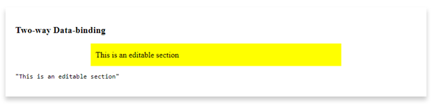
You can start typing in the yellow editable rectangle and you will see whatever you type underneath.

Let’s switch gears and add Storybook to the application.

Add Storybook packages

We need to add Storybook for Angular to your application. The Storybook website offers a detailed installation guide on Storybook for Angular. Once installed, apply the following changes, so that Storybook runs correctly with your Angular 7 application.

Open the src/app/tsconfig.app.json file and make sure the exclude property has the following values:

"exclude": [
  "test.ts",
  "**/*.spec.ts",
  "stories"
 ]

Open the .storybook/tsconfig.json file and paste the following:

{
 "extends": "../src/tsconfig.app.json",
 "compilerOptions": {
    "types": [
    "node"
  ]
 },
 "exclude": [
    "../src/test.ts",
    "../src/**/*.spec.ts",
    "../projects/**/*.spec.ts"
 ],
 "include": [
    "../src/**/*",
    "../projects/**/*"
 ]
}

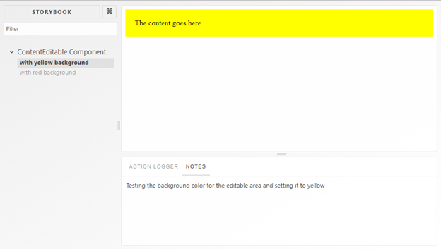
Create and run a few Storybook stories

Add the following Storybook stories into the file located at src/app/stories/index.stories.ts:

storiesOf('ContentEditable Component', module)
 .add(
   'with yellow background',
   withNotes('Testing the background color for the editable area and setting it to yellow')(() => ({
     component: ContentEditableComponent,
     props: {
       styles: { 'background-color': 'yellow', 'padding': '20px' },
       ngModel: 'The content goes here',
       ngModelChange: action('ngModelChange')
     }
   }))
 )
 .add(
   'with red background',
   withNotes('Testing the background color for the editable area by setting it to red')(() => ({
     component: ContentEditableComponent,
     props: {
       styles: { 'background-color': 'red', 'color': '#fff', 'padding': '20px' },
       ngModel: 'The content goes here',
       ngModelChange: action('ngModelChange')
     }
   }))
 );

The first story renders the ContentEditable component with a yellow background. While the second renders the component with a red background.

Run the Storybook tool to view and test your stories by issuing the following CLI command:

npm run storybook

You should be able to see something similar to this:

ContentEditableComponent under Storybook IDE

Now that we are sure the Storybook stories are up and running, let’s set up Applitools to use these stories and run our visual automated tests.

Add and run Applitools Storybook SDK for Angular

To add Applitools Storybook SDK for Angular to this application issue the following CLI command:

npm install @applitools/eyes.storybook --save-dev

Make sure to grab an Applitool API Key and store it on your machine. For a complete tutorial on how to install and run Applitools Storybook SDK for Angular, you may check this link: Storybook Angular Tutorial.

To run the Storybook stories and send the snapshots to the Applitools Server, issue the following command:

npx [eyes-storybook](https://github.com/applitools/eyes.storybook)

The command simply opens the Storybook stories, runs them one by one, and then sends all the DOM snapshots to the Applitools Server. Let’s have a look at the test results inside Applitools Test Manager.

Review test results on Applitools Test Manager

We can see the results of the tests we just ran from the Applitools Test Manager. To access the Applitools Test Manager, navigate to https://www.applitools.com. Sign in to get onto the Dashboard. For a detailed look at the Applitools Test Manager, you can check my article on Applitools — The automated visual regression testing framework

The results for running the Storybook tests show the following:

Applitools Test Manager Results

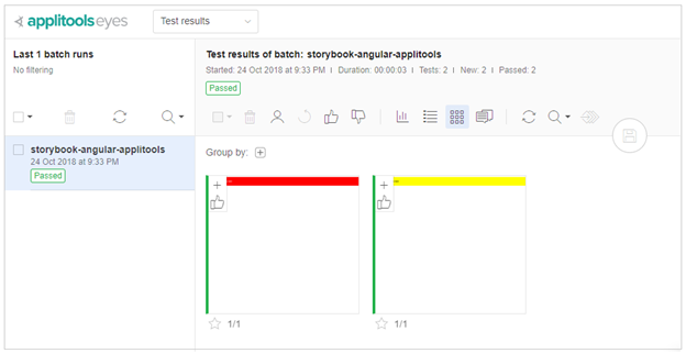
The test manager lists the test runs or batches (as referred to by Applitools) on the left- hand side. Clicking on any of the batches displays all of the snapshots for all of the Storybook stories in your application.

Click on the first snapshot (the red color) to expand and review it in detail:

Inspecting results with Test Manager

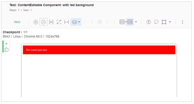
A rich toolbox is available to zoom in/out on the snapshot and compare this snapshot to any previously taken, known as the baseline. In this case, since this is the first time we are running the stories, there won’t be any baseline set. Therefore, Applitools Test Manager sets these snapshots as a baseline for upcoming regression test cycles.

Next, we’re going to simulate what happens when we have a visual regression in one of our components. To do this most easily, we’ll change one of our Storybook stories to render our component in a way that will be different from the baseline images we took earlier. Then, when we re-run the visual testing, we should see a discrepancy appear that we’ll have to resolve.

To do this, let’s assume that the story named in the red background above, has the ngModel value changed and now reads as follows:

.add(
  'with red background',
  withNotes('Testing the background color for the editable area by setting it to red')(() => ({
    component: ContentEditableComponent,
    props: {
      styles: { 'background-color': 'red', 'color': '#fff', 'padding': '20px' },
      ngModel: 'The red content goes here',
      ngModelChange: action('ngModelChange')
    }
  }))
 )

Now run this command:

npx eyes-storybook

The command gives you a detailed test result every time you run it. Check the following results:

Using @applitools/eyes.storybook version 2.1.9.

√ Storybook was started
√ Reading stories
√ Done 2 stories out of 2

[EYES: TEST RESULTS]:

ContentEditable Component: with yellow background [1024x768] — Passed

ContentEditable Component: with red background [1024x768] — Failed 1 of 1

A total of 1 difference was found.

See details at [https://eyes.applitools.com/app/test-results/00000251861893628194?accountId=D9XKRBVuYUmBxXpWWWsB3g~~](https://eyes.applitools.com/app/test-results/00000251861893628194?accountId=D9XKRBVuYUmBxXpWWWsB3g~~)

Total time: 36 seconds

Running the second story fails, as expected because we changed the content that was initially displayed inside the ContentEditable component. The test result output provides you with a link to check the discrepancies online. Click on the link to open the issues directly in the Applitools Test Manager:

Showing differences on the Test Manager

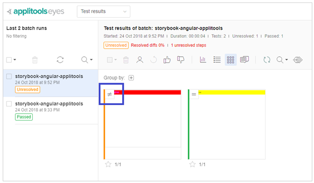
A new batch is displayed on the left-hand side with a status of Unresolved. The Unresolved status indicates that the Applitools Test Manager discovered a discrepancy between the two test runs. This will require your input in order to resolve the discrepancy. Either approve the difference, and create a new baseline, or reject it to keep the original baseline.

Notice the blue square above indicating the Not Equal sign. This means the second snapshot test run has some differences to the first test run snapshot (the baseline). Clicking on the first snapshot reveals the differences between both snapshots. The current one and the baseline. The differences in content are highlighted in blue. You can also compare the new snapshot with the baseline by selecting both:

Compare two snapshots side by side

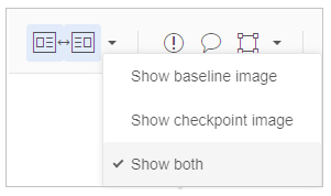
This should display both side by side and all differences are highlighted for you. You may spend more time at the Applitools Test Manager to explore all the rich features provided for you to do a thorough analysis on running the story tests.

Conclusion

This article touched the surface on how you can mix together Storybook and Angular together in one application. By means of Applitools Storybook SDK for Angular, you can provide automated visual UI testing by running the Storybook stories and generate snapshots that are then sent to the Applitools AI Server to compare and analyze and prepare the test results for you.

You can grab the code for this article by cloning the repository on GitHub.

This Dot Labs is a development consultancy that is trusted by top industry companies, including Stripe, Xero, Wikimedia, Docusign, and Twilio. This Dot takes a hands-on approach by providing tailored development strategies to help you approach your most pressing challenges with clarity and confidence. Whether it's bridging the gap between business and technology or modernizing legacy systems, you’ll find a breadth of experience and knowledge you need. Check out how This Dot Labs can empower your tech journey.

You might also like

A Guide to (Typed) Reactive Forms in Angular - Part III (Creating Custom Form Controls) cover image

A Guide to (Typed) Reactive Forms in Angular - Part III (Creating Custom Form Controls)

So far in the series, we have learned the basics of Angular Reactive forms and created some neat logic to construct and display dynamic forms. But our work is still not done yet. Whether we just want to make our controls look good and enhance them with some markup, or whether we need a more complex control than a simple textarea, input or checkbox, we'll either need to use a component library such as Angular Material Components or get familiar with the ControlValueAccessor` interface. Angular Material, by the way, uses ControlValueAccessor` in its components and I recommend looking into the source code if you want to learn some advanced use cases (I have borrowed a lot of their ideas in the past). In this post, however, we will build a basic custom control from scratch. A common requirement for a component that cannot be satisfied by using standard HTML markup I came across in many projects is having a searchable combobox**. So let's build one. We will start by creating a new Angular component and we can do that with a handy ng cli command: ` ng generate component form-fields/combobox ` Then we'll implement displaying data passed in the form of our FormField` class we have defined earlier in a list and allowing for filtering and selecting the options: `TypeScript // combobox.component.ts import { Component, ElementRef, Input, ViewChild } from '@angular/core'; import { FormField } from '../../forms.model'; @Component({ selector: 'app-combobox', templateUrl: './combobox.component.html', styleUrls: ['./combobox.component.scss'], }) export class ComboboxComponent { private filteredOptions?: (string | number)[]; // a simple way to generate a "unique" id for each component // in production, you should rather use a library like uuid public id = String(Date.now() + Math.random()); @ViewChild('input') public input?: ElementRef; public selectedOption = ''; public listboxOpen = false; @Input() public formFieldConfig!: FormField; public get options(): (string | number)[] { return this.filteredOptions || this.formFieldConfig.options || []; } public get label(): string { return this.formFieldConfig.label; } public toggleListbox(): void { this.listboxOpen = !this.listboxOpen; if (this.listboxOpen) { this.input?.nativeElement.focus(); } } public closeListbox(event: FocusEvent): void { // timeout is needed to prevent the list box from closing when clicking on an option setTimeout(() => { this.listboxOpen = false; }, 150); } public filterOptions(filter: string): void { this.filteredOptions = this.formFieldConfig.options?.filter((option) => { return option.toString().toLowerCase().includes(filter.toLowerCase()); }); } public selectOption(option: string | number): void { this.selectedOption = option.toString(); this.listboxOpen = false; } } ` `HTML {{ label }} &#9660; {{ option }} ` > Note: For the sake of brevity, we will not be implementing keyboard navigation and aria labels. I strongly suggest referring to W3C WAI patterns to get guidelines on the markup and behavior of an accessible combo box. While our component now looks and behaves like a combo box, it's not a form control yet and is not connected with the Angular forms API. That's where the aforementioned ControlValueAccessor` comes into play along with the `NG_VALUE_ACCESSOR` provider. Let's import them first, update the `@Component` decorator to provide the value accessor, and declare that our component is going to implement the interface: `TypeScript import { ControlValueAccessor, NGVALUE_ACCESSOR } from '@angular/forms'; @Component({ selector: 'app-combobox', templateUrl: './combobox.component.html', styleUrls: ['./combobox.component.scss'], providers: [ { // provide the value accessor provide: NGVALUE_ACCESSOR, // for our combobox component useExisting: ComboboxComponent, // and we don't want to override previously provided value accessors // we want to provide an additional one under the same "NGVALUE_ACCESSOR" token instead multi: true, }, ], }) export class ComboboxComponent implements ControlValueAccessor { ` Now, the component should complain about a few missing methods that we need to satisfy the ControlValueAccessor` interface: - A writeValue` method that is called whenever the form control value is updated from the forms API (e.g. with `patchValue()`). - A registerOnChange` method, which registers a callback function for when the value is changed from the UI. - A registerOnTouched` method that registers a callback function that marks the control when it's been interacted with by the user (typically called in a `blur` handler). - An optional setDisabledState` method that is called when we change the form control `disabled` state- Our (pretty standard) implementation will look like the following: `TypeScript private onChanged!: Function; private onTouched!: Function; public disabled = false; // This will write the value to the view if the form control is updated from outside. public writeValue(value: any) { this.value = value; } // Register a callback function that is called when the control's value changes in the UI. public registerOnChange(onChanged: Function) { this.onChanged = onChanged; } // Register a callback function that is called by the forms API on initialization to update the form model on blur. public registerOnTouched(onTouched: Function) { this.onTouched = onTouched; } public setDisabledState(isDisabled: boolean): void { this.disabled = isDisabled; } public setDisabledState(isDisabled: boolean): void { this.disabled = isDisabled; } ` We don't have to update the template a lot, but we can add [disabled]="disabled"` attribute on our button and input to disable the interactive UI elements if the provided form control was disabled. The rest of the work can be done in the component's TypeScript code. We'll call `this.onTouched()` in our `closeListbox` method, and create a `value` setter that updates our internal value and also notifies the model about the value change: `TypeScript public set value(val: string | number) { this.selectedOption = val.toString(); this.onChanged && this.onChanged(this.selectedOption); this.onTouched && this.onTouched(); } ` You can check out the full implementation on StackBlitz. Conclusion In this series, we've explored the powerful features of Angular reactive forms, including creating and managing dynamic typed forms. We also demonstrated how to use the ControlValueAccessor interface to create custom form controls, such as a searchable combo box. This knowledge will enable you to design complex and dynamic forms in your Angular applications. While the examples provided here are basic, they serve as a solid foundation for building more advanced form controls and implementing validation, accessibility, and other features that are essential for a seamless user experience. By mastering Angular reactive forms and custom form controls, you'll be able to create versatile and maintainable forms in your web applications. If you want to further explore the topic and prefer a form of a video, you can check out an episode of JavaScript Marathon by my amazing colleague Chris. Happy coding!...

A Guide to (Typed) Reactive Forms in Angular - Part I (The Basics) cover image

A Guide to (Typed) Reactive Forms in Angular - Part I (The Basics)

When building a simple form with Angular, such as a login form, you might choose a template-driven approach, which is defined through directives in the template and requires minimal boilerplate. A barebone login form using a template-driven approach could look like the following: `HTML E-mail Password Login! ` `TypeScript // login.component.ts import { Component } from '@angular/core'; @Component({ selector: 'app-login', templateUrl: './login.component.html' }) export class LoginComponent implements OnInit { public credentials = { email: '', password: '' }; constructor(public myAuthenticationService: MyAuthenticationService) { } } ` However, when working on a user input-heavy application requiring complex validation, dynamic fields, or a variety of different forms, the template-driven approach may prove insufficient. This is where reactive forms** come into play. Reactive forms employ a reactive approach, in which the form is defined using a set of form controls and form groups. Form data and validation logic are managed in the component class, which updates the view as the user interacts with the form fields. This approach requires more boilerplate but offers greater explicitness and flexibility. In this three-part blog series, we will dive into the reactive forms data structures, learn how to build dynamic super forms, and how to create custom form controls. In this first post, we will familiarize ourselves with the three data structures from the @angular/forms` module: FormControl The FormControl` class in Angular represents a single form control element, such as an input, select, or textarea. It is used to track the value, validation status, and user interactions of a single form control. To create an instance of a form control, the `FormControl` class has a constructor that takes an optional initial value, which sets the starting value of the form control. Additionally, the class has various methods and properties that allow you to interact with and control the form control, such as setting its value, disabling it, or subscribing to value changes. As of Angular version 14, the FormControl` class has been updated to include support for **typed reactive forms** - a feature the Angular community has been wanting for a while. This means that it is now a generic class that allows you to specify the type of value that the form control will work with using the type parameter ``. By default, `TValue` is set to any, so if you don't specify a type, the form control will function as an untyped control. If you have ever updated your Angular project with ng cli` to version 14 or above, you could have also seen an `UntypedFormControl` class. The reason for having a `UntypedFormControl` class is to support incremental migration to typed forms. It also allows you to enable types for your form controls after automatic migration. Here is an example of how you may initialize a FormControl` in your component. `TypeScript import { FormControl } from '@angular/forms'; const nameControl = new FormControl("John Doe"); ` Our form control, in this case, will work with string` values and have a default value of "John Doe". If you want to see the full implementation of the FormControl` class, you can check out the Angular docs! FormGroup A FormGroup` is a class used to group several `FormControl` instances together. It allows you to create complex forms by organizing multiple form controls into a single object. The `FormGroup` class also provides a way to track the overall validation status of the group of form controls, as well as the value of the group as a whole. A FormGroup` instance can be created by passing in a collection of `FormControl` instances as the group's controls. The group's controls can be accessed by their names, just like the controls in the group. As an example, we can rewrite the login form presented earlier to use reactive forms and group our two form controls together in a FormGroup` instance: `TypeScript // login.component.ts import { FormControl, FormGroup, Validators } from '@angular/forms'; @Component({ selector: 'app-login', templateUrl: './login.component.html' }) export class LoginComponent implements OnInit { public form = new FormGroup({ email: new FormControl('', [Validators.required, Validators.email]), password: new FormControl('', [Validators.required]), }); constructor(public myAuthenticationService: MyAuthenticationService) { } public login() { // if you hover over "email" and "password" in your IDE, you should see their type is inferred console.log({ email: this.form.value.email, password: this.form.value.password }); this.myAuthenticationService.login(this.form.value); } } ` `HTML E-mail Password Login! ` Notice we have to specify a formGroup` and a `formControlName` to map the markup to our reactive form. You could also use a `formControl` directive instead of `formControlName`, and provide the `FormControl` instance directly. FormArray As the name suggests, similar to FormGroup`, a `FormArray` is a class used to group form controls, but is used to group them in a collection rather than a group. In most cases, you will default to using a FormGroup` but a `FormArray` may come in handy when you find yourself in a highly dynamic situation where you don't know the number of form controls and their names up front. One use case where it makes sense to resort to using FormArray` is when you allow users to add to a list and define some values inside of that list. Let's take a TODO app as an example: `TypeScript import { Component } from '@angular/core'; import { FormArray, FormControl, FormGroup } from '@angular/forms'; @Component({ selector: 'app-todo-list', template: Add TODO , }) export class TodoListComponent { public todos = new FormArray>([]); public todoForm = new FormGroup({ todos: this.todos, }); addTodo() { this.todoForm.controls['todos'].push(new FormControl('')); } } ` In both of the examples provided, we instantiate FormGroup directly. However, some developers prefer to pre-declare the form group and assign it within the ngOnInit method. This is usually done as follows: `TypeScript // login.component.ts import { FormControl, FormGroup, Validators } from '@angular/forms'; @Component({ selector: 'app-login', templateUrl: './login.component.html' }) export class LoginComponent implements OnInit { // predeclare the form group public form: FormGroup; constructor(public myAuthenticationService: MyAuthenticationService) { } ngOnInit() { // assign in ngOnInit this.form = new FormGroup({ email: new FormControl('', [Validators.required, Validators.email]), password: new FormControl('', [Validators.required]), }); } public login() { // no type inference :( console.log(this.form.value.email); } } ` If you try the above example in your IDE, you'll notice that the type of this.form.value` is no longer inferred, and you won't get autocompletion for methods such as `patchValue`. This is because the FormGroup type defaults to `FormGroup`. To get the right types, you can either assign the form group directly or explicitly declare the generics like so: `TypeScript public form: FormGroup, password: FormControl, }>; ` However, explicitly typing all your forms like this can be inconvenient and I would advise you to avoid pre-declaring your FormGroups` if you can help it. In the next blog post, we will learn a way to construct dynamic super forms with minimal boilerplate....

Take your App to the Next Level with Vue 3 cover image

Take your App to the Next Level with Vue 3

Vue 3 has now officially launched and you are probably wondering how you are going to start migrating your existing Vue 2 apps to Vue 3. I will be honest with you: a framework migration is always the most tedious and painstaking task you will ever encounter. The good news is that migrating from Vue 2 to Vue 3 is not that difficult and complicated. As you may know, Vue 3 source code has been written from scratch. However, the maintainers of the framework made sure not to change the API too much. In other words, we will benefit from all the goodies Vue 3 brings, with minimal change. How awesome is that?! Vue 3 Official Migration Guide The Vue documentation website has been refreshed to reflect the latest changes. The Vue community has maintained the best documentation to help us learn and use Vue. The Vue documentation dedicates a section on Vue 3 Migration making mention of the new features, the breaking changes for Vue 2 apps, the supporting libraries like Vue CLI, Vuex, Vue Router and others. The website explicitly states that the team is still working on a dedicated migration guide from Vue 2 to Vue 3. Meanwhile, until an official migration guide is released, let’s get a little insight on what could possibly be involved if you were to tackle this for yourself. What to consider before upgrading to Vue 3? As Vue 3 is still new, there will be some things to keep in mind. There are thousands of applications and third-party libraries created for Vue 2 and even Vue 1.5. It’s going to be a lengthy and time consuming effort to migrate all those libraries to support Vue 3. Before you attempt any migration process, make sure all the libraries you use are supported by Vue 3. For instance, Vuetify isn't. You can read more about this here. In addition, if you use any of the third-party libraries, they need to be checked or you might find they have upgraded already. Moreover, the Vue 3 reactivity system has been rewritten to utilize the new language features in ES2015. Vue 3 uses proxies for its reactivity system instead of the `Object.defineProperty()` function. JavaScript proxies are supported by most modern browsers. Unfortunately, Proxies cannot be polyfilled for older browsers; therefore, Vue 3 offers two implementations of it’s reactivity system. One implementation will use proxies for the most recent and modern browsers. The other one will fall back to the Vue 2 way of implementing reactivity to support the older browsers. Step by Step Migration - Demo In this section, we'll go through migrating the This Dot - Vue Meetup website. The existing website is built with Vue 2. It’s essential to follow the steps below as is. Of course, depending on the features you’ve used, you will adjust this workflow to fit your needs and migrate more features in your apps. Let's start! Step 1: Create a new Git branch It’s important to start off with a brand new branch to play around with the migration. This way your main branches, like master or dev, will remain intact without disrupting any live code. Let’s assume we are branching from the master` branch. Run the following command to create a new branch: `bash git checkout master && git pull git checkout -b upgrade-to-vue3 ` Step 2: Install the latest Vue CLI version Currently, as of the time of writing this article, the latest version of the Vue CLI is 4.5.6. To install the latest version, run the following command: `bash npm install -g @vue/cli ` Verify the installation by running the following command and making sure it reads as @vue/cli 4.5.6`: `bash vue --version ` Upgrading the Vue CLI not only helps in upgrading the existing application, but it also gives you the chance to scaffold a new Vue 3 app in the future. Step 3: Upgrade the Vue libraries The next step is to upgrade the Vue NPM packages and all other packages used inside the package.json` file. To start with, open the package.json` file and make sure to amend the Vue libraries with the following versions: `javascript "vue": "^3.0.0", "vue-router": "^4.0.0-beta.11" "vuex": "^v4.0.0-beta.4" ` Now, let’s upgrade the rest of the libraries using the Vue CLI. Run the following command to start upgrading the libraries: `bash vue upgrade ` The command goes through all the libraries you are using inside the package.json` file and tries to upgrade them to the latest compatible version. For example, when I run this command, the Vue CLI detects the Vue libraries that need to be upgraded and prompts for confirmation: Type Y` to continue with the upgrade. In summary, the upgrade reported the following packages changes, additions, and removal. While the CLI is upgrading the @vue/cli-plugin-eslint` it will also upgrade the current ESLint version installed on your computer. The latest Vue CLI supports ESLint v6. Once again, the Vue CLI prompts for confirmation before upgrading ESLint. Type Y` to continue with the upgrade. `bash added 131 packages from 157 contributors, removed 34 packages, updated 90 packages, moved 3 packages and audited 1908 packages in 19.798s ` The numbers will definitely be different for you and depending on the app. It’s now time to run the app and make sure you don’t have missing libraries or other problems. In my case, I ran the app and got a few ESLint issues. Luckily, the Vue CLI comes packaged with a command to auto fix ESLint issues. In this case, you run the npm run lint` and the Vue CLI handles the rest for you! Step 4: Add the @vue/compiler-sfc NPM package The @vue/compiler-sfc package contains lower level utilities that you can use if you are writing a plugin / transform for a bundler or module system that compiles Vue single file components into JavaScript. It is used in the vue-loader. This is an essential component if you are using Single File Components which is the case in most of the Vue apps. Let’s install this package by running the following command: `bash npm i @vue/compiler-sfc ` Let’s move on and start upgrading the source code to use the latest APIs offered by Vue 3. Step 5: Upgrade the `main.js` file Vue 3 changes the way an application is created by introducing the createApp()` function. Back in Vue 2 and earlier versions, we used to create a global Vue instance. This approach had several disadvantages. The main one had third-party libraries to making changes to our Vue single App instance. By introducing createApp(), you can instantiate multiple Vue apps side by side. It creates a context or boundary for your app instance where you do all the registration as you will see shortly. Typically, a Vue app is started inside the main.js` file. Let’s visit this file and make the necessary changes to upgrade to Vue 3. `javascript import Vue from "vue"; import App from "./App.vue"; import GlobalVarMixin from "./mixins/global-variables-mixin"; import router from "./router"; import VueAnalytics from "vue-analytics"; //layouts import Default from "./1.layouts/l-default.vue"; import Form from "./1.layouts/l-form.vue"; import Content from "./1.layouts/l-content.vue"; Vue.component("l-default", Default); Vue.component("l-form", Form); Vue.component("l-content", Content); Vue.mixin(GlobalVarMixin); if (process.env.VUEAPP_GOOGLE_ANALYTICS_ID) { Vue.use(VueAnalytics, { id: process.env.VUEAPP_GOOGLE_ANALYTICS_ID, router }); } else { console.log("Google Analytics not loaded"); } Vue.config.productionTip = false; new Vue({ router, render: h => h(App) }).$mount("#app"); ` This is a slimmed down version of the original main.js` file in the app. Let’s dissect the file one line at a time and upgrade accordingly. `javascript import Vue from "vue"; ` Replace the line above with: `javascript import { createApp } from "vue"; ` Let’s replace the code that’s creating the app using the Vue 3 createApp() function. `javascript new Vue({ router, render: h => h(App) }).$mount("#app"); ` Replace with: `javascript const app = createApp(App); ` The app` variable now holds a new Vue app instance for us. The `router` instance will be registered separately. Let’s update the Vue component registration. `javascript Vue.component("l-default", Default); Vue.component("l-form", Form); Vue.component("l-content", Content); ` Replace with: `javascript app.component("l-default", Default); app.component("l-form", Form); app.component("l-content", Content); ` With Vue 3, you register components at the app instance level and not globally. Let’s update the Vue mixin registration. `javascript Vue.mixin(GlobalVarMixin); ` Replace with: `javascript app.mixin(GlobalVarMixin); ` Now register the router` on the app instance as follows: `javascript app.use(router); ` Now let’s register the vue-analytics plugin on the app instance. `javascript if (process.env.VUEAPP_GOOGLE_ANALYTICS_ID) { Vue.use(VueAnalytics, { id: process.env.VUEAPP_GOOGLE_ANALYTICS_ID, router }); } else { console.log("Google Analytics not loaded"); } ` Replace with: `javascript if (process.env.VUEAPP_GOOGLE_ANALYTICS_ID) { app.use(VueAnalytics, { id: process.env.VUEAPP_GOOGLE_ANALYTICS_ID, router }); } else { console.log("Google Analytics not loaded"); } ` The plugin is now installed on the app instance rather than the global Vue instance. This is also valid for any other plugin out there. Make sure to remove the line below as it’s not needed anymore in Vue 3 apps: `javascript Vue.config.productionTip = false; ` Finally, let’s mount the app instance by using the following: `javascript app.mount("#app"); ` The final version of the upgrade main.js` file looks like this: `javascript import { createApp } from "vue"; import App from "./App.vue"; import router from "./router"; import GlobalVarMixin from "./mixins/global-variables-mixin"; import VueAnalytics from "vue-analytics"; //layouts import Default from "./1.layouts/l-default.vue"; import Form from "./1.layouts/l-form.vue"; import Content from "./1.layouts/l-content.vue"; const app = createApp(App); app.component("l-default", Default); app.component("l-form", Form); app.component("l-content", Content); app.mixin(GlobalVarMixin); app.use(router); if (process.env.VUEAPP_GOOGLE_ANALYTICS_ID) { app.use(VueAnalytics, { id: process.env.VUEAPP_GOOGLE_ANALYTICS_ID, router }); } else { console.log("Google Analytics not loaded"); } app.mount("#app"); ` That’s it! Step 6: Upgrade the `router.js` file The Vue Router has undergone changes and it’s now under v4.0. Let’s review what the current router.js` file looks like: `javascript import Vue from "vue"; import Router from "vue-router"; Vue.use(Router); export default new Router({ routes: [ ... ], scrollBehavior(to, from, savedPosition) { if (to.hash) { return { selector: to.hash }; } else if (savedPosition) { return savedPosition; } else { return { x: 0, y: 0 }; } } }); ` Replace the import statements with the following line: `javascript import { createRouter, createWebHashHistory } from "vue-router"; ` Instead of creating a new instance of the Router` object, we will be using the new function provided by Vue Router which is `createRouter()`. `javascript export default createRouter({ history: createWebHashHistory(), routes: [...] }) ` The router.js` file now exports an instance of the `Router` object using the `createRoute()` function. This function expects an input parameter of type object. The `routes` and `history` properties are the minimum accepted to pass into this object. The routes` array is still the same as in Vue 2. It’s an array of routes, nothing has changed here. The createWebHashHistory()` function is now used to specify a Hash History mode in the Vue Router. As a side note, depending on what you are using in your app, there is also the `createWebHistory()` function that sets the mode to HTML 5. You can read more about History Modes. Next, we will update the scrollBehavior()` function as it has undergone some major changes. Replace the existing function with the following: `javascript scrollBehavior(to, from, savedPosition) { if (to.hash) { return { el: to.hash, behavior: "smooth" }; } else if (savedPosition) { return savedPosition; } else { return { top: 0 }; } } ` You can read more about Scroll Behavior in the Vue Router 4.0. Now, let’s run the app and see if everything works as expected. When I run the app, I get the following warning in the Dev Tools: `bash can no longer be used directly inside or . Use slot props instead: ` This warning has to do with Vue Router and the Transition component. You can read more about the Transitions in Vue Router. Let’s navigate to the App.vue` component and check what the current source code is: `html ` In Vue Router v4.0, you can no longer nest a ` component inside a `` component. The fix is simple and provided to you in the documentation. Replace the above with the following: `html ` These were all the steps needed to upgrade the Vue Meetup app. Others I’d like to draw your attention to a few more things when upgrading your apps to Vue 3. One of the components in the app had a single slot; that is, the default slot. The way it was used in the Vue 2 app was: `html ... … ... ` When I ran the app, the component was showing nothing, an empty screen! It seems Vue 2 was more tolerant by not forcing me to specify the name of the slot, even though this is the default slot. The quick fix in Vue 3 is as follows: `html ... ... ` Something else I didn’t mention is the Vuex v4.0. The same steps that we followed to upgrade the Vue Router can be followed here. The approach is similar. You can read more about the Vuex v4.0 Breaking Changes. Conclusion I am pretty sure we will all face more issues and encounter different hiccups while upgrading our apps. It will all depend on the features of your Vue 2. Remember, everything has a solution! While we wait for the Vue team to share an official migration guide, start trying to upgrade and see how you go. If you get stuck, feel free to drop me a message on twitter using my Twitter handle @bhaidar....

Being a CTO at Any Level: A Discussion with Kathy Keating, Co-Founder of CTO Levels cover image

Being a CTO at Any Level: A Discussion with Kathy Keating, Co-Founder of CTO Levels

In this episode of the engineering leadership series, Kathy Keating, co-founder of CTO Levels and CTO Advisor, shares her insights on the role of a CTO and the challenges they face. She begins by discussing her own journey as a technologist and her experience in technology leadership roles, including founding companies and having a recent exit. According to Kathy, the primary responsibility of a CTO is to deliver the technology that aligns with the company's business needs. However, she highlights a concerning statistic that 50% of CTOs have a tenure of less than two years, often due to a lack of understanding and mismatched expectations. She emphasizes the importance of building trust quickly in order to succeed in this role. One of the main challenges CTOs face is transitioning from being a technologist to a leader. Kathy stresses the significance of developing effective communication habits to bridge this gap. She suggests that CTOs create a playbook of best practices to enhance their communication skills and join communities of other CTOs to learn from their experiences. Matching the right CTO to the stage of a company is another crucial aspect discussed in the episode. Kathy explains that different stages of a company require different types of CTOs, and it is essential to find the right fit. To navigate these challenges, Kathy advises CTOs to build a support system of advisors and coaches who can provide guidance and help them overcome obstacles. Additionally, she encourages CTOs to be aware of their own preferences and strengths, as self-awareness can greatly contribute to their success. In conclusion, this podcast episode sheds light on the technical aspects of being a CTO and the challenges they face. Kathy Keating's insights provide valuable guidance for CTOs to build trust, develop effective communication habits, match their skills to the company's stage, and create a support system for their professional growth. By understanding these key technical aspects, CTOs can enhance their leadership skills and contribute to the success of their organizations....