Skip to content

Intro to Google DevTools: Elements Panel

Intro to Google DevTools: Elements Panel

This article was written over 18 months ago and may contain information that is out of date. Some content may be relevant but please refer to the relevant official documentation or available resources for the latest information.

Intro to Google DevTools: Elements Panel Today's article will give an overview of the Elements panel in Google DevTools. The Elements panel allows you to perform a number of cool things. It gives you access to things like a specific node and allows you to tweak and change that node. We’ll cover how to inspect a node, change a node, update and add styles to a node.

Inspecting a DOM node So we’re going to start by going to a site and right clicking and selecting the inspect option. This will bring up the Elements panel, and show us the DOM node for the object we’ve decided to inspect.

picture1

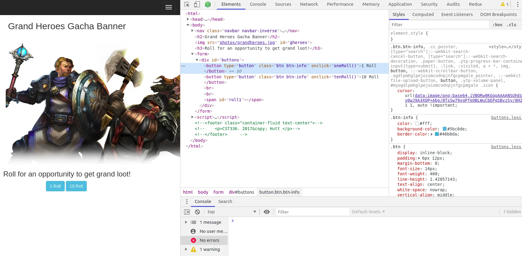
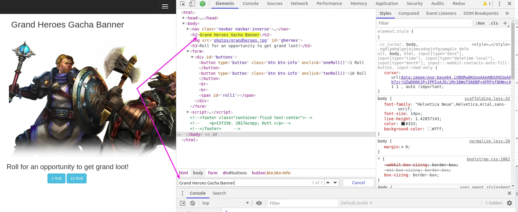
We can also search for a particular DOM node. After inspecting, I want to find the DOM node for the header “Grand Heroes Gacha Banner”. I’ll start by clicking CTRL+F, which will bring up a search bar on the Elements panel. I will then type in Grand Heroes Gacha Banner and this will give me the matches. These matches will then be highlighted in yellow.

picture2

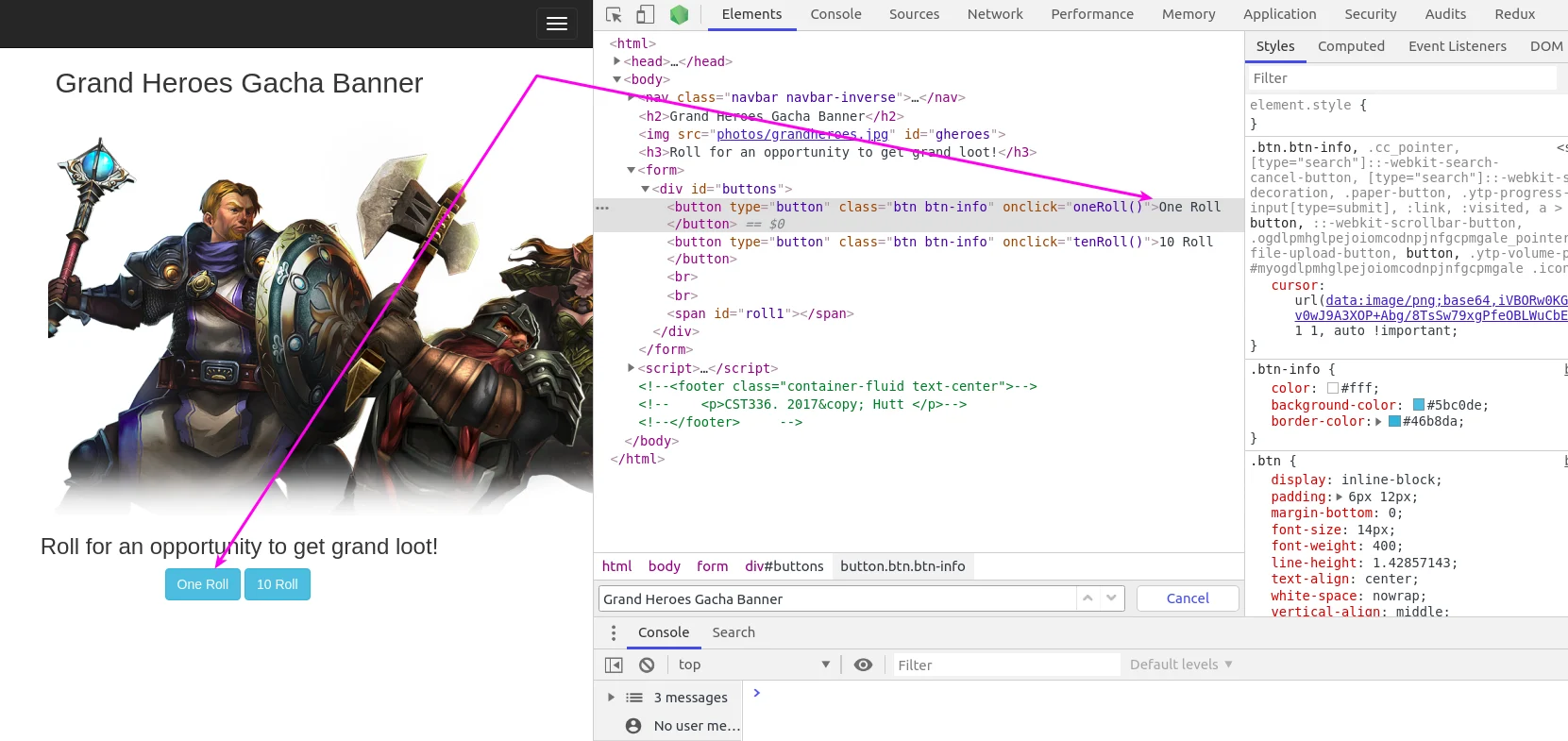
Changing a DOM node Now that we have the DOM node selected, we’re going to edit it and change some things. First we’re going to edit the text from 1 Roll to One Roll by double clicking on 1 Roll. As you can see below this will be updated immediately and we can see the change on the website.

picture3

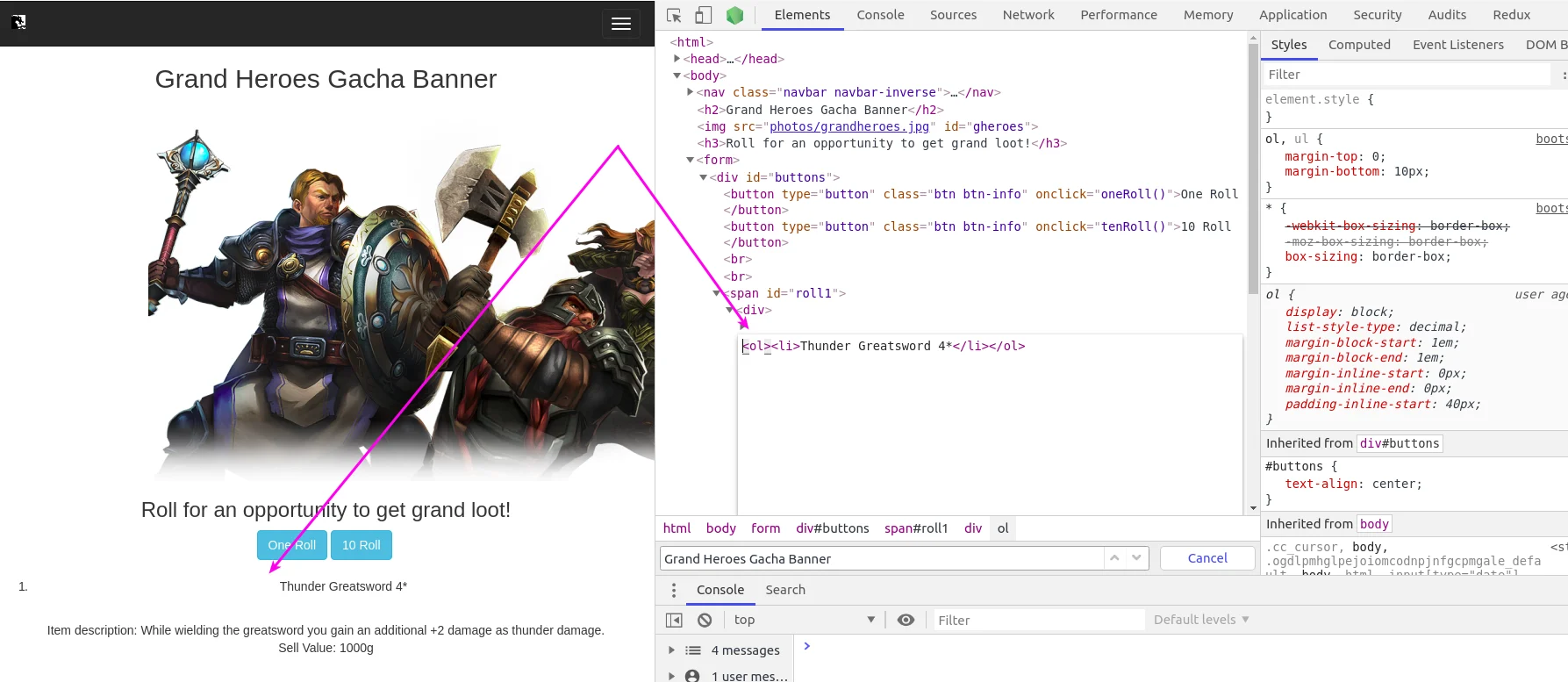
Then, we’re going to edit the node type. So first, I’m going to click on the newly changed One Roll. This triggers an event, and gives us some text. At this point, I’m going to inspect the item name. Now that we can see the DOM node in the Elements panel, I’ll right click it, and click edit as HTML. I’m going to change it to a list. Just like before, this will be updated immediately, and we can see the change on the website.

picture4

Updating DOM node styles This will be very similar to changing a DOM node. This time, we’ll be focusing on the css and style of the DOM we select. I’ll inspect the One Roll button again, but this time, look to the styles of the right side of the Elements panel.

picture5

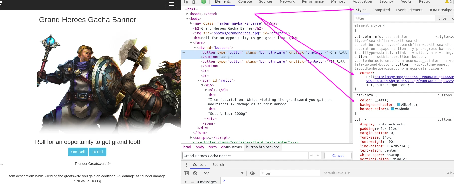
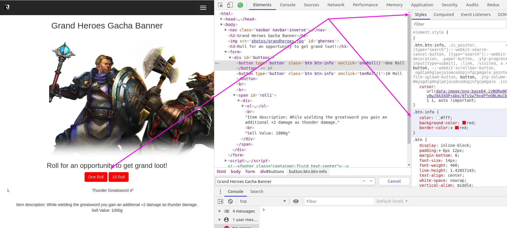
After doing this, you can see all of the style information for the One Roll button. We’re going to start by editing the background color of the button. I will start by left clicking the background-color, and changing it to red. I will also do the same for the border-color. You will see that the color updates immediately, and changes from the light blue to a red.

picture6

Now, for another example, I will also update the buttons style to make it larger. I will do this by changing the padding of the button which is 6 x 12, but first I want to check out the dimensions of the button. To do this, I will scroll to the bottom of the style tab until I see a dimension box.

picture7

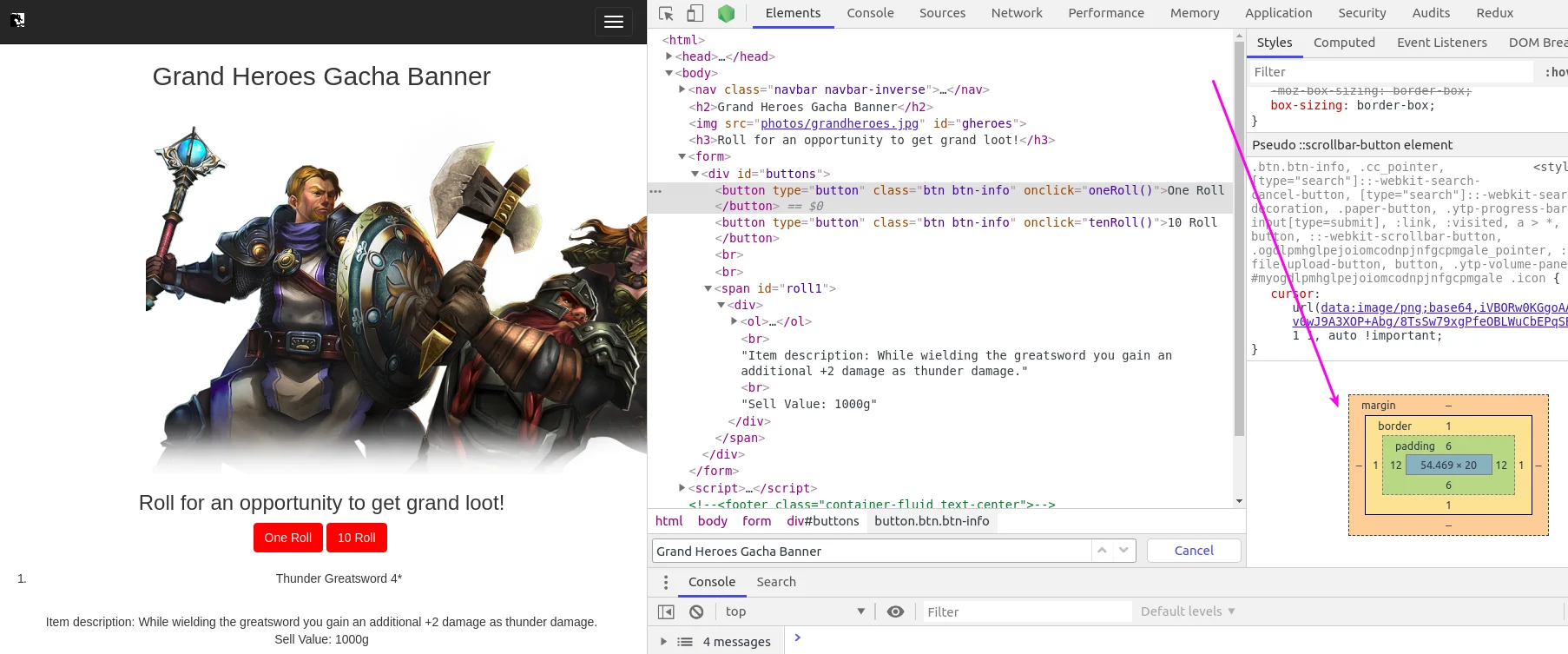
This box is very useful as it will give you the margin, border, padding, width, and height of the item selected. As you can see, the box is color coded, and when you hover over the different colors, it is reflected on the node you have selected.

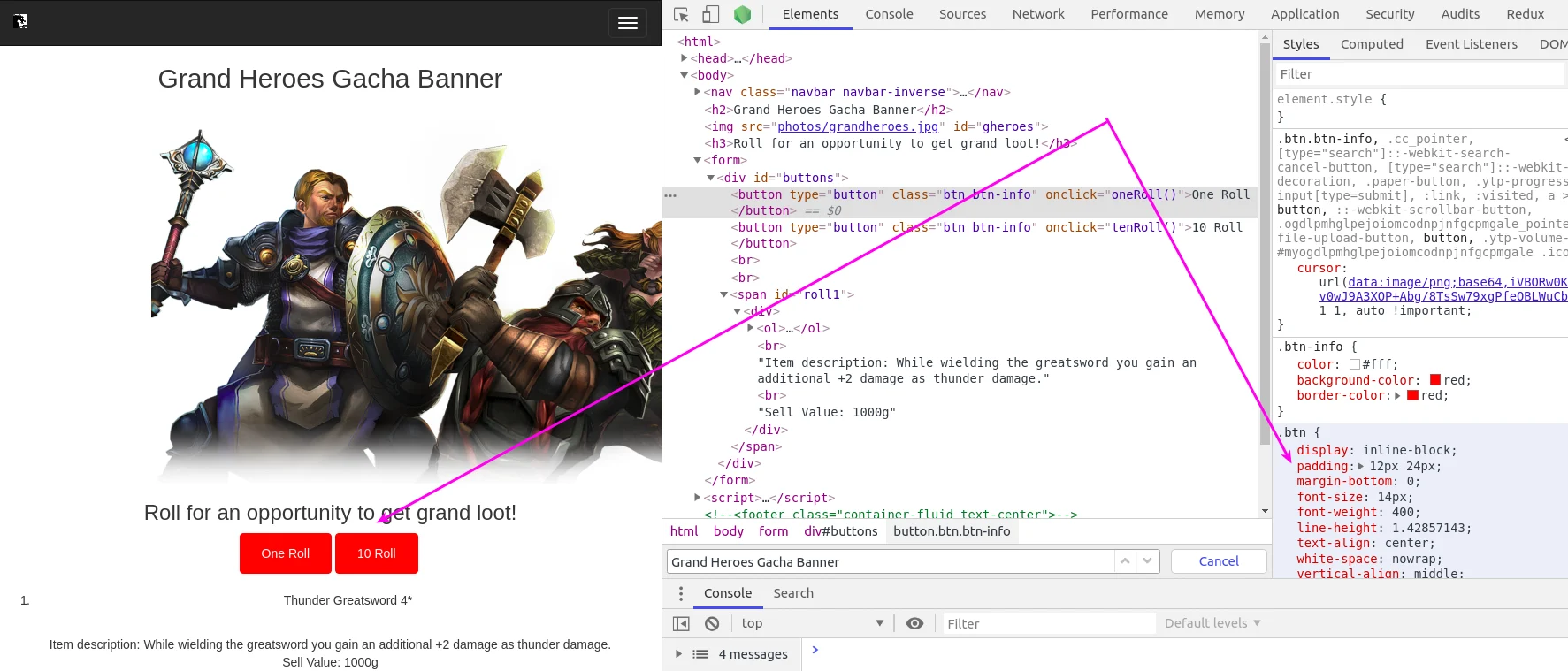
I’m going to double it from 6 x 12 to 12 x 24. As a result, the button will double in size and update to reflect this.

picture8

Adding DOM node styles This is going to be similar to updating the node style, but this time we’ll, be adding our changes to the element.style {} area. picture9

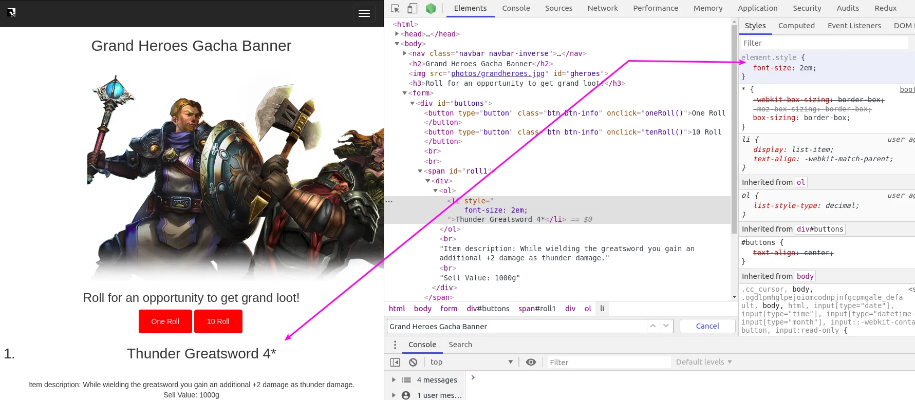
After clicking the One Roll button and getting more text down below, we’ll inspect the item name. Now, we’ll navigate over to the styles, and go into the element.style {} area mentioned above. In this area, I want to add font-size: 2em to increase the size of the item name.

picture10

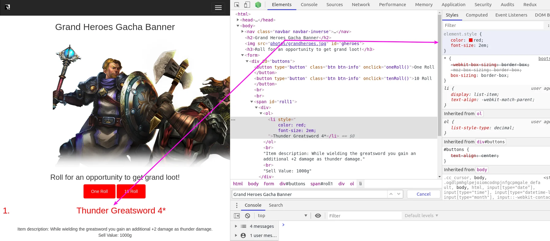
We can also change the color, so I’ll also add in color: red to update it from black to red.

picture11

Conclusion Today's article covered an overview of the Elements panel in Google DevTools. Hopefully, after reading this, you will have learned something new and useful. I personally find the Elements panel to be extremely helpful. I use it frequently when wanting to test out new ideas for layouts and styles before putting it into an IDE.

This Dot is a consultancy dedicated to guiding companies through their modernization and digital transformation journeys. Specializing in replatforming, modernizing, and launching new initiatives, we stand out by taking true ownership of your engineering projects.

We love helping teams with projects that have missed their deadlines or helping keep your strategic digital initiatives on course. Check out our case studies and our clients that trust us with their engineering.

You might also like

How to Truncate Strings Easily with CSS cover image

How to Truncate Strings Easily with CSS

You'll often need to truncate text when working with user interfaces, especially when displaying content within a limited space. CSS provides a straightforward way to handle this scenario, ensuring that long text strings are cut off gracefully without affecting the overall layout. CSS Truncation Techniques Single-Line Truncation If you want to truncate a single line of text, CSS provides a simple solution. The key properties to use here are overflow, white-space, and text-overflow. ` Explanation of properties: * white-space: nowrap: This ensures the text stays on a single line, preventing wrapping. * overflow: hidden: This hides any content that overflows the container. * text-overflow: ellipsis: This adds the ellipsis (…) at the end of the truncated text. Multi-Line Truncation While truncating a single line of text is common, sometimes you may want to display multiple lines but still cut off the text when it exceeds a certain number of lines. You can use a combination of CSS properties such as -webkit-line-clamp along with the display and overflow properties. ` Live example: Explanation of properties: * display: -webkit-box: This is a legacy flexbox-like display property that works with the -webkit-line-clamp property. * -webkit-line-clamp: Specifies the number of lines to show before truncating. * -webkit-box-orient: vertical: Ensures the box is laid out vertically for proper multi-line truncation. * overflow: hidden: Prevents content overflow. * text-overflow: ellipsis: Adds an ellipsis after the truncated content. Why Use CSS for Text Truncation Over JavaScript Techniques? While it’s possible to truncate text using JavaScript, CSS is often a better choice for this task for several reasons. Let's explore why CSS-based truncation techniques are generally preferred over JavaScript. Performance Efficiency CSS operates directly within the browser's layout engine, meaning it doesn’t require additional processing or event handling as JavaScript does. When using JavaScript to truncate text, the script needs to run on page load (or after DOM manipulation), and sometimes, it needs to listen for events such as window resizing to adjust truncation. This can introduce unnecessary overhead, especially in complex or resource-constrained environments like mobile devices. CSS, on the other hand, is declarative. Once applied, it allows the browser to handle text rendering without any further execution or processing. This leads to faster load times and a smoother user experience. Simplicity and Maintainability CSS solutions are much simpler to implement and maintain than their JavaScript counterparts. All it takes is a few lines of CSS to implement truncation. In contrast, a JavaScript solution would require you to write and maintain a function that manually trims strings, inserts ellipses, and re-adjusts the text whenever the window is resized. Here's the JavaScript Truncation Example to compare the complexity: JavaScript Truncation Example: ` At the example above, we truncated the text to 50 characters which may be 1 line on large screens and 6 lines on mobile and in that case we will need to add more code to truncate it responsively. As you can see, the CSS solution we used earlier is more concise and readable, whereas the JavaScript version is more verbose and requires managing the string length manually. Responsiveness Without Extra Code With CSS, truncation can adapt automatically to different screen sizes and layouts. You can use relative units (like percentages or vw/vh), media queries, or flexbox/grid properties to ensure the text truncates appropriately in various contexts. If you were using JavaScript, you’d need to write additional logic to detect changes in the viewport size and update the truncation manually. This would likely involve adding event listeners for window resize events, which can degrade performance and lead to more complex code. CSS Example for Responsive Truncation: ` To achieve this in JavaScript, you’d need to add more code to handle the width adjustments dynamically, making it more complex to maintain and troubleshoot. Separation of Concerns CSS handles the presentation layer of your website, while JavaScript should focus on dynamic functionality or data manipulation. By keeping truncation logic within your CSS, you're adhering to the principle of separation of concerns, where each layer of your web application has a clear, well-defined role. Using JavaScript for visual tasks like truncation mixes these concerns, making your codebase harder to maintain, debug, and scale. CSS is purpose-built for layout and visual control, and truncation is naturally a part of that domain. Browser Support and Cross-Browser Consistency Modern CSS properties like text-overflow and -webkit-line-clamp are widely supported across all major browsers. This means that CSS solutions for truncation are generally consistent and reliable. JavaScript solutions, on the other hand, may behave differently depending on the browser environment and require additional testing and handling for cross-browser compatibility. While older browsers may not support specific CSS truncation techniques (e.g., multi-line truncation), fallback options (like single-line truncation) can be easily managed through CSS alone. With JavaScript, more complex logic might be required to handle such situations. Reduced Risk of Layout Shifting JavaScript-based text truncation risks causing layout shifting, especially during initial page loads or window resizes. The browser may need to recalculate the layout multiple times, leading to content flashing or jumpy behavior as text truncation is applied. CSS-based truncation is applied as part of the browser’s natural rendering flow, eliminating this risk and ensuring a smoother experience for the user. Conclusion CSS is the optimal solution for truncating text in most cases due to its simplicity, efficiency, and responsiveness. It leverages the power of the browser’s rendering engine, avoids the overhead of JavaScript, and keeps your code clean and maintainable. While JavaScript truncation has its use cases, CSS should always be your go-to solution for truncating strings, especially in static or predictable layouts. If you like this post, check out the other CSS posts on our blog!...

:where functional pseudo-selectors :is valuable in CSS cover image

:where functional pseudo-selectors :is valuable in CSS

If you’ve written CSS before, you’ve used pseudo selectors. Typically, we’d use them to style :hover events or select every :nth-of-type() In recent years CSS has become a lot more powerful, and with that, we now have many more pseudo-selectors available to use. Let’s explore some functional pseudo-selectors together and see how to use them to enhance our front-end code. Functional pseudo-classes While there are a wide range of pseudo-classes, I want to focus on the _functional_ ones today. :is :is works very similar to a regular CSS class list at first glance ` One of its main benefits is that you can group CSS classes to form more readable and maintainable conditions. ` For deep nesting, this can make your CSS significantly easier to understand, simplifying editing at a later date. ` You may be thinking that CSS has another solution that improves readability in a similar way: nesting. That’s true, and in this context, you can use them interchangeably, though the syntax is still shorter. ` However deeper nesting using nested CSS can become complex quickly. Sometimes it makes sense to use :is to help avoid this complexity. ` :is also provides a specificity modifier you don’t get with nested css. If you write: ` Every selector within the:is would be treated as if it had the same specificity value as the ID. With :is, the highest value applies to all other values within the :is. This does not apply to nested CSS. :not It does exactly what you think it does. The :not selector grabs everything _except_ the classes you define: ` Like the other pseudo-classes, you can negate multiple classes if you choose: ` This can be powerful when combined with other pseudo-selectors: ` :where Using the :where pseudo-class is great for creating low-specificity CSS. If you create a library or plugin that’s going to be used by other people and you want them to style it themselves, but don’t want it to appear ugly when they first set it up, :where is the way to do that. For example, let’s style all our links with an underline using :where ` With this approach, we can override our link’s default styles without having to create difficult to maintain CSS: ` If we didn't use :where above, import order would matter if we wanted to override this. But because we planned ahead, we can just use a standard a tag. Without using :where we’re stuck with options that are much harder to work with: ` :where also has the same benefits of class grouping that :is does but without the specificity, so you can do something like this and then override it easily later. ` :has One of the most powerful pseudo selectors is :has, which gives you the option to style a tag or class based on other classes or tags associated with it. ` An incredible benefit :has brings is the ability to create parent selector functionality. This gives you a wide variety of options to style the parent based on the state of the children. ` You can also combine this with the :not selector to select elements that don’t have specific children. ` Benefits of Pseudo-Classes Readability One of the benefits of all of these pseudo-selectors is that they can act similarly to nested CSS. It’s possible to use these to make your code more readable. ` Using :is this way is effectively the same as using nested CSS, but if you need lower specificity you could use :where, or :not if you want to exclude (instead of include) some classes. Functionality :not and :has provide new options which weren’t possible before, allowing you to style more dynamically and provide better experiences while simplifying your code. Before these options were available, the only solution was to style the code using JavaScript. While this technically allows you to achieve your styling goals, it’s not ideal. Mixing CSS operations into JS files makes it much harder to maintain long-term because it adds a layer of abstraction to your solution, while the built-in CSS option is much simpler. While :is and :where don’t provide as much new functionality, they still allow you to write more understandable CSS with less ambiguity or workarounds, making maintenance significantly easier. Summing up Modern CSS allows us to be much more flexible with our styles, all while writing less code. Simplifying CSS and removing the need to compensate, either by writing extra CSS or styling through JS, means our CSS files are more explicit and easier to maintain in the long term. They may not be needed often, but they’re an incredibly important part of your front-end toolbelt. Have you found any interesting ways to use functional pseudo-classes? Send us a post on X or message us on LinkedIn and show me what cool things you’ve made....

How to Integrate Mailchimp Forms in a React Project cover image

How to Integrate Mailchimp Forms in a React Project

Intro Today we will cover how to set up an email signup form using React and Mailchimp. This blog will be using the starter.dev cra-rxjs-styled-components template to expedite the process. This article assumes you have a basic understanding of React, and have set up a Mailchimp account. Here is the code repo if you want to review it while reading, or just skip ahead. We will start with setting up our React project using Starter.dev for simplicity, and then finish it up by integrating the two for our signup form. To start, we will be using the command yarn create @this-dot/starter --kit cra-rxjs-styled-components, which can be found here. We’ll go ahead, and give the project a name. I will be calling mine react-mailchimp. Now we will navigate into the project and do a yarn install. Then we can run yarn run dev to get it up and running locally on localhost:3000. This should have us load up on the React App, RxJS, and styled-components Starter kit page. With that all set, we’ll also need to install jsonp by using yarn add jsonp. We’ll be using jsonp instead of fetch to avoid any CORS issues we may run into. This also makes for an easy and quick process by not relying on their API, which can’t be utilized by the client. Now that we have our project set up, we will go ahead and go and grab our form action URL from MailChimp. This can be found by going to your Audience > Signup Forms > Embedded Forms > Continue and then grabbing the form action URL found in the Embedded Form Code. We need to make a small change to the URL and swap /post? with /post-json?. We can now start setting up our form input, and our submit function. I will add a simple form input and follow it up, and a submit function. Inside the submit function, we will use our imported jsonp to invoke our action URL. ` We’ll also add a quick alert to let the user know that it was successful and that’s it! We’ve now successfully added the email to our MailChimp account. Conclusion Today, we covered how to integrate Mailchimp with a react app using the cra-rxjs-styled-components template from starter.dev. I highly recommend using starter.dev to get your project up and running quickly. Here is the code repo again for you to check out....

The simplicity of deploying an MCP server on Vercel cover image

The simplicity of deploying an MCP server on Vercel

The current Model Context Protocol (MCP) spec is shifting developers toward lightweight, stateless servers that serve as tool providers for LLM agents. These MCP servers communicate over HTTP, with OAuth handled clientside. Vercel’s infrastructure makes it easy to iterate quickly and ship agentic AI tools without overhead. Example of Lightweight MCP Server Design At This Dot Labs, we built an MCP server that leverages the DocuSign Navigator API. The tools, like `get_agreements`, make a request to the DocuSign API to fetch data and then respond in an LLM-friendly way. ` Before the MCP can request anything, it needs to guide the client on how to kick off OAuth. This involves providing some MCP spec metadata API endpoints that include necessary information about where to obtain authorization tokens and what resources it can access. By understanding these details, the client can seamlessly initiate the OAuth process, ensuring secure and efficient data access. The Oauth flow begins when the user's LLM client makes a request without a valid auth token. In this case they’ll get a 401 response from our server with a WWW-Authenticate header, and then the client will leverage the metadata we exposed to discover the authorization server. Next, the OAuth flow kicks off directly with Docusign as directed by the metadata. Once the client has the token, it passes it in the Authorization header for tool requests to the API. ` This minimal set of API routes enables me to fetch Docusign Navigator data using natural language in my agent chat interface. Deployment Options I deployed this MCP server two different ways: as a Fastify backend and then by Vercel functions. Seeing how simple my Fastify MCP server was, and not really having a plan for deployment yet, I was eager to rewrite it for Vercel. The case for Vercel: * My own familiarity with Next.js API deployment * Fit for architecture * The extremely simple deployment process * Deploy previews (the eternal Vercel customer conversion feature, IMO) Previews of unfamiliar territory Did you know that the MCP spec doesn’t “just work” for use as ChatGPT tooling? Neither did I, and I had to experiment to prove out requirements that I was unfamiliar with. Part of moving fast for me was just deploying Vercel previews right out of the CLI so I could test my API as a Connector in ChatGPT. This was a great workflow for me, and invaluable for the team in code review. Stuff I’m Not Worried About Vercel’s mcp-handler package made setup effortless by abstracting away some of the complexity of implementing the MCP server. It gives you a drop-in way to define tools, setup https-streaming, and handle Oauth. By building on Vercel’s ecosystem, I can focus entirely on shipping my product without worrying about deployment, scaling, or server management. Everything just works. ` A Brief Case for MCP on Next.js Building an API without Next.js on Vercel is straightforward. Though, I’d be happy deploying this as a Next.js app, with the frontend features serving as the documentation, or the tools being a part of your website's agentic capabilities. Overall, this lowers the barrier to building any MCP you want for yourself, and I think that’s cool. Conclusion I'll avoid quoting Vercel documentation in this post. AI tooling is a critical component of this natural language UI, and we just want to ship. I declare Vercel is excellent for stateless MCP servers served over http....

Let's innovate together!

We're ready to be your trusted technical partners in your digital innovation journey.

Whether it's modernization or custom software solutions, our team of experts can guide you through best practices and how to build scalable, performant software that lasts.

Prefer email? hi@thisdot.co