Skip to content

Enhancing Your Playwright Workflow: A Guide to the VSCode Extension

Enhancing Your Playwright Workflow: A Guide to the VSCode Extension

This article was written over 18 months ago and may contain information that is out of date. Some content may be relevant but please refer to the relevant official documentation or available resources for the latest information.

Introduction

In my last post, Quick Guide to Playwright Fixtures: Enhancing Your Tests, I delved into some of the enhancements we've been implementing in our end-to-end (E2E) tests using Playwright. As I refine our testing strategies, I've come across a tool that has quickly become an essential part of my workflow: the Playwright VSCode extension.

If you're like me and constantly looking for ways to streamline testing and debugging, you'll appreciate any tool that can make the process more efficient and enjoyable. That's where this extension comes in. It's not just about writing tests - it's about enhancing the entire development experience. In this post, I'll walk you through getting started with the Playwright VSCode extension, sharing some tips and tricks that have made a real difference in my day-to-day work.

Installing the Extension & Basic Setup

Before diving into the Playwright VSCode extension, it's essential to have Playwright installed on your machine. If you haven't done so already, you can quickly install it by running:

npx playwright install

This command will set up Playwright and ensure all necessary dependencies are installed.

Once Playwright is ready, the VSCode extension will be installed next. Open Visual Studio Code, navigate to the Extensions view by clicking on the Extensions icon in the Activity Bar on the side of the window, and search for “Playwright”. The official extension, ID: ms-playwright.playwright / named: “Playwright Test for VSCode” by Microsoft, should appear at the top of the list. Click "Install," and you're all set.

With the extension installed, you can start leveraging its powerful features to enhance your Playwright testing workflow within VSCode.

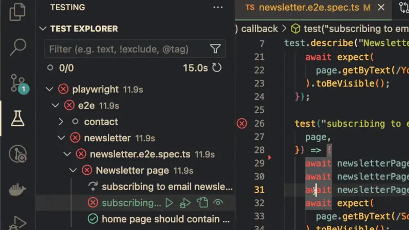
Running the Tests and Identifying Outputs

To run a test, simply open the test file in VSCode. The Playwright extension will automatically detect test files and display a "Run" icon next to each test and test suite. You can click on this icon to run individual tests or test suites.

Alternatively, you can run all the tests in your project using the Playwright Test Explorer, accessible from the sidebar.

Running test from explore

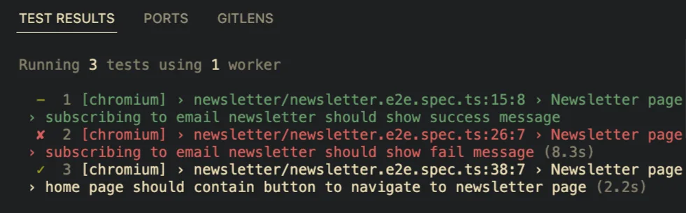
Once you start running your tests, the extension provides real-time feedback within the editor. You'll see the status of each test - whether it passes, fails, or is skipped - right next to the corresponding test in your code. This immediate feedback loop is incredibly helpful for catching issues as you write your tests.

Showing test issue on the code

The output of your tests will be displayed in the VSCode terminal. You'll see detailed information about each test run.

Test result on VSCode terminal

Debugging Step-by-Step

I find debugging particularly useful when a test fails unexpectedly or when I want to verify that certain actions are being performed as intended. Instead of guessing what might be wrong, I can see exactly what's going on in each test step, making debugging a much more straightforward and less frustrating process.

To start debugging, you can easily set a breakpoint in your test file by clicking on the left margin next to the line number where you'd like the execution to pause. Once your breakpoints are in place, you can initiate the debug process by selecting the "Debug" option next to the test you'd like to investigate.

Test debug on VSCode

Once the debugger is running, the extension allows you to step through your code, inspect variables, and evaluate expressions - all within VSCode. This real-time insight into your test execution is a game-changer, enabling you to pinpoint issues more effectively and confidently refine your tests.

Using the Pick Locator Tool

Another handy feature is the "Pick Locator" tool. If you've ever struggled with selecting the right element in your tests, this tool can be a time saver. It helps you generate reliable locators by letting you interact directly with the webpage elements you want to target.

To use the Pick Locator tool, click the "Pick Locator" button in the Playwright Test Explorer. This will open a new window where you can navigate to the site you're testing. As you hover over elements on the page, the tool will suggest locators, allowing you to select the most appropriate one for your test.

Pick locator tool on VSCode
Picking a heading element in the browser

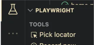
While the Pick Locator tool is handy, it’s important to ensure that the locators you generate are robust and maintainable. This is especially true when integrating them with the fixtures I discussed in my previous blog post. Combining the proper locators with well-designed fixtures can create more reliable and reusable test setups, ultimately making your E2E tests more efficient.

Conclusion

The Playwright VSCode extension has quickly become indispensable in my development workflow. It significantly enhanced my experience of writing and running Playwright tests.

Whether you’re just starting with Playwright or looking to optimize your existing tests, this extension offers a range of features that can save you time and effort. Combining these tools with thoughtful test design, such as leveraging fixtures, you can create a more efficient and effective testing process.

I hope this guide has given you a good overview of what the Playwright VSCode extension can do and how it can benefit your work. If you haven’t tried it yet, I highly recommend giving it a go. And as always, feel free to explore further and experiment with the features that best suit your needs.

This Dot is a consultancy dedicated to guiding companies through their modernization and digital transformation journeys. Specializing in replatforming, modernizing, and launching new initiatives, we stand out by taking true ownership of your engineering projects.

We love helping teams with projects that have missed their deadlines or helping keep your strategic digital initiatives on course. Check out our case studies and our clients that trust us with their engineering.

You might also like

Understanding the Difference Between `:focus` and `:focus-visible` in CSS cover image

Understanding the Difference Between `:focus` and `:focus-visible` in CSS

Understanding the Difference Between :focus and :focus-visible in CSS I have learned my fair share about the importance of keyboard accessibility, so I know that visual indication of the focused element is very important. But the well-known :focus pseudo-class is not always the best fit for this job. That's where :focus-visible comes in. Let's look at the differences between these two pseudo-classes and explore the best practices for using them effectively. What is the :focus Pseudo-Class? The :focus pseudo-class is a CSS selector that applies styles to any element that receives focus, regardless of how that focus was triggered. This includes focus events from keyboard navigation, mouse clicks, and touch interactions. Example Usage of :focus ` In this example, the button will display a blue outline whenever it is focused, whether the user clicks on it with a mouse, taps it on a touchscreen, or navigates to it using the keyboard. What is the :focus-visible Pseudo-Class? The :focus-visible pseudo-class is more specialized. It only applies styles to an element when the browser determines that the focus should be visible. This typically occurs when the user navigates via the keyboard or assistive technologies rather than through mouse or touch input. Example Usage of :focus-visible ` Here, the button will only show a blue outline when focused through keyboard navigation or another input method that usually requires visible focus indicators. Key Differences Between :focus and :focus-visible :focus - Behavior: Applies to any element that receives focus, regardless of the input method. - Use Cases: Ensures that all interactions with the element are visually indicated, whether by mouse, keyboard, or touch. :focus-visible - Behavior: Applies styles only when the focus should be visible, such as using a keyboard or assistive technology. - Use Cases: Ideal for scenarios where you want to provide focus indicators only to keyboard and assistive technology users while avoiding unnecessary outlines for mouse and touch users, typically required by design. Accessibility Implications :focus - Pros: - Guarantees that all users can see when an element is focused, which is critical for accessibility. - Cons: - Can lead to a suboptimal experience for mouse users, as focus styles may appear unnecessarily during mouse interactions. :focus-visible - Pros: - Enhances user experience by showing focus indicators only when necessary, thus keeping the interface clean for mouse and touch users. - Tailors the experience for keyboard and assistive technology users, providing them with clear visual cues. - Cons: - Additional considerations may be required to ensure that focus indicators are not accidentally omitted, especially in older browsers that do not support :focus-visible. - There may be cases where you want to show focus indicators for all users, regardless of input method. Best Practices for Using :focus and :focus-visible To achieve the best accessibility and user experience, combining both :focus and :focus-visible in your CSS is often a good idea. Combining :focus and :focus-visible ` Here is a Stackblitz example of what such styling could look like for you to try out and play with. Additional Tips - Test with Keyboard and Assistive Technology: Ensure that your web application is navigable using a keyboard (Tab, Shift + Tab, etc.) and that focus indicators are visible for those who rely on them. It's never a bad idea to include accessibility testing in your e2e testing suite. - Provide Clear Focus Indicators: Make sure that focus indicators are prominent and easy to see. A subtle or hard-to-spot focus indicator can severely impact accessibility for users who rely on keyboard navigation. Conclusion The :focus-visible pseudo-class offers a more refined way to manage focus indicators, improving accessibility and user experience, particularly for keyboard and assistive technology users. By understanding the differences between :focus and :focus-visible, and applying best practices in your CSS, you can create more accessible and user-friendly web applications. Remember, accessibility should never be an afterthought. By thoughtfully applying focus styles, you ensure that all users, regardless of how they interact with your site, can easily navigate and interact....

Quick Guide to Playwright Fixtures: Enhancing Your Tests cover image

Quick Guide to Playwright Fixtures: Enhancing Your Tests

Introduction Following our recent blog post on migrating E2E tests from Cypress to Playwright, we've identified opportunities to enhance our test scripts further. In this guide, we'll delve into the basics of Playwright fixtures, demonstrating their utility and flexibility in test environments. Playwright fixtures are reusable components that set up and tear down the environment or conditions necessary for tests. They are crucial for writing clean, maintainable, and scalable tests. Fixtures can handle tasks like opening a browser, initializing a database, or logging into an application—actions you might need before running your tests. As a practical example, we'll revisit one of the tests from our previous post, enhancing it with a new fixture to streamline the testing process and significantly improve maintainability. This post is designed to provide the foundational skills to integrate fixtures into your testing workflows effectively, giving you the confidence to manage and maintain your test scripts more efficiently. Creating Our First Fixture To illustrate the power of fixtures in Playwright, let’s consider a practical example from a test scenario in our project. Below is a snippet of a test case from our newsletter page: ` This test scenario navigates to the newsletter page, fills in an email, submits the form, and checks for a success message. To optimize our test suite, we'll refactor common actions like navigation, form completion, and submission into reusable fixtures. This approach makes our tests cleaner and more maintainable and reduces redundancy across similar test scenarios. Implementing the Fixture Here’s how the fixture looks: ` This fixture encapsulates the actions of navigating to the page, filling out the email field, and submitting the form. By abstracting these actions, we simplify and focus our test cases. Refactoring the Test With the fixture in place, let’s see how it changes our original test file: ` A beforeEach method to reset the state of the NewsletterPage fixture ensures a clean and consistent environment for each test scenario. This practice is crucial for maintaining the integrity and reliability of your tests. By leveraging the NewsletterPage fixture, each test within the "Newsletter page" suite starts with a clean and pre-configured environment. This setup improves test clarity and efficiency and aligns with best practices for scalable test architecture. Conclusion As we've seen, fixtures are powerful tools that help standardize test environments, reduce code redundancy, and ensure that each test operates in a clean state. By abstracting common setup and teardown tasks into fixtures, we can focus our testing efforts on what matters most, verifying the behavior and reliability of the software we're developing. Remember, the key to successful test management is choosing the right tools and using them wisely to create scalable, maintainable, and robust testing frameworks. Playwright fixtures offer a pathway towards achieving these goals, empowering teams to build better software faster and more confidently....

Efficiently Extract Object References in Shopify Storefront GraphQL API cover image

Efficiently Extract Object References in Shopify Storefront GraphQL API

Efficiently Extract Object References in Shopify Storefront GraphQL API Introduction So, this blog post is born out of necessity and a bit of frustration. If you're diving into the world of Shopify's Storefront API, you've probably realized that while it's powerful, extracting data in the object reference from Metadata fields or Metaobjects (in the GraphQL query) can be a bit like searching for a needle in a haystack. This complexity often arises not from the API's lack of capabilities but from the sparse and sometimes unclear documentation on this specific aspect. That's precisely why I decided to create this post. As a developer, I found myself in a situation where the documentation and community resources were either scarce or not detailed enough for the specific challenges I faced. This guide is the result of my journey - from confusion to clarity. The Situation To understand the crux of my challenge, it's essential to recognize that creating metafields and metaobjects is a common practice for those seeking a more customized and controlled experience with Shopify CMS. In my specific case, I wanted to enrich the information available for each product's vendor beyond what Shopify typically allows, which is just a single text box. I aimed to have each vendor display their name and two versions of their logo: a themed logo that aligns with my website's color scheme and an original logo for use on specific pages. The challenge emerged when I fetched a list of all vendors to display on a page. My GraphQL query for the Storefront API looked like this: ` This was when I hit a roadblock. How do I fetch a field with a more complex type than a simple text or number, like an image? To retrieve the correct data, what specific details must I include in the originalLogo and themedLogo fields? In my quest for a solution, I turned to every resource I could think of. I combed through the Storefront API documentation, searched endlessly on Stack Overflow, and browsed various tech forums. Despite all these efforts, I couldn’t find the clear, detailed answers I needed. It felt like I was looking for something that should be there but wasn’t. Solution Before diving into the solution, it's important to note that this is the method I discovered through trial and error. There might be other approaches, but I want to share the process that worked for me without clear documentation. My first step was to understand the nature of the data returned by the Storefront API. I inspected the value of a metaobject, which looked something like this: ` The key here was the gid, or global unique identifier. What stood out was that it always includes the object type, in this case, MediaImage. This was crucial because it indicated which union to use and what properties to query from this object in the Storefront API documentation. So, I modified my query to include a reference to this object type, focusing on the originalLogo field as an example: ` The next step was to consult the Storefront API documentation for MediaImage at Shopify API Documentation. Here, I discovered the image field within MediaImage, an object containing the url field. With this information, I updated my query: ` Finally, when executing this query, the output for a single object was as follows: ` Through this process, I successfully extracted the necessary data from the object references in the metafields, specifically handling more complex data types like images. Conclusion In wrapping up, it's vital to emphasize that while this guide focused on extracting MediaImage data from Shopify's Storefront API, the methodology I've outlined is broadly applicable. The key is understanding the structure of the gid (global unique identifier) and using it to identify the correct object types within your GraphQL queries. Whether you're dealing with images or any other data type defined in Shopify's Storefront API, this approach can be your compass. Dive into the API documentation, identify the object types relevant to your needs, and adapt your queries accordingly. It's a versatile strategy that can be tailored to suit many requirements. Remember, the world of APIs and e-commerce is constantly evolving, and staying adaptable and resourceful is crucial. This journey has been a testament to the power of perseverance and creative problem-solving in the face of technical challenges. May your ventures into Shopify's Storefront API be equally rewarding and insightful....

Implementing Dynamic Types in Docusign Extension Apps cover image

Implementing Dynamic Types in Docusign Extension Apps

Implementing Dynamic Types in Docusign Extension Apps In our previous blog post about Docusign Extension Apps, Advanced Authentication and Onboarding Workflows with Docusign Extension Apps, we touched on how you can extend the OAuth 2 flow to build a more powerful onboarding flow for your Extension Apps. In this blog post, we will continue explaining more advanced patterns in developing Extension Apps. For that reason, we assume at least basic familiarity with how Extension Apps work and ideally some experience developing them. To give a brief recap, Docusign Extension Apps are a powerful way to embed custom logic into Docusign agreement workflows. These apps are lightweight services, typically cloud-hosted, that integrate at specific workflow extension points to perform custom actions, such as data validation, participant input collection, or interaction with third-party services. Each Extension App is configured using a manifest file. This manifest defines metadata such as the app's author, support links, and the list of extension points it uses (these are the locations in the workflow where your app's logic will be executed). The extension points that are relevant for us in the context of this blog post are GetTypeNames and GetTypeDefinitions. These are used by Docusign to retrieve the types supported by the Extension App and their definitions, and to show them in the Maestro UI. In most apps, these types are static and rarely change. However, they don't have to be. They can also be dynamic and change based on certain configurations in the target system that the Extension App is integrating with, or based on the user role assigned to the Maestro administrator on the target system. Static vs. Dynamic Types To explain the difference between static and dynamic types, we'll use the example from our previous blog post, where we integrated with an imaginary task management system called TaskVibe. In the example, our Extension App enabled agreement workflows to communicate with TaskVibe, allowing tasks to be read, created, and updated. Our first approach to implementing the GetTypeNames and GetTypeDefinitions endpoints for the TaskVibe Extension App might look like the following. The GetTypeNames endpoint returns a single record named task: ` Given the type name task, the GetTypeDefinitions endpoint would return the following definition for that type: ` As noted in the Docusign documentation, this endpoint must return a Concerto schema representing the type. For clarity, we've omitted most of the Concerto-specific properties. The above declaration states that we have a task type, and this type has properties that correspond to task fields in TaskVibe, such as record ID, title, description, assignee, and so on. The type definition and its properties, as described above, are static and they never change. A TaskVibe task will always have the same properties, and these are essentially set in stone. Now, imagine a scenario where TaskVibe supports custom properties that are also project-dependent. One project in TaskVibe might follow a typical agile workflow with sprints, and the project manager might want a "Sprint" field in every task within that project. Another project might use a Kanban workflow, where the project manager wants a status field with values like "Backlog," "ToDo," and so on. With static types, we would need to return every possible field from any project as part of the GetTypeDefinitions response, and this introduces new challenges. For example, we might be dealing with hundreds of custom field types, and showing them in the Maestro UI might be too overwhelming for the Maestro administrator. Or we might be returning fields that are simply not usable by the Maestro administrator because they relate to projects the administrator doesn't have access to in TaskVibe. With dynamic types, however, we can support this level of customization. Implementing Dynamic Types When Docusign sends a request to the GetTypeNames endpoint and the types are dynamic, the Extension App has a bit more work than before. As we've mentioned earlier, we can no longer return a generic task type. Instead, we need to look into each of the TaskVibe projects the user has access to, and return the tasks as they are represented under each project, with all the custom fields. (Determining access can usually be done by making a query to a user information endpoint on the target system using the same OAuth 2 token used for other calls.) Once we find the task definitions on TaskVibe, we then need to return them in the response of GetTypeNames, where each type corresponds to a task for the given project. This is a big difference from static types, where we would only return a single, generic task. For example: ` The key point here is that we are now returning one type per task in a TaskVibe project. You can think of this as having a separate class for each type of task, in object-oriented lingo. The type name can be any string you choose, but it needs to be unique in the list, and it needs to contain the minimum information necessary to be able to distinguish it from other task definitions in the list. In our case, we've decided to form the ID by concatenating the string "task_" with the ID of the project on TaskVibe. The implementation of the GetTypeDefinitions endpoint needs to: 1. Extract the project ID from the requested type name. 1. Using the project ID, retrieve the task definition from TaskVibe for that project. This definition specifies which fields are present on the project's tasks, including all custom fields. 1. Once the fields are retrieved, map them to the properties of the Concerto schema. The resulting JSON could look like this (again, many of the Concerto properties have been omitted for clarity): ` Now, type definitions are fully dynamic and project-dependent. Caching of Type Definitions on Docusign Docusign maintains a cache of type definitions after an initial connection. This means that changes made to your integration (particularly when using dynamic types) might not be immediately visible in the Maestro UI. To ensure users see the latest data, it's useful to inform them that they may need to refresh their Docusign connection in the App Center UI if new fields are added to their integrated system (like TaskVibe). As an example, a newly added custom field on a TaskVibe project wouldn't be reflected until this refresh occurs. Conclusion In this blog post, we've explored how to leverage dynamic types within Docusign Extension Apps to create more flexible integrations with external systems. While static types offer simplicity, they can be constraining when working with external systems that offer a high level of customization. We hope that this blog post provides you with some ideas on how you can tackle similar problems in your Extension Apps....

Let's innovate together!

We're ready to be your trusted technical partners in your digital innovation journey.

Whether it's modernization or custom software solutions, our team of experts can guide you through best practices and how to build scalable, performant software that lasts.

Prefer email? hi@thisdot.co