Skip to content

Building SEO-Powered Websites With Gatsby

Gatsby is a framework that leverages React for building SEO-powered websites. Many websites are created to be discovered, hence, SEO support is an important factor in such websites.

Many factors influence SEO such as accessibility, correct meta-information (at the head tag) and some other external tools. Gatsby supports using appropriate meta information for individual pages to improve their presence online.

In this article, we'll look at the limitations of Create React App in respect to SEO, and how Gatsby solves this with SSR. Furthermore in the article, we'll go through a tutorial on building a basic website with good SEO.

Why CRA is not a good tool for SEO

CRA is an opinionated tool used for building React applications but cannot be used for SEO. Here's why:

When using React, you'll most probably be using a library like react-helmet (a document head manager for React) for updating meta-information about the site. The limitations of such libraries is that they contain JavaScript, which means they can only be executed on the browser (so JavaScript can run).

SEO crawlers or social media tools that inspect head tags of websites (to display a card, perhaps) would not execute that JavaScript. Instead, they make use of the default meta information they can find. In CRA, the default title in public/index.html is "React App". This means, for every page you create (based on routes), they will all have the same title. They only show different titles when they are executed on the client's browser because the react-helmet library gets the chance to be executed, thereby updating the head tags. This article contains more information.

How Gatsby solves React SEO problems with SSR

Gatsby is a Static Site Generator (SSG) which uses Server Side Rendering (SSR) to generate static pages during the build process.

What this means is that you provide dynamic meta information in every page, and during the process of static site generation, pages are server-side rendered with the specified meta information, thereby making static pages with their own details.

With this technique, every page contains its own meta title, meta description and basically every meta information.

The following tutorial shows how Gatsby improves SEO in web applications.

Building an SEO powered site with Gatsby

We'll be building a basic website with two pages: / - Home and /about - About Us. These two pages would have their own meta information attached to them during the build process.

To get started, let's created our Gatsby project. Run the following in your terminal:

gatsby new new-project https://github.com/gatsbyjs/gatsby-starter-default

This pulls the default template, and installs all necessary dependencies. In the src directory, you'll find three directories: components, images and pages.

As you may observe, the template already comes with some configurations for seo and optimizing images. To build our project afresh, delete the following files/directories:

components/header.js
components/layout.css
components/layout.js
components/image.js
pages/404.js
pages/page-2.js
pages/index.js
pages/using-typescript.tsx

This will leave us with components/seo.js and images.

In a future series, we'll explore the gatsby-image plugin used in components/images.js. But for now, understand that it performs optimizations on images.

Let's briefly explore the content of components/seo.js

function SEO({ description, lang, meta, title }) {
	const { site } = useStaticQuery(
		graphql`
			query {
				site {
					siteMetadata {
						title
						description
						author
					}
				}
			}
		`
	);

	const metaDescription = description || site.siteMetadata.description;
	const defaultTitle = site.siteMetadata?.title;

	return (
		<Helmet
			htmlAttributes={{
				lang,
			}}
			title={title}
			titleTemplate={defaultTitle ? `%s | ${defaultTitle}` : null}
			meta={[
				{
					name: `description`,
					content: metaDescription,
				},
				{
					property: `og:title`,
					content: title,
				},
				{
					property: `og:description`,
					content: metaDescription,
				},
				{
					property: `og:type`,
					content: `website`,
				},
				{
					name: `twitter:card`,
					content: `summary`,
				},
				{
					name: `twitter:creator`,
					content: site.siteMetadata?.author || ``,
				},
				{
					name: `twitter:title`,
					content: title,
				},
				{
					name: `twitter:description`,
					content: metaDescription,
				},
			].concat(meta)}
		/>
	);
}

SEO.defaultProps = {
	lang: `en`,
	meta: [],
	description: ``,
};

SEO.propTypes = {
	description: PropTypes.string,
	lang: PropTypes.string,
	meta: PropTypes.arrayOf(PropTypes.object),
	title: PropTypes.string.isRequired,
};

Note that this component can look a bit different in another template, or you may do it differently.

The SEO component receives four props: title, description, lang and meta with title as required. You can specify more props if you want or take out those you don't need.

This allows different pages to specify their titles, descriptions and other meta information specific to them.

Helmet is from react-helmet but is used a bit different from how it is used in CRA. It works with gatsby-plugin-react-helmet which provides server rendering support.

components/seo.js also contains some GraphQL which we will cover in a future series.

The Helmet plugin during the build process populates all pages with their respective meta information depending on the inputs provided during development.

Now let's add our pages.

With Gatsby, you do not need any routing packages for determining components to show based on specific URLs. To create a page, all you need to do is add the component's file directly under the pages directory.

To create the two pages for our project, add two files: index.js for / and about.js for /about.

Before proceeding with our pages, let's add a layout.

Create components/layout.js and components/header.js.

Add the following in components/header.js:

import { Link } from "gatsby";
import React from "react";
import PropTypes from "prop-types";

const Header = ({ siteName }) => {
	return (
		<header className="header">
			<div className="site">
				<Link to="/">{siteName}</Link>
			</div>
			<nav>
				<ul>
					<li>
						<Link to="/">Home</Link>{" "}
					</li>
					<li>
						<Link to="/about">About</Link>{" "}
					</li>
				</ul>
			</nav>
		</header>
	);
};

Header.propTypes = {
	siteName: PropTypes.string.isRequired,
};

export default Header;

Same React. The only thing new here is a different Link component from Gatsby is used.

In the components/layout.js, add the following:

import React from "react";
import Header from "./header";

const Layout = ({ children }) => {
	return (
		<div>
			<Header siteName="My Project" />
			{children}
		</div>
	);
};

export default Layout;

For the pages, add the following to index.js:

import React from "react";
import { Link } from "gatsby";

import Layout from "../components/layout";
import SEO from "../components/seo";

const IndexPage = () => (
	<Layout>
		<SEO title="Homepage" description="This is the homepage of my website" />
		<div className="hero-container">
			<div className="hero-left">
				<span className="hero-left-heading">Buy your Laptops Here</span>
				<span className="hero-left-text">
					You can get quality laptops here. What are you waiting for to make
					your first purchase?
				</span>
				<Link className="hero-left-link" to="/about">
					Learn More about me
				</Link>
			</div>
			<div className="hero-right">
				<div className="hero-right-image-container">
					<img src={require("../images/laptop.jpg")} />
				</div>
			</div>
		</div>
	</Layout>
);

export default IndexPage;

I added an unsplash image to images and required it require('../images/laptop.jpg') as seen above.

We'll look at the usage of the SEO component soon.

For pages/about.js, add the following:

import React from "react";

import Layout from "../components/layout";
import SEO from "../components/seo";

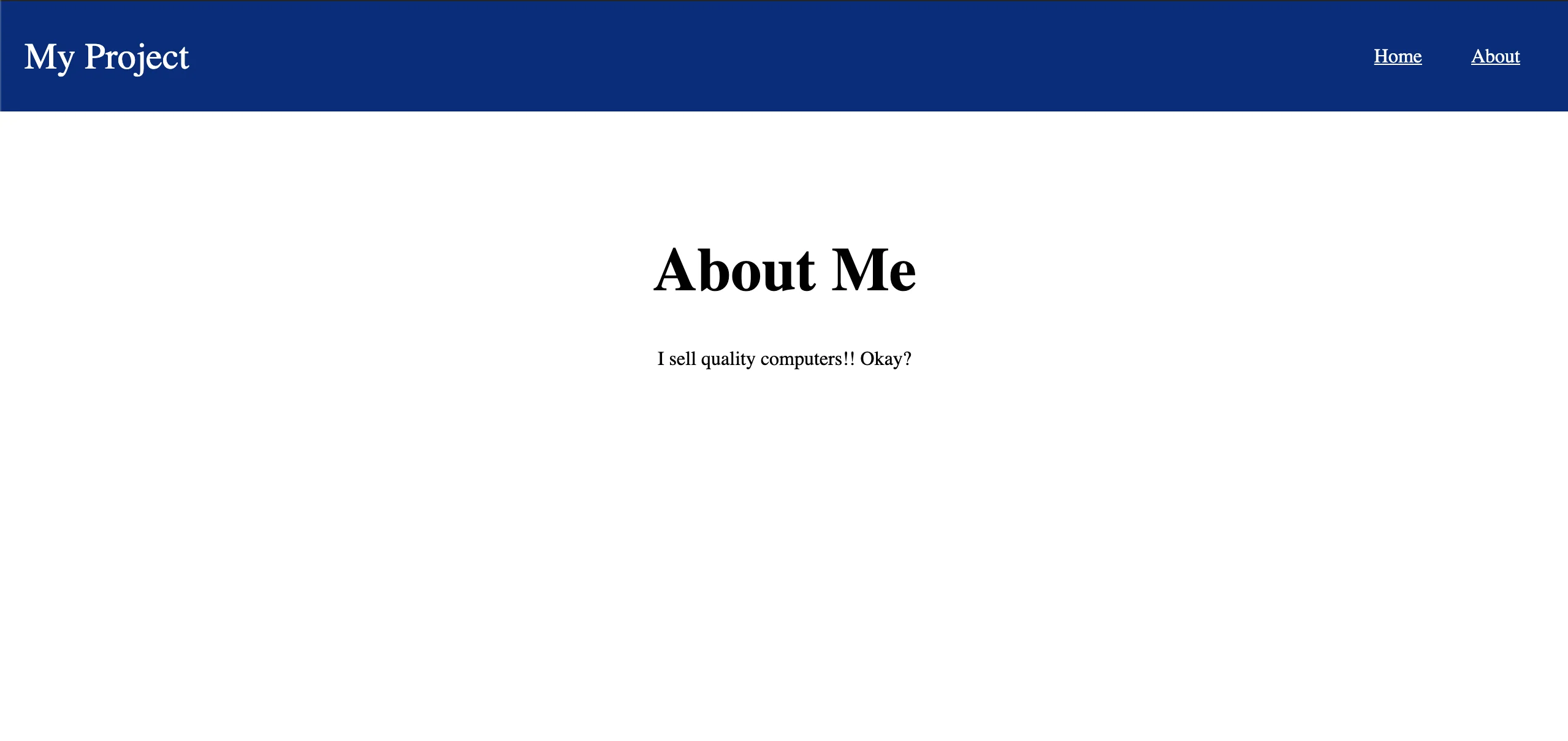
const AboutPage = () => (
	<Layout>
		<SEO
			title="About my website"
			description="This page contains more information about my website and the work that I do"
		/>
		<main>
			<div className="about-container">
				<h1>About Me</h1>
				<p>I sell quality computers!! Okay?</p>
			</div>
		</main>
	</Layout>
);

export default AboutPage;

Create a new directory called styles under src and create a new file: global.css. Copy the following css styles to that file:

* {
	box-sizing: border-box;
}

body {
	margin: 0;
	padding: 0;
}

ul {
	padding: 0;
	list-style: none;
}

.header {
	padding: 20px;
	background-color: rgb(5, 42, 123);
	display: flex;
	justify-content: space-between;
	align-items: center;
}

.header .site a {
	color: white;
	font-size: 30px;
	text-decoration: none;
}

.header nav ul {
	display: flex;
}
.header nav ul li a {
	color: white;
	margin: 20px;
}

.hero-container {
	display: flex;
	align-items: center;
	justify-content: space-between;
	padding: 100px 30px;
}

.hero-left {
	display: flex;
	flex-direction: column;
	max-width: 500px;
	padding: 20px;
}

.hero-left-heading {
	font-size: 40px;
	color: rgb(181, 0, 154);
	font-weight: bold;
}

.hero-left-text {
	margin: 20px 0;
}

.hero-left-link {
	display: block;
	width: max-content;
	padding: 15px;
	border-radius: 5px;
	background-color: rgb(181, 0, 154);
	color: white;
	display: flex;
	justify-content: center;
	align-items: center;
	text-decoration: none;
}

.hero-right-image-container {
	width: 600px;
	height: 400px;
	overflow: hidden;
}
.hero-right-image-container img {
	object-fit: cover;
	width: 100%;
	height: 100%;
}

.about-container {
	margin-top: 100px;
	text-align: center;
}

.about-container h1 {
	font-size: 50px;
}

For the global stylesheet to be used for the whole site, the gatsby-browser.js API file would be used.

gatsby-browser.js is a reserved API file that gives access to actions within the browser.

In gatsby-browser.js (at the root of your project), add the following:

import "./src/styles/global.css";

When you run the gatsby server for your project (gatsby develop), you'll get the following on localhost:8000:

For /:

Gatsby Basic Website Homepage

For /about:

Gatsby Basic Website About page

The SEO component makes all the pages unique and SEO-ready. For index.js, we have:

<SEO title="Homepage" description="This is the homepage of my website" />

Just as we have configured the SEO component using react-helmet, this updates the meta information for the homepage during the build process. This way, the first thing crawlers will see is the unique meta details for the page, as they do not require any JavaScript to be updated.

To test this, do the following:

  • build for project for production (gatsby run build)
  • serve the production build (gatsby run serve)

This will run the built content on localhost:9000.

You can use curl on your terminal to inspect the source code (or run inspect on the browser).

curl localhost:9000

The result:

Gatsby Basic Website Homepage Source

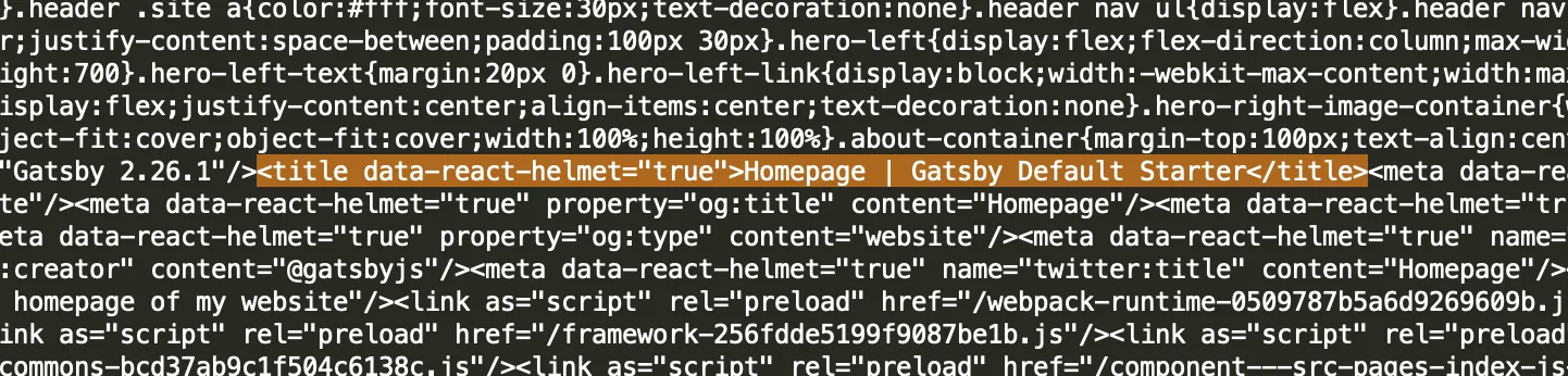
The reason it came out as "Homepage | Gatsby Default Starter" is because of the prop titleTemplate provided by Helmet which was configured like so in the SEO template:

titleTemplate={defaultTitle ? `%s | ${defaultTitle}` : null}

This appends a default title to every title provided by the pages.

Conclusion

In this article, we looked at how Gatsby solves the problem of SEO using server side rendering for generating static pages.

The basic example used in the tutorial shows how each page contain their own meta information that can easily be crawled by SEO bots or social media tools.

This Dot Labs is a development consultancy that is trusted by top industry companies, including Stripe, Xero, Wikimedia, Docusign, and Twilio. This Dot takes a hands-on approach by providing tailored development strategies to help you approach your most pressing challenges with clarity and confidence. Whether it's bridging the gap between business and technology or modernizing legacy systems, you’ll find a breadth of experience and knowledge you need. Check out how This Dot Labs can empower your tech journey.

You might also like

How to Integrate Mailchimp Forms in a React Project cover image

How to Integrate Mailchimp Forms in a React Project

Intro Today we will cover how to set up an email signup form using React and Mailchimp. This blog will be using the starter.dev cra-rxjs-styled-components template to expedite the process. This article assumes you have a basic understanding of React, and have set up a Mailchimp account. Here is the code repo if you want to review it while reading, or just skip ahead. We will start with setting up our React project using Starter.dev for simplicity, and then finish it up by integrating the two for our signup form. To start, we will be using the command yarn create @this-dot/starter --kit cra-rxjs-styled-components, which can be found here. We’ll go ahead, and give the project a name. I will be calling mine react-mailchimp. Now we will navigate into the project and do a yarn install. Then we can run yarn run dev to get it up and running locally on localhost:3000. This should have us load up on the React App, RxJS, and styled-components Starter kit page. With that all set, we’ll also need to install jsonp by using yarn add jsonp`. We’ll be using jsonp instead of fetch to avoid any CORS issues we may run into. This also makes for an easy and quick process by not relying on their API, which can’t be utilized by the client. Now that we have our project set up, we will go ahead and go and grab our form action URL from MailChimp. This can be found by going to your Audience > Signup Forms > Embedded Forms > Continue and then grabbing the form action URL found in the Embedded Form Code. We need to make a small change to the URL and swap /post? with /post-json?. We can now start setting up our form input, and our submit function. I will add a simple form input and follow it up, and a submit function. Inside the submit function, we will use our imported jsonp to invoke our action URL. ` import { useState } from 'react'; import jsonp from 'jsonp'; export const MailChimp = () => { const [email, setEmail] = useState(''); const onSubmit = (e: any) => { e.preventDefault(); const url = 'insert-mailchimp-action-url-here'; jsonp(${url}&EMAIL=${email}`, { param: 'c' }, (_: any, data: any) => { console.log('data', data); const { msg } = data; alert(msg); }); }; return ( Email setEmail(e.target.value)} > Submit ); }; ` We’ll also add a quick alert to let the user know that it was successful and that’s it! We’ve now successfully added the email to our MailChimp account. Conclusion Today, we covered how to integrate Mailchimp with a react app using the cra-rxjs-styled-components template from starter.dev. I highly recommend using starter.dev to get your project up and running quickly. Here is the code repo again for you to check out....

Building a Multi-Response Streaming API with Node.js, Express, and React cover image

Building a Multi-Response Streaming API with Node.js, Express, and React

Introduction As web applications become increasingly complex and data-driven, efficient and effective data transfer methods become critically important. A streaming API that can send multiple responses to a single request can be a powerful tool for handling large amounts of data or for delivering real-time updates. In this article, we will guide you through the process of creating such an API. We will use video streaming as an illustrative example. With their large file sizes and the need for flexible, on-demand delivery, videos present a fitting scenario for showcasing the power of multi-response streaming APIs. The backend will be built with Node.js and Express, utilizing HTTP range requests to facilitate efficient data delivery in chunks. Next, we'll build a React front-end to interact with our streaming API. This front-end will handle both the display of the streamed video content and its download, offering users real-time progress updates. By the end of this walkthrough, you will have a working example of a multi-response streaming API, and you will be able to apply the principles learned to a wide array of use cases beyond video streaming. Let's jump right into it! Hands-On Implementing the Streaming API in Express In this section, we will dive into the server-side implementation, specifically our Node.js and Express application. We'll be implementing an API endpoint to deliver video content in a streaming fashion. Assuming you have already set up your Express server with TypeScript, we first need to define our video-serving route. We'll create a GET endpoint that, when hit, will stream a video file back to the client. Please make sure to install cors for handling cross-origin requests, dotenv for loading environment variables, and throttle for controlling the rate of data transfer. You can install these with the following command: ` yarn add cors dotenv throttle @types/cors @types/dotenv @types/throttle ` `typescript import cors from 'cors'; import 'dotenv/config'; import express, { Request, Response } from 'express'; import fs from 'fs'; import Throttle from 'throttle'; const app = express(); const port = 8000; app.use(cors()); app.get('/video', (req: Request, res: Response) => { // Video by Zlatin Georgiev from Pexels: https://www.pexels.com/video/15708449/ // For testing purposes - add the video in you static` folder const path = 'src/static/pexels-zlatin-georgiev-15708449 (2160p).mp4'; const stat = fs.statSync(path); const fileSize = stat.size; const range = req.headers.range; if (range) { const parts = range.replace(/bytes=/, '').split('-'); const start = parseInt(parts[0], 10); const end = parts[1] ? parseInt(parts[1], 10) : fileSize - 1; const chunksize = end - start + 1; const file = fs.createReadStream(path, { start, end }); const head = { 'Content-Range': bytes ${start}-${end}/${fileSize}`, 'Accept-Ranges': 'bytes', 'Content-Length': chunksize, 'Content-Type': 'video/mp4', }; res.writeHead(206, head); file.pipe(res); } else { const head = { 'Content-Length': fileSize, 'Content-Type': 'video/mp4', }; res.writeHead(200, head); fs.createReadStream(path).pipe(res); } }); app.listen(port, () => { console.log(Server listening at ${process.env.SERVER_URL}:${port}`); }); ` In the code snippet above, we are implementing a basic video streaming server that responds to HTTP range requests. Here's a brief overview of the key parts: 1. File and Range Setup__: We start by determining the path to the video file and getting the file size. We also grab the range header from the request, which contains the range of bytes the client is requesting. 2. Range Requests Handling__: If a range is provided, we extract the start and end bytes from the range header, then create a read stream for that specific range. This allows us to stream a portion of the file rather than the entire thing. 3. Response Headers__: We then set up our response headers. In the case of a range request, we send back a '206 Partial Content' status along with information about the byte range and total file size. For non-range requests, we simply send back the total file size and the file type. 4. Data Streaming__: Finally, we pipe the read stream directly to the response. This step is where the video data actually gets sent back to the client. The use of pipe() here automatically handles backpressure, ensuring that data isn't read faster than it can be sent to the client. With this setup in place, our streaming server is capable of efficiently delivering large video files to the client in small chunks, providing a smoother user experience. Implementing the Download API in Express Now, let's add another endpoint to our Express application, which will provide more granular control over the data transfer process. We'll set up a GET endpoint for '/download', and within this endpoint, we'll handle streaming the video file to the client for download. `typescript app.get('/download', (req: Request, res: Response) => { // Again, for testing purposes - add the video in you static` folder const path = 'src/static/pexels-zlatin-georgiev-15708449 (2160p).mp4'; const stat = fs.statSync(path); const fileSize = stat.size; res.writeHead(200, { 'Content-Type': 'video/mp4', 'Content-Disposition': 'attachment; filename=video.mp4', 'Content-Length': fileSize, }); const readStream = fs.createReadStream(path); const throttle = new Throttle(1024 1024 * 5); // throttle to 5MB/sec - simulate lower speed readStream.pipe(throttle); throttle.on('data', (chunk) => { Console.log(Sent ${chunk.length} bytes to client.`); res.write(chunk); }); throttle.on('end', () => { console.log('File fully sent to client.'); res.end(); }); }); ` This endpoint has a similar setup to the video streaming endpoint, but it comes with a few key differences: 1. Response Headers__: Here, we include a 'Content-Disposition' header with an 'attachment' directive. This header tells the browser to present the file as a downloadable file named 'video.mp4'. 2. Throttling__: We use the 'throttle' package to limit the data transfer rate. Throttling can be useful for simulating lower-speed connections during testing, or for preventing your server from getting overwhelmed by data transfer operations. 3. Data Writing__: Instead of directly piping the read stream to the response, we attach 'data' and 'end' event listeners to the throttled stream. On the 'data' event, we manually write each chunk of data to the response, and on the 'end' event, we close the response. This implementation provides a more hands-on way to control the data transfer process. It allows for the addition of custom logic to handle events like pausing and resuming the data transfer, adding custom transformations to the data stream, or handling errors during transfer. Utilizing the APIs: A React Application Now that we have a server-side setup for video streaming and downloading, let's put these APIs into action within a client-side React application. Note that we'll be using Tailwind CSS for quick, utility-based styling in our components. Our React application will consist of a video player that uses the video streaming API, a download button to trigger the download API, and a progress bar to show the real-time download progress. First, let's define the Video Player component that will play the streamed video: `tsx import React from 'react'; const VideoPlayer: React.FC = () => { return ( Your browser does not support the video tag. ); }; export default VideoPlayer; ` In the above VideoPlayer component, we're using an HTML5 video tag to handle video playback. The src attribute of the source tag is set to the video endpoint of our Express server. When this component is rendered, it sends a request to our video API and starts streaming the video in response to the range requests that the browser automatically makes. Next, let's create the DownloadButton component that will handle the video download and display the download progress: `tsx import React, { useState } from 'react'; const DownloadButton: React.FC = () => { const [downloadProgress, setDownloadProgress] = useState(0); const handleDownload = async () => { try { const response = await fetch('http://localhost:8000/download'); const reader = response.body?.getReader(); if (!reader) { return; } const contentLength = +(response.headers?.get('Content-Length') || 0); let receivedLength = 0; let chunks = []; while (true) { const { done, value } = await reader.read(); if (done) { console.log('Download complete.'); const blob = new Blob(chunks, { type: 'video/mp4' }); const url = window.URL.createObjectURL(blob); const a = document.createElement('a'); a.style.display = 'none'; a.href = url; a.download = 'video.mp4'; document.body.appendChild(a); a.click(); window.URL.revokeObjectURL(url); setDownloadProgress(100); break; } chunks.push(value); receivedLength += value.length; const progress = (receivedLength / contentLength) 100; setDownloadProgress(progress); } } catch (err) { console.error(err); } }; return ( Download Video {downloadProgress > 0 && downloadProgress Download progress: )} {downloadProgress === 100 && Download complete!} ); }; export default DownloadButton; ` In this DownloadButton component, when the download button is clicked, it sends a fetch request to our download API. It then uses a while loop to continually read chunks of data from the response as they arrive, updating the download progress until the download is complete. This is an example of more controlled handling of multi-response APIs where we are not just directly piping the data, but instead, processing it and manually sending it as a downloadable file. Bringing It All Together Let's now integrate these components into our main application component. `tsx import React from 'react'; import VideoPlayer from './components/VideoPlayer'; import DownloadButton from './components/DownloadButton'; function App() { return ( My Video Player ); } export default App; ` In this simple App component, we've included our VideoPlayer and DownloadButton components. It places the video player and download button on the screen in a neat, centered layout thanks to Tailwind CSS. Here is a summary of how our system operates: - The video player makes a request to our Express server as soon as it is rendered in the React application. Our server handles this request, reading the video file and sending back the appropriate chunks as per the range requested by the browser. This results in the video being streamed in our player. - When the download button is clicked, a fetch request is sent to our server's download API. This time, the server reads the file, but instead of just piping the data to the response, it controls the data sending process. It sends chunks of data and also logs the sent chunks for monitoring purposes. The React application collects these chunks and concatenates them, displaying the download progress in real-time. When all chunks are received, it compiles them into a Blob and triggers a download in the browser. This setup allows us to build a full-featured video streaming and downloading application with fine control over the data transmission process. To see this system in action, you can check out this video demo. Conclusion While the focus of this article was on video streaming and downloading, the principles we discussed here extend beyond just media files. The pattern of responding to HTTP range requests is common in various data-heavy applications, and understanding it can be a useful tool in your web development arsenal. Finally, remember that the code shown in this article is just a simple example to demonstrate the concepts. In a real-world application, you would want to add proper error handling, validation, and possibly some form of access control depending on your use case. I hope this article helps you in your journey as a developer. Building something yourself is the best way to learn, so don't hesitate to get your hands dirty and start coding!...

Composing React Components with TypeScript cover image

Composing React Components with TypeScript

TypeScript is a language that supercharges your JavaScript by giving your application's source codes type-checking. Combining the compiler tool and the IDE plug-ins gives a beautiful development experience when building JavaScript applications. What I love most about using TypeScript is that when I use it, I know exactly the structure of data to give to components and when I give a different structure, the IntelliSense immediately notifies me. Also, as a friend said: > If you use TypeScript in your application (without doing "illegal" kinds of stuff like passing any` everywhere), you'll never have an uncaught error of "`x` as `undefined`" This view is opinionated, but I quite agree with it. Using TypeScript with React makes building React components faster with little to no uncaught errors. It allows you to specify the exact structure of expected props` for any component. In this article, we'll learn how to use TypeScript to compose React components. To continue with this article, a fair knowledge of TypeScript is required. This is a great starting guide to learn TypeScript. At the end, we'll also look at the difference between prop-types` and TypeScript. Let's start building components In this article, we'll build four components: an Input`, a `Button`, a `Header`, and a `BlogCard` component. These components will show how TypeScript can be used with React. Setting up TypeScript for React Some React frameworks (like NextJS and GatsbyJS) already have support for TypeScript out of the box, but for Create React App, you have a few things you'll need to do. If it's a new project, you can create the project like so: `shell create-react-app project-name --template typescript ` The --template typescript` installs dependencies that add support for TypeScript in your React application. If it's an existing project, then you would need to install the Typescript dependencies: `shell npm install --save typescript @types/node @types/react @types/react-dom ` With these, you can rename .js` files to `.tsx` to allow TypeScript codes. Now, let's build our components. An `Input` component For our Input` component, we need the following `props`: `defaultValue`, `onChange`, `placeholder` and `name`. Each of them is a string value except `onChange`, which is a function. Using TypeScript, here's how we define the component: `tsx // Input.tsx import React from "react"; type Props = { onChange: (str: string) => void; placeholder: string; name: string; value?: string; }; function Input({ onChange, name, placeholder, value = "" }: Props) { return ( onChange(event.target.value)} name={name} placeholder={placeholder} value={value} /> ); } export default Input; ` This way, our component is well defined. The expected onChange` method must accept only one argument which must be a string. `placeholder`, `name` and `value` (if provided) must be a string. If a different data type is passed, the IntelliSense immediately yells, or the compile command on the terminal breaks. And here's how this component is used: `tsx // Form.tsx import React, { useState } from "react"; import Input from "./Input"; function Form() { const [nameInput, setNameInput] = useState(""); const onChange = (str: string) => { setNameInput(str); }; return ( ); } export default Form; ` Let's change the data type of the placeholder` property to see the warning we get: `tsx ... ... ` Here's the warning: A `Button` component Our Button` component will have the following `props`: `value` and `processing` like so: `tsx // Button.tsx type Props = { value: "Submit" | "Continue" | "Update"; processing: boolean; }; function Button({ value, processing }: Props) { return {processing ? "Processing" : value}; } ` For the value` prop, we're expecting either of three strings: "Submit", "Continue", or "Update", and the `processing` expects a `true` or `false` value. Let's see the component in use: `tsx // Form.tsx import React, { useState } from "react"; import Input from "./Input"; import Button from "./Button"; function Form() { const [nameInput, setNameInput] = useState(""); const onChange = (str: string) => { setNameInput(str); }; return ( ); } export default Form; ` As you'd notice, "Next" is not included in the expected strings for value`. Therefore, we get an error from IntelliSense. Here are two things you'd notice on your IDE: As seen above, on entering quotes, the IDE already gives you the acceptable values. But if you pass "Next", you'll get this: A `Header` component So our Header` component would be a bit complex. For an authenticated user, the header would have the user's name, but if otherwise, we have the "Sign in" text. Here's how we'll define it: `tsx // Header.tsx import React from "react"; type User = { name: string; }; type Props = | { authenticated: false; profile: null; } | { authenticated: true; profile: User; }; function Header(props: Props) { return ( Home About {props.authenticated ? props.profile.name : Sign in} ); } export default Header; ` The Header` component accepts two props: `authenticated` and `profile`. The `props` are conditional such that when `props.authenticated` is `false`, `props.profile` is `null` and when `props.authenticated` is `true`, `props.profile` is the `User` type. This means, if a user is authenticated, a profile` object must also be provided. Here's how the component is used: `tsx import Header from "./Header"; function Layout() { return ( ); } ` For the above, we do something unacceptable. authenticated` is true, but a different data type for `profile` is provided. Here's what the IntelliSense gives: A `BlogCard` component In this component, we expect a post` prop which is an object with the following properties: `title`, `author`, `date` and `timeToRead`. Here's how we define it with TypeScript: `tsx // BlogCard.tsx import React from "react"; type Props = { post: { title: string; author: { name: string; }; date: Date; timeToRead: number; }; }; function BlogCard({ post }: Props) { return ( {post.title} on {new Intl.DateTimeFormat().format(post.date)} {post.timeToRead}mins By {post.author.name} ); } export default BlogCard; ` And here's how it's used: `tsx // BlogPosts.tsx import React from "react"; import BlogCard from "./BlogCard"; type Post = { title: string; author: { name: string; }; date: Date; timeToRead: number; }; function BlogPosts() { const posts: Post[] = [ { title: "What is JavaScript", date: new Date(), timeToRead: 3, author: { name: "Dillion Megida" } } ]; return ( {posts.map((p, i) => ( ))} ); } export default BlogPosts; ` Note that* the `Post` type does not have to be written multiple times in different files. It can be a shared type exported from its own file and used anywhere. With the above, we do not get an error because every data type is as expected. Now let's say we added an extra property to the Post` type in the blog posts like so: `tsx type Post = { title: string; author: { name: string; }; date: Date; timeToRead: number; excerpt: string; // new property } ... ` We get errors in the IDE like so: In the components examples above, we've seen how to add typings to the component's properties such that a parent components using such components would know exactly what the component wants to receive. We've seen how the Intellisense provides error messages when types are not valid. Having an IntelliSense makes the development faster as you can easily see the warnings and errors in your IDE. Without IntelliSense, you can also verify the data types when you try building (npm run build`) your React application. For example, using the Header` component like so: `tsx ... ... ` Running npm run build` for the above code gives the following error in the terminal: The examples above are in this Stackblitz project. You can play with it, and violate expected types to see warnings. Prop Types TypeScript is not the only way to ensure expected data types in a React application. There are also prop-types`. They are quite similar, but work in different ways. `prop-types` is more of an injected tool that inspects data received from an API to ensure it has the expected type. Also, it can be used in libraries that are compiled to JavaScript to be consumed by other applications. This means, even in Vanilla JavaScript, you'll still be able to catch type errors. However, `prop-types` is limited in the way you can specify data types compared to TypeScript. For example, `prop-types` cannot have interfaces, neither can they have the conditional props as we saw for the `Header` component. This StackOverFlow answer shows a detailed difference between them. Conclusion While TypeScript has a lot of work (adding typings to almost everything) which can be strenuous, it makes developing React applications faster and with little fear of errors. You're not just limited to single types as with prop-types`, but you can also specify objects of objects or literally any pattern as an expected type. There's also more than you can do with TypeScript and React. You can further read the TypeScript Documentation to learn more....

Being a CTO at Any Level: A Discussion with Kathy Keating, Co-Founder of CTO Levels cover image

Being a CTO at Any Level: A Discussion with Kathy Keating, Co-Founder of CTO Levels

In this episode of the engineering leadership series, Kathy Keating, co-founder of CTO Levels and CTO Advisor, shares her insights on the role of a CTO and the challenges they face. She begins by discussing her own journey as a technologist and her experience in technology leadership roles, including founding companies and having a recent exit. According to Kathy, the primary responsibility of a CTO is to deliver the technology that aligns with the company's business needs. However, she highlights a concerning statistic that 50% of CTOs have a tenure of less than two years, often due to a lack of understanding and mismatched expectations. She emphasizes the importance of building trust quickly in order to succeed in this role. One of the main challenges CTOs face is transitioning from being a technologist to a leader. Kathy stresses the significance of developing effective communication habits to bridge this gap. She suggests that CTOs create a playbook of best practices to enhance their communication skills and join communities of other CTOs to learn from their experiences. Matching the right CTO to the stage of a company is another crucial aspect discussed in the episode. Kathy explains that different stages of a company require different types of CTOs, and it is essential to find the right fit. To navigate these challenges, Kathy advises CTOs to build a support system of advisors and coaches who can provide guidance and help them overcome obstacles. Additionally, she encourages CTOs to be aware of their own preferences and strengths, as self-awareness can greatly contribute to their success. In conclusion, this podcast episode sheds light on the technical aspects of being a CTO and the challenges they face. Kathy Keating's insights provide valuable guidance for CTOs to build trust, develop effective communication habits, match their skills to the company's stage, and create a support system for their professional growth. By understanding these key technical aspects, CTOs can enhance their leadership skills and contribute to the success of their organizations....