Skip to content

Composing React Components with TypeScript

This article was written over 18 months ago and may contain information that is out of date. Some content may be relevant but please refer to the relevant official documentation or available resources for the latest information.

TypeScript is a language that supercharges your JavaScript by giving your application's source codes type-checking. Combining the compiler tool and the IDE plug-ins gives a beautiful development experience when building JavaScript applications.

What I love most about using TypeScript is that when I use it, I know exactly the structure of data to give to components and when I give a different structure, the IntelliSense immediately notifies me.

Also, as a friend said:

If you use TypeScript in your application (without doing "illegal" kinds of stuff like passing any everywhere), you'll never have an uncaught error of "x as undefined"

This view is opinionated, but I quite agree with it.

Using TypeScript with React makes building React components faster with little to no uncaught errors. It allows you to specify the exact structure of expected props for any component.

In this article, we'll learn how to use TypeScript to compose React components. To continue with this article, a fair knowledge of TypeScript is required. This is a great starting guide to learn TypeScript.

At the end, we'll also look at the difference between prop-types and TypeScript.

Let's start building components

In this article, we'll build four components: an Input, a Button, a Header, and a BlogCard component. These components will show how TypeScript can be used with React.

Setting up TypeScript for React

Some React frameworks (like NextJS and GatsbyJS) already have support for TypeScript out of the box, but for Create React App, you have a few things you'll need to do.

If it's a new project, you can create the project like so:

create-react-app project-name --template typescript

The --template typescript installs dependencies that add support for TypeScript in your React application.

If it's an existing project, then you would need to install the Typescript dependencies:

npm install --save typescript @types/node @types/react @types/react-dom

With these, you can rename .js files to .tsx to allow TypeScript codes.

Now, let's build our components.

An Input component

For our Input component, we need the following props: defaultValue, onChange, placeholder and name. Each of them is a string value except onChange, which is a function.

Using TypeScript, here's how we define the component:

// Input.tsx
import React from "react";

type Props = {
  onChange: (str: string) => void;
  placeholder: string;
  name: string;
  value?: string;
};
function Input({ onChange, name, placeholder, value = "" }: Props) {
  return (
    <input
      onChange={event => onChange(event.target.value)}
      name={name}
      placeholder={placeholder}
      value={value}
    />
  );
}

export default Input;

This way, our component is well defined. The expected onChange method must accept only one argument which must be a string. placeholder, name and value (if provided) must be a string. If a different data type is passed, the IntelliSense immediately yells, or the compile command on the terminal breaks.

And here's how this component is used:

// Form.tsx
import React, { useState } from "react";

import Input from "./Input";

function Form() {
  const [nameInput, setNameInput] = useState("");
  const onChange = (str: string) => {
    setNameInput(str);
  };

  return (
    <form>
      <Input
        onChange={onChange}
        name="name"
        placeholder="Enter your name"
        value={nameInput}
      />
    </form>
  );
}

export default Form;

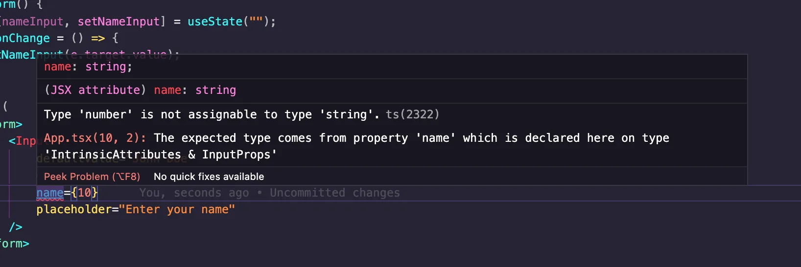
Let's change the data type of the placeholder property to see the warning we get:

...
<form>
    <Input
        ...
        name={10}
    />
</form>
...

Here's the warning:

Error gotten when an unexpected data type is passed to Input

A Button component

Our Button component will have the following props: value and processing like so:

// Button.tsx
type Props = {
    value: "Submit" | "Continue" | "Update";
    processing: boolean;
};
function Button({ value, processing }: Props) {
    return <button>{processing ? "Processing" : value}</button>;
}

For the value prop, we're expecting either of three strings: "Submit", "Continue", or "Update", and the processing expects a true or false value.

Let's see the component in use:

// Form.tsx
import React, { useState } from "react";

import Input from "./Input";
import Button from "./Button";

function Form() {
  const [nameInput, setNameInput] = useState("");
  const onChange = (str: string) => {
    setNameInput(str);
  };

  return (
    <form>
      <Input
        onChange={onChange}
        name="name"
        placeholder="Enter your name"
        value={nameInput}
      />
      <Button value='Submit' processing={false} />
      <Button value='Submit' processing={true} />
    </form>
  );
}

export default Form;

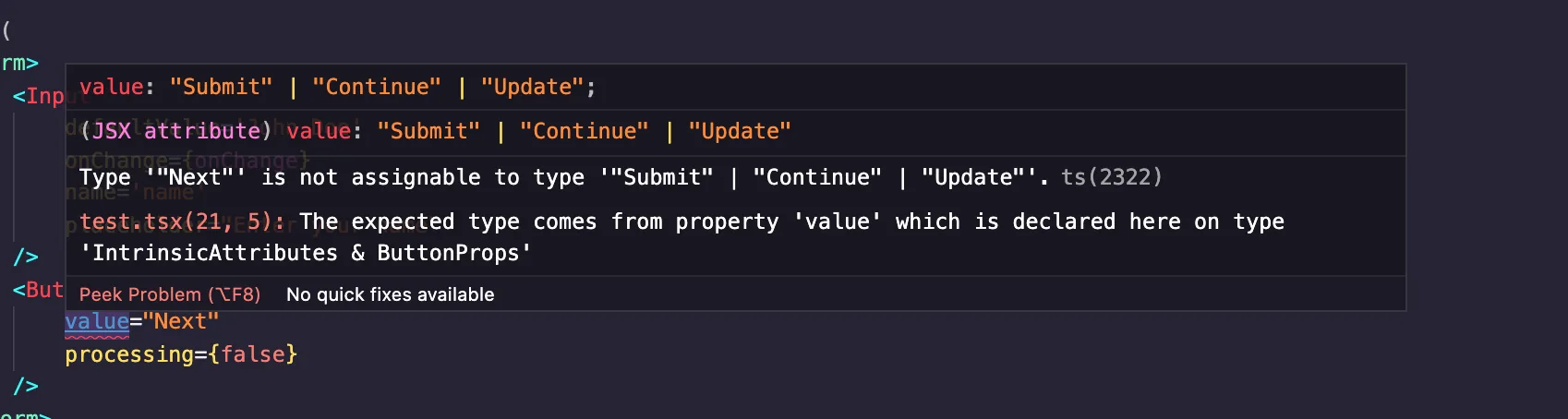
As you'd notice, "Next" is not included in the expected strings for value. Therefore, we get an error from IntelliSense. Here are two things you'd notice on your IDE:

Showing the expected values of the Button value prop

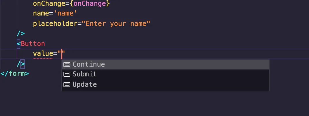
As seen above, on entering quotes, the IDE already gives you the acceptable values. But if you pass "Next", you'll get this:

Error gotten after passing an unexpected value to Button value prop

A Header component

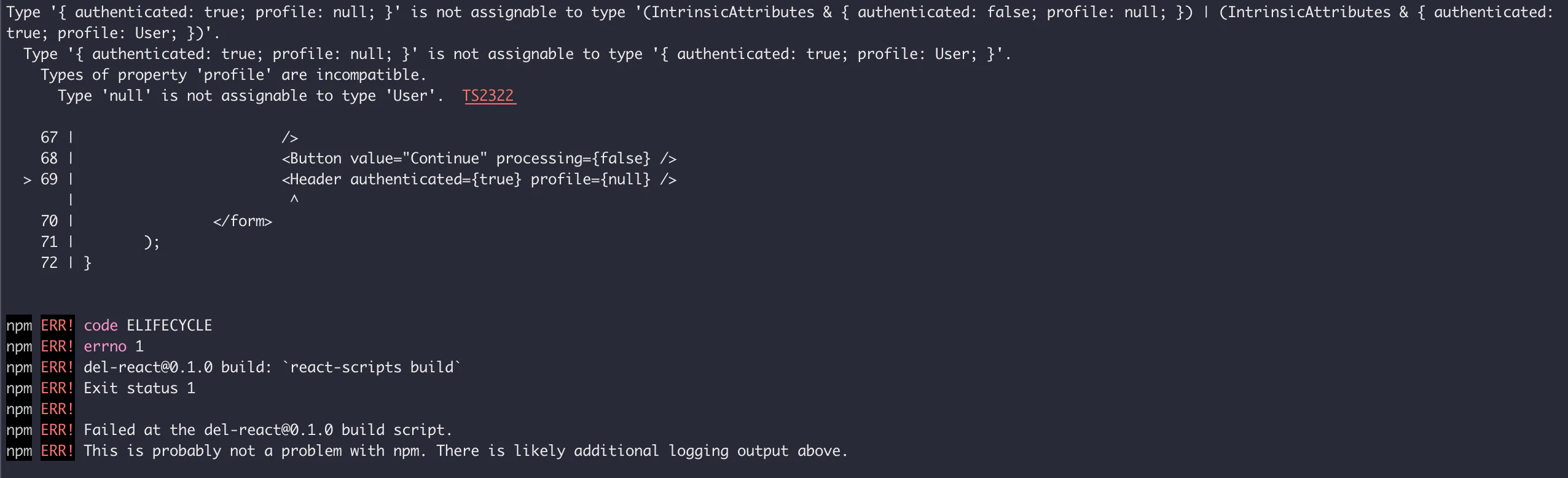
So our Header component would be a bit complex. For an authenticated user, the header would have the user's name, but if otherwise, we have the "Sign in" text. Here's how we'll define it:

// Header.tsx
import React from "react";

type User = {
  name: string;
};
type Props =
  | {
      authenticated: false;
      profile: null;
    }
  | {
      authenticated: true;
      profile: User;
    };
function Header(props: Props) {
  return (
    <header>
      <a href="/">Home</a>
      <a href="/about">About</a>
      {props.authenticated ? props.profile.name : <a href="/signin">Sign in</a>}
    </header>
  );
}

export default Header;

The Header component accepts two props: authenticated and profile. The props are conditional such that when props.authenticated is false, props.profile is null and when props.authenticated is true, props.profile is the User type.

This means, if a user is authenticated, a profile object must also be provided.

Here's how the component is used:

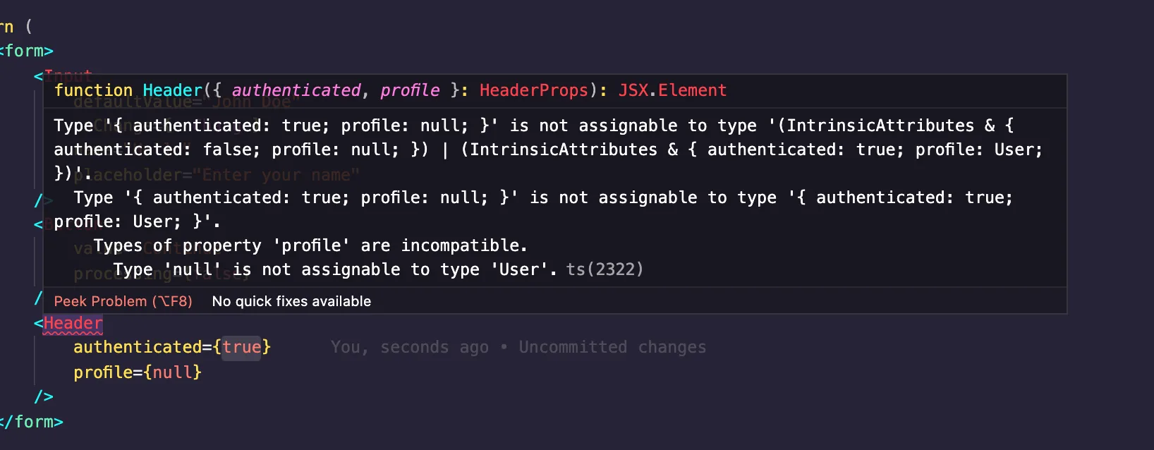
import Header from "./Header";

function Layout() {
    return (
        <div>
            <Header authenticated={true} profile={null} />
        </div>
    );
}

For the above, we do something unacceptable. authenticated is true, but a different data type for profile is provided. Here's what the IntelliSense gives:

Error gotten after passing unaccepted value to Header component

A BlogCard component

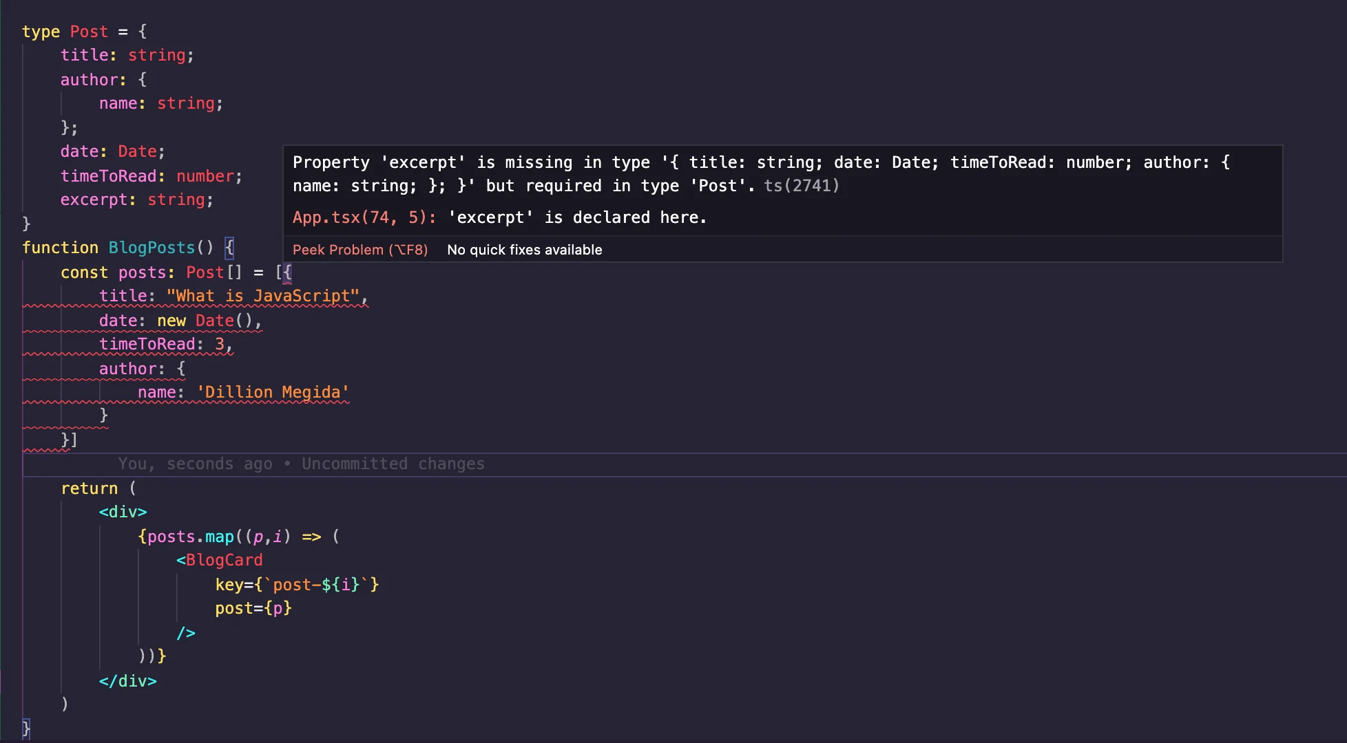
In this component, we expect a post prop which is an object with the following properties: title, author, date and timeToRead. Here's how we define it with TypeScript:

// BlogCard.tsx
import React from "react";

type Props = {
  post: {
    title: string;
    author: {
      name: string;
    };
    date: Date;
    timeToRead: number;
  };
};
function BlogCard({ post }: Props) {
  return (
    <div className="blog-card">
      <span className="title">{post.title}</span>
      <span className="date">
        on {new Intl.DateTimeFormat().format(post.date)}
      </span>
      <span className="time-to-read">{post.timeToRead}mins</span>
      <span className="author-name">By {post.author.name}</span>
    </div>
  );
}

export default BlogCard;

And here's how it's used:

// BlogPosts.tsx
import React from "react";
import BlogCard from "./BlogCard";

type Post = {
  title: string;
  author: {
    name: string;
  };
  date: Date;
  timeToRead: number;
};
function BlogPosts() {
  const posts: Post[] = [
    {
      title: "What is JavaScript",
      date: new Date(),
      timeToRead: 3,
      author: {
        name: "Dillion Megida"
      }
    }
  ];
  return (
    <div>
      {posts.map((p, i) => (
        <BlogCard key={`post-${i}`} post={p} />
      ))}
    </div>
  );
}

export default BlogPosts;

Note that the Post type does not have to be written multiple times in different files. It can be a shared type exported from its own file and used anywhere.

With the above, we do not get an error because every data type is as expected. Now let's say we added an extra property to the Post type in the blog posts like so:

type Post = {
    title: string;
    author: {
        name: string;
    };
    date: Date;
    timeToRead: number;
    excerpt: string; // new property
}
...

We get errors in the IDE like so:

Error gotten when excerpt property in Post type is not provided in post object

In the components examples above, we've seen how to add typings to the component's properties such that a parent components using such components would know exactly what the component wants to receive. We've seen how the Intellisense provides error messages when types are not valid.

Having an IntelliSense makes the development faster as you can easily see the warnings and errors in your IDE. Without IntelliSense, you can also verify the data types when you try building (npm run build) your React application.

For example, using the Header component like so:

...
<Header
    authenticated={true}
    profile={null}
/>
...

Running npm run build for the above code gives the following error in the terminal:

Terminal error when you run npm run build with an invalid type in a component

The examples above are in this Stackblitz project. You can play with it, and violate expected types to see warnings.

Prop Types

TypeScript is not the only way to ensure expected data types in a React application. There are also prop-types. They are quite similar, but work in different ways. prop-types is more of an injected tool that inspects data received from an API to ensure it has the expected type. Also, it can be used in libraries that are compiled to JavaScript to be consumed by other applications. This means, even in Vanilla JavaScript, you'll still be able to catch type errors. However, prop-types is limited in the way you can specify data types compared to TypeScript. For example, prop-types cannot have interfaces, neither can they have the conditional props as we saw for the Header component.

This StackOverFlow answer shows a detailed difference between them.

Conclusion

While TypeScript has a lot of work (adding typings to almost everything) which can be strenuous, it makes developing React applications faster and with little fear of errors. You're not just limited to single types as with prop-types, but you can also specify objects of objects or literally any pattern as an expected type.

There's also more than you can do with TypeScript and React. You can further read the TypeScript Documentation to learn more.

This Dot is a consultancy dedicated to guiding companies through their modernization and digital transformation journeys. Specializing in replatforming, modernizing, and launching new initiatives, we stand out by taking true ownership of your engineering projects.

We love helping teams with projects that have missed their deadlines or helping keep your strategic digital initiatives on course. Check out our case studies and our clients that trust us with their engineering.

You might also like

React Conf 2024 Review cover image

React Conf 2024 Review

A lot has happened since the last React Conf, so 2024 was action-packed. The conference lasted two days in Las Vegas and was focused on all the new stuff coming with React v19. Day one was centered around React 19/Server Components, and day two was React Native. There were some exciting reveals, fantastic talks, and demos. This post will cover the conference's big news, specifically the main keynotes from days 1 and 2. Day 1 Keynote The main keynote included several speakers from the React team, and early in the talk they mentioned a goal of “Make it easy for anyone to build great user experiences.” This sounds great but I was curious to see exactly what they meant by this since it seems like React has arguably gotten more complex with the introduction of Server Components and related API’s. The keynote was split into 3 sections: State of React - Lauren Tan Lauren shared the staggering adoption React has received over the years and thanked all the contributors and the community. She also highlighted the amazing ecosystem of packages, tools, and frameworks. It’s hard to argue against these points, but React seems to be in a weird in-between state. The framework is headed in this new direction but doesn’t feel quite there yet. React 19 A few team members collaborated on a walkthrough of React 19, which included all the new features and a bunch of quality-of-life improvements. The main highlights were: * Server Rendering & Suspense - One of the coolest bits was showing how to co-locate and load stylesheets and other assets in components. “HTML Composition for Bundlers, Libraries, & Apps” * Hydration - This was a fan favorite, and the TL;DR is fewer hydration errors with better messages and debuggability. * Actions - This is one of my favorite new features, as it feels like something that was missing from the React toolkit for a long time. The new Actions API is a “First-class pattern for asynchronous data updates in response to user input”. It includes Remix inspired form behaviors and API’s that replace a lot of boilerplate for handling async operations like loading and error states. * JSX Improvements One of the most applauded announcements was the changes to refs, which are now automatically passed to every component 🙌 React Compiler !! Yes, we’ve all heard the news by now. They are finally open sourcing the compiler that they teased over 2 years ago. React compiler understands React code/rules and is able to automatically optimize/memoize our application code. One of the big complaints of React has long been that there’s a lot of mental overhead and thought that needs to be put into optimizing and building fast components. So, the goal is to remove that burden from the developers so that they can focus on writing their business logic. One of the slides mentioned that the compiler has the following behaviors: Dead Code Elimination, Constant Propagation, Type Inference, Alias Analysis, Mutable Lifetime Inference, HIR, and Diagnostics. I’m not going to pretend to know all those things, but I’ve already heard a lot of positive feedback about how it works and how advanced it is. The team mentioned that they are already running the compiler in production on Instagram.com and some of their other websites. Day 2 Keynote Day 2 opened with sharing the incredible growth in downloads and adoptions that React Native has had (78M downloads in 2023). They shared some meta info about the recent releases and talked about all the partners helping to push the framework forward. They mentioned the Meta investment in React Native and shared about some of the ways that they are using it internally in places like Facebook Marketplace. Next they shared about all the work that Microsoft is doing with React Native for things like supporting building Windows apps with React Native. I was surprised to learn that the Windows Start Bar is a React Native app 🤯. New Architecture "Rewrite React Native to be synchronous so it’s possible to be concurrent" I was surprised when I read this since these two things seem to conflict with one another. The new architecture allows for the concurrent mode in React. This section opened by describing the original architecture of React Native (JavaScript code with a bridge for passing information back and forth from the native layer) The new architecture replaces “the bridge” with a concept called “JSI (JavaScript Interface)”. Instead of message passing, it uses memory sharing between the JS and Native layers. The big announcement was that the new architecture has been moved into Beta and they have released a bunch of things to help with compatibility between the old and new architecture to minimize breakages when upgrading. Production Ready Apps The section opened by talking about all the complexities and pieces involved with shipping a high-quality app to Android and iOS. If you’re a mobile developer, you know it’s quite a lot. They highlighted a new section of the documentation that provides details about “React Native Frameworks”. They are recommending using a “Framework” with React Native, just like they are recommending for React on the web. I had never even considered the idea of a “React Native Framework” before, so I thought that was pretty surprising. I guess it makes sense that Expo is a Framework but I’m not aware of any others like it. So the recommendation from the React Native documentation is: “Use Expo”. Which leads to the next part of the keynote…. Expo This part of the talk went more in-depth on a lot of the complexities with mobile development that Expo helps you solve. They highlighted an amazing suite of modules that they have dubbed the “Expo SDK”. The SDK consists of well-defined modules that handle some type of integration with the underlying Native platforms. They also have a Modules API to help build your own Native modules. Another new feature that I wasn’t aware of is API routes with Expo Router. How does that even work??? The next thing they mentioned was a feature called CNG (Continuous Native Generation). I’ve played with this a bit and it’s pretty nice. Expo will generate the iOS and Android projects/code that is needed to build the final application. The sales pitch is that this will help with upgrades if you aren’t managing and changing your native code by yourself. If you’ve upgraded a React Native app before you know how painful this can be. I am interested to see if CNG is practical in the real world. In my experience most projects have ended up ejected from expo and require managing your own native code. This section wrapped up with talking about builds and deployments with Expo Application Services (EAS). I don’t have experience with EAS yet personally but builds and deployments have always been the biggest pain point in my experience. I would definitely give it a try on my next project. As someone who has worked with React Native and Expo quite a bit over the years, it truly has come a really long way. Expo is amazing. Summary There were a ton of really exciting announcements and content just between the two keynotes. My impression from the conference is that a new era of React is kicking off and it’s really exciting. I’d hate to be one of the people betting against React as they’ve shown time and time again that they are willing to take risks and innovate in this space. It’s going to be a busy year in the React ecosystem as more frameworks adopt Server Components and more applications give it a try. There were a bunch of other really incredible talks in the conference and I’m really excited to write about a couple of them in particular. I wish I could have attended in person but the live stream didn’t disappoint!...

Remix's evolution to a Vite plugin cover image

Remix's evolution to a Vite plugin

The Remix / React Router news is a beautiful illustration of software evolution. You start with a clear idea of what you’re building, but it’s impossible to anticipate exactly what it will become. If you haven’t heard the news yet, Ryan Florence announced at React Conf 2024 that Remix will be a Vite plugin for React Router. It’s a sort of surprising announcement but it makes a lot of sense if you’ve been following along as Remix the project has evolved. In this post we’ll recap the evolution of the project and then dig into what this change means for the future of Remix in the Server Components era of React. 🗓️ October 2021 > Remix is open sourced In the beginning, Remix cost money. In October 2021 they received some seed funding and the project was open sourced. Remix was an exciting new framework for server-rendering React websites that included API’s for loading data on the server and submitting data to the server with forms. It started a trend in the front-end framework space that a lot of other popular frameworks have modeled after or taken inspiration from. 🗓️ March 2022 - September 2022 > Remixing React Router At some point they realized that the API’s that they had created for Remix were a more natural fit in React Router. In this post Ryan details the plans to move these Remix API’s into React Router. Several months later, React Router 6.4 is released with the action, loader, and other Remix API’s baked in. > "We've always thought of Remix as "just a compiler and server for React Router" After this release, Remix is now mostly as they described - a compiler and server for React Router. 🗓️ October 2023 - February 2024 > Remix gets Vite support If you’re not familiar with Vite, it’s an extremely popular tool for front-end development that handles things like development servers and code bundling/compiling. A lot of the modern front-end frameworks are built on top of it. Remix announced support for Vite as an alternative option to their existing compiler and server. Since Remix is now mostly “just a compiler and server for React Router” - what’s left of Remix now that Vite can handle those things? 🗓️ May 2024 > Remix is React Router The Remix team releases a post detailing the announcement that Ryan made at React Conf. Looking back through the evolution of the project this doesn’t seem like an out of the blue, crazy announcement. Merging Remix API’s into React Router and then replacing the compiler and server with Vite didn’t leave much for Remix to do as a standalone project. 🐐 React Router - the past, present, and future of React React Router is one of the oldest, and most used packages in the React ecosystem. > Since Remix has always been effectively "React Router: The Framework", we wanted to create a bridge for all these React Router projects to be able to upgrade to Remix. With Remix being baked into React Router and now supporting SPA mode, legacy React Router applications have an easier path for migrating to the next generation of React. https://x.com/ryanflorence/status/1791488550162370709 Remix vs React 19 If you’ve taken a look at React 19 at all, it turns out it now handles a lot of the problems that Remix set out to solve in the first place. Things like Server Components, Server Actions, and Form Actions provide the same sort of programming model that Remix popularized. https://x.com/ryanflorence/status/1791484663883829258 Planned Changes for Remix and React Router Just recently, a post was published giving the exact details of what the changes to Remix and React Router will look like. tl;dr For React Router * React Router v6 to v7 will be a non-breaking upgrade * The Vite plugin from Remix is coming to React Router in v7 * The Vite plugin simply makes existing React Router features more convenient to use, but it isn't required to use React Router v7 * v7 will support both React 18 and React 19 For Remix * What would have been Remix v3 is React Router v7 * Remix v2 to React Router v7 will be a non-breaking upgrade * Remix is coming back better than ever in a future release with an incremental adoption strategy enabled by these changes For Both * React Router v7 comes with new features not in Remix or React Router today: RSC, server actions, static pre-rendering, and enhanced Type Safety across the board The show goes on I love how this project has evolved and I tip my hat to the Remix/React Router team. React Router feels like a cozy blanket in an ecosystem that is going through some major changes which feels uncertain and a little scary at times. The Remix / React Router story is still being written and I’m excited to see where it goes. I’m looking forward to seeing the work they are doing to support React Server Components. A lot of people are pretty excited about RSC’s and there is a lot of room for unique and interesting implementations. Long live React Router 🙌....

Building SEO-Powered Websites With Gatsby cover image

Building SEO-Powered Websites With Gatsby

Gatsby is a framework that leverages React for building SEO-powered websites. Many websites are created to be discovered, hence, SEO support is an important factor in such websites. Many factors influence SEO such as accessibility, correct meta-information (at the head tag) and some other external tools. Gatsby supports using appropriate meta information for individual pages to improve their presence online. In this article, we'll look at the limitations of Create React App in respect to SEO, and how Gatsby solves this with SSR. Furthermore in the article, we'll go through a tutorial on building a basic website with good SEO. Why CRA is not a good tool for SEO CRA is an opinionated tool used for building React applications but cannot be used for SEO. Here's why: When using React, you'll most probably be using a library like react-helmet (a document head manager for React) for updating meta-information about the site. The limitations of such libraries is that they contain JavaScript, which means they can only be executed on the browser (so JavaScript can run). SEO crawlers or social media tools that inspect head tags of websites (to display a card, perhaps) would not execute that JavaScript. Instead, they make use of the default meta information they can find. In CRA, the default title in public/index.html is "React App". This means, for every page you create (based on routes), they will all have the same title. They only show different titles when they are executed on the client's browser because the react-helmet library gets the chance to be executed, thereby updating the head tags. This article contains more information. How Gatsby solves React SEO problems with SSR Gatsby is a Static Site Generator (SSG) which uses Server Side Rendering (SSR) to generate static pages during the build process. What this means is that you provide dynamic meta information in every page, and during the process of static site generation, pages are server-side rendered with the specified meta information, thereby making static pages with their own details. With this technique, every page contains its own meta title, meta description and basically every meta information. The following tutorial shows how Gatsby improves SEO in web applications. Building an SEO powered site with Gatsby We'll be building a basic website with two pages: / - Home and /about - About Us. These two pages would have their own meta information attached to them during the build process. To get started, let's created our Gatsby project. Run the following in your terminal: ` This pulls the default template, and installs all necessary dependencies. In the src directory, you'll find three directories: components, images and pages. As you may observe, the template already comes with some configurations for seo and optimizing images. To build our project afresh, delete the following files/directories: ` This will leave us with components/seo.js and images. In a future series, we'll explore the gatsby-image plugin used in components/images.js. But for now, understand that it performs optimizations on images. Let's briefly explore the content of components/seo.js ` _Note that_ this component can look a bit different in another template, or you may do it differently. The SEO component receives four props: title, description, lang and meta with title as required. You can specify more props if you want or take out those you don't need. This allows different pages to specify their titles, descriptions and other meta information specific to them. Helmet is from react-helmet but is used a bit different from how it is used in CRA. It works with gatsby-plugin-react-helmet which provides server rendering support. components/seo.js also contains some GraphQL which we will cover in a future series. The Helmet plugin during the build process populates all pages with their respective meta information depending on the inputs provided during development. Now let's add our pages. With Gatsby, you do not need any routing packages for determining components to show based on specific URLs. To create a page, all you need to do is add the component's file directly under the pages directory. To create the two pages for our project, add two files: index.js for / and about.js for /about. Before proceeding with our pages, let's add a layout. Create components/layout.js and components/header.js. Add the following in components/header.js: ` Same React. The only thing new here is a different Link component from Gatsby is used. In the components/layout.js, add the following: ` For the pages, add the following to index.js: ` I added an unsplash image to images and required it require('../images/laptop.jpg') as seen above. We'll look at the usage of the SEO component soon. For pages/about.js, add the following: ` Create a new directory called styles under src and create a new file: global.css. Copy the following css styles to that file: ` For the global stylesheet to be used for the whole site, the gatsby-browser.js API file would be used. gatsby-browser.js is a reserved API file that gives access to actions within the browser. In gatsby-browser.js (at the root of your project), add the following: ` When you run the gatsby server for your project (gatsby develop), you'll get the following on localhost:8000: For /: For /about: The SEO component makes all the pages unique and SEO-ready. For index.js, we have: ` Just as we have configured the SEO component using react-helmet, this updates the meta information for the homepage during the build process. This way, the first thing crawlers will see is the unique meta details for the page, as they do not require any JavaScript to be updated. To test this, do the following: - build for project for production (gatsby run build) - serve the production build (gatsby run serve) This will run the built content on localhost:9000. You can use curl on your terminal to inspect the source code (or run inspect on the browser). ` The result: The reason it came out as "Homepage | Gatsby Default Starter" is because of the prop titleTemplate provided by Helmet which was configured like so in the SEO template: ` This appends a default title to every title provided by the pages. Conclusion In this article, we looked at how Gatsby solves the problem of SEO using server side rendering for generating static pages. The basic example used in the tutorial shows how each page contain their own meta information that can easily be crawled by SEO bots or social media tools....

“We were seen as amplifiers, not collaborators,” Ashley Willis, Sr. Director of Developer Relations at GitHub, on How DevRel has Changed, Open Source, and Holding Space as a Leader cover image

“We were seen as amplifiers, not collaborators,” Ashley Willis, Sr. Director of Developer Relations at GitHub, on How DevRel has Changed, Open Source, and Holding Space as a Leader

Ashley Willis has seen Developer Relations evolve from being on the sidelines of the tech team to having a seat at the strategy table. In her ten years in the space, she’s done more than give great conference talks or build community—she’s helped shape what the DevRel role looks like for software providers. Now as the Senior Director of Developer Relations at GitHub, Ashley is focused on building spaces where developers feel heard, seen, and supported. > “A decade ago, we were seen as amplifiers, not collaborators,” she says. “Now we’re influencing product roadmaps and shaping developer experience end to end.” DevRel Has Changed For Ashley, the biggest shift hasn’t been the work itself—but how it’s understood. > “The work is still outward-facing, but it’s backed by real strategic weight,” she explains. “We’re showing up in research calls and incident reviews, not just keynotes.” That shift matters, but it’s not the finish line. Ashley is still pushing for change when it comes to burnout, representation, and sustainable metrics that go beyond conference ROI. > “We’re no longer fighting to be taken seriously. That’s a win. But there’s more work to do.” Talking Less as a Leader When we asked what the best advice Ashley ever received, she shared an early lesson she received from a mentor: “Your presence should create safety, not pressure.” > “It reframed how I saw my role,” she says. “Not as the one with answers, but the one who holds the space.” Ashley knows what it’s like to be in rooms where it’s hard to speak up. She leads with that memory in mind, and by listening more than talking, normalizing breaks, and creating environments where others can lead too. > “Leadership is emotional labor. It’s not about being in control. It’s about making it safe for others to lead, too.” Scaling More Than Just Tech Having worked inside high-growth companies, Ashley knows firsthand: scaling tech is one thing. Scaling trust is another. > “Tech will break. Roadmaps will shift. But if there’s trust between product and engineering, between company and community—you can adapt.” And she’s learned not to fall for premature optimization. Scale what you have. Don’t over-design for problems you don’t have yet. Free Open Source Isn’t Free There’s one myth Ashley is eager to debunk: that open source is “free.” > “Open source isn’t free labor. It’s labor that’s freely given,” she says. “And it includes more than just code. There’s documentation, moderation, mentoring, emotional care. None of it is effortless.” Open source runs on human energy. And when we treat contributors like an infinite resource, we risk burning them out, and breaking the ecosystem we all rely on. > “We talk a lot about open source as the foundation of innovation. But we rarely talk about sustaining the people who maintain that foundation.” Burnout is Not Admirable Early in her career, Ashley wore burnout like a badge of honor. She doesn’t anymore. > “Burnout doesn’t prove commitment,” she says. “It just dulls your spark.” Now, she treats rest as productive. And she’s learned that clarity is kindness—especially when giving feedback. > “I thought being liked was the same as being kind. It’s not. Kindness is honesty with empathy.” The Most Underrated GitHub Feature? Ashley’s pick: personal instructions in GitHub Copilot. Most users don’t realize they can shape how Copilot writes, like its tone, assumptions, and context awareness. Her own instructions are specific: empathetic, plainspoken, technical without being condescending. For Ashley, that helps reduce cognitive load and makes the tool feel more human. > “Most people skip over this setting. But it’s one of the best ways to make Copilot more useful—and more humane.” Connect with Ashley Willis She has been building better systems for over a decade. Whether it’s shaping Copilot UX, creating safer teams, or speaking truth about the labor behind open source, she’s doing the quiet work that drives sustainable change. Follow Ashley on BlueSky to learn more about her work, her maker projects, and the small things that keep her grounded in a fast-moving industry. Sticker Illustration by Jacob Ashley....

Let's innovate together!

We're ready to be your trusted technical partners in your digital innovation journey.

Whether it's modernization or custom software solutions, our team of experts can guide you through best practices and how to build scalable, performant software that lasts.

Prefer email? hi@thisdot.co