Developer Insights
Join millions of viewers! Our engineers craft human-written articles solving real-world problems weekly. Enjoy fresh technical content and numerous interviews featuring modern web advancements with industry leaders and open-source authors.
Advanced Authentication and Onboarding Workflows with Docusign Extension Apps
See how you can extend the OAuth 2 flow in Docusign Extension Apps to integrate with non-OAuth system, or build custom onboarding flows....
Jul 4, 2025
8 mins
The Quirks And Gotchas of PHP
Curious about PHP’s quirks? Discover how type juggling, loose comparisons, dynamic properties, and other oddities can trip you up—plus what’s changed in PHP 8 to fix (or introduce) new surprises....
Jun 20, 2025
6 mins

Roo Custom Modes
Roo Code is an extension for VS Code that provides agentic-style AI code editing functionality. You can configure Roo to use any LLM model and version you want by providing API keys....
Jun 13, 2025
6 mins

What Sets the Best Autonomous Coding Agents Apart?
Autonomous coding agents are no longer experimental, they are becoming an integral part of modern development workflows, redefining how software is built and maintained....
Jun 3, 2025
4 mins
Next.js Rendering Strategies and how they affect core web vitals
When it comes to building fast and scalable web apps with Next.js, it’s important to understand how rendering works, especially with the App Router. Next.js organizes rendering around two main environments: the server and the client....
May 30, 2025
9 mins

Introduction to Vercel’s Flags SDK
You'll also understand why you might prefer this tool over other feature flag solutions out there....
May 23, 2025
5 mins
The Importance of a Scientific Mindset in Software Engineering: Part 2 (Debugging)
Part 2 of the “scientific mindset” series dives into the structured world of scientific debugging. Rather than relying on guesswork, we’ll explore how to form testable hypotheses to pinpoint and resolve software defects efficiently....
May 9, 2025
13 mins
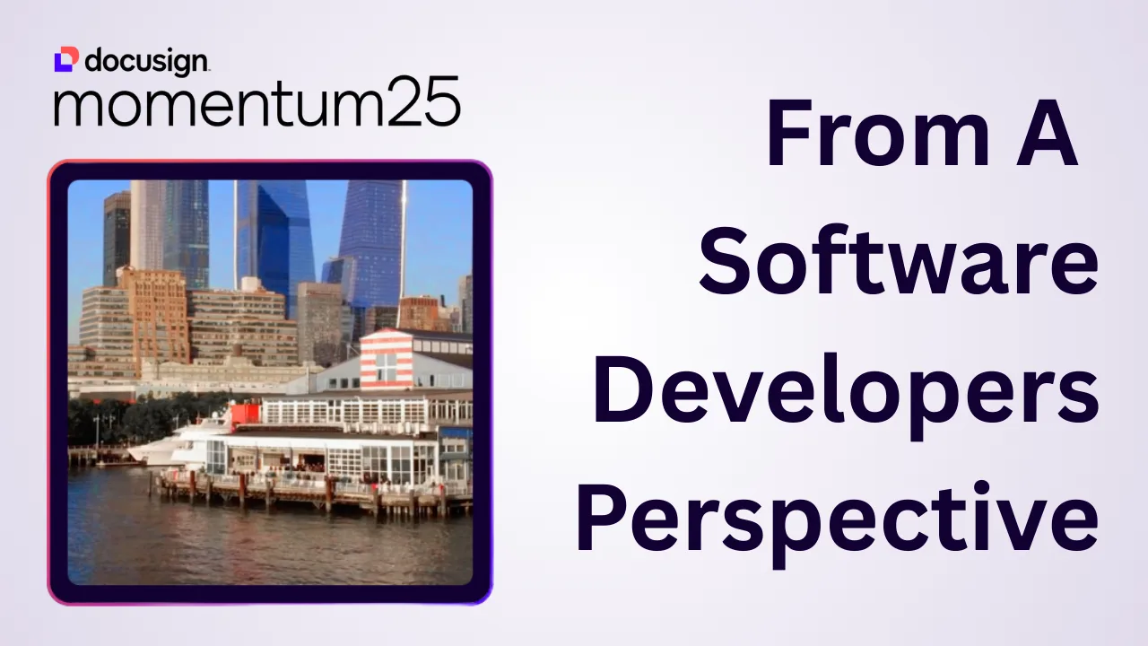
Docusign Momentum 2025 From A Developer’s Perspective
*What if your contract details stuck in PDFs could ultimately become the secret sauce of your business automation workflows?* In a world drowning in PDFs and paperwork, I never thought I’d get goosebumps about agreements – until I attended Docusign Momentum 2025. I went in expecting talks about e-signatures; I left realizing the big push and emphasis with many enterprise-level organizations will be around Intelligent Agreement Management (IAM). It is positioned to transform how we build business software, so let’s talk about it. As Director of Technology at This Dot Labs, I had a front-row seat to all the exciting announcements at Docusign Momentum. Our team also had a booth there showing off the 6 Docusign extension apps This Dot Labs has released this year. We met 1-on-1 with a lot of companies and leaders to discuss the exciting promise of IAM. What can your company accomplish with IAM? Is it really worth it for you to start adopting IAM?? Let’s dive in and find out. After his keynote, I met up with Robert Chatwani, President of Docusign and he said this > “At Docusign, we truly believe that the power of a great platform is that you won’t be able to exactly predict what can be built on top of it,and builders and developers are at the heart of driving this type of innovation. Now with AI, we have entered what I believe is a renaissance era for new ideas and business models, all powered by developers.” Docusign’s annual conference in NYC was an eye-opener: agreements are no longer just documents to sign and shelve, but dynamic data hubs driving key processes. Here’s my take on what I learned, why it matters, and why developers should pay attention. From E-Signatures to Intelligent Agreements – A New Era Walking into Momentum 2025, you could feel the excitement. Docusign’s CEO and product team set the tone in the keynote: “Agreements make the world go round, but for too long they’ve been stuck in inboxes and PDFs, creating drag on your business.” Their message was clear – Docusign is moving from a product to a platform. In other words, the company that pioneered e-signatures now aims to turn static contracts into live, integrated assets that propel your business forward. I saw this vision click when I chatted with an attendee from a major financial services firm. His team manages millions of forms a year – loan applications, account forms, you name it. He admitted they were still “just scanning and storing PDFs” and struggled to imagine how IAM could help. We discussed how much value was trapped in those documents (what Docusign calls the “Agreement Trap” of disconnected processes). By the end of our coffee, the lightbulb was on: with the right platform, those forms could be automatically routed, data-extracted, and trigger workflows in other systems – no more black hole of PDFs. His problem wasn’t unique; many organizations have critical data buried in agreements, and they’re waking up to the idea that it doesn’t have to be this way. What Exactly is Intelligent Agreement Management (IAM)? So what is Docusign’s Intelligent Agreement Management? In essence, IAM is an AI-powered platform that connects every part of the agreement lifecycle. It’s not a single product, but a collection of services and tools working in concert. Docusign IAM helps transform agreement data into insights and actions, accelerate contract cycles, and boost productivity across departments. The goal is to address the inefficiencies in how agreements are created, signed, and managed – those inefficiencies that cost businesses time and money. At Momentum, Docusign showcased the core components of IAM: - Docusign Navigator link: A smart repository to centrally store, search, and analyze agreements. It uses AI to convert your signed documents (which are basically large chunks of text) into structured, queryable data. Instead of manually digging through contracts for a specific clause, you can search across all agreements in seconds. Navigator gives you a clear picture of your organization’s contractual relationships and obligations (think of it as Google for your contracts). Bonus: it comes with out-of-the-box dashboards for things like renewal dates, so you can spot risks and opportunities at a glance. - Docusign Maestro link: A no-code workflow engine to automate agreement workflows from start to finish. Maestro lets you design customizable workflows that orchestrate Docusign tasks and integrate with third-party apps – all without writing code. For example, you could have a workflow for new vendor onboarding: once a vendor contract is signed, Maestro could automatically notify your procurement team, create a task in your project tracker, and update a record in your ERP system. At the conference, they demoed how Maestro can streamline processes like employee onboarding and compliance checks through simple drag-and-drop steps or archiving PDFs of signed agreements into Google Drive or Dropbox. - Docusign Iris (AI Engine) link: The brains of the operation. Iris is the new AI engine powering all of IAM’s “smarts” – from reading documents to extracting data and making recommendations. It’s behind features like automatic field extraction, AI-assisted contract review, intelligent search, and even document summarization. In the keynote, we saw examples of Iris in action: identify key terms (e.g. payment terms or renewal clauses) across a stack of contracts, or instantly generate a summary of a lengthy agreement. These capabilities aren’t just gimmicks; as one Docusign executive put it, they’re “signals of a new way of working with agreements”. Iris essentially gives your agreement workflow a brain – it can understand the content of agreements and help you act on it. - Docusign App Center link: A hub to connect the tools of your trade into Docusign. App Center is like an app store for integrations – it lets you plug in other software (project management, CRM, HR systems, etc.) directly into your Maestro workflows. This is huge for developers (and frankly, anyone tired of building one-off integrations). Instead of treating Docusign as an isolated e-signature tool, App Center makes it a platform you can extend. I’ll dive more into this in the next section, since it’s close to my heart – my team helped build some of these integrations! In short, IAM ties together the stages of an agreement (create → sign → store → manage) and supercharges each with automation and AI. It’s modular, too – you can adopt the pieces you need. Docusign essentially unbundled the agreement process into building blocks that developers and admins can mix-and-match. The future of agreements, as Docusign envisions it, is a world where organizations *“seamlessly add, subtract, and rearrange modular solutions to meet ever-changing needs”* on a single trusted platform. The App Center and Real-World Integrations (Yes, We Built Those!) One of the most exciting parts of Momentum 2025 for me was seeing the Docusign App Center come alive. As someone who works on integrations, I was practically grinning during the App Center demos. Docusign highlighted several partner-built apps that snap into IAM, and I’m proud to say This Dot Labs built six of them – including integrations for Monday.com, Slack, Jira, Asana, Airtable, and Mailchimp. Why are these integrations a big deal? Because developers often spend countless hours wiring up systems that need to talk to each other. With App Center, a lot of that heavy lifting is already done. You can install an app with a few clicks and configure data flows in minutes instead of coding for months. In fact, a study found it takes the average org 12 months to develop a custom workflow via APIs, whereas with Docusign’s platform you can do it via configuration almost immediately. That’s a game-changer for time-to-value. At our This Dot Labs booth, I spoke with many developers who were intrigued by these possibilities. For example, we showed how our Docusign Slack Extension lets teams send Slack messages and notifications when agreements are sent and signed.. If a sales contract gets signed, the Slack app can automatically post a notification in your channel and even attach the signed PDF – no more emailing attachments around. People loved seeing how easily Docusign and Slack now talk to each other using this extension. Another popular one was our Monday.com app. With it, as soon as an agreement is signed, you can trigger actions in Monday – like assigning onboarding tasks for a new client or employee. Essentially, signing the document kicks off the next steps automatically. These integrations showcase why IAM is not just about Docusign’s own features, but about an ecosystem. App Center already includes connectors for popular platforms like Salesforce, HubSpot, Workday, ServiceNow, and more. The apps we built for Monday, Slack, Jira, etc., extend that ecosystem. Each app means one less custom integration a developer has to build from scratch. And if an app you need doesn’t exist yet – well, that’s an opportunity. (Shameless plug: we’re happy to help build it!) The key takeaway here is that Docusign is positioning itself as a foundational layer in the enterprise software stack. Your agreement workflow can now natively include things like project management updates, CRM entries, notifications, and data syncs. As a developer, I find that pretty powerful. It’s a shift from thinking of Docusign as a single SaaS tool to thinking of it as a platform that glues processes together. Not Just Another Contract Tool – Why IAM Matters for Business After absorbing all the Momentum keynotes and sessions, one thing is clear: IAM is not “just another contract management tool.” It’s aiming to be the platform that automates critical business processes which happen to revolve around agreements. The use cases discussed were not theoretical – they were tangible scenarios every developer or IT lead will recognize: - Procurement Automation: We heard how companies are using IAM to streamline procurement. Imagine a purchase order process where a procurement request triggers an agreement that goes out for e-signature, and once signed, all relevant systems update instantly. One speaker described connecting Docusign with their ERP so that vendor contracts and purchase orders are generated and tracked automatically. This reduces the back-and-forth with legal and ensures nothing falls through the cracks. It’s easy to see the developer opportunity: instead of coding a complex procurement approval system from scratch, you can leverage Docusign’s workflow + integration hooks to handle it. Docusign IAM is designed to connect to systems like CRM, HR, and ERP so that agreements flow into the same stream of data. For developers, that means using pre-built connectors and APIs rather than reinventing them. - Faster Employee Onboarding: Onboarding a new hire or client typically involves a flurry of forms and tasks – offer letters or contracts to sign, NDAs, setup of accounts, etc. We saw how IAM can accelerate onboarding by combining e-signature with automated task generation. For instance, the moment a new hire signs their offer letter, Maestro could trigger an onboarding workflow: provisioning the employee in systems, scheduling orientation, and creating tasks in tools like Asana or Monday. All those steps get kicked off by the signed agreement. Docusign Maestro’s integration capabilities shine here – it can tie into HR systems or project management apps to carry the baton forward. The result is a smoother day-one experience for the new hire and less manual coordination for IT and HR. As developers, we can appreciate how this modular approach saves us from writing yet another “onboarding script”; we configure the workflow, and IAM handles the rest. - Reducing Contract Auto-Renewal Risk: If your company manages a lot of recurring contracts (think vendor services, subscriptions, leases), missing a renewal deadline can be costly. One real-world story shared at Momentum was about using IAM to prevent unwanted auto-renewals. With traditional tracking (spreadsheets or calendar reminders), it’s easy to forget a termination notice and end up locked into a contract for another year. Docusign’s solution: let the AI engine (Iris) handle it. It can scan your repository, surface any renewal or termination dates, and proactively remind stakeholders – or even kick off a non-renewal workflow if desired. As the Bringing Intelligence to Obligation Management session highlighted, “Missed renewal windows lead to unwanted auto-renewals or lost revenue… A forgotten termination deadline locks a company into an unneeded service for another costly term.” With IAM, those pitfalls are avoidable. The system can automatically flag and assign tasks well before a deadline hits. For developers, this means we can deliver risk-reduction features without building a custom date-tracking system – the platform’s AI and notification framework has us covered. These examples all connect to a bigger point: agreements are often the linchpin of larger business processes (buying something, hiring someone, renewing a service). By making agreements “intelligent,” Docusign IAM is essentially automating chunks of those processes. This translates to real outcomes – faster cycle times, fewer errors, and less risk. From a technical perspective, it means we developers have a powerful ally: we can offload a lot of workflow logic to the IAM platform. Why code it from scratch if a combination of Docusign + a few integration apps can do it? Why Developers Should Care about IAM (Big Time) If you’re a software developer or architect building solutions for business teams, you might be thinking: This sounds cool, but is it relevant to me? Let me put it this way – after Momentum 2025, I’m convinced that ignoring IAM would be a mistake for anyone in enterprise software. Here’s why: - Faster time-to-value for your clients or stakeholders: Business teams are always pressuring IT to deliver solutions faster. With IAM, you have ready-made components to accelerate projects. Need to implement a contract approval workflow? Use Maestro, not months of coding. Need to integrate Docusign with an internal system? Check App Center for an app or use their APIs with far less glue code. Docusign’s own research shows that connecting systems via App Center and Maestro can cut development time dramatically (from ~12 months of custom dev to mere weeks or less). For us developers, that means we can deliver results sooner, which definitely wins points with the business. - Fewer custom builds (and less maintenance): Let’s face it – maintaining custom scripts or one-off integrations is not fun. Every time a SaaS API changes or a new requirement comes in, you’re back in the code. IAM’s approach offers more reuse and configuration instead of raw code. The platform is doing the hard work of staying updated (for example, when Slack or Salesforce change something in their API, Docusign’s connector app will handle it). By leveraging these pre-built connectors and templates, you write less custom code, which means fewer bugs and lower maintenance overhead. You can focus your coding effort on the unique parts of your product, not the boilerplate integration logic. - Reusable and modular workflows: I love designing systems as Lego blocks – and IAM encourages that. You can build a workflow once and reuse it across multiple projects or clients with slight tweaks. For instance, an approval workflow for sales contracts might be 90% similar to one for procurement contracts – with IAM, you can reuse that blueprint. The fact that everything is on one platform also means these workflows can talk to each other or be combined. This modularity is a developer’s dream because it leads to cleaner architecture. Docusign explicitly touts this modular approach, noting that organizations can easily rearrange solutions on the fly to meet new needs. It’s like having a library of proven patterns to draw from. - AI enhancements with minimal effort: Adding AI into your apps can be daunting if you have to build or train models yourself. IAM essentially gives you AI-as-a-service for agreements. Need to extract key data from 1,000 contracts? Iris can do that out-of-the-box. Want to implement a risk scoring for contracts? The AI can flag unusual terms or deviations. As a developer, being able to call an API or trigger a function that returns “these are the 5 clauses to look at” is incredibly powerful – you’re injecting intelligence without needing a data science team. It means you can offer more value in your applications (and impress those end-users!) by simply tapping into IAM’s AI features. Ultimately, Docusign IAM empowers developers to build more with less code. It’s about higher-level building blocks. This doesn’t replace our jobs – it makes our jobs more focused on the interesting problems. I’d rather spend time designing a great user experience or tackling a complex business rule than coding yet another Docusign-to-Slack integration. IAM is taking care of the plumbing and adding a layer of smarts on top. Don’t Underestimate Agreement Intelligence – Your Call to Action Momentum 2025 left me with a clear call to action: embrace agreement intelligence. If you’re a developer or tech leader, it’s time to explore what Docusign IAM can do for your projects. This isn’t just hype from a conference – it’s a real shift in how we can deliver solutions. Here are a few ways to get started: - Browse the IAM App Center – Take a look at the growing list of apps in the Docusign App Center. You might find that integration you’ve been meaning to build is already available (or one very close to it). Installing an app is trivial, and you can configure it to fit your workflow. This is the low-hanging fruit to immediately add value to your existing Docusign processes. If you have Docusign eSignature or CLM in your stack, App Center is where you extend it. - Think about integrations that could unlock value – Consider the systems in your organization that aren’t talking to each other. Is there a manual step where someone re-enters data from a contract into another system? Maybe an approval that’s done via email and could be automated? Those are prime candidates for an IAM solution. For example, if Legal and Sales use different tools, an integration through IAM can bridge them, ensuring no agreement data falls through the cracks. Map out your agreement process end-to-end and identify gaps – chances are, IAM has a feature to fill them. - Experiment with Maestro and the API – If you’re technical, spin up a trial of Docusign IAM. Try creating a Maestro workflow for a simple use case, or use the Docusign API/SDKs to trigger some AI analysis on a document. Seeing it in action will spark ideas. I was amazed how quickly I could set up a workflow with conditions and parallel steps – things that would take significant coding time if I did them manually. The barrier to entry for adding complex logic has gotten a lot lower. - Stay informed and involved – Docusign’s developer community and IAM documentation are growing. Momentum may be over, but the “agreement intelligence” movement is just getting started. Keep an eye on upcoming features (they hinted at even more AI-assisted tools coming soon). Engage with the community forums or join Docusign’s IAM webinars. And if you’re building something cool with IAM, consider sharing your story – the community benefits from hearing real use cases. My final thought: don’t underestimate the impact that agreement intelligence can have in modern workflows. We spend so much effort optimizing various parts of our business, yet often overlook the humble agreement – the contracts, forms, and documents that initiate or seal every deal. Docusign IAM is shining a spotlight on these and saying, “Here is untapped gold. Let’s mine it.” As developers, we have an opportunity (and now the tools) to lead that charge. I’m incredibly excited about this new chapter. After seeing what Docusign has built, I’m convinced that intelligent agreements can be a foundational layer for digital transformation. It’s not just about getting documents signed faster; it’s about connecting dots and automating workflows in ways we couldn’t before. As I reflect on Momentum 2025, I’m inspired and already coding with new ideas in mind. I encourage you to do the same – check out IAM, play with the App Center, and imagine what you could build when your agreements start working intelligently for you. The future of agreements is here, and it’s time for us developers to take full advantage of it. Ready to explore? Head to the Docusign App Center and IAM documentation and see how you can turn your agreements into engines of growth. Trust me – the next time you attend Momentum, you might just have your own success story to share. Happy building!...
Apr 29, 2025
14 mins

“Music and code have a lot in common,” freeCodeCamp’s Jessica Wilkins on what the tech community is doing right to onboard new software engineers
Before she was a software developer at freeCodeCamp, Jessica Wilkins was a classically trained clarinetist performing across the country. Her days were filled with rehearsals, concerts, and teaching, and she hadn’t considered a tech career until the world changed in 2020. > “When the pandemic hit, most of my gigs were canceled,” she says. “I suddenly had time on my hands and an idea for a site I wanted to build.” That site, a tribute to Black musicians in classical and jazz music, turned into much more than a personal project. It opened the door to a whole new career where her creative instincts and curiosity could thrive just as much as they had in music. Now at freeCodeCamp, Jessica maintains and develops the very JavaScript curriculum that has helped her and millions of developers around the world. We spoke with Jessica about her advice for JavaScript learners, why musicians make great developers, and how inclusive communities are helping more women thrive in tech. Jessica’s Top 3 JavaScript Skill Picks for 2025 If you ask Jessica what it takes to succeed as a JavaScript developer in 2025, she won’t point you straight to the newest library or trend. Instead, she lists three skills that sound simple, but take real time to build: > “Learning how to ask questions and research when you get stuck. Learning how to read error messages. And having a strong foundation in the fundamentals” She says those skills don’t come from shortcuts or shiny tools. They come from building. > “Start with small projects and keep building,” she says. “Books like You Don’t Know JS help you understand the theory, but experience comes from writing and shipping code. You learn a lot by doing.” And don’t forget the people around you. > “Meetups and conferences are amazing,” she adds. “You’ll pick up things faster, get feedback, and make friends who are learning alongside you.” Why So Many Musicians End Up in Tech A musical past like Jessica’s isn’t unheard of in the JavaScript industry. In fact, she’s noticed a surprising number of musicians making the leap into software. > “I think it’s because music and code have a lot in common,” she says. “They both require creativity, pattern recognition, problem-solving… and you can really get into flow when you’re deep in either one.” That crossover between artistry and logic feels like home to people who’ve lived in both worlds. What the Tech Community Is Getting Right Jessica has seen both the challenges and the wins when it comes to supporting women in tech. > “There’s still a lot of toxicity in some corners,” she says. “But the communities that are doing it right—like Women Who Code, Women in Tech, and Virtual Coffee—create safe, supportive spaces to grow and share experiences.” She believes those spaces aren’t just helpful, but they’re essential. > “Having a network makes a huge difference, especially early in your career.” What’s Next for Jessica Wilkins? With a catalog of published articles, open-source projects under her belt, and a growing audience of devs following her journey, Jessica is just getting started. She’s still writing. Still mentoring. Still building. And still proving that creativity doesn’t stop at the orchestra pit—it just finds a new stage. Follow Jessica Wilkins on X and Linkedin to keep up with her work in tech, her musical roots, and whatever she’s building next. Sticker illustration by Jacob Ashley....
Apr 25, 2025
3 mins
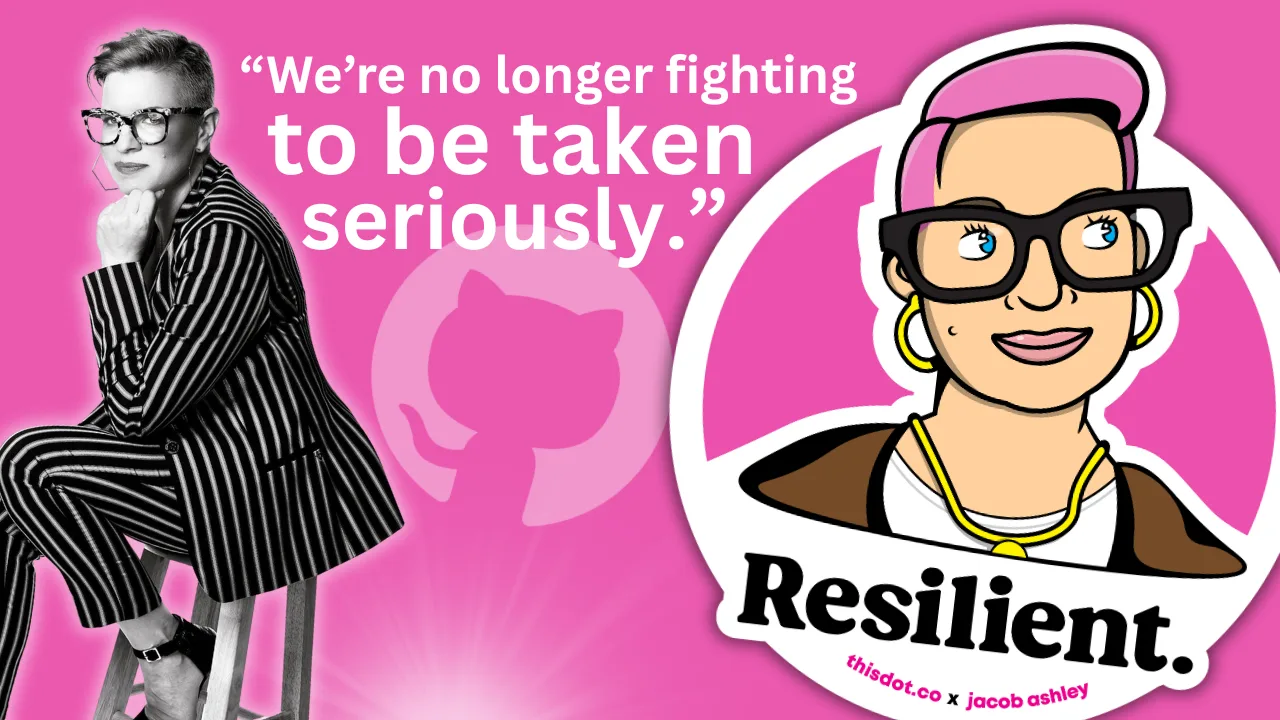
“We were seen as amplifiers, not collaborators,” Ashley Willis, Sr. Director of Developer Relations at GitHub, on How DevRel has Changed, Open Source, and Holding Space as a Leader
Ashley Willis has seen Developer Relations evolve from being on the sidelines of the tech team to having a seat at the strategy table. In her ten years in the space, she’s done more than give great conference talks or build community—she’s helped shape what the DevRel role looks like for software providers. Now as the Senior Director of Developer Relations at GitHub, Ashley is focused on building spaces where developers feel heard, seen, and supported. > “A decade ago, we were seen as amplifiers, not collaborators,” she says. “Now we’re influencing product roadmaps and shaping developer experience end to end.” DevRel Has Changed For Ashley, the biggest shift hasn’t been the work itself—but how it’s understood. > “The work is still outward-facing, but it’s backed by real strategic weight,” she explains. “We’re showing up in research calls and incident reviews, not just keynotes.” That shift matters, but it’s not the finish line. Ashley is still pushing for change when it comes to burnout, representation, and sustainable metrics that go beyond conference ROI. > “We’re no longer fighting to be taken seriously. That’s a win. But there’s more work to do.” Talking Less as a Leader When we asked what the best advice Ashley ever received, she shared an early lesson she received from a mentor: “Your presence should create safety, not pressure.” > “It reframed how I saw my role,” she says. “Not as the one with answers, but the one who holds the space.” Ashley knows what it’s like to be in rooms where it’s hard to speak up. She leads with that memory in mind, and by listening more than talking, normalizing breaks, and creating environments where others can lead too. > “Leadership is emotional labor. It’s not about being in control. It’s about making it safe for others to lead, too.” Scaling More Than Just Tech Having worked inside high-growth companies, Ashley knows firsthand: scaling tech is one thing. Scaling trust is another. > “Tech will break. Roadmaps will shift. But if there’s trust between product and engineering, between company and community—you can adapt.” And she’s learned not to fall for premature optimization. Scale what you have. Don’t over-design for problems you don’t have yet. Free Open Source Isn’t Free There’s one myth Ashley is eager to debunk: that open source is “free.” > “Open source isn’t free labor. It’s labor that’s freely given,” she says. “And it includes more than just code. There’s documentation, moderation, mentoring, emotional care. None of it is effortless.” Open source runs on human energy. And when we treat contributors like an infinite resource, we risk burning them out, and breaking the ecosystem we all rely on. > “We talk a lot about open source as the foundation of innovation. But we rarely talk about sustaining the people who maintain that foundation.” Burnout is Not Admirable Early in her career, Ashley wore burnout like a badge of honor. She doesn’t anymore. > “Burnout doesn’t prove commitment,” she says. “It just dulls your spark.” Now, she treats rest as productive. And she’s learned that clarity is kindness—especially when giving feedback. > “I thought being liked was the same as being kind. It’s not. Kindness is honesty with empathy.” The Most Underrated GitHub Feature? Ashley’s pick: personal instructions in GitHub Copilot. Most users don’t realize they can shape how Copilot writes, like its tone, assumptions, and context awareness. Her own instructions are specific: empathetic, plainspoken, technical without being condescending. For Ashley, that helps reduce cognitive load and makes the tool feel more human. > “Most people skip over this setting. But it’s one of the best ways to make Copilot more useful—and more humane.” Connect with Ashley Willis She has been building better systems for over a decade. Whether it’s shaping Copilot UX, creating safer teams, or speaking truth about the labor behind open source, she’s doing the quiet work that drives sustainable change. Follow Ashley on BlueSky to learn more about her work, her maker projects, and the small things that keep her grounded in a fast-moving industry. Sticker Illustration by Jacob Ashley....
Apr 18, 2025
3 mins
Increasing development velocity with Cursor
Boost your coding efficiency with Cursor, an AI-powered VSCode fork. Learn how features like Autocomplete, Ask, and Agent can streamline development, automate tasks, and enhance productivity....
Apr 18, 2025
11 mins
Internationalization in Next.js with next-intl
Discover how to bring seamless internationalization to your Next.js app using next-intl...
Apr 11, 2025
4 mins
Let's innovate together!
We're ready to be your trusted technical partners in your digital innovation journey.
Whether it's modernization or custom software solutions, our team of experts can guide you through best practices and how to build scalable, performant software that lasts.