Web Components with Svelte
Svelte is a great framework for building applications, but did you know you can create custom elements and web components with it?
In this post, we'll learn how to create a Svelte component, export it as a custom element, and use it. We'll also learn about limitations when doing it.
Developing
Let's start a new project to build our components.
npm init vite

✔ Project name: · svelte-web-components
✔ Select a framework: · svelte
✔ Select a variant: · svelte-ts

cd svelte-web-components
pnpm install //use the package manager you prefer
pnpm run dev
For this example, we will not be building a Svelte application, but we will need at least a demo page to test all our web components.
We can delete the src/App.svelte file and modify the file located at main.ts to export the files in our library folder, instead of mounting our application.
// src/main.ts
export * from './lib/Counter.svelte'
Then, we need to give a tag to our web component. To achieve this, we need to add a special Svelte element to our component.
<script lang="ts">
  let count: number = 0
  const increment = () => {
    count += 1
  }
</script>

<!--Add this line to your web component-->
<svelte:options tag="my-counter" />

<button on:click={increment}>
  Clicks: {count}
</button>

<style>
  button {
    font-family: inherit;
    font-size: inherit;
    padding: 1em 2em;
    color: #ff3e00;
    background-color: rgba(255, 62, 0, 0.1);
    border-radius: 2em;
    border: 2px solid rgba(255, 62, 0, 0);
    outline: none;
    width: 200px;
    font-variant-numeric: tabular-nums;
    cursor: pointer;
  }

  button:focus {
    border: 2px solid #ff3e00;
  }

  button:active {
    background-color: rgba(255, 62, 0, 0.2);
  }
</style>
The assigned tag is the one that will be used later as a regular HTML element.
For this component: <my-counter></my-counter>
Note: You can also set tag={null} and let the consumer define the tag.
// ...
customElements.define('my-counter', Counter);
It's time to update our demo page to use the web component that will be generated.
<!-- index.html -->

<!DOCTYPE html>
<html lang="en">
  <head>
    <meta charset="UTF-8" />
    <link rel="icon" href="/favicon.ico" />
    <meta name="viewport" content="width=device-width, initial-scale=1.0" />
    <title>Svelte + TS + Vite App</title>
  </head>
  <body>
    <my-counter></my-counter>
    <script type="module" src="/src/main.ts"></script>
  </body>
</html>
I removed the <div id="app"> because we will not be using it. Then, I added our custom element tag to the body of the site.
Finally, we need to tell the compiler that we want to compile our Svelte components as custom elements.
Go to vite.config.js and update it like this:
import { defineConfig } from 'vite';
import { svelte } from '@sveltejs/vite-plugin-svelte';

// https://vitejs.dev/config/
export default defineConfig({
  plugins: [
    svelte({
      compilerOptions: {
        customElement: true,
      },
    }),
  ],
});
Let's run our application (pnpm run dev). You should be able to see our web component in action.
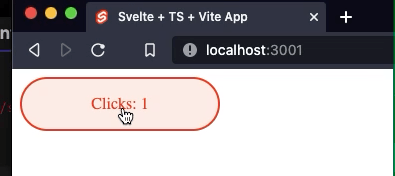
It works!
Now, let's create a second web component.
I'll add a clock that will display the current time.
<!-- lib/Clock.svelte -->
<svelte:options tag="my-clock" />

<script lang="ts">
  import { onMount, onDestroy } from 'svelte';
  let date = new Date().toLocaleTimeString();
  let interval;

  onMount(() => {
    interval = setInterval(() => {
      date = new Date().toLocaleTimeString()
    }, 1000);
  });

  onDestroy(() => {
    clearInterval(interval);
  });
</script>

<span>{date|| '' }</span>

<style>
  span {
    font-family: inherit;
    font-size: inherit;
    padding: 1em 2em;
    color: #ff3e00;
    background-color: rgba(255, 62, 0, 0.1);
    border-radius: 2em;
    border: 2px solid rgba(255, 62, 0, 0);
    outline: none;
    width: 200px;
    font-variant-numeric: tabular-nums;
    cursor: pointer;
  }

  span:active {
    background-color: rgba(255, 62, 0, 0.2);
  }
</style>
We should not forget to export it in our main.ts file.
export * from './lib/Counter.svelte'
export * from './lib/Clock.svelte'
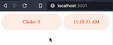
And finally, use it in our index.html file.
<!DOCTYPE html>
<html lang="en">
<!-- ... -->
  <body>
    <my-counter></my-counter>
    <my-clock></my-clock>
    <script type="module" src="/src/main.ts"></script>
  </body>
</html>
Let's run our application, and see the result.
Building
We can keep adding as many web components as we want, but let's inspect our build output.
pnpm run build

vite v2.4.3 building for production...
✓ 6 modules transformed.
dist/index.html                  0.46kb
dist/assets/index.fdfcd12f.js    1.99kb / brotli: 0.67kb
dist/assets/vendor.4be80997.js   5.67kb / brotli: 2.13kb
Our components are bundled together (index.*.js), and the common code is in vendor.*.js. This might be a bit unfortunate if you want to distribute this as a library.
So let's analyze our options:
Bundle our library
If we want to create a single file for our output, we can use the lib option in our vite config.
Let's create a new config file vite.lib.config.js
import { defineConfig } from 'vite'
import { svelte } from '@sveltejs/vite-plugin-svelte'

// https://vitejs.dev/config/
export default defineConfig({
  build:{
    lib:{
      entry: './src/main.ts',
      name: 'MyLibrary',
    }
  },
  plugins: [svelte({
    compilerOptions:{
      customElement: true
    }
  })]
})
Now, we need to run our build process with the right config file.
pnpm run build -- -c=vite.lib.config.js

vite v2.4.3 building for production...
✓ 5 modules transformed.
dist/svelte-web-components.es.js   7.37kb / brotli: 2.60kb
dist/svelte-web-components.umd.js   7.46kb / brotli: 2.64kb
By default, the build.lib options will bundle your library in two formats: es and umd. You can configure it by adding the formats property to the lib settings. Available options are: 'es' | 'cjs' | 'umd' | 'iife'
Everything split
A third option would be to build everything as an independent web component, and a shared code file.
Let's create a different config file for this vite.split.config.js.
import { defineConfig } from 'vite';
import { svelte } from '@sveltejs/vite-plugin-svelte';

// https://vitejs.dev/config/
export default defineConfig({
  build:{
    rollupOptions: {
      input: ['./src/lib/Counter.svelte', './src/lib/Clock.svelte'],
    }
  },
  plugins: [
    svelte({
      compilerOptions: {
        customElement: true,
      },
    })
  ]
});
The output of this build would look like this:
pnpm run build -- -c=vite.split.config.js

vite v2.4.3 building for production...
✓ 4 modules transformed.
dist/assets/Counter.be2b21b7.js   1.03kb / brotli: 0.52kb
dist/assets/Clock.ca5b7224.js     1.09kb / brotli: 0.53kb
dist/assets/vendor.4be80997.js    5.67kb / brotli: 2.13kb
As you can see, we now have our counter and clock as independent chunks, and both depend on vendor.*.js
You can be specific on how many chunks you want, and what to bundle together or not.
Working with regular Svelte components and custom elements in the same project
When a project is set up to compile to web components, it will try to compile every .svelte file, including your App.svelte file, which may not be what you want.
Let's create a new project, and set it up to work with Svelte components along with other components that will be compiled into custom elements.
npm init vite

✔ Project name: · svelte-web-components-mix
✔ Select a framework: · svelte
✔ Select a variant: · svelte-ts

cd svelte-web-components
pnpm install
pnpm run dev
I will copy the Clock.svelte file from the previous project, and leave the Counter as it is.
We have a problem now. We cannot compile the clock as a custom element, and if we try to do it by modifying the config, the compiler will complain that our App and Counter do not have tags to be compiled.
Luckily, we can have different settings for different files.
// vite.config.js

import { defineConfig } from 'vite'
import { svelte } from '@sveltejs/vite-plugin-svelte'

// https://vitejs.dev/config/
export default defineConfig({
  plugins: [
    svelte({
      exclude: ['./src/lib/Clock.svelte']
    }),
    svelte({
      exclude: ['./src/App.svelte', './src/lib/Counter.svelte'],
      compilerOptions: {
        customElement: true,
      }
    })
  ]
})
As you can see, we set up the Svelte plugin twice, and exclude the files that we need to.
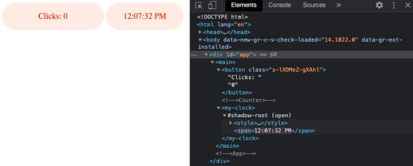
Finally, we will update our App.svelte file to include our Clock custom element, and use it.
<!-- App.svelte -->
<script lang="ts">
  import Counter from './lib/Counter.svelte'
  import './lib/Clock.svelte'
</script>

<main>
  <Counter />
  <my-clock></my-clock>
</main>
If we run our application now, and inspect the document, we will confirm that we are using a web component for the clock along the compiled counter.
Things to consider when building custom elements
There are some limitations/features of custom elements that work differently when working with web components
- To prevent props from being accessed from the DOM, add
accessors={false}to thesvelte:optionselement - Use a regular CustomEvent instead of the usual
createEventDispatchermethod from Svelte when emitting from a web component. Addcomposed:trueto cross the Shadow DOM boundaries
<script>
function onClick(e) {
    e.target.dispatchEvent(new CustomEvent('message', {detail:{text:'Hello'}, composed:true}))
}
</script>

<button on:click={onClick} bind:this={buttonEl}>click me</button>
- Some browsers do not support them. (Polyfills are required)
- Shadow DOM is not available server-side.
- Styles are encapsulated and not scoped. External/global styles will not be applied.
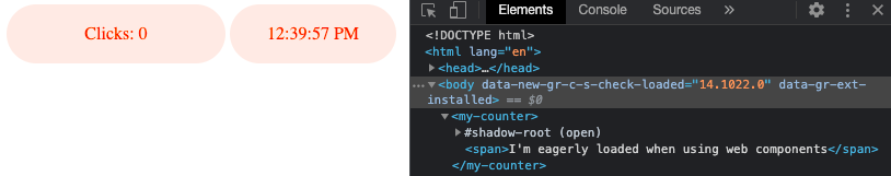
- In the DOM, slotted content renders eagerly.
This means that it will be added even if it's not shown.
{#if condition}
<slot></slot>
{/if}
Avoid using slotted content inside #each blocks, as it will not be rerendered. As a general rule, avoid putting a <slot></slot> inside a template modifier as it will not work as expected.
Final thoughts
As you can see, there are plenty of options for developing and bundling your app and web components.
You can find a repo with the final code here.
I hope this post will help you explore what you can do with Svelte, and custom elements.