Skip to content

Web Components Communication Using an Event Bus

This article was written over 18 months ago and may contain information that is out of date. Some content may be relevant but please refer to the relevant official documentation or available resources for the latest information.

Imagine you're building a Single Page Application using Web Components only. You have several pages, have configured the routes, and need to be able to handle general events or actions.

Here's when you start to think about potential solutions as well: Maybe it's time to add state management to the application? Is it a good time to build a "custom" solution? What about using some design patterns in this case?

The answers to these questions will depend on the complexity of the current scenario, the experience of the developers, or on the opinions of the team. It is clear that there is no absolute answer!

In this article, we'll go over how to communicate between components using a custom Event Bus implementation.

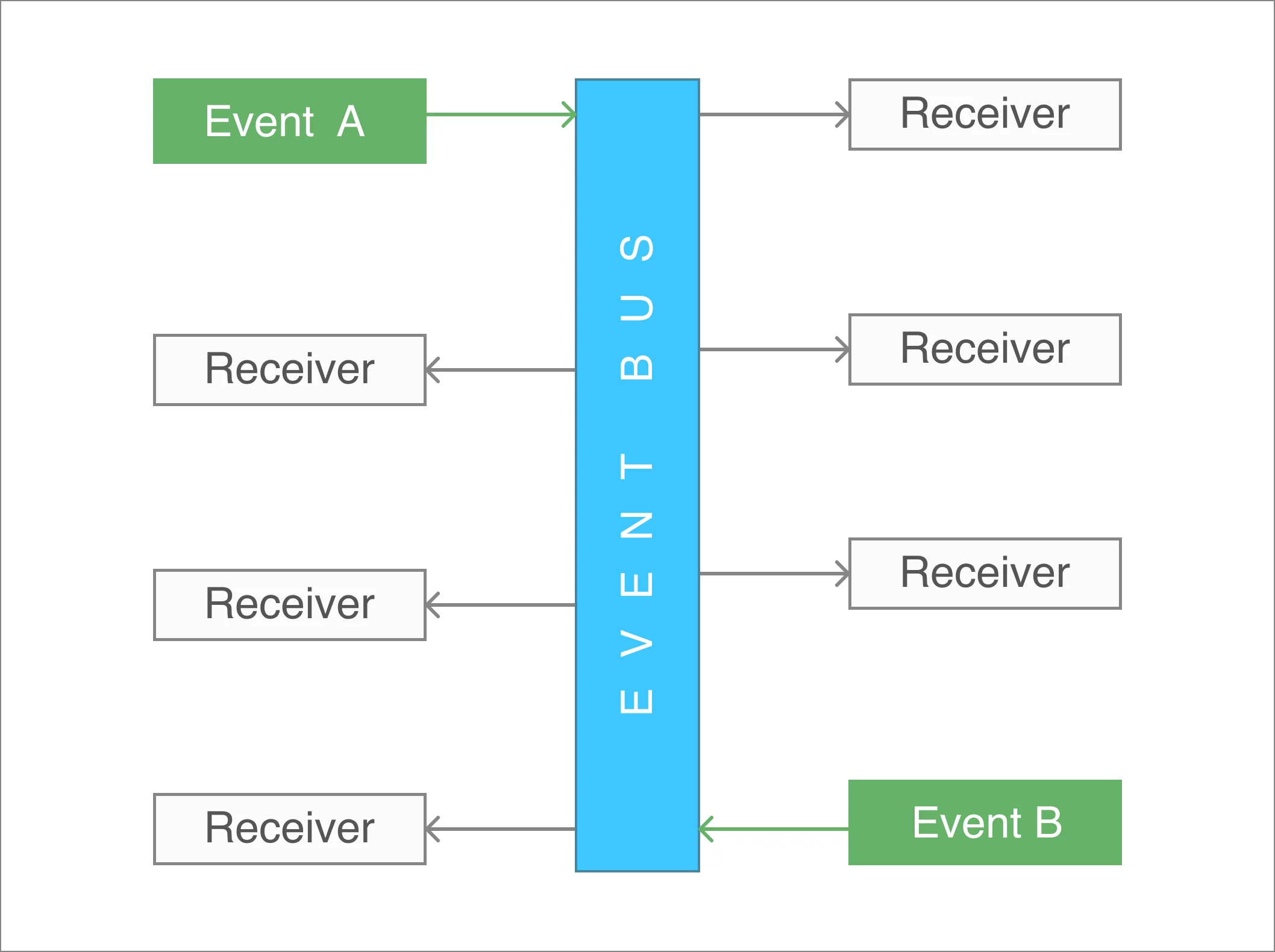
What is an Event Bus?

The Event Bus idea is generally associated with the Publish-subscribe pattern:

Publish–subscribe is a messaging pattern where senders of messages, called publishers, do not program the messages to be sent directly to specific receivers, called 'subscribers', but instead, categorize published messages into classes without knowledge of subscribers

In other words, an Event Bus can be considered as a global way to transport messages or events to make them accessible from any place within the application.

Event Bus

Web Components Communication

When you're working with Web Components through LitElement, it's usual firing events for sending messages between them. You can use either Standard or Custom events.

  • Fire a Standard Event using new Event('event')
  • Fire a Custom Event using new CustomEvent('event', {...options})

For a practical example, let's assume we have two components at this time: The first one could be named as a parent component and the second one as the child component

The Child Component

The child component is defined as a custom button implementation only.

import { LitElement, html, property, customElement, css } from 'lit-element';

export interface MyButtonEvent {
  label: string;
  date: string;
}

@customElement('my-button')
class MyButton extends LitElement {
  static styles = css`
    :host {
      display: inline-block;
      padding: 10px;
      background: #5fe1ee;
      border-radius: 5px;
      cursor: pointer;
    }
  `;

  @property({ type: String }) label: string = 'Hello LitElement';

  constructor() {
    super();
  }

  render() {
    return html`
      <span @click=${this.handleClick}>
        ${this.label}
      </span>
    `;
  }

  private handleClick(e: MouseEvent) {
    this.dispatchEvent(new Event("myClick"));
  }
}

The above code snippet does the following:

  • It creates a model for the data to be passed through a Custom Event. The model is defined as an interface called MyButtonEvent.
  • Next, the component is created using a TypeScript class with the help of the LitElement decorators
    • The @customElement decorator allows the component definition using a name for it: my-button. It is applied at the class level.
    • The static styles attribute defines the styles for the component using a tagged template literal(css)
    • The @property decorator, which allows declaring properties in a readable way.
    • The render method returns the HTML content through a template literal(html). This function will be called any time label property changes.

Now pay attention to the render() method. It does use the @click binding into the template. And this allows capturing the click event itself in a declarative way.

The Parent Component

The parent component works as a container since it will be in charge of the custom button rendering. Here's how the template will be using the child component:

<my-button label="Show Alert"> </my-button>

However, in a real-world scenario, this parent component we'll need to handle the child event myClick once it gets fired.

// my-container.ts

import { LitElement, html, customElement, css } from "lit-element";
import "./my-button";

@customElement("my-container")
class MyContainer extends LitElement {
  static styles = css`
    :host {
      display: block;
    }
  `;

  constructor() {
    super();
  }

  render() {
    return html`
      <my-button @myClick=${this.handleClick} label="Hello LitElement">
      </my-button>
    `;
  }

  private handleClick(e: Event) {
    console.log("MyContainer, myClick", e);
  }
}

Find a brief explanation of the previous code snippet before starting to use the Event Bus.

  • The render function defines a template literal, and makes use of the my-button element using <my-button></my-button> as if it were part of the HTML vocabulary
    • The @myClick attribute sets a function reference to handle the event in a declarative syntax.
    • The label attribute sets the text displayed in the button. Anytime it changes, the button will be rendered again.
  • The handleClick function receives an Event object with more information about it. Open your browser's console, and feel free to inspect this value.

In case you require sending data along with the event, the handleClick method can be updated accordingly:

  private handleClick(e: CustomEvent<MyButtonEvent>) {
    const detail: MyButtonEvent = e.detail;
    // Process the 'detail' object here
  }

Event Bus Communication

For this example, we can assume that the parent component will act as the "root" of all events to be used through the Event Bus object.

Then, let's register an alert event in the constructor method. The purpose of it will be to render an alert message from different places in the application.

// my-container.ts

class MyContainer extends LitElement {

  private alertRegistry: Registry;

  constructor() {
    super();

    this.alertRegistry = EventBus.getInstance().register(
      'alert',
      (message: string) => {
        AlertManager.showAlert(message);
      }
    );
  }
}

Once you register an event, you can get the Registry object to be able to unregister later.

You're ready to go!

As a next step, let's dispatch an alert event every time the button gets "clicked". This can be done within the handleClick function:

  // my-container.ts
  private handleClick(e: CustomEvent<MyButtonEvent>) {
    const detail: MyButtonEvent = e.detail;
    EventBus.getInstance().dispatch('alert', `Alert at ${detail.date}`);
  }

Now the Event Bus is working as expected. You can start registering/dispatching other events from other components. They do not need to be related in any way, since the communication channel for this type of event will be the Event Bus.

Unregistering from the Event Bus

It's important to keep track of the different events you're registering to avoid potential memory leaks in the application.

For this example, we'll enable displaying the alert message only for the first time. Other clicks over the "Show Alert" button won't take any effect or dispatch actions through the Event Bus.

Let's update the parent component.

// my-container.ts

  private handleClick(e: CustomEvent<MyButtonEvent>) {
    const detail: MyButtonEvent = e.detail;

    EventBus.getInstance().dispatch('alert', `Alert at ${detail.date}`);
    this.alertRegistry.unregister();
  }

The last line of the handleClick method ensures the unregistering process from the Event Bus. Thus, other calls for the alert event will be ignored.

Live Demo

Wanna play around with this code? Just open the embedded Stackblitz editor:

Conclusion

In this article, I described two ways to communicate and pass data between components.

  • In case the components are related, it is clear that the best way to communicate them is through simple or custom events.
  • If you're planning to send events across the entire application, no matter the component or the module, then the Event Bus may work for you. In other words, it's a way to just send Events to a common channel without knowing who is going to process the message at the end.

Feel free to reach out on Twitter if you have any questions. Follow me on GitHub to see more about my work. Be ready for more articles about Lit in this blog.

This Dot is a consultancy dedicated to guiding companies through their modernization and digital transformation journeys. Specializing in replatforming, modernizing, and launching new initiatives, we stand out by taking true ownership of your engineering projects.

We love helping teams with projects that have missed their deadlines or helping keep your strategic digital initiatives on course. Check out our case studies and our clients that trust us with their engineering.

You might also like

Implementing Dynamic Types in Docusign Extension Apps cover image

Implementing Dynamic Types in Docusign Extension Apps

Implementing Dynamic Types in Docusign Extension Apps In our previous blog post about Docusign Extension Apps, Advanced Authentication and Onboarding Workflows with Docusign Extension Apps, we touched on how you can extend the OAuth 2 flow to build a more powerful onboarding flow for your Extension Apps. In this blog post, we will continue explaining more advanced patterns in developing Extension Apps. For that reason, we assume at least basic familiarity with how Extension Apps work and ideally some experience developing them. To give a brief recap, Docusign Extension Apps are a powerful way to embed custom logic into Docusign agreement workflows. These apps are lightweight services, typically cloud-hosted, that integrate at specific workflow extension points to perform custom actions, such as data validation, participant input collection, or interaction with third-party services. Each Extension App is configured using a manifest file. This manifest defines metadata such as the app's author, support links, and the list of extension points it uses (these are the locations in the workflow where your app's logic will be executed). The extension points that are relevant for us in the context of this blog post are GetTypeNames and GetTypeDefinitions. These are used by Docusign to retrieve the types supported by the Extension App and their definitions, and to show them in the Maestro UI. In most apps, these types are static and rarely change. However, they don't have to be. They can also be dynamic and change based on certain configurations in the target system that the Extension App is integrating with, or based on the user role assigned to the Maestro administrator on the target system. Static vs. Dynamic Types To explain the difference between static and dynamic types, we'll use the example from our previous blog post, where we integrated with an imaginary task management system called TaskVibe. In the example, our Extension App enabled agreement workflows to communicate with TaskVibe, allowing tasks to be read, created, and updated. Our first approach to implementing the GetTypeNames and GetTypeDefinitions endpoints for the TaskVibe Extension App might look like the following. The GetTypeNames endpoint returns a single record named task: ` Given the type name task, the GetTypeDefinitions endpoint would return the following definition for that type: ` As noted in the Docusign documentation, this endpoint must return a Concerto schema representing the type. For clarity, we've omitted most of the Concerto-specific properties. The above declaration states that we have a task type, and this type has properties that correspond to task fields in TaskVibe, such as record ID, title, description, assignee, and so on. The type definition and its properties, as described above, are static and they never change. A TaskVibe task will always have the same properties, and these are essentially set in stone. Now, imagine a scenario where TaskVibe supports custom properties that are also project-dependent. One project in TaskVibe might follow a typical agile workflow with sprints, and the project manager might want a "Sprint" field in every task within that project. Another project might use a Kanban workflow, where the project manager wants a status field with values like "Backlog," "ToDo," and so on. With static types, we would need to return every possible field from any project as part of the GetTypeDefinitions response, and this introduces new challenges. For example, we might be dealing with hundreds of custom field types, and showing them in the Maestro UI might be too overwhelming for the Maestro administrator. Or we might be returning fields that are simply not usable by the Maestro administrator because they relate to projects the administrator doesn't have access to in TaskVibe. With dynamic types, however, we can support this level of customization. Implementing Dynamic Types When Docusign sends a request to the GetTypeNames endpoint and the types are dynamic, the Extension App has a bit more work than before. As we've mentioned earlier, we can no longer return a generic task type. Instead, we need to look into each of the TaskVibe projects the user has access to, and return the tasks as they are represented under each project, with all the custom fields. (Determining access can usually be done by making a query to a user information endpoint on the target system using the same OAuth 2 token used for other calls.) Once we find the task definitions on TaskVibe, we then need to return them in the response of GetTypeNames, where each type corresponds to a task for the given project. This is a big difference from static types, where we would only return a single, generic task. For example: ` The key point here is that we are now returning one type per task in a TaskVibe project. You can think of this as having a separate class for each type of task, in object-oriented lingo. The type name can be any string you choose, but it needs to be unique in the list, and it needs to contain the minimum information necessary to be able to distinguish it from other task definitions in the list. In our case, we've decided to form the ID by concatenating the string "task_" with the ID of the project on TaskVibe. The implementation of the GetTypeDefinitions endpoint needs to: 1. Extract the project ID from the requested type name. 1. Using the project ID, retrieve the task definition from TaskVibe for that project. This definition specifies which fields are present on the project's tasks, including all custom fields. 1. Once the fields are retrieved, map them to the properties of the Concerto schema. The resulting JSON could look like this (again, many of the Concerto properties have been omitted for clarity): ` Now, type definitions are fully dynamic and project-dependent. Caching of Type Definitions on Docusign Docusign maintains a cache of type definitions after an initial connection. This means that changes made to your integration (particularly when using dynamic types) might not be immediately visible in the Maestro UI. To ensure users see the latest data, it's useful to inform them that they may need to refresh their Docusign connection in the App Center UI if new fields are added to their integrated system (like TaskVibe). As an example, a newly added custom field on a TaskVibe project wouldn't be reflected until this refresh occurs. Conclusion In this blog post, we've explored how to leverage dynamic types within Docusign Extension Apps to create more flexible integrations with external systems. While static types offer simplicity, they can be constraining when working with external systems that offer a high level of customization. We hope that this blog post provides you with some ideas on how you can tackle similar problems in your Extension Apps....

End-to-end type-safety with JSON Schema cover image

End-to-end type-safety with JSON Schema

End-to-end type-safety with JSON Schema I recently wrote an introduction to JSON Schema post. If you’re unfamiliar with it, check out the post, but TLDR: It’s a schema specification that can be used to define the input and output data for your JSON API. In my post, I highlight many fantastic benefits you can reap from defining schemas for your JSON API. One of the more interesting things you can achieve with your schemas is end-to-end type safety from your backend API to your client application(s). In this post, we will explore how this can be accomplished slightly deeper. Overview The basic idea of what we want to achieve is: * a JSON API server that validates input and output data using JSON Schema * The JSON Schema definitions that our API uses transformed into TypeScript types With those pieces in place, we can achieve type safety on our API server and the consuming client application. The server side is pretty straightforward if you’re using a server like Fastify with already enabled JSON Schema support. This post will focus on the concepts more than the actual implementation details though. Here’s a simple diagram illustrating the high-level concept: We can share the schema and type declaration between the client and server. In that case, we can make a request to an endpoint where we know its type and schema, and assuming the server validates the data against the schema before sending it back to the client, our client can be confident about the type of the response data. Marrying JSON Schema and TypeScript There are a couple of different ways to accomplish this: * Generating types from schema definitions using code generation tools * Creating TypeBox definitions that can infer TypeScript types and be compiled to JSON Schema I recommend considering both and figuring out which would better fit your application and workflows. Like anything else, each has its own set of trade-offs. In my experience, I’ve found TypeBox to be the most compelling if you want to go deep with this pattern. Code generation A couple of different packages are available for generating TS types from JSON Schema definitions. * https://github.com/bcherny/json-schema-to-typescript * https://github.com/vega/ts-json-schema-generator They are CLI tools that you can provide a glob path to where your schema files are located and will generate TS declaration files to a specified output path. You can set up an npm hook or a similar type of script that will generate types for your development environment. TypeBox TypeBox is a JSON Schema type builder. With this approach, instead of json files, we define schemas in code using the TypeBox API. The TypeBox definitions infer to TypeScript types directly, which eliminates the code generation step described above. Here’s a simple example from the documentation of a JSON Schema definition declared with TypeBox: ` This can then be inferred as a TypeScript type: ` Aside from schemas and types, TypeBox can do a lot more to help us on our type-safety journey. We will explore it a bit more in upcoming sections. Sharing schemas between client and server applications Sharing our JSON Schema between our server and client app is the main requirement for end-to-end type-safety. There are a couple of different ways to accomplish this, but the simplest would be to set up our codebase as a monorepo that contains both the server and client app. Some popular options for TypeScript monorepos are: PNPM, Turborepo, and NX. If a monorepo is not an option, you can publish your schema and types as a package that can be installed in both projects. However, this setup would require a lot more maintenance work. Ultimately, as long as you can import your schemas and types from the client and server app, you are in good shape. Server-to-client validation and type-safety For the sake of simplicity, let's focus on data flowing from the server to the client for now. Generally speaking, the concepts also apply in reverse, as long as your JSON API server validates your inputs and outputs. We’ll look at the most basic version of having strongly typed data on the client from a request to our server. Type-safe client requests In our server application, if we validate the /users endpoint with a shared schema - on the client side, when we make the request to the endpoint, we know that the response data is validated using the user schema. As long as we are confident of this fact, we can use the generated type from that schema as the return type on our client fetch call. Here’s some pseudocode: ` Our server endpoint would look something like this: ` You could get creative and build out a map that defines all of your endpoints, their metadata, and schemas, and use the map to define your server endpoints and create an API client. Transforming data over the wire Everything looks stellar, but we can still take our efforts a bit further. To this point, we are still limited to serialized JSON data. If we have a created_at field (number or ISO string) tied to our user, and we want it to be a Date object when we get a hold of it on the client side - additional work and consideration are required. There are some different strategies out there for deserializing JSON data. The great thing about having shared schemas between our client and server is that we can encode our type information in the schema without sending additional metadata from our server to the client. Using format to declare type data In my initial JSON Schema blog post, I touched on the format field of the specification. In our schema, if the actual type of our date is a string in ISO8601 format, we can declare our format to be "date-time". We can use this information on the client to transform the field into a proper Date object. ` Transforming serialized JSON Data This can be a little bit tricky; again, there are many ways to accomplish it. To demonstrate the concept, we’ll use TypeBox to define our schemas as discussed above. TypeBox provides a Transform type that you can use to declare, encode, and decode methods for your schema definition. ` It even provides helpers to statically generate the decoded and encoded types for your schema ` If you declare your decode and encode functions for your schemas, you can then use the TypeBox API to handle decoding the serialized values returned from your JSON API. Here’s what the concept looks like in practice fetching a user from our API: ` Nice. You could use a validation library like Zod to achieve a similar result but here we aren’t actually doing any validation on our client side. That happened on the server. We just know the types based on the schema since both ends share them. On the client, we are just transforming our serialized JSON into what we want it to be in our client application. Summary There are a lot of pieces in play to accomplish end-to-end type safety. With the help of JSON Schema and TypeBox though, it feels like light work for a semi-roll-your-own type of solution. Another great thing about it is that it’s flexible and based on pretty core concepts like a JSON API paired with a TypeScript-based client application. The number of benefits that you can reap from defining JSON Schemas for your APIs is really great. If you’re like me and wanna keep it simple by avoiding GraphQL or other similar tools, this is a great approach....

How to Create Standalone Components in Angular cover image

How to Create Standalone Components in Angular

Angular has become one of the most popular frameworks to build web applications today. One of the key features of the framework is its component-based architecture, which allows best practices like modularity and reusability. Each Angular component consists of a template, a TypeScript class and metadata. In this blog post, we will dive deeper into standalone components, and we will explore the anatomy of an application based on them. For the demo application, we will create a card-like component which can be used to render blog posts in a web application. Prerequisites You'll need to have installed the following tools in your local environment: * The latest LTS version of Node.js is recommended. * Either NPM or Yarn as a package manager. * The Angular CLI tool(Command-line interface for Angular). Initialize the Project Let's create a project from scratch using the Angular CLI tool: ` This command will initialize a base project using some configuration options: * --routing. It will create a routing module. * --prefix corp. It defines a prefix to be applied to the selectors for created components(corp in this case). The default value is app. * --style css. The file extension for the styling files. * --skip-tests. Disable the generation of testing files for the new project. If you pay attention to the generated files and directories, you'll see an initial project structure including the main application module and component: ` Creating Standalone Components First, let's create the custom button to be used as part of the Card component later. Run the following command on your terminal: ` It will create the files for the component. The --standalone option will generate the component as _standalone_. Let's update the button.component.ts file using the content below. ` Pay attention to this component since it's marked as standalone: true. Starting with Angular v15: components, directives, and pipes can be marked as standalone by using the flag standalone. When a class is marked as _standalone_, it does not need to be declared as part of an NgModule. Otherwise, the Angular compiler will report an error. Also, imports can be used to reference the dependencies. > The imports property specifies the standalone component's template dependencies — those directives, components, and pipes that can be used within its template. Standalone components can import other standalone components, directives, and pipes as well as existing NgModules. Next, let's create the following components: card-title, card-content, card-actions and card. This can be done at once using the next commands. ` On card-title.component.ts file, update the content as follows: ` Next, update the card-content.component.ts file: ` The card-actions.component.ts file should have the content below: ` Finally, the card.component.ts file should be defined as follows: ` Using Standalone Components Once all Standalone components are created, we can use them without the need to define an NgModule. Let's update the app.component.ts file as follows: ` Again, this Angular component is set as standalone: true and the imports section specifies the other components created as dependencies. Then, we can update the app.component.html file and use all the standalone components. ` This may not work yet, since we need to configure the Angular application and get rid of the autogenerated module defined under the app.module.ts file. Bootstrapping the Application Angular provides a new API to use a standalone component as the application's root component. Let's update the main.ts file with the following content: ` As you can see, we have removed the previous bootstrapModule call and the bootstrapApplication function will render the standalone component as the application's root component. You can find more information about it here. Live Demo and Source Code Want to play around with this code? Just open the Stackblitz editor or the preview mode in fullscreen. Conclusion We’re now ready to use and configure the Angular components as standalone and provide a simplified way to build Angular applications from scratch. Do not forget that you can mark directives and pipes as standalone: true. If you love Angular as much as we do, you can start building today using one of our starter.dev kits or by looking at their related showcases for more examples....

AI Is Speeding Up Development. But Where Are the New Bottlenecks? cover image

AI Is Speeding Up Development. But Where Are the New Bottlenecks?

AI is accelerating development, but it’s also exposing everything else that’s broken. At the Leadership Exchange, leaders unpacked how AI is reshaping the SDLC and what organizations need to address beyond just coding to make adoption successful. Moderated by Rob Ocel, VP of Innovation at This Dot Labs, the panel featured Itai Gerchikov at Anthropic and Harald Kirschner, Principal Product Manager for GitHub Copilot & VS Code at Microsoft. Panelists explored the current state of AI adoption across the software development lifecycle and shared practical insights into how organizations can effectively integrate AI tools. Panelists discussed how companies are investing in AI tools, skills, and managed competency programs to support developers. While AI can dramatically accelerate coding, the panel emphasized that adoption affects every stage of the SDLC. Bottlenecks now appear in testing, DevOps, product delivery, and marketing as AI speeds up development. Organizations that address technical debt and process inefficiencies are better positioned to extract maximum value from AI tools. The conversation also focused on opportunities and risks. Security, governance, and workforce education were highlighted as critical factors for adoption. Panelists stressed that AI initiatives should be aligned with broader business goals rather than pursued in isolation. They noted that companies experimenting at the cutting edge need to consider organizational readiness just as carefully as technical capabilities. Panelists also explored how leading organizations are navigating the early stages of adoption. Those ahead of the curve are using structured experimentation, prioritizing process improvements, and continuously evaluating outcomes to refine their AI strategies. Learning from these early adopters allows other organizations to anticipate emerging trends and prepare for the next phase of AI adoption rather than simply replicating past approaches. Key Takeaways - Investing in AI skills and tools should be done thoughtfully, with clear alignment to business objectives. - Examining the full SDLC helps identify bottlenecks that AI may accelerate or expose. - Organizations can gain a competitive advantage by learning from early adopters and planning for where AI adoption is heading. AI adoption is not just a technical initiative; it is a strategic transformation that requires attention to people, process, and technology. Organizations that balance innovation with operational discipline will be best positioned to capture the full potential of AI across the software lifecycle. Seeing similar challenges in your own SDLC? Let’s compare notes. Join us at an upcoming Leadership Exchange or reach out to continue the conversation. Tracy can be reached at tlee@thisdot.co....

Let's innovate together!

We're ready to be your trusted technical partners in your digital innovation journey.

Whether it's modernization or custom software solutions, our team of experts can guide you through best practices and how to build scalable, performant software that lasts.

Prefer email? hi@thisdot.co