Intro
This article is part of ReactiveForms series. It is written with the assumption that you already know the basics of ReactiveForms. If you don't, I encourage you to take a look at the first part of this series ReactiveForms: Don't die trying (Pt.1).
The focus of this part is to take the form from the previous part, and make it accessible. You may be wondering what that means. To learn more about accessibility standards, visit WCAG 2.1 and WAI ARIA Authoring Practices.
Before starting, feel free to check out the repo we are going to use. It has 2 branches: non-accessible and accessible. You will start with non-accessible, which is the default branch. I recommend you not look at accessible brand until you have finished the article.
Accessibility
Making an app accessible requires you to provide multiple alternatives for interacting with an application, taking into account all kinds of differences in ability that may prevent some users from using it. While doing this makes it easier for people that have disabilities to use your app, you are also improving it for all users. I like to call these benefits indirect improvements.
A good example of an indirect improvement is the fact that, by making an application easy to use with assistive technology, specifically screen readers, your application will be easily crawlable by SEO bots. Another benefit is that accessible apps are more performant for users that cannot focus their eyes on the screen to continue interacting with the application (ex: while driving).
Accessibility is a really broad topic that cannot be covered in a single article, so I decided to pay more attention to a subset of the rules that are part of the WCAG 2.1.
- Adaptable (1.3)
- Info and relationships (1.3.1)
- Identify Purpose (1.3.6)
- Keyboard Accessible (2.1)
- Keyboard (2.1.1)
- Navigable (2.4)
- Focus visible (2.4.7)
- Input Assistance (3.3)
- Labels and Instructions (3.3.2)
Now, given the subset of rules we want to comply with, we have to go through the current code to see how many of them are we breaking.
Tools
There are plenty of tools for accessibility testing, and they vary in different aspects. Let's start by saying that there are two types of tools:
- Automated Testing
- Manual Testing
You maybe wondering, why would I manually test when there's automated tests available? The reason for that is because WCAG 2.1 consists on:
- 4 principles
- 16 guidelines
- 78 success criteria
Out of those 78 success criteria, if you are planning to go for AA compliance, you can narrow them down to around 50. Sadly, out of those 50, there is automated test coverage for around 20 of them. This means that there's no way to ensure AA compliance without manual testing.
Automated Testing
There are multiple tools that help you diagnose issues. It's a good starting point, and also helps make sure nobody introduced an unexpected issue.
- Lighthouse: Tool based on aXe core, it runs around 30 tests, and it also points out the errors. It can be installed as a Chrome Extension and integrates to the DevTools.
- aXe core: Tool developed by deque, it has 85 available tests, and it allows you to configure which rules to run. It can be installed as a Chrome Extension, and integrates to the DevTools.
- wave: Tool developed by WebAIM. It has a lot of tests, and it's helpful for new starters because it points out, as an overlay on the page, all the errors found.
- pa11y: Npm package that allows running tests from the command line, or inside of a Javascript file. It provides users with the possibility of selecting the engine they want to use: aXe or HTMLCodeSniffer. It has a modality called
pa11ycifor making its introduction a part of the CI/CD process.
In the reference section below, there's a link for each of the tools.
It's tempting to say, why would I manual test if I have all these tools? Well it turns out that, in order to be compliant with AA, there are criterias that cannot be tested using automated tools.
Manual Testing
If you are trying to make a highly accessible site, you'll need to test it as if you were a user with certain disabilities. That means no mouse- just keyboard. And if you are planning on going pro, you should definitely try it with a blindfold on. But you'll need the power of Assistive Technology if you are seriously doing this. The following are a few of the available Screen Readers in the market:
- JAWS: The main player in the game, it has been out there longer than the others, but its a premium product. Although it has a free sample version, they strictly saying that its not for accessibility testing purposes.
- NVDA: Free and open source software that's only compatible with windows, and is recommended to use it with Firefox.
- VoiceOver: Option used by the Apple users.
- ChromeVox: Chrome Extension that allows users to read a page.
In the reference section below, there's a link for each of the tools
The majority of the users with visual impairments have their tooling configured at OS level. Although it is tempting to use ChromeVox from the developer perspective, I prefer to stick with NVDA, which is closer to reality and has a lot of functionalities that ChromeVox doesn't have yet.
Another important detail is that these users know the importance of continuously improving their browser version. Its very common to see among NVDA users to have the latest version of Firefox.
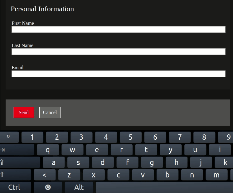
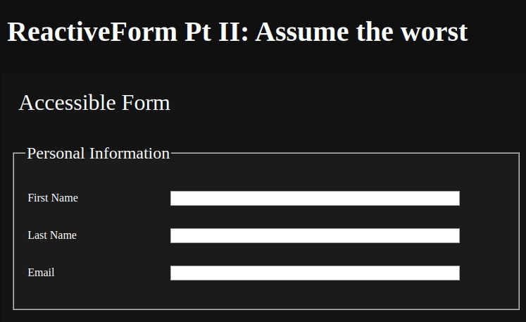
Current Code
Give a Man a Fish, and You Feed Him for a Day. Teach a Man To Fish, and You Feed Him for a Lifetime
I'm a strong believer in that quote, so my recommendation to get the most out of this article is to learn the process, not the solution. That's why, for every rule you'll be learning, I highly advise you to DO IT YOURSELF, and try to find solutions on your own before looking at the answers.
One of the trickiest things of accessibility is the fact that it has to become part of the developer culture, and should be included as a part of the Definition of done. It's much easier to make an accessible site non accessible than to do it the other way around.
Adaptable
Info and relationships
Information, structure, and relationships conveyed through presentation, can be programmatically determined, or are available in text.
This means that we have to use the proper semantic HTML whenever possible. If it's not possible, its recommended to use ARIA attributes to provide context to the non semantic html that was used. Sadly, screen readers are not able to understand classes, so they rely entirely in the semantic html, and the ARIA attributes. Remember to try on your own before going to the answer.
It's time to identify the problems in the code.
HINT: Are you sure the application is using the right semantic Html?
- Using a div with a class of
.header, instead of the<header>element. - Using a div with a class of
.main, instead of the<main>element. - Using a div with a class of
.section, instead of the<section>element. - Using a div with a class of
.form, instead of the<form>element. - Using a div with a class of
.legend, instead of the<legend>element. - Using a div with a class of
.fieldset, instead of the<fieldset>element. - Using a div with a class of
.label, instead of the<label>element. - Using a div with a class of
.button, instead of the<button>element.
After applying those changes, the styles will break because they use the classes instead of the direct element. Before continuing, you'll need to fix the .scss file.
Another important detail is that the label element has a for attribute that receives a string that matches the id of an input. That way, it is possible for assistive technology to describe the inputs.
Identify Purpose
In content implemented using markup languages, the purpose of User Interface Components, icons, and regions can be programmatically determined.
This means that Html5 provides us with techniques for properly determining regions in the web page like header, main, footer, etc. The idea is that you use those to structure the markup in a way that assistive technology can successfully interpret it. Remember to try on your own before going to the answer.
It is now time to identify the problems in the code.
HINT: By now, you should know that you have to do nothing. Yes, nothing. By using the proper semantic elements from the previous rule, this is also covered.
Keyboard accessible
Keyboard
All functionality of the content is operable through a keyboard interface without requiring specific timings for individual keystrokes, except where the underlying function requires input that depends on the path of the user's movement, and not just the endpoints.
This means that you should allow the user to navigate through the different interactive elements. There are two ways to address this problem. We can either use the right semantic elements, or add ARIA attributes in order to comply with WAI ARIA Authoring Practices. Remember to try on your own before going to the answer.
Is time to identify the problems in the code.
HINT: Incredibly, if you did the changes from the first step, this is also solved. The only elements that were not keyboard accessible were the buttons. By now, you should be aware of the importance of using the right element. Otherwise, we'd have to implement a lot of functionalities that are already provided to us by Html5.
Navigable
Focus visible
Any keyboard operable user interface has a mode of operation where the keyboard focus indicator is visible.
This means that all the elements that are interactive should provide users with an easy way to identify when its being focused. All modern browsers have a mechanism to provide it as a built-in functionality. Even though many times it is better to use the built-in options, this is not always the case. There are cases in which the focus color doesn't have the right contrast with the background, or you want to make the outline not only in the input, but also in the label.
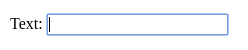
Thankfully, in Css3, there's a selector :focus that you can use in conjunction with the input if you want to customize its color, and assign a new value to the outline by doing something like this:
input:focus {
  outline-color: red;
}
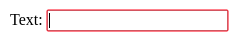
In case you believe the outline is too small, you can also set the focus to the parent element and configure using the selector :focus-within you can add the outline to the container making the focus way clearer. This can be done by doing this:
input:focus {
  outline: none;
}

label:focus-within {
  outline: 1px red solid;
}
Note: Label is used because in the code sample the inputs are wrapped on a label element.
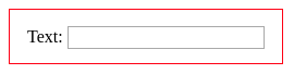
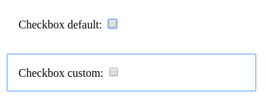
This strategy is especially useful when working with checkbox inputs because the default behavior of the focus is hard to detect.
Input Assistance
Labels and Instructions
Labels or instructions are provided when content requires user input.
This means that for every user interaction we have to provide some mechanism in order for assistive technology to tell the user about it. Thankfully for you, Html5 has come to the rescue, the label element has a way to be bound to an input which not only help for visual impaired users but also allows to click the label and automatically focus the input.
The magic behind the trick of the label is that you can assign a unique Id to an input, and using the attribute for from the label, they can be tied together. In case there's no way to add a label element in your application, you can use the attributes aria-label or aria-labelledby.
What if you want to take this functionality to the next level? The label is too small, and you want to give users an even easier way to focus the input. If you put the input inside the label, the entire container is clickable, and will guide the user focus directly to the input.
Conclusion
After doing all the suggestions, you'll have a form that's easily accessible not only through keyboard, but also for screen readers. And that's quite a huge indirect improvement. I recommend you to install NVDA, and try both branches from the repository provided by it.
It's possible to increase the accessibility of a website just by using Html5 in the right way. It comes out-of-the-box with many functionalities that make your life easier. If you are still not convinced, just imagine that everytime you want to create a new button, you had to create an event listener for key down events to provide keyboard interaction to buttons.
The next time you create a functionality, go to the WAI ARIA Authoring Practices and look to see if there's a component that has the behavior for which you are looking. Worst case scenario, you find something with a few similarities that will give you somewhere to start. As a final advice, do NOT reinvent the wheel. Use what's already out there.
References
I have to thank {% user devpato %} for the awesome cover image.