
Performance: Optimizing Images on Gatsby Sites
Our Labs website is written using Gatsby, and uses images in many places. We have images that are both statically hosted, and images that are hosted in Contentful.
The Problem
We found that many of our static images weren't compressed as optimally as they could be and were inflating page sizes.
This example comes from a page with many images that are being used as-is with no post-processing in the site build. Some of the images are lossless compressed PNGs that can be JPGs instead, and some of them are already JPGs but their sizes far exceed the size of the container they're in.
The Solution
Instead of manually optimizing each static image we can let gatsby-image do this for us.
Static Images
The static images can be easily fixed by replacing all uses of <img> with <Img> from gatsby-image. GQL queries will also need to be updated to return fixed or fluid images. gatsby-image doesn't take image urls directly like a normal <img> tag does, but instead, takes a special fluid or fixed type that optimizes the images differently. The fixed type should be used when the width and height are known, and will not change. The fluid type should be used if the image will stretch to fill the container that it's in, depending on the screen size.
Here's an example of an <img> for avatars being replaced with a fixed image.
import Img from 'gatsby-image';

...

{/* Before using the built-in img */}
<img src={testimonial.avatarUrl} alt="avatar" />

{/* A fixed image using gatsby-image */}
<Img fixed={testimonial.avatarUrl.childImageSharp.fixed} alt="avatar" />
The type of avatarUrl needs to be changed from a string to a sharp fixed image in the GQL query. This is also where optimization parameters such as size and quality can be configured.
# Before
items {
  id
  name
  twitter
  avatarUrl
  quote
  category
}

# After
items {
  id
  name
  twitter
  avatarUrl {
    childImageSharp {
      fixed(width: 44, height: 44) {
        ...GatsbyImageSharpFixed
      }
    }
  }
  quote
  category
}
Here, just width and height are specified, but there are other useful parameters such as quality and toFormat, which can be useful if you want to make sure images are converted and compressed to your liking during the build. Here's an example that ensures images have a size of 160x160 and are JPGs with 80% quality:
fixed(width: 160, height: 160, toFormat: JPG, quality: 80) {
  ...GatsbyContentfulFixed
}
All static image paths returned by the query should be relative so that gatsby-image can find them. Absolute image paths will not work with it like they do with <img>.
Optimizing Images from Contentful
While the gatsby-image package makes it very easy to optimize images when you're dealing with content templates, it doesn't work well on its own if you're dealing with markdown or pre-supplied HTML. Posts on our Labs blog are written in markdown, and are stored with Contentful, and we render posts by converting them to HTML with gatsby-transformer-remark.
We're able to optimize these images using gatsby-remark-images-contentful. This plugin extends gatsby-transformer-remark to output images that use parameters from Contentful's Image API, and to generate different sized versions of images that are chosen based off of the size of the device. This plugin also adds a "blur up" effect as the image is downloaded, and holds the size of the incoming image to prevent a reflow. It's also notable that using this plugin will give us image lazy loading as well, which can speed up load times for image heavy pages substantially.
Here's how we configured this plugin in gatsby-config.js:
{
  resolve: 'gatsby-transformer-remark',
  options: {
    plugins: [
      {
        resolve: `gatsby-remark-images-contentful`,
        options: {
          // This should be the maximum width that your content containers can be.
          maxWidth: 768,
        },
      },
    ],
  },
},
Before & After Results
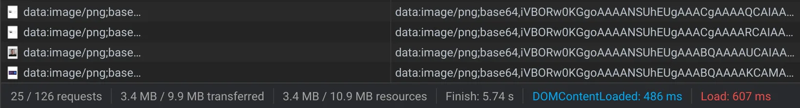
Here's an example of how our teams page has improved and went from a 856kB image weight to 300kB with these simple changes.
Before
After
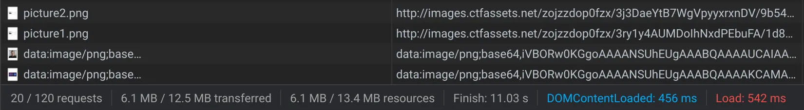
Here's an example of an image heavy blog post with images from Contentful that had its initial load size cut by almost 50%, from 6.1MB to 3.4MB.
Before
After
The gains seen here come mostly from lazy loading provided by gatsby-image, so images are only downloaded once they're about to come into view; however savings also come from serving images of appropriate sizes, so a mobile device such as the Pixel 2 will have an initial load of 1.6MB. We don't forcefully format all blog post images to JPG currently as there may be legitimate reasons to not use them, e.g. you want to keep transparency or embed animated gifs.
Closing
Gatsby makes it easy to optimize your sites without expending too much effort. If you're already using Gatsby, I'd encourage you to make sure you're using it to its fullest potential.