Skip to content

Ignite your way with Infragistics Ultimate Developer Toolkit

Infragistics is celebrating its 30th anniversary! Throughout the years, Infragistics built its strategy around two strong pillars: embracing the latest and greatest technologies, and focusing on high-performance and speed. These main pillars enriched developers, and their communities, with toolsets that made development enjoyable, and productive at the same time.

Infragistics presents the Ultimate suite as a single platform for UX design, and enterprise app development, for the web, desktop, and mobile. The suite offers more than 100 beautifully styled, high-performance grids, charts, and other UI controls.

Infragistics thought of every detail in the development life-cycle process. They offer prototyping tools to help you sketch your designs from the client’s early inception stage, allowing you to work on the UX, finalize the layout, and even orient the developer to build the final app.

In this introductory article on their Ignite UI suite, I will explore the different platforms supported by Infragistics, and will then delve into more details on the Ignite UI for Angular suite.

Infragistics Ultimate Developer Toolkit

Infragistics provides UI components for a variety of frameworks and platforms. This includes ones for the Web (ASP.NET, Angular, React and JavaScript), Desktop (Windows Forms and WPF), and Mobile (Xamarin, iOS and Android).

The components are served in packages. For instance, when developing with React, you would only install the packages for Ignite for React.

Here’s a list of the supported platforms and their corresponding components.

Web

Indigo Design A unified workspace for visual design, UX prototyping, and code generation for Angular development.

Ignite UI for Angular Infragistics wraps together more than 50 Material-based UI native components, designed, and built on an Angular platform.

Ignite UI for React A set of native UI components for React developers, featuring a high-performance data grid, and real-time high-volume data charts.

Ignite UI for JavaScript This package offers more than 100 HTML5 / JavaScript jQuery components with wrappers for React, Angular & ASP.NET MVC.

Infragistics Ultimate UI for ASP.NET ASP.NET AJAX UI controls.

Desktop

Infragistics Ultimate UI for Windows Forms This package contains more than 100 fully-featured Microsoft Office-style UI controls.

Infragistics Ultimate UI for WPF This package contains WPF native UI controls.

Mobile

Infragistics Ultimate UI for Xamarin This package contains Xamarin native UI components including Charts, Grid, Scheduling, and much more.

Infragistics Ultimate UI for iOS This package contains native UI controls for both iPad and iPhone apps.

Infragistics Ultimate UI for Android This package contains lightning-fast native UI controls for Android apps.

Prototyping

Infragistics offers the Indigo.Design Desktop to build prototypes for User Stories to share with peers for review, and collaboration. This software comes in two flavors for both Windows and Mac OS machines. Here’s a link to the software’s official documentation.

In addition to all the packages listed, Infragistics puts great effort in delivering an easy-to-follow, and extensive documentation for all their platforms, and UI components. You can consult the document anytime by visiting the Infragistics Help documentation website.

Also, Infragistics offers a set of reference apps that you can look at, take ideas from, and that allow you to see, in real-time, how the UI components are being used and integrated inside apps. You can have a look at the reference apps by visiting the Infragistics Apps Gallery website.

Ignite UI for Angular

Infragistics has placed a great emphasis on developing their Angular suite. They offer native UI components for Angular that are based on the Google Material design standards. In addition, they enrich the Angular app development with a unique, and valuable experience, by offering the Sketch UI kits.

The Sketch UI kits have a one-to-one mapping with all the Angular components they offer. The designer opens Sketch, loads the Sketch UI kits, and then designs the app screens, using “native” Ignite UI for Angular components. The end result is a prototype that is uploaded to the Infragistics Cloud, and shared with peer developers, designers, and stakeholders to review, comment on, and use to produce a final design prototype.

The developers can then take prototype URLs, go to Visual Studio Code per se, install the Infragistics extension, and generate code assets for their Angular app, based on the prototype. The extension generates Angular Components based on the screens baked inside the prototype.

The Ignite UI for Angular suite aims to help developers build modern, high-performance HTML 5 JavaScript apps for modern desktop browsers, mobile experiences, and progressive web apps (PWA).

Prerequisites

Before you can start using Ignite for Angular, you must have the following installed on your machine:

  • Visual Studio Code (VS Code). You can use any other code editor, but in order to make full use of the rich support Infragistics offers for Angular development, it is recommended that you use VS Code.
  • Node.js and NPM. This requirement is standard for developing front-ends using Angular, React, Vue and even vanilla JavaScript.

Ignite UI CLI

Infragistics takes that extra step, and offers the Ignite UI CLI. This is a Command-Line Interface by Ingratistics.

The easiest way to create, and scaffold an app with Infragistics, is to use the CLI. This CLI is not only used with Angular, but can also be used for React and jQuery apps.

Here’s a step by step guide on how to generate your first app using the Ignite UI CLI.

You start by installing the Ignite UI CLI as a global dependency on your machine by issuing the following command:

npm install -g igniteui-cli

Once the installation process is finished, you can start the tool using either guided experience or specific commands.

For instance, to create a new Angular app, you issue the command:

ig new <project name> --framework=angular --type=igx-ts

To add a new Component to your app you issue:

ig add <component/template> <component_name>

You can read more about the CLI on the Ignite UI CLI official page.

Selection of Angular Components

Going through all of the Angular components in depth now, isn't useful. I have highlighted a few that interested me, and will give you a small overview of what is offered.

Financial Chart

The Financial Chart is one of the most popular and advanced charts offered by Infragistics. This type of chart is used to visualize financial data using a simple, and intuitive API.

To play with a live Financial Chart, here’s a sample hosted on StackBlitz: {% stackblitz angular-ytbzfi %}

Data Chart

Infragistics Angular Data Chart is the most extensive, and feature-rich, chart on the web today. It supports chart compositions (multiple charts overlaid), axis, series, legend, and annotation layers. Being highly customizable, it offers many more options, and features.

Something special about this chart is the long list of series types supported by default. The list includes, but is not limited to:

An example of a Radial Series chart is as follows: Radial Series chart

You can find the entire list here: Data Chart Series Types.

To play with a live Data Chart, here’s a sample hosted on StackBlitz: {% stackblitz angular-bv857d %}

Mask

You apply the igxMask directive on a text input field, and you can control the user input, and format the visual value, based on configurable mask rules. You have a rich set of masking rules to choose from.

To use this directive, start by importing the following Angular Modules into your app module:

// app.module.ts

...
import { IgxMaskModule, IgxInputGroupModule } from 'igniteui-angular';

@NgModule({
    ...
    imports: [..., IgxInputGroupModule, IgxMaskModule]
    ...
})
export class AppModule {}

Then you can apply an Input Mask inside your components. The example below shows how you can use a Phone Input Mask:

<igx-input-group>
    <igx-prefix>
        <igx-icon>phone</igx-icon>
    </igx-prefix>
    <label igxLabel>Phone</label>
    <input igxInput type="text" [igxMask]="'(####) 00-00-00 Ext. 9999'"/>
</igx-input-group>

If you would like to play with a live Mask component, here’s a sample hosted on StackBlitz:

{% stackblitz angular-yh3dpu %}

The Navigation Drawer is one of my favorite components. It provides a smooth and smart navigation experience for developing Web apps that will be used on Mobile devices.

The Navigation Drawer is a side-navigation container. It can rest above content, and slide in/out of view or be pinned to expand/collapse within content. The component is highly configurable via its input properties: Mode (pinned, open, mini-variant) and Position (Right and Left). The mini-variant mode renders the side-navigation bar with icons only instead of showing both the icon, and text of the item.

Navigation Drawer

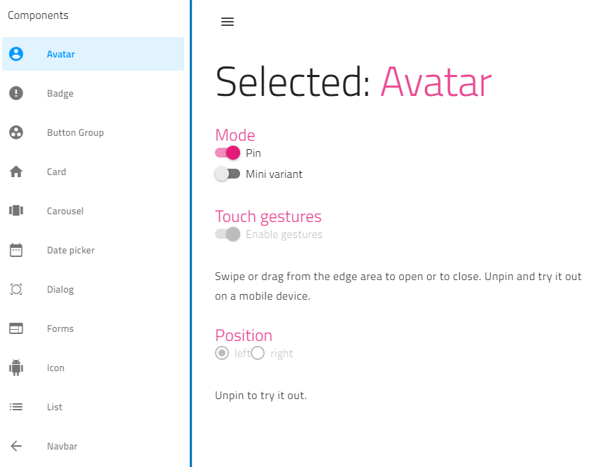
Installing and using this component is no different from the rest of component offered by Ignite for Angular.

To play with a live Navigation Drawer component, here’s a sample hosted on StackBlitz: {% stackblitz angular-rsizth %}

Layout Manager

The Layout Manager directive, which is part of Ignite UI for Angular, is a wrapper on-top of Flexbox. You can organize and structure your HTML markup without having to write a single CSS selector for the layout.

The Layout Manager focuses on giving Angular developers a seamless design experience when developing, and laying out their apps.

To use this directive, start by importing the IgxLayoutModule Angular Module into your app module:

// app.module.ts

...
import { IgxLayoutModule } from 'igniteui-angular';

@NgModule({
    ...
    imports: [..., IgxLayoutModule ]
    ...
})
export class AppModule {}

Then you can apply the igxLayout, igxFlex, and other related directives to your HTML markup as follows:

<div class="layout-box" igxLayout igxLayoutDir="row">
              <div class="layout-box__el" igxFlex>1</div>
              <div class="layout-box__el" igxFlex>2</div>
              <div class="layout-box__el" igxFlex>3</div>
</div>

If you would like to play with a live Layout Manager component, here’s a sample hosted on StackBlitz: {% stackblitz angular-vtetkk %}
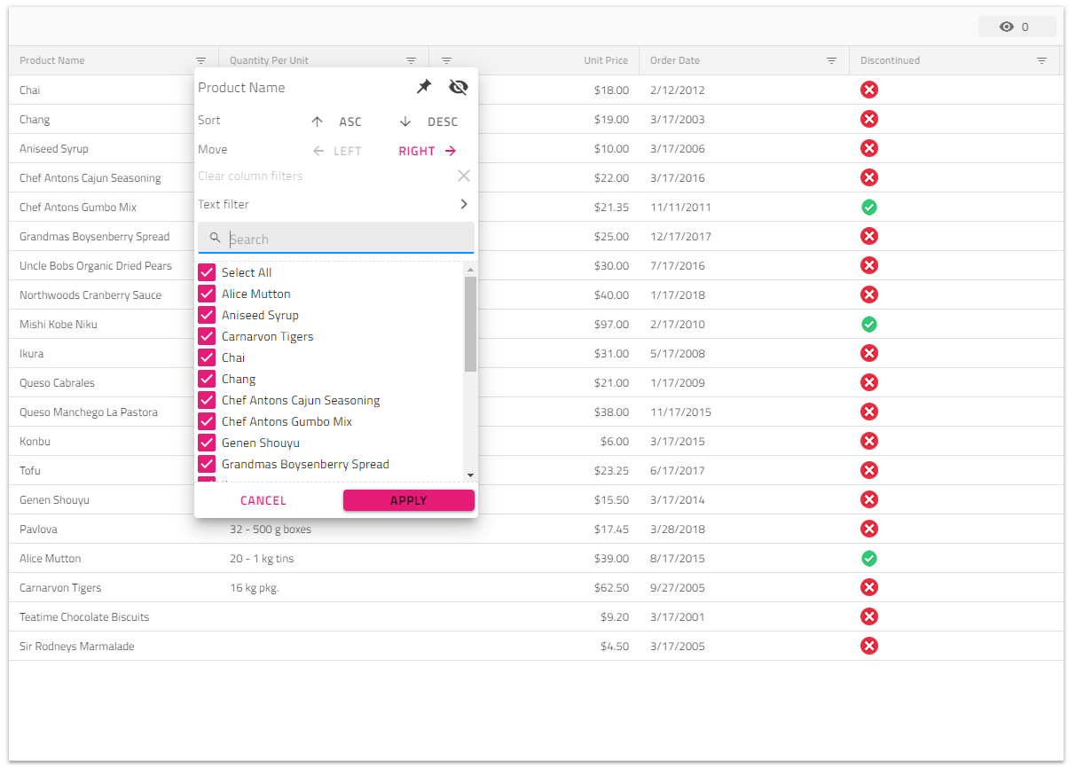
DataGrid

Infragistics claims to have developed the fastest high performance Data Grid for Angular platform.

The Grid is, by far, the most customizable Data Grid currently existing for the Angular ecosystem. The team at Infragistics have thought of every single detail a developer might need and want to customize in a Data Grid.

The features include data binding, live data binding (data streaming), editing, row editing, paging, filtering, advanced filtering, sorting, grouping, column moving, column pinning, column resizing, column hiding, searching, toolbar, multi-column header, exporting to Excel, pasting from Excel, and so much more.

You are in the presence of the Infragistics version of Excel Spreadsheets!

Data Grid

Importing and using the Data Grid cannot be simpler!

Start by importing the IgxGridModule Angular Module to the app module:

// app.module.ts

import { IgxGridModule } from 'igniteui-angular';
// Or
import { IgxGridModule } from 'igniteui-angular/grid';

@NgModule({
    imports: [
        ...
        IgxGridModule.forRoot(),
        ...
    ]
})
export class AppModule {}

To embed a Data Grid inside the HTML markup, add the following component:

<igx-grid #grid1 id="grid1" [data]="localData" [autoGenerate]="true"></igx-grid>

To reference the Data Grid from inside the Angular Component code-behind, add the following:

import { IgxGridComponent } from 'igniteui-angular/grid/';
// Or
import { IgxGridComponent } from 'igniteui-angular'
...

@ViewChild('myGrid', { read: IgxGridComponent })
public grid: IgxGridComponent;

It’s that straightforward to start using the Data Grid component for Angular!

Check the Infragistics extensive docs to learn more about customizing, and enabling more features in the Data Grid.

If you would like to play with a live Data Grid component, here’s a sample hosted on StackBlitz: {% stackblitz angular-4oqzke %}

Excel Library

An Excel Library comes as part of the Ignite UI for Angular. The Infragistics Angular Excel Library allows you to work with spreadsheet data using familiar Microsoft Excel spreadsheet objects like Workbooks, Worksheets, Cells, Formulas, and many more.

You can export your app data to an Excel sheet, and also load data from an Excel sheet into your app.

Have a look at the Excel Library page for more examples on all the options, and possibilities available for you.

Moreover, Infragistics offers an Export to Excel service that you can use inside your Angular components, and services.

To use this service, you start by importing the IgxExcelExporterService into the app module:

// app.module.ts

...
import { IgxExcelExporterService } from "igniteui-angular";

@NgModule({
  providers: [ IgxExcelExporterService ]
})

export class AppModule {}

Then, you inject the IgxExcelExporterService into the constructor of the component or service:

// component.ts

...
import { IgxExcelExporterService, IgxExcelExporterOptions } from "igniteui-angular";
...

constructor(private excelExportService: IgxExcelExporterService) {
}

And finally, to export your data to Excel, you call the exportData() function:

// component.ts

...

public localData = [
  { Name: "Eric Ridley", Age: "26" },
  { Name: "Alanis Brook", Age: "22" },
  { Name: "Jonathan Morris", Age: "23" }
];

public exportButtonHandler() {
  this.excelExportService.exportData(this.localData, new IgxExcelExporterOptions("ExportedDataFile"));
}

Indigo Design System

The Indigo Design System offered by Infragistics caught my attention to the extent that I wanted to dedicate a section to talk about this design system, and its versatility, especially for designers, and developers working on Angular apps.

Indigo Design System offers a unified platform for visual design, UX prototyping, code generation, and app development.

You’ve got your designers, and developers, both integrated into a single platform. This design system has a workflow that is depicted as follows:

Indigo Design System
  1. Designers create designs in Sketch using the Indigo.Design System. The Indigo Design System integrates with Sketch in the form of:

  2. Indigo-Components (Design library with 50+ components that match Ignite UI for Angular)

  3. Indigo-Patterns (A collection of common UI patterns composed of Indigo-Components)

  4. Indigo-Styling (Customize colors, typography, icons, and elevations to match your brand)

  5. Designers share and test prototypes with peer developers, designers, and stakeholders, via a common platform known as cloud.indigo.design.

  6. Use Sketch to create interactive prototypes of your designs and screens.

  7. Share and Collaborate with others: View prototypes on any device, and collect feedback using comments.

  8. Developers generate Angular components, and code from prototypes

  9. Install the Infragistics Extension for VS Code

  10. Load-in a prototype by URL and the code generation process starts

Conclusion

To explore and try all the features of Infragistics Ultimate Developer Toolkit, would require writing books and articles! This article introduces the Infragistics Ultimate Developer Toolkit, and related hyperlinks, that you can follow to read more about the topics.

Still, what has been discussed in this article is the tip of the iceberg when it comes to what the modern and efficient development ecosystem Infragistics offers!

The Infragistics design model for their components and controls is, by far, one of the easiest, and most straightforward model to follow. For instance, when using the Ignite UI for Angular components, you get the feeling that you are using Angular built-in components and services. They’ve done an excellent job giving Angular developers a seamless experience when using their UI components.

This Dot Labs is a development consultancy that is trusted by top industry companies, including Stripe, Xero, Wikimedia, Docusign, and Twilio. This Dot takes a hands-on approach by providing tailored development strategies to help you approach your most pressing challenges with clarity and confidence. Whether it's bridging the gap between business and technology or modernizing legacy systems, you’ll find a breadth of experience and knowledge you need. Check out how This Dot Labs can empower your tech journey.

You might also like

A Guide to (Typed) Reactive Forms in Angular - Part I (The Basics) cover image

A Guide to (Typed) Reactive Forms in Angular - Part I (The Basics)

When building a simple form with Angular, such as a login form, you might choose a template-driven approach, which is defined through directives in the template and requires minimal boilerplate. A barebone login form using a template-driven approach could look like the following: `HTML E-mail Password Login! ` `TypeScript // login.component.ts import { Component } from '@angular/core'; @Component({ selector: 'app-login', templateUrl: './login.component.html' }) export class LoginComponent implements OnInit { public credentials = { email: '', password: '' }; constructor(public myAuthenticationService: MyAuthenticationService) { } } ` However, when working on a user input-heavy application requiring complex validation, dynamic fields, or a variety of different forms, the template-driven approach may prove insufficient. This is where reactive forms** come into play. Reactive forms employ a reactive approach, in which the form is defined using a set of form controls and form groups. Form data and validation logic are managed in the component class, which updates the view as the user interacts with the form fields. This approach requires more boilerplate but offers greater explicitness and flexibility. In this three-part blog series, we will dive into the reactive forms data structures, learn how to build dynamic super forms, and how to create custom form controls. In this first post, we will familiarize ourselves with the three data structures from the @angular/forms` module: FormControl The FormControl` class in Angular represents a single form control element, such as an input, select, or textarea. It is used to track the value, validation status, and user interactions of a single form control. To create an instance of a form control, the `FormControl` class has a constructor that takes an optional initial value, which sets the starting value of the form control. Additionally, the class has various methods and properties that allow you to interact with and control the form control, such as setting its value, disabling it, or subscribing to value changes. As of Angular version 14, the FormControl` class has been updated to include support for **typed reactive forms** - a feature the Angular community has been wanting for a while. This means that it is now a generic class that allows you to specify the type of value that the form control will work with using the type parameter ``. By default, `TValue` is set to any, so if you don't specify a type, the form control will function as an untyped control. If you have ever updated your Angular project with ng cli` to version 14 or above, you could have also seen an `UntypedFormControl` class. The reason for having a `UntypedFormControl` class is to support incremental migration to typed forms. It also allows you to enable types for your form controls after automatic migration. Here is an example of how you may initialize a FormControl` in your component. `TypeScript import { FormControl } from '@angular/forms'; const nameControl = new FormControl("John Doe"); ` Our form control, in this case, will work with string` values and have a default value of "John Doe". If you want to see the full implementation of the FormControl` class, you can check out the Angular docs! FormGroup A FormGroup` is a class used to group several `FormControl` instances together. It allows you to create complex forms by organizing multiple form controls into a single object. The `FormGroup` class also provides a way to track the overall validation status of the group of form controls, as well as the value of the group as a whole. A FormGroup` instance can be created by passing in a collection of `FormControl` instances as the group's controls. The group's controls can be accessed by their names, just like the controls in the group. As an example, we can rewrite the login form presented earlier to use reactive forms and group our two form controls together in a FormGroup` instance: `TypeScript // login.component.ts import { FormControl, FormGroup, Validators } from '@angular/forms'; @Component({ selector: 'app-login', templateUrl: './login.component.html' }) export class LoginComponent implements OnInit { public form = new FormGroup({ email: new FormControl('', [Validators.required, Validators.email]), password: new FormControl('', [Validators.required]), }); constructor(public myAuthenticationService: MyAuthenticationService) { } public login() { // if you hover over "email" and "password" in your IDE, you should see their type is inferred console.log({ email: this.form.value.email, password: this.form.value.password }); this.myAuthenticationService.login(this.form.value); } } ` `HTML E-mail Password Login! ` Notice we have to specify a formGroup` and a `formControlName` to map the markup to our reactive form. You could also use a `formControl` directive instead of `formControlName`, and provide the `FormControl` instance directly. FormArray As the name suggests, similar to FormGroup`, a `FormArray` is a class used to group form controls, but is used to group them in a collection rather than a group. In most cases, you will default to using a FormGroup` but a `FormArray` may come in handy when you find yourself in a highly dynamic situation where you don't know the number of form controls and their names up front. One use case where it makes sense to resort to using FormArray` is when you allow users to add to a list and define some values inside of that list. Let's take a TODO app as an example: `TypeScript import { Component } from '@angular/core'; import { FormArray, FormControl, FormGroup } from '@angular/forms'; @Component({ selector: 'app-todo-list', template: Add TODO , }) export class TodoListComponent { public todos = new FormArray>([]); public todoForm = new FormGroup({ todos: this.todos, }); addTodo() { this.todoForm.controls['todos'].push(new FormControl('')); } } ` In both of the examples provided, we instantiate FormGroup directly. However, some developers prefer to pre-declare the form group and assign it within the ngOnInit method. This is usually done as follows: `TypeScript // login.component.ts import { FormControl, FormGroup, Validators } from '@angular/forms'; @Component({ selector: 'app-login', templateUrl: './login.component.html' }) export class LoginComponent implements OnInit { // predeclare the form group public form: FormGroup; constructor(public myAuthenticationService: MyAuthenticationService) { } ngOnInit() { // assign in ngOnInit this.form = new FormGroup({ email: new FormControl('', [Validators.required, Validators.email]), password: new FormControl('', [Validators.required]), }); } public login() { // no type inference :( console.log(this.form.value.email); } } ` If you try the above example in your IDE, you'll notice that the type of this.form.value` is no longer inferred, and you won't get autocompletion for methods such as `patchValue`. This is because the FormGroup type defaults to `FormGroup`. To get the right types, you can either assign the form group directly or explicitly declare the generics like so: `TypeScript public form: FormGroup, password: FormControl, }>; ` However, explicitly typing all your forms like this can be inconvenient and I would advise you to avoid pre-declaring your FormGroups` if you can help it. In the next blog post, we will learn a way to construct dynamic super forms with minimal boilerplate....

A Guide to (Typed) Reactive Forms in Angular - Part III (Creating Custom Form Controls) cover image

A Guide to (Typed) Reactive Forms in Angular - Part III (Creating Custom Form Controls)

So far in the series, we have learned the basics of Angular Reactive forms and created some neat logic to construct and display dynamic forms. But our work is still not done yet. Whether we just want to make our controls look good and enhance them with some markup, or whether we need a more complex control than a simple textarea, input or checkbox, we'll either need to use a component library such as Angular Material Components or get familiar with the ControlValueAccessor` interface. Angular Material, by the way, uses ControlValueAccessor` in its components and I recommend looking into the source code if you want to learn some advanced use cases (I have borrowed a lot of their ideas in the past). In this post, however, we will build a basic custom control from scratch. A common requirement for a component that cannot be satisfied by using standard HTML markup I came across in many projects is having a searchable combobox**. So let's build one. We will start by creating a new Angular component and we can do that with a handy ng cli command: ` ng generate component form-fields/combobox ` Then we'll implement displaying data passed in the form of our FormField` class we have defined earlier in a list and allowing for filtering and selecting the options: `TypeScript // combobox.component.ts import { Component, ElementRef, Input, ViewChild } from '@angular/core'; import { FormField } from '../../forms.model'; @Component({ selector: 'app-combobox', templateUrl: './combobox.component.html', styleUrls: ['./combobox.component.scss'], }) export class ComboboxComponent { private filteredOptions?: (string | number)[]; // a simple way to generate a "unique" id for each component // in production, you should rather use a library like uuid public id = String(Date.now() + Math.random()); @ViewChild('input') public input?: ElementRef; public selectedOption = ''; public listboxOpen = false; @Input() public formFieldConfig!: FormField; public get options(): (string | number)[] { return this.filteredOptions || this.formFieldConfig.options || []; } public get label(): string { return this.formFieldConfig.label; } public toggleListbox(): void { this.listboxOpen = !this.listboxOpen; if (this.listboxOpen) { this.input?.nativeElement.focus(); } } public closeListbox(event: FocusEvent): void { // timeout is needed to prevent the list box from closing when clicking on an option setTimeout(() => { this.listboxOpen = false; }, 150); } public filterOptions(filter: string): void { this.filteredOptions = this.formFieldConfig.options?.filter((option) => { return option.toString().toLowerCase().includes(filter.toLowerCase()); }); } public selectOption(option: string | number): void { this.selectedOption = option.toString(); this.listboxOpen = false; } } ` `HTML {{ label }} &#9660; {{ option }} ` > Note: For the sake of brevity, we will not be implementing keyboard navigation and aria labels. I strongly suggest referring to W3C WAI patterns to get guidelines on the markup and behavior of an accessible combo box. While our component now looks and behaves like a combo box, it's not a form control yet and is not connected with the Angular forms API. That's where the aforementioned ControlValueAccessor` comes into play along with the `NG_VALUE_ACCESSOR` provider. Let's import them first, update the `@Component` decorator to provide the value accessor, and declare that our component is going to implement the interface: `TypeScript import { ControlValueAccessor, NGVALUE_ACCESSOR } from '@angular/forms'; @Component({ selector: 'app-combobox', templateUrl: './combobox.component.html', styleUrls: ['./combobox.component.scss'], providers: [ { // provide the value accessor provide: NGVALUE_ACCESSOR, // for our combobox component useExisting: ComboboxComponent, // and we don't want to override previously provided value accessors // we want to provide an additional one under the same "NGVALUE_ACCESSOR" token instead multi: true, }, ], }) export class ComboboxComponent implements ControlValueAccessor { ` Now, the component should complain about a few missing methods that we need to satisfy the ControlValueAccessor` interface: - A writeValue` method that is called whenever the form control value is updated from the forms API (e.g. with `patchValue()`). - A registerOnChange` method, which registers a callback function for when the value is changed from the UI. - A registerOnTouched` method that registers a callback function that marks the control when it's been interacted with by the user (typically called in a `blur` handler). - An optional setDisabledState` method that is called when we change the form control `disabled` state- Our (pretty standard) implementation will look like the following: `TypeScript private onChanged!: Function; private onTouched!: Function; public disabled = false; // This will write the value to the view if the form control is updated from outside. public writeValue(value: any) { this.value = value; } // Register a callback function that is called when the control's value changes in the UI. public registerOnChange(onChanged: Function) { this.onChanged = onChanged; } // Register a callback function that is called by the forms API on initialization to update the form model on blur. public registerOnTouched(onTouched: Function) { this.onTouched = onTouched; } public setDisabledState(isDisabled: boolean): void { this.disabled = isDisabled; } public setDisabledState(isDisabled: boolean): void { this.disabled = isDisabled; } ` We don't have to update the template a lot, but we can add [disabled]="disabled"` attribute on our button and input to disable the interactive UI elements if the provided form control was disabled. The rest of the work can be done in the component's TypeScript code. We'll call `this.onTouched()` in our `closeListbox` method, and create a `value` setter that updates our internal value and also notifies the model about the value change: `TypeScript public set value(val: string | number) { this.selectedOption = val.toString(); this.onChanged && this.onChanged(this.selectedOption); this.onTouched && this.onTouched(); } ` You can check out the full implementation on StackBlitz. Conclusion In this series, we've explored the powerful features of Angular reactive forms, including creating and managing dynamic typed forms. We also demonstrated how to use the ControlValueAccessor interface to create custom form controls, such as a searchable combo box. This knowledge will enable you to design complex and dynamic forms in your Angular applications. While the examples provided here are basic, they serve as a solid foundation for building more advanced form controls and implementing validation, accessibility, and other features that are essential for a seamless user experience. By mastering Angular reactive forms and custom form controls, you'll be able to create versatile and maintainable forms in your web applications. If you want to further explore the topic and prefer a form of a video, you can check out an episode of JavaScript Marathon by my amazing colleague Chris. Happy coding!...

Introducing the release of Vue 3 cover image

Introducing the release of Vue 3

Back in October 2018, Evan You announced plans to start building the third version of VueJS. Featuring 30+ RFCs, over 2,600 commits, 628 pull request from 99 contributors, Vue 3's release reflects tireless ingenuity, passion, and hard work. Its release, no doubt, is a cause for celebration for all of the Vue community members who have been eagerly awaiting it. I, for one, am thrilled to share some resources that I believe will help developers migrate to Vue 3: - Vue 2 -> Vue 3 Migration Guide - Vue Router 3.0 -> Vue Router 4.0 Migration Guide - Vuex 4 - Chrome Vue JS DevTools - FireFox DevTools Here at This Dot, we have tracked Vue 3's development from the onset. We have written blog posts, published a book, hosted Vue Meetups, debuted JavaScript Marathon, shared Modern Web Podcasts, and more! Today, we’ll take a guided tour through all the material we have shared on Vue 2 and Vue 3. Blog Posts Here are our latest blog posts on Vue 3: - How to Set Up Storybook in Vue 3 - Async Components in Vue 3 - Your first Vue 3 app using TypeScript - Teleporting in Vue 3 - Content Distribution in Vue 3 - Custom Directives in Vue 3 - Vue 3 Composition API, do you really need it? You may access the remaining blog posts at This Dot Labs Blog. A Complete Guide to VueJS In April 2020, This Dot released A Complete Guide to VueJS by Bilal Haidar. This book is a precise, and detailed resource for learning VueJS, and highlights some top courses for Vue and JavaScript. Most importantly, it gives a brief introduction to almost all the new features in Vue 3. Grab your own copy for free! Vue Meetups We have hosted more than 10+ Vue Meetups in the past year with dozens of speakers, including Evan You, other Vue Core team members, and Vue developers interested in the future of the framework. To watch past meetup recordings, follow this link to get access to all the meetups on one page. JavaScript Marathon This Dot's team delivered six free live Vue JS tutorials during the JavaScript Marathon. Here’s a list of all the VueJS live sessions recordings: - 1 Hour to Learn Vue - Master State Management in Vue with VueX - Master PWA in Vue - Learning Unit Testing in Vue - Pro Tips on Using AWS with Vue - Debugging Vue: Quick Tips and Tricks Modern Web Podcasts This Dot's team delivered more than 40+ podcasts in the last two years. Here’s a link to the Vue JS Podcasts: - S07E1 Modern Web Podcast - Introducing Vite - Evan You’s new project + Vue 3 Updates - S06E12 Modern Web Podcast - Vue 3, Code Education, & the Vue Community - S06E4 Modern Web Podcast - Vue Updates with Chris Fitz, Jake Dohm, and Rob Ocel The Future of Vue The team at This Dot is hardly finished tracking Vue's progress, as well as the progress of many other web based technologies. To join us on our technical exploration journey, be sure to follow This Dot Media on Twitter! If you have specific questions about how to begin your Vue 3 migration, or have general questions about Vue 3, don't hesitate to reach out to us at hi@thisdot.co....

I Broke My Hand So You Don't Have To (First-Hand Accessibility Insights) cover image

I Broke My Hand So You Don't Have To (First-Hand Accessibility Insights)

We take accessibility quite seriously here at This Dot because we know it's important. Still, throughout my career, I've seen many projects where accessibility was brushed aside for reasons like "our users don't really use keyboard shortcuts" or "we need to ship fast; we can add accessibility later." The truth is, that "later" often means "never." And it turns out, anyone could break their hand, like I did. I broke my dominant hand and spent four weeks in a cast, effectively rendering it useless and forcing me to work left-handed. I must thus apologize for the misleading title; this post should more accurately be dubbed "second-hand" accessibility insights. The Perspective of a Developer Firstly, it's not the end of the world. I adapted quickly to my temporary disability, which was, for the most part, a minor inconvenience. I had to type with one hand, obviously slower than my usual pace, but isn't a significant part of a software engineer's work focused on thinking? Here's what I did and learned: - I moved my mouse to the left and started using it with my left hand. I adapted quickly, but the experience wasn't as smooth as using my right hand. I could perform most tasks, but I needed to be more careful and precise. - Many actions require holding a key while pressing a mouse button (e.g., visiting links from the IDE), which is hard to do with one hand. - This led me to explore trackpad options. Apart from the Apple Magic Trackpad, choices were limited. As a Windows user (I know, sorry), that wasn't an option for me. I settled for a cheap trackpad from Amazon. A lot of tasks became easier; however, the trackpad eventually malfunctioned, sending me back to the mouse. - I don't know a lot of IDE shortcuts. I realized how much I've been relying on a mouse for my work, subconsciously refusing to learn new keyboard shortcuts (I'll be returning my senior engineer license shortly). So I learned a few new ones, which is good, I guess. - Some keyboard shortcuts are hard to press with one hand. If you find yourself in a similar situation, you may need to remap some of them. - Copilot became my best friend, saving me from a lot of slow typing, although I did have to correct and rewrite many of its suggestions. The Perspective of a User As a developer, I was able to get by and figure things out to be able to work effectively. As a user, however, I got to experience the other side of the coin and really feel the accessibility (or lack thereof) on the web. Here are a few insights I gained: - A lot of websites apparently tried_ to implement keyboard navigation, but failed miserably. For example, a big e-commerce website I tried to use to shop for the aforementioned trackpad seemed to work fine with keyboard navigation at first, but once I focused on the search field, I found myself unable to tab out from it. When you make the effort to implement keyboard navigation, please make sure it works properly and it doesn't get broken with new changes. I wholeheartedly recommend having e2e tests (e.g. with Playwright) that verify the keyboard navigation works as expected. - A few websites and web apps I tried to use were completely unusable with the keyboard and were designed to be used with a mouse only. - Some sites had elaborate keyboard navigation, with custom keyboard shortcuts for different functionality. That took some time to figure out, and I reckon it's not as intuitive as the designers thought it would be. Once a user learns the shortcuts, however, it could make their life easier, I suppose. - A lot of interactive elements are much smaller than they should be, making it hard to accurately click on them with your weaker hand. Designers, I beg you, please make your buttons bigger. I once worked on an application that had a "gloves mode" for environments where the operators would be using gloves, and I feel like maybe the size we went with for the "gloves mode" should be the standard everywhere, especially as screens get bigger and bigger. - Misclicking is easy, especially using your weaker hand. Be it a mouse click or just hitting an Enter key on accident. Kudos to all the developers who thought about this and implemented a confirmation dialog or other safety measures to prevent users from accidentally deleting or posting something. I've however encountered a few apps that didn't have any of these, and those made me a bit anxious, to be honest. If this is something you haven't thought about when developing an app, please start doing so, you might save someone a lot of trouble. Some Second-Hand Insights I was only a little bit impaired by being temporarily one-handed and it was honestly a big pain. In this post, I've focused on my anecdotal experience as a developer and a user, covering mostly keyboard navigation and mouse usage. I can only imagine how frustrating it must be for visually impaired users, or users with other disabilities, to use the web. I must confess I haven't always been treating accessibility as a priority, but I've certainly learned my lesson. I will try to make sure all the apps I work on are accessible and inclusive, and I will try to test not only the keyboard navigation, ARIA attributes, and other accessibility features, but also the overall experience of using the app with a screen reader. I hope this post will at least plant a little seed in your head that makes you think about what it feels like to be disabled and what would the experience of a disabled person be like using the app you're working on. Conclusion: The Humbling Realities of Accessibility The past few weeks have been an eye-opening journey for me into the world of accessibility, exposing its importance not just in theory but in palpable, daily experiences. My short-term impairment allowed me to peek into a life where simple tasks aren't so simple, and convenient shortcuts are a maze of complications. It has been a humbling experience, but also an illuminating one. As developers and designers, we often get caught in the rush to innovate and to ship, leaving behind essential elements that make technology inclusive and humane. While my temporary disability was an inconvenience, it's permanent for many others. A broken hand made me realize how broken our approach towards accessibility often is. The key takeaway here isn't just a list of accessibility tips; it's an earnest appeal to empathize with your end-users. "Designing for all" is not a checkbox to tick off before a product launch; it's an ongoing commitment to the understanding that everyone interacts with technology differently. When being empathetic and sincerely thinking about accessibility, you never know whose life you could be making easier. After all, disability isn't a special condition; it's a part of the human condition. And if you still think "Our users don't really use keyboard shortcuts" or "We can add accessibility later," remember that you're not just failing a compliance checklist, you're failing real people....