Skip to content

How to Build a Counter App with SvelteKit

This article was written over 18 months ago and may contain information that is out of date. Some content may be relevant but please refer to the relevant official documentation or available resources for the latest information.

If you’ve ever wanted to learn SvelteKit, now is the time! In this article we will cover the basics of Svelte and SvelteKit and also learn how to build a simple counter app.

This article is a summary of the JS Marathon training by Nacho Falk on Svelte. Read the article, or watch along!

What is SvelteKit

SvelteKit is a Vite-powered framework for building Svelte applications. It enables users to take advantage of filesystem-based routing, and build a variety of applications including server-side rendered, static site generated, or single page applications.

But before we start with SvelteKit, let’s brush up on our Svelte.

What is Svelte?

Svelte is a front end, open-source JavaScript framework for building fast interactive web applications.

Unique Features of Svelte

  • Build time compilation, delivers less js code to the server
  • No virtual DOM, requires direct and specific modification to browser DOM
  • Simple reactivity, easier to modify and maintain application state
  • Scoped CSS, no css leaking between components

A Svelte Component

A Svelte component is written into a .svelte file using a superset of HTML syntax.

Each .svelte file holds a component, which is a reusable self-contained block of code that encapsulates HTML, CSS, and JavaScript or Typescript.

Svelte Component code example

<!-- evelutaed once -->
<script context="module">
  /**
   * can be imported as 
   * import { text } from filename.svelt
  */

  export const text = 'hello'

</script>

<script>
  let foo = 1
</script>

<h1>Template 1</h1>

<p>{foo}</p>

<style>
  h1 {
    color: blue;
  }
</style>

The 4 sections in a .svelte file

Module

This section contains codes and other information about the .svelte component. With the module, you can export functions to other components. The default export for a .svelte file is the component itself. Anything exported from the module section is independent of the component.

The ComponentScript

This contains the script and logic of the component itself. This can be JavaScript or TypeScript code. If you want to specify the desired syntax, the script code can look like this:

// typescript
<script lang="ts">
  let foo: number = 1
</script>

// javascript
<script lang="js">
  let foo = 1
</script>

Template This section contains the HTML template code for the component.

Style This section contains the stylesheet code for the component UI.

Props To define a prop of the component, you will declare a variable in the script section like the example code below.

<script lang="ts">
  import Child from './child.svelte'
  let foo: number = 1
  let prop1 = 1,
      prop2 = 2,
      obj = {
        prop1,
        prop2
      };
</script>

<h1>Template 1</h1>

<p>{foo}</p>
<Child prop1={prop1} prop2={prop2} />
<Child {prop1} {prop2} />
<Child {...obj} />

Declared props can be passed to a child component through assignment, short-hand assignment, or by destructing it like the code shown above.

Handling Events

To declare an event, import the createEventDispatcher provided by Svelte, and attach the on directives to the events like on:click.

Example

<script lang="ts">
import { createEventDispatcher } from "svelte";

  let dispatch = createEventDispatcher();

</script>

<button on:click={(e) => dispatch('foo', {foo: 'bar'})}>Button 1</button>

But you can also declare and handle events in Svelte using other methods, like:

<!-- handle on click event -->
<button on:click={(e) => console.log(e)}>Button Log</button>

<!-- event modifiers -->
<button on:click|preventDefault={(e) => console.log(e)}>Button Prevent</button>

<!-- bubble event to be used by the consumer of this component -->
<button on:click>Button 1</button>

Slots Svelte

  • Slots can be used to create components that accept and render any children.
  • Slots are created in Svelte by using <slot> inside components that can accept either components or markup.

Building a Counter Application with Svelte Kit

Now that we understand the basics, let’s get into building a Counter App with SvelteKit that Nacho taught us during the JS Marathon training.

To create a SvelteKit app, run:

npm init svelte
Screenshot 2022-07-26 1.58.58 PM

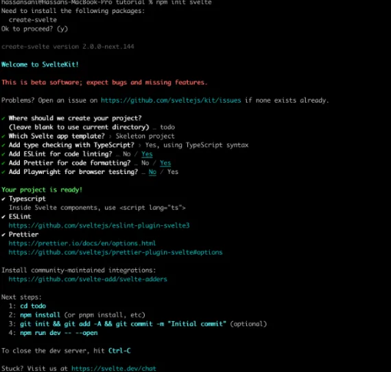
The CLI will prompt you with some questions:

Where should we create your project?
  (leave blank to use current directory) … todo

Type the name of the directory you want to use, or leave blank if you will be using the current directory. Follow the prompt to choose.

Then run…

npm install

…to install dependencies for the application.

To test the application, run:
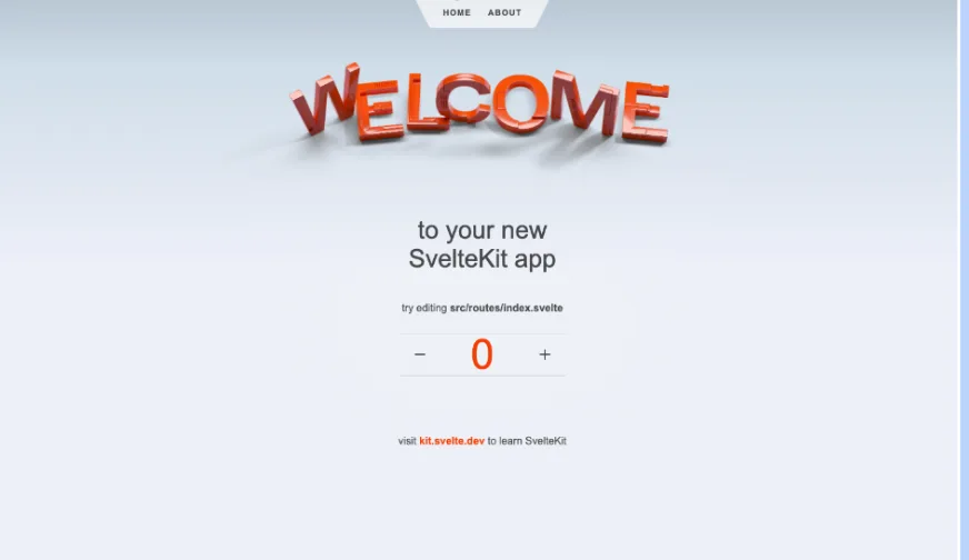
npm run dev

This will render the application on the http://localhost:3000/.

Screenshot 2022-07-26 2.00.33 PM

Open the directory with your code editor:

Screenshot 2022-07-26 2.01.45 PM

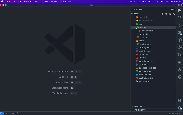
Modify src/routes/index.svelte file and replace it with the following

<script context="module" lang="ts">
	export const prerender = true;
</script>

<section>
	<h1>
		<div class="welcome">
			<picture>
				<source srcset="svelte-welcome.webp" type="image/webp" />
				<img src="svelte-welcome.png" alt="Welcome" />
			</picture>
		</div>

		to your new<br />SvelteKit app
	</h1>

	<h2>
		try editing <strong>src/routes/index.svelte</strong>
	</h2>
</section>

<style>
	section {
		display: flex;
		flex-direction: column;
		justify-content: center;
		align-items: center;
		flex: 1;
	}

	h1 {
		width: 100%;
	}

	.welcome {
		position: relative;
		width: 100%;
		height: 0;
		padding: 0 0 calc(100% * 495 / 2048) 0;
	}

	.welcome img {
		position: absolute;
		width: 100%;
		height: 100%;
		top: 0;
		display: block;
	}
</style>

Now, create a new file src/routes/__layout.svelte with the following, just adding the design:

<script lang="ts"> 

         import '../app.css'; 
 </script> 

<svelte:head>
	<title>Home</title>
	<meta name="description" content="Svelte demo app" />
</svelte:head> 

 <main> 
         <slot /> 
 </main> 

 <style> 
         main { 
                 flex: 1; 
                 display: flex; 
                 flex-direction: column; 
                 padding: 1rem; 
                 width: 100%; 
                 max-width: 1024px; 
                 margin: 0 auto; 
                 box-sizing: border-box; 
         } 

         footer { 
                 display: flex; 
                 flex-direction: column; 
                 justify-content: center; 
                 align-items: center; 
                 padding: 40px; 
         } 

         footer a { 
                 font-weight: bold; 
         } 

         @media (min-width: 480px) { 
                 footer { 
                         padding: 40px 0; 
                 } 
         } 
 </style>

Counter Component

In this part, we start creating various components for the to-dos, beginning with the Counter component. Create the src/components/Counter.svelte file with the following:

<script lang="ts">
	import { spring } from 'svelte/motion';

	let count = 0;

	const displayed_count = spring();
	$: displayed_count.set(count);
	$: offset = modulo($displayed_count, 1);

	function modulo(n: number, m: number) {
		// handle negative numbers
		return ((n % m) + m) % m;
	}
</script>

<div class="counter">
	<button on:click={() => (count -= 1)} aria-label="Decrease the counter by one">
		<svg aria-hidden="true" viewBox="0 0 1 1">
			<path d="M0,0.5 L1,0.5" />
		</svg>
	</button>

	<div class="counter-viewport">
		<div class="counter-digits" style="transform: translate(0, {100 * offset}%)">
			<strong class="hidden" aria-hidden="true">{Math.floor($displayed_count + 1)}</strong>
			<strong>{Math.floor($displayed_count)}</strong>
		</div>
	</div>

	<button on:click={() => (count += 1)} aria-label="Increase the counter by one">
		<svg aria-hidden="true" viewBox="0 0 1 1">
			<path d="M0,0.5 L1,0.5 M0.5,0 L0.5,1" />
		</svg>
	</button>
</div>

<style>
	.counter {
		display: flex;
		border-top: 1px solid rgba(0, 0, 0, 0.1);
		border-bottom: 1px solid rgba(0, 0, 0, 0.1);
		margin: 1rem 0;
	}

	.counter button {
		width: 2em;
		padding: 0;
		display: flex;
		align-items: center;
		justify-content: center;
		border: 0;
		background-color: transparent;
		touch-action: manipulation;
		color: var(--text-color);
		font-size: 2rem;
	}

	.counter button:hover {
		background-color: var(--secondary-color);
	}

	svg {
		width: 25%;
		height: 25%;
	}

	path {
		vector-effect: non-scaling-stroke;
		stroke-width: 2px;
		stroke: var(--text-color);
	}

	.counter-viewport {
		width: 8em;
		height: 4em;
		overflow: hidden;
		text-align: center;
		position: relative;
	}

	.counter-viewport strong {
		position: absolute;
		display: flex;
		width: 100%;
		height: 100%;
		font-weight: 400;
		color: var(--accent-color);
		font-size: 4rem;
		align-items: center;
		justify-content: center;
	}

	.counter-digits {
		position: absolute;
		width: 100%;
		height: 100%;
	}

	.hidden {
		top: -100%;
		user-select: none;
	}
</style>

What are we doing in the Counter component? We imported the spring function from svelte/motion since we will be working with a click event that will be changing the counter value frequently. The spring function will help with animation.

Next, we declared a count variable with an initial value of 0 then we declared a displayed_count function as the name suggests to display the counts as the click event is fired and we assigned an instance of the spring() function to it.

Then, we assigned the Svelte Reactive statement to the displayed_count to run the function whenever the count variable changes. Then, we declared the offset variable and assigned an instance of a modulo function to handle negative digits.

For the template, we attached on:click events for decreasing and increasing the $displayed_count variable.

Now head over to the index.svelte component to import the Counter component.

<script context="module" lang="ts">
	export const prerender = true;
</script>

// Start import here
<script lang="ts">
	import Counter from '../components/Counter.svelte';
</script>

<svelte:head>
	<title>Home</title>
	<meta name="description" content="Svelte demo app" />
</svelte:head>

<section>
	<h1>
		<div class="welcome">
			<picture>
				<source srcset="svelte-welcome.webp" type="image/webp" />
				<img src="svelte-welcome.png" alt="Welcome" />
			</picture>
		</div>

		to your new<br />SvelteKit app
	</h1>

	<h2>
		try editing <strong>src/routes/index.svelte</strong>
	</h2>

	<!-- Add the Counter component here -->
	<Counter />
</section>

Before we test the application, let's add an about page and a header to the application.

Create about.svelte file. The name for the route must correspond to the route name. To learn more about SveltKit Routing, check out the docs.

About Component

For the about route add the following:

<svelte:head>
	<title>About</title>
	<meta name="description" content="About this app" />
</svelte:head>

<div class="content">
	<h1>About this app</h1>

	<p>
		This is a <a href="https://kit.svelte.dev">SvelteKit</a> app. You can make your own by typing the
		following into your command line and following the prompts:
	</p>

	<pre>npm init svelte</pre>

	<p>
		The page you're looking at is purely static HTML, with no client-side interactivity needed.
		Because of that, we don't need to load any JavaScript. Try viewing the page's source, or opening
		the devtools network panel and reloading.
	</p>

</div>

<style>
	.content {
		width: 100%;
		max-width: var(--column-width);
		margin: var(--column-margin-top) auto 0 auto;
	}
</style>

The about component is purely static HTML.

Header Component

Create Header.svelte file and add the following

​​<script lang="ts">
	import { page } from '$app/stores';
</script>

<header>

	<nav>
		<svg viewBox="0 0 2 3" aria-hidden="true">
			<path d="M0,0 L1,2 C1.5,3 1.5,3 2,3 L2,0 Z" />
		</svg>
		<ul>
			<li class:active={$page.url.pathname === '/'}><a sveltekit:prefetch href="/">Home</a></li>
			<li class:active={$page.url.pathname === '/about'}>
				<a sveltekit:prefetch href="/about">About</a>
			</li>
		</ul>
		<svg viewBox="0 0 2 3" aria-hidden="true">
			<path d="M0,0 L0,3 C0.5,3 0.5,3 1,2 L2,0 Z" />
		</svg>
	</nav>

</header>

<style>
	header {
		display: flex;
		justify-content: space-around;
	}

	nav {
		display: flex;
		justify-content: center;
		--background: rgba(255, 255, 255, 0.7);
	}

	svg {
		width: 2em;
		height: 3em;
		display: block;
	}

	path {
		fill: var(--background);
	}

	ul {
		position: relative;
		padding: 0;
		margin: 0;
		height: 3em;
		display: flex;
		justify-content: center;
		align-items: center;
		list-style: none;
		background: var(--background);
		background-size: contain;
	}

	li {
		position: relative;
		height: 100%;
	}

	li.active::before {
		--size: 6px;
		content: '';
		width: 0;
		height: 0;
		position: absolute;
		top: 0;
		left: calc(50% - var(--size));
		border: var(--size) solid transparent;
		border-top: var(--size) solid var(--accent-color);
	}

	nav a {
		display: flex;
		height: 100%;
		align-items: center;
		padding: 0 1em;
		color: var(--heading-color);
		font-weight: 700;
		font-size: 0.8rem;
		text-transform: uppercase;
		letter-spacing: 0.1em;
		text-decoration: none;
		transition: color 0.2s linear;
	}

	a:hover {
		color: var(--accent-color);
	}
</style>

Import Header component into __layout.svelte file, modify the code:

<script lang="ts">
	// Import Header component here
	import Header from '../components/Header.svelte';
	import '../app.css';
</script>

<!-- Add the Header component -->
<Header />

<main>
	<slot />
</main>

<footer>
	<p>visit <a href="https://kit.svelte.dev">kit.svelte.dev</a> to learn SvelteKit</p>
</footer>

<style>
	main {
		flex: 1;
		display: flex;
		flex-direction: column;
		padding: 1rem;
		width: 100%;
		max-width: 1024px;
		margin: 0 auto;
		box-sizing: border-box;
	}

	footer {
		display: flex;
		flex-direction: column;
		justify-content: center;
		align-items: center;
		padding: 40px;
	}

	footer a {
		font-weight: bold;
	}

	@media (min-width: 480px) {
		footer {
			padding: 40px 0;
		}
	}
</style>

Run the application to see the final result

Screenshot 2022-07-26 2.06.29 PM

Conclusion

Hopefully you learned a little about SvelteKit and were able to follow along and build a simple app!

If you want a live demo on how to build an app using Svelte and SvelteKit, I suggest watching the full video of the JS Marathon training on YouTube

Here is the GitHub repository for the complete project, which you can clone.

This Dot is a consultancy dedicated to guiding companies through their modernization and digital transformation journeys. Specializing in replatforming, modernizing, and launching new initiatives, we stand out by taking true ownership of your engineering projects.

We love helping teams with projects that have missed their deadlines or helping keep your strategic digital initiatives on course. Check out our case studies and our clients that trust us with their engineering.

You might also like

Understanding Sourcemaps: From Development to Production cover image

Understanding Sourcemaps: From Development to Production

What Are Sourcemaps? Modern web development involves transforming your source code before deploying it. We minify JavaScript to reduce file sizes, bundle multiple files together, transpile TypeScript to JavaScript, and convert modern syntax into browser-compatible code. These optimizations are essential for performance, but they create a significant problem: the code running in production does not look like the original code you wrote. Here's a simple example. Your original code might look like this: ` After minification, it becomes something like this: ` Now imagine trying to debug an error in that minified code. Which line threw the exception? What was the value of variable d? This is where sourcemaps come in. A sourcemap is a JSON file that contains a mapping between your transformed code and your original source files. When you open browser DevTools, the browser reads these mappings and reconstructs your original code, allowing you to debug with variable names, comments, and proper formatting intact. How Sourcemaps Work When you build your application with tools like Webpack, Vite, or Rollup, they can generate sourcemap files alongside your production bundles. A minified file references its sourcemap using a special comment at the end: ` The sourcemap file itself contains a JSON structure with several key fields: ` The mappings field uses an encoding format called VLQ (Variable Length Quantity) to map each position in the minified code back to its original location. The browser's DevTools use this information to show you the original code while you're debugging. Types of Sourcemaps Build tools support several variations of sourcemaps, each with different trade-offs: Inline sourcemaps: The entire mapping is embedded directly in your JavaScript file as a base64 encoded data URL. This increases file size significantly but simplifies deployment during development. ` External sourcemaps: A separate .map file that's referenced by the JavaScript bundle. This is the most common approach, as it keeps your production bundles lean since sourcemaps are only downloaded when DevTools is open. Hidden sourcemaps: External sourcemap files without any reference in the JavaScript bundle. These are useful when you want sourcemaps available for error tracking services like Sentry, but don't want to expose them to end users. Why Sourcemaps During development, sourcemaps are absolutely critical. They will help avoid having to guess where errors occur, making debugging much easier. Most modern build tools enable sourcemaps by default in development mode. Sourcemaps in Production Should you ship sourcemaps to production? It depends. While security by making your code more difficult to read is not real security, there's a legitimate argument that exposing your source code makes it easier for attackers to understand your application's internals. Sourcemaps can reveal internal API endpoints and routing logic, business logic, and algorithmic implementations, code comments that might contain developer notes or TODO items. Anyone with basic developer tools can reconstruct your entire codebase when sourcemaps are publicly accessible. While the Apple leak contained no credentials or secrets, it did expose their component architecture and implementation patterns. Additionally, code comments can inadvertently contain internal URLs, developer names, or company-specific information that could potentially be exploited by attackers. But that’s not all of it. On the other hand, services like Sentry can provide much more actionable error reports when they have access to sourcemaps. So you can understand exactly where errors happened. If a customer reports an issue, being able to see the actual error with proper context makes diagnosis significantly faster. If your security depends on keeping your frontend code secret, you have bigger problems. Any determined attacker can reverse engineer minified JavaScript. It just takes more time. Sourcemaps are only downloaded when DevTools is open, so shipping them to production doesn't affect load times or performance for end users. How to manage sourcemaps in production You don't have to choose between no sourcemaps and publicly accessible ones. For example, you can restrict access to sourcemaps with server configuration. You can make .map accessible from specific IP addresses. Additionally, tools like Sentry allow you to upload sourcemaps during your build process without making them publicly accessible. Then configure your build to generate sourcemaps without the reference comment, or use hidden sourcemaps. Sentry gets the mapping information it needs, but end users can't access the files. Learning from Apple's Incident Apple's sourcemap incident is a valuable reminder that even the largest tech companies can make deployment oversights. But it also highlights something important: the presence of sourcemaps wasn't actually a security vulnerability. This can be achieved by following good security practices. Never include sensitive data in client code. Developers got an interesting look at how Apple structures its Svelte codebase. The lesson is that you must be intentional about your deployment configuration. If you're going to include sourcemaps in production, make that decision deliberately after considering the trade-offs. And if you decide against using public sourcemaps, verify that your build process actually removes them. In this case, the public repo was quickly removed after Apple filed a DMCA takedown. (https://github.com/github/dmca/blob/master/2025/11/2025-11-05-apple.md) Making the Right Choice So what should you do with sourcemaps in your projects? For development: Always enable them. Use fast options, such as eval-source-map in Webpack or the default configuration in Vite. The debugging benefits far outweigh any downsides. For production: Consider your specific situation. But most importantly, make sure your sourcemaps don't accidentally expose secrets. Review your build output, check for hardcoded credentials, and ensure sensitive configurations stay on the backend where they belong. Conclusion Sourcemaps are powerful development tools that bridge the gap between the optimized code your users download and the readable code you write. They're essential for debugging and make error tracking more effective. The question of whether to include them in production doesn't have a unique answer. Whatever you decide, make it a deliberate choice. Review your build configuration. Verify that sourcemaps are handled the way you expect. And remember that proper frontend security doesn't come from hiding your code. Useful Resources * Source map specification - https://tc39.es/ecma426/ * What are sourcemaps - https://web.dev/articles/source-maps * VLQ implementation - https://github.com/Rich-Harris/vlq * Sentry sourcemaps - https://docs.sentry.io/platforms/javascript/sourcemaps/ * Apple DMCA takedown - https://github.com/github/dmca/blob/master/2025/11/2025-11-05-apple.md...

Next.js + MongoDB Connection Storming cover image

Next.js + MongoDB Connection Storming

Building a Next.js application connected to MongoDB can feel like a match made in heaven. MongoDB stores all of its data as JSON objects, which don’t require transformation into JavaScript objects like relational SQL data does. However, when deploying your application to a serverless production environment such as Vercel, it is crucial to manage your database connections properly. If you encounter errors like these, you may be experiencing Connection Storming: * MongoServerSelectionError: connect ECONNREFUSED &lt;IP_ADDRESS>:&lt;PORT> * MongoNetworkError: failed to connect to server [&lt;hostname>:&lt;port>] on first connect * MongoTimeoutError: Server selection timed out after &lt;x> ms * MongoTopologyClosedError: Topology is closed, please connect * Mongo Atlas: Connections % of configured limit has gone above 80 Connection storming occurs when your application has to mount a connection to Mongo for every serverless function or API endpoint call. Vercel executes your application’s code in a highly concurrent and isolated fashion. So, if you create new database connections on each request, your app might quickly exceed the connection limit of your database. We can leverage Vercel’s fluid compute model to keep our database connection objects warm across function invocations. Traditional serverless architecture was designed for quick, stateless web app transactions. Now, especially with the rise of LLM-oriented applications built with Next.js, interactions with applications are becoming more sequential. We just need to ensure that we assign our MongoDB connection to a global variable. Protip: Use global variables Vercel’s fluid compute model means all memory, including global constants like a MongoDB client, stays initialized between requests as long as the instance remains active. By assigning your MongoDB client to a global constant, you avoid redundant setup work and reduce the overhead of cold starts. This enables a more efficient approach to reusing connections for your application’s MongoDB client. The example below demonstrates how to retrieve an array of users from the users collection in MongoDB and either return them through an API request to /api/users or render them as an HTML list at the /users route. To support this, we initialize a global clientPromise variable that maintains the MongoDB connection across warm serverless executions, avoiding re-initialization on every request. ` Using this database connection in your API route code is easy: ` You can also use this database connection in your server-side rendered React components. ` In serverless environments like Vercel, managing database connections efficiently is key to avoiding connection storming. By reusing global variables and understanding the serverless execution model, you can ensure your Next.js app remains stable and performant....

State of Deno: A Look at the Deno CLI, Node.js Compatibility and the Fresh Framework cover image

State of Deno: A Look at the Deno CLI, Node.js Compatibility and the Fresh Framework

In this State of Deno event, our panelists discussed the Deno CLI, Node.js compatibility for the npm ecosystem, and the Fresh framework. In this wrap-up, we will take a deeper look into these latest developments and explore what is on the horizon for Deno. You can watch the full State of Deno event on the This Dot Media YouTube Channel. Here is a complete list of the host and panelists that participated in this online event. Hosts: Tracy Lee, CEO, This Dot Labs, @ladyleet Panelists: Colin Ihrig, Software Engineer at Deno, @cjihrig Luca Casonato, Software Engineer at Deno, @lcasdev Bartek Iwańczuk, Software Engineer at Deno, @biwanczuk David Sherret, Software Engineer at Deno, @DavidSherret Table of Contents - Exploring the Deno CLI and its features - What is Deno? - Built in support for TypeScript - Built in toolchain - Deno install and upgrade commands - Deno permissions - Upcoming features - Deno products - Deno Deploy - Deno and Node.js compatibility - Future support for npm packages - The Deno to Node Transform library tool - Fresh framework - Conclusion - We look forward to seeing you at our next State of Deno! Exploring the Deno CLI and Its Features What is Deno? Deno is server-side runtime for JavaScript that also behaves similarly to a browser because it supports all of the same browser APIs on the server. This support provides access to existing knowledge, resources, and documentation for these browser APIs. The team at Deno works closely with browser vendors to make sure that new web APIs work well for both server-side runtime and browsers. Built In Support for TypeScript One of the advantages of Deno is that it ships with TypeScript by default. This removes the setup and configuration time, and reduces the barrier of entry for getting started with TypeScript. Deno also type checks your TypeScript code so you no longer have to use tsc. Built in Toolchain The Deno CLI comes with an entire toolchain which includes a formatter, Linter, package manager, vendor remote dependencies, editor integrations, and more. One of those tools is the Documentation Generator, which annotates library function comments, types, or interfaces with JSDocs comments to easily generate documentation. For a complete list of the Deno CLI tools, please visit their documentation page. Deno install and upgrade commands Deno install is another feature that allows you to take a script and install it using a global command. ` If there is a new version of Deno, you can just run the upgrade command and it will upgrade itself, which makes it a version manager for itself. ` Deno permissions Deno by default will not have file, network or environment access unless you grant those permissions by running a script with command line flags. ` Even with permissions granted, you can scope it to certain directories to allow it to only read and write in the directory of your choosing. If you run the program without permissions granted, the program will still prompt you for permission access before accessing a file. To learn more about Deno's permissions, please read through the documentation. Upcoming features Deno is currently working on improving performance in the areas of HTTP, FFI (Foreign Function Interface) and Node compatibility. There are also improvements being made on the Documentation Generator, to make sure that the docs provided are good and removing the need to maintain two separate docs. Deno Products Deno Deploy Deno deploy is a hosted offering that makes it easy to go from local development to production ready. This service integrates well with GitHub, and provides an option to pay only when users make requests to your services. Deno deploy has a dashboard that allows you to automate most of the processes and show you metrics, deployment statistics, CPU utilization, and network utilization. It also allows you to set up custom domains and provision certificates. Deno and Node.js compatibility Deno v1.15 will introduce a Node.js compatibility mode which will make it possible to run some of Node's programs in Deno. Node APIs like the http server will work in Deno as they would in Node.js. When it comes to the NPM ecosystem compatibility, the goal is to support the large number of packages built on Node.js. The Deno team is working on these compatibility issues, because it uses web APIs for most of their operations. All of these Web APIs were created after Node.js was conceived, meaning that Node implements a whole different set of APIs to do certain operations like performing network requests. This new Node.js API compatibility layer will be able to translate API calls to modern underlying APIs which is what the actual runtime implements. Future support for npm packages When it comes to supporting npm packages on Deno, the goal is to have a transpiler server that takes common.js code and translates that into ESM (ECMAScript module) code. The reason for this is because, just like browsers, Deno only supports ESM code. Deno uses the concept of npm specifiers to provide access to the npm package. Deno downloads the npm package and runs it from a global cache. common.js is also supported ,and it runs the code as it is. ` For npm packages, Deno will create a single copy of the downloaded package instead of multiple directories or sub-directories of modules. It is one global hash file, with no node_modules directory by default, and no need for a package.json by default. If a package requires a node_modules directory, then that directory can be created using a specifier flag. The following command will create a node_modules directory in the project directory, using symlink. ` The Deno to Node Transform library tool The Deno team built a tool to allow library authors to transform Deno packages to Node.js packages. Deno to Node Transform (DNT) takes the Deno code then builds it for Node and distributes it as an npm package. This allows library authors to take advantage of the Deno tool chain. This package can also be shipped on npm for Node.js users. Fresh framework Fresh is a new web framework for Deno, that makes use of the Deno toolchain ecosystem. Fresh uses JSX for templating, and it is similar to Next.js or Remix. A key difference between Fresh and Next.js or Remix, is that Fresh is built to be server-side rendered on the edge rather than server-side in a few locations. Another difference is that with Fresh, no JavaScript is shipped to the client by default, which makes it faster. Fresh handles the Server-side rendering, generates the HTML, sends the file to the client, and hydrates only the part of the page that requires JavaScript on the client by default. Here are some products that already use the Fresh framework: - Deno - merch.deno.com - Deno Deploy To learn more about how to build apps with the Fresh framework, please read through this helpful blog post. Conclusion The team at Deno is making great progress to bring more exciting features to the community to make the runtime engine easy to use for building or migrating existing libraries. If you have any questions about the State of Deno, be sure to ask here. What is it you find exciting about Deno? We will be happy to hear about it on Twitter! We look forward to seeing you at our next State of Deno!...

Implementing Dynamic Types in Docusign Extension Apps cover image

Implementing Dynamic Types in Docusign Extension Apps

Implementing Dynamic Types in Docusign Extension Apps In our previous blog post about Docusign Extension Apps, Advanced Authentication and Onboarding Workflows with Docusign Extension Apps, we touched on how you can extend the OAuth 2 flow to build a more powerful onboarding flow for your Extension Apps. In this blog post, we will continue explaining more advanced patterns in developing Extension Apps. For that reason, we assume at least basic familiarity with how Extension Apps work and ideally some experience developing them. To give a brief recap, Docusign Extension Apps are a powerful way to embed custom logic into Docusign agreement workflows. These apps are lightweight services, typically cloud-hosted, that integrate at specific workflow extension points to perform custom actions, such as data validation, participant input collection, or interaction with third-party services. Each Extension App is configured using a manifest file. This manifest defines metadata such as the app's author, support links, and the list of extension points it uses (these are the locations in the workflow where your app's logic will be executed). The extension points that are relevant for us in the context of this blog post are GetTypeNames and GetTypeDefinitions. These are used by Docusign to retrieve the types supported by the Extension App and their definitions, and to show them in the Maestro UI. In most apps, these types are static and rarely change. However, they don't have to be. They can also be dynamic and change based on certain configurations in the target system that the Extension App is integrating with, or based on the user role assigned to the Maestro administrator on the target system. Static vs. Dynamic Types To explain the difference between static and dynamic types, we'll use the example from our previous blog post, where we integrated with an imaginary task management system called TaskVibe. In the example, our Extension App enabled agreement workflows to communicate with TaskVibe, allowing tasks to be read, created, and updated. Our first approach to implementing the GetTypeNames and GetTypeDefinitions endpoints for the TaskVibe Extension App might look like the following. The GetTypeNames endpoint returns a single record named task: ` Given the type name task, the GetTypeDefinitions endpoint would return the following definition for that type: ` As noted in the Docusign documentation, this endpoint must return a Concerto schema representing the type. For clarity, we've omitted most of the Concerto-specific properties. The above declaration states that we have a task type, and this type has properties that correspond to task fields in TaskVibe, such as record ID, title, description, assignee, and so on. The type definition and its properties, as described above, are static and they never change. A TaskVibe task will always have the same properties, and these are essentially set in stone. Now, imagine a scenario where TaskVibe supports custom properties that are also project-dependent. One project in TaskVibe might follow a typical agile workflow with sprints, and the project manager might want a "Sprint" field in every task within that project. Another project might use a Kanban workflow, where the project manager wants a status field with values like "Backlog," "ToDo," and so on. With static types, we would need to return every possible field from any project as part of the GetTypeDefinitions response, and this introduces new challenges. For example, we might be dealing with hundreds of custom field types, and showing them in the Maestro UI might be too overwhelming for the Maestro administrator. Or we might be returning fields that are simply not usable by the Maestro administrator because they relate to projects the administrator doesn't have access to in TaskVibe. With dynamic types, however, we can support this level of customization. Implementing Dynamic Types When Docusign sends a request to the GetTypeNames endpoint and the types are dynamic, the Extension App has a bit more work than before. As we've mentioned earlier, we can no longer return a generic task type. Instead, we need to look into each of the TaskVibe projects the user has access to, and return the tasks as they are represented under each project, with all the custom fields. (Determining access can usually be done by making a query to a user information endpoint on the target system using the same OAuth 2 token used for other calls.) Once we find the task definitions on TaskVibe, we then need to return them in the response of GetTypeNames, where each type corresponds to a task for the given project. This is a big difference from static types, where we would only return a single, generic task. For example: ` The key point here is that we are now returning one type per task in a TaskVibe project. You can think of this as having a separate class for each type of task, in object-oriented lingo. The type name can be any string you choose, but it needs to be unique in the list, and it needs to contain the minimum information necessary to be able to distinguish it from other task definitions in the list. In our case, we've decided to form the ID by concatenating the string "task_" with the ID of the project on TaskVibe. The implementation of the GetTypeDefinitions endpoint needs to: 1. Extract the project ID from the requested type name. 1. Using the project ID, retrieve the task definition from TaskVibe for that project. This definition specifies which fields are present on the project's tasks, including all custom fields. 1. Once the fields are retrieved, map them to the properties of the Concerto schema. The resulting JSON could look like this (again, many of the Concerto properties have been omitted for clarity): ` Now, type definitions are fully dynamic and project-dependent. Caching of Type Definitions on Docusign Docusign maintains a cache of type definitions after an initial connection. This means that changes made to your integration (particularly when using dynamic types) might not be immediately visible in the Maestro UI. To ensure users see the latest data, it's useful to inform them that they may need to refresh their Docusign connection in the App Center UI if new fields are added to their integrated system (like TaskVibe). As an example, a newly added custom field on a TaskVibe project wouldn't be reflected until this refresh occurs. Conclusion In this blog post, we've explored how to leverage dynamic types within Docusign Extension Apps to create more flexible integrations with external systems. While static types offer simplicity, they can be constraining when working with external systems that offer a high level of customization. We hope that this blog post provides you with some ideas on how you can tackle similar problems in your Extension Apps....

Let's innovate together!

We're ready to be your trusted technical partners in your digital innovation journey.

Whether it's modernization or custom software solutions, our team of experts can guide you through best practices and how to build scalable, performant software that lasts.

Prefer email? hi@thisdot.co