Handling Forms in Svelte
If you're building an app or website, it's very likely that at some point you need to add a form to it.
In this post, we'll dive into how to handle forms in Svelte, starting from a simple approach. Then, we'll start adding complexity to it, and finally, we'll have a reusable solution.
Starting with a simple form
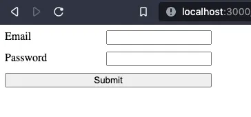
Let's build a sign-in form with two fields: email and password.
We'll begin by creating a new Svelte project (I prefer vite).
npm init @vitejs/app

✔ Project name: · forms-in-svelte
✔ Select a framework: · svelte
✔ Select a variant: · svelte-ts

cd forms-in-svelte
pnpm install //use the package manager you prefer
pnpm run dev
NOTE: At the moment of writing there's a bug with Svelte TypeScript projects. If you get an error, add "type":"module" in your package.json file.
Now that we have our application ready, we'll start by removing the content of App.svelte and create a sign-in form.
We should also delete the Counter component created by default.
<!-- App.svelte -->
<main>
  <form>
    <div>
        <label for="name">Email</label>
        <input
          type="text"
          id="email"
          name="email"
          value=""
        />
    </div>
    <div>
      <label for="name">Password</label>
      <input
        type="password"
        id="password"
        name="password"
        value=""
      />
  </div>
    <button type="submit">Submit</button>
  </form>
</main>

<style>
   * {
      box-sizing: border-box;
    }
    form {
      display: flex;
      flex-direction: column;
      width: 300px;
    }

    form > div{
      display: flex;
      justify-content: space-between;
    }

    form > div + * {
      margin-top: 10px;
    }
</style>
Handling the submit event
Currently, our form does nothing. We need to handle the submit event on the form. To do that, we must add a handler.
To handle a submit event, we need to add to the form element the on:submit handler.
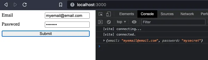
For now, we will only parse the form, and print it in the console.
<!-- App.svelte -->
<script lang="ts">
  function onSubmit(e) {
    const formData = new FormData(e.target);

    const data = {};
    for (let field of formData) {
      const [key, value] = field;
      data[key] = value;
    }
    console.log(data)
  }
</script>

<main>
  <form on:submit|preventDefault={onSubmit}>
   <!-- ... -->
  </form>
</main>
<!-- ... -->
Note that we used the event modifier |preventDefault. This is equivalent to adding the Event preventDefault method in the handler.
Adding validation
Now that our form "works", we can add more features to it. For example, we may want to add some validation when the form is submitted. We will make both inputs required. If the form is invalid, we will print an error in the console. Otherwise, we will print the form data.
<!-- App.svelte -->
<script lang="ts">
  function isFormValid(data: {[fieldName: string]: any}): boolean {
    if(!isRequiredFieldValid(data.email)){
      return false
    }

    if(!isRequiredFieldValid(data.password)){
      return false
    }
    return true
  }

  function isRequiredFieldValid(value){
    return value != null && value !== ""
  }

  function onSubmit(e) {
    const formData = new FormData(e.target);

    const data: any = {};
    for (let field of formData) {
      const [key, value] = field;
      data[key] = value;
    }
    if(isFormValid(data)){
      console.log(data)
    } else {
      console.log("Invalid Form")
    }
  }
</script>
<!-- ... -->
Displaying errors
Now, our form is running a simple validation on submit, but we are missing feedback for the user. It's time to display some errors in case something fails.
<!-- App.svelte -->
<script lang="ts">
  let errors: { [inputName: string]: any } = {};

  function isFormValid(data: { [inputName: string]: any }): boolean {
    return !Object.keys(errors).some((inputName) =>
      Object.keys(errors[inputName]).some(
        (errorName) => errors[inputName][errorName],
      ),
    );
  }

  function validateForm(data: { [inputName: string]: any }):void {
    if (!isRequiredFieldValid(data.email)) {
      errors['email'] = { ...errors['email'], required: true };
    } else {
      errors['email'] = { ...errors['email'], required: false };
    }

    if (!isRequiredFieldValid(data.password)) {
      errors['password'] = { ...errors['password'], required: true };
    } else {
      errors['password'] = { ...errors['password'], required: false };
    }
  }

  function isRequiredFieldValid(value) {
    return value != null && value !== '';
  }

  function onSubmit(e) {
    const formData = new FormData(e.target);

    const data: any = {};
    for (let field of formData) {
      const [key, value] = field;
      data[key] = value;
    }

    validateForm(data);

    if (isFormValid(data)) {
      console.log(data);
    } else {
      console.log('Invalid Form');
    }
  }
</script>

<main>
  <form on:submit|preventDefault={onSubmit}>
    <div>
      <label for="name">Email</label>
      <input type="text" id="email" name="email" value="" />
      {#if errors.email && errors.email.required}
        <p class="error-message">Email is required</p>
      {/if}
    </div>
    <div>
      <label for="name">Password</label>
      <input type="password" id="password" name="password" value="" />
      {#if errors.password && errors.password.required}
        <p class="error-message">Password is required</p>
      {/if}
    </div>
    <button type="submit">Submit</button>
  </form>
</main>

<style>
  /* ... */

  form > div {
    display: flex;
    flex-wrap: wrap;
    justify-content: space-between;
  }

  /* ... */

  .error-message {
    color: tomato;
    flex: 0 0 100%;
    margin: 0 2px;
    font-size: 0.8em;
  }
</style>
First, I created an error object to keep track of each field, and its errors. I created it as an empty object as I expect it to be populated when verification happens.
Three functions will help validation:
isRequiredFieldValidchecks if a given value is null, undefined, or an empty string.validateFormsets errors to true or false for each form input. In this example, we are checking if both required fields are valid.isFormValidwill check if there's an error in the form.
In the template, error messages are added below each form input, with a message to be displayed if the error is present and true.
Finally, some CSS was added for styling the form.
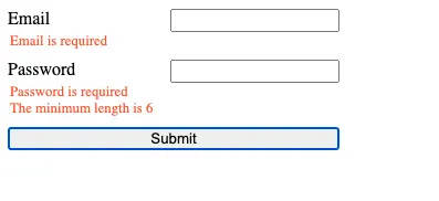
The result looks something like this:
Preparing for reusability
We have a working form right now, but it would be better if somehow we could make our form reusable.
The pattern will be repeated for each input we add. It would be nice if we could make it configurable, or if we could easily add more errors and validators without repeating ourselves.
Let's move the validators to a new file, and add more information to the response.
// Validators.ts
export interface ValidatorResult {
  [validatorName: string]: {
    error: boolean;
    message?: string;
  };
}

export type ValidatorFn = (value: any) => ValidatorResult;

function required(value: any): ValidatorResult {
  if (value === '' || value == null) {
    return { required: { error: true, message: 'Field is required' } };
  }
  return { required: { error: false } };
}

export const Validators = {
  required,
};
Previously, we had the isRequiredFieldValid method returning just a boolean. Now it returns an object with the error name required, error status, and a message, but can be extended with more information if required.
We now need to make use of this new Validator in our App component.
<!-- App.svelte -->
<script lang="ts">
  import { Validators } from './lib/Validators';
  import type { ValidatorFn, ValidatorResult } from './lib/Validators';

  let errors: { [inputName: string]: ValidatorResult } = {};

  let form: {
    [inputName: string]: {
      validators: ValidatorFn[];
    };
  } = {
    email: {
      validators: [Validators.required],
    },
    password: {
      validators: [Validators.required],
    },
  };

  function isFormValid(): boolean {
    return !Object.values(errors).some((field) =>
      Object.values(field).some((errorObject) => errorObject.error),
    );
  }

  function validateForm(data: { [inputName: string]: any }): void {
    Object.keys(data).forEach((field) => validateField(field, data[field]));
  }

  function validateField(field, value) {
    form[field]?.validators &&
      form[field].validators.forEach((fn) => {
        const error = fn(value);
        errors[field] = { ...errors[field], ...error };
      });
  }

  function onSubmit(e) {
    const formData = new FormData(e.target);

    const data: any = {};
    for (let field of formData) {
      const [key, value] = field;
      data[key] = value;
    }

    validateForm(data);

    if (isFormValid()) {
      console.log(data);
    } else {
      console.log('Invalid Form');
    }
  }
</script>

<main>
  <form on:submit|preventDefault={onSubmit}>
    <div>
      <label for="name">Email</label>
      <input type="text" id="email" name="email" value="" />
      {#if errors?.email?.required?.error}
        <p class="error-message">Email is required</p>
      {/if}
    </div>
    <div>
      <label for="name">Password</label>
      <input type="password" id="password" name="password" value="" />
      {#if errors?.password?.required?.error}
        <p class="error-message">Password is required</p>
      {/if}
    </div>
    <button type="submit">Submit</button>
  </form>
</main>

<!-- ... -->
First, I've created a form object that contains the different input names with a list of the validators that should be checked for each of them.
I added the required validator for both of them.
Then we will run all validators in the form object where the key matches the name of the input element.
The template has been updated too to handle the validator response object.
With this small refactoring, we've preserved our previous behavior, but opened the door to expand our form.
More validators
Let's add another validator to our password input.
We'll check if the password has a minimum length of 6 characters.
We'll start by creating a new validator. The best way is to use a higher-order function to set up the length, and return our validator function from it.
export interface ValidatorResult {
  [validatorName: string]: {[key:string]:any} & {
    error: boolean;
    message?: string;
  };
}

// ...

function minLength(number) {
  return function (value): ValidatorResult {
    if (value == null || value.length < number) {
      return {
        minLength: {
          error: true,
          value: number,
          message: `Field minimum length is ${number}`,
        },
      };
    }
    return { minLength: { error: false } };
  };
}

export const Validators = {
  required,
  minLength
};
Now, we need to add it to our form configuration object, and handle the error in the template. We are using the error default message.
<!-- App.svelte -->
<script lang="ts">
// ...
  let form: {
    [inputName: string]: {
      validators: ValidatorFn[];
    };
  } = {
    email: {
      validators: [Validators.required],
    },
    password: {
      validators: [Validators.required, Validators.minLength(6)],
    },
  };

 //...
</script>

<main>
  <form on:submit|preventDefault={onSubmit}>
   <!-- ... -->
    <div>
      <label for="name">Password</label>
      <input type="password" id="password" name="password" value="" />
      {#if errors?.password?.required?.error}
        <p class="error-message">Password is required</p>
      {/if}
	  {#if errors?.password?.minLength?.error}
        <p class="error-message">{errors.password.minLength.message}</p>
      {/if}
    </div>
    <button type="submit">Submit</button>
  </form>
</main>

<!-- ... -->
Handling other form events
I want to add another feature to our form. I want to validate each field separately on blur.
We can use an event handler with one of each input element to do it.
<!-- App.svelte -->
<script lang="ts">
  //...

  function onBlur(e){
    validateField(e.target.name, e.target.value)
  }

</script>

<main>
  <form on:submit|preventDefault={onSubmit}>
    <!-- ... -->
      <input type="text" id="email" name="email" value="" on:blur={onBlur} />
    <!-- ... -->
      <input type="password" id="password" name="password" value="" on:blur={onBlur} />
       <!-- ... -->
  </form>
</main>

<!-- ... -->
We just added an on:blur event handler, and onBlur method to take care of everything. Now, everytime an input loses focus it will be validated.
Our form is working as expected. However, I'd like to move it to a new component.
Creating a reusable form component
Let's create a new component Form.svelte, and move most of the form logic into it.
The form configuration should remain in the App component, and be passed into the new Form component.
<!-- Form.svelte -->
<script lang="ts">
  import { setContext } from 'svelte';
  import type { ValidatorFn, ValidatorResult } from './Validators';
  import { createEventDispatcher } from 'svelte';
  import { writable } from 'svelte/store';

  export let form: {
    [inputName: string]: {
      validators: ValidatorFn[];
    };
  } = {};

  let formEl;

  const dispatch = createEventDispatcher();
  let errors = writable({});

  function onBlur(e) {
    validateField(e.target.name, e.target.value);
  }

  function isFormValid(): boolean {
    return !Object.values($errors).some((field) =>
      Object.values(field).some(
        (errorObject: ValidatorResult) => errorObject.error,
      ),
    );
  }

  function validateField(field, value) {
    form[field]?.validators &&
      form[field].validators.forEach((fn) => {
        const error = fn(value);
        errors.update((e) => {
          e[field] = { ...e[field], ...error };
          return e;
        });
      });
  }

  function validateForm(data: { [inputName: string]: any }): void {
    Object.keys(data).forEach((field) => validateField(field, data[field]));
  }

  function onSubmit(e) {
    const formData = new FormData(e.target);

    const data: any = {};
    for (let field of formData) {
      const [key, value] = field;
      data[key] = value;
    }
    validateForm(data);

    return dispatch('submit', { valid: isFormValid(), data });
  }

  export function reset() {
    formEl.reset();
  }

  setContext('form', { errors, onBlur });
</script>

<form on:submit|preventDefault={onSubmit} bind:this={formEl}>
  <slot />
</form>

<style>
  form {
    display: flex;
    flex-direction: column;
    width: 300px;
  }

  :global(form > div) {
    display: flex;
    flex-wrap: wrap;
    justify-content: space-between;
  }

  :global(form > div + *) {
    margin-top: 10px;
  }
</style>
The template is very simple. A form element with a slot.
We are also binding the form element, and the on:submit event.
There's only one input: form, which will be in charge of passing data from the parent component.
The element's binding will be used to expose the native reset method from the form element. And the event binding will be used to perform validations, and emit a new submit event to be handled by the parent component.
One important thing to notice is that, to communicate the slotted elements with the Form component, we will use the Context API. There's one caveat though, context is not reactive. But, we can make it reactive by making its content a store.
Currently, we will only need to pass two things to the slotted content, the onBlur method, and the errors object. Because we expect the error object to be changing, I rewrote it as a writable store. Note that everything that previously used the errors object will have to use this new store.
To keep the parent component simple (the one containing the form), the form content will be wrapped in new components that will make use of the context API to get the data from the Form component.
Because I want always to have a label for any given field, I'll make it part of the Input component, and because I want to add validation on blur, I'll get the onBlur method exposed by the Form component through the context API.
<!-- Input.svelte -->
<script lang="ts">
  import { getContext } from 'svelte';
  export let type = 'text';
  export let label;
  export let name;
  const { onBlur } = getContext('form');
</script>

<label for={name}>{label}</label>
<input {name} {type} on:blur={onBlur} />
We are closer to getting the same behavior as before, but we are missing the error components. We can wrap all that functionality in a single component, and get the error information through the context API.
<!-- Error.svelte -->
  import { getContext } from 'svelte';
  const { errors } = getContext('form');
  export let message = null;
  export let fieldName;
  export let errorKey;
</script>

{#if $errors?.[fieldName]?.[errorKey]?.error}
  <p class="error-message">{message || $errors[fieldName][errorKey].message}</p>
{/if}

<style>
  .error-message {
    color: tomato;
    flex: 0 0 100%;
    margin: 0 2px;
    font-size: 0.8em;
  }
</style>
We are now reading the value from the errors store to decide if the message should be shown or not.
We are also using a default message from the validator in case no message is provided.
Now that all the pieces are ready, we can update our App component.
<!-- App.svelte -->
<script lang="ts">
  import { Validators } from './lib/Validators';
  import Form from './lib/Form.svelte';
  import Input from './lib/Input.svelte';
  import Error from './lib/Error.svelte';

  let formEl;
  let form = {
    email: {
      validators: [Validators.required],
    },
    password: {
      validators: [Validators.required, Validators.minLength(6)],
    },
  };

  function onSubmit(e) {
    if (e?.detail?.valid) {
      console.log(e.detail.data);
      setTimeout(() => formEl.reset(), 1000)
    } else {
      console.log('Invalid Form');
    }
  }
</script>

<main>
  <Form {form} on:submit={onSubmit} bind:this={formEl}>
    <div>
      <Input label="Email" name="email" />
      <Error
        fieldName="email"
        errorKey="required"
        message="Email is required"
      />
    </div>
    <div>
      <Input label="Password" name="password" />
      <Error
        fieldName="password"
        errorKey="required"
        message="Password is required"
      />
      <Error fieldName="password" errorKey="minLength" />
    </div>
    <button type="submit">Submit</button>
  </Form>
</main>

<style>
  * {
    box-sizing: border-box;
  }
</style>
Our app component now only needs to set up the validators, handle the submit event, and can reset the form if needed.
Extending the form component
Our form component is now exposing just a few things emitted on the submit event, or through the context API, for the slotted components.
Similar to what we've done with the input field, we must extend the functionality for select, radio buttons, checkboxes, or any other form control that we want.
For example, this is how a select component may look like.
<!-- Select.svelte -->
<script lang="ts">
  import { getContext } from 'svelte';
  export let label;
  export let name;
  const { onBlur } = getContext('form');
</script>

<label for={name}>{label}</label>
<select {name} on:blur={onBlur}>
  <slot />
</select>
And this is how it could be used:
<!-- App.svelte -->
<script lang="ts">
  import { Validators } from './lib/Validators';
  import Form from './lib/Form.svelte';
  import Input from './lib/Input.svelte';
  import Error from './lib/Error.svelte';
  import Select from './lib/Select.svelte';

  let form = {
    name: {
      validators: [Validators.required],
    },
    food: {
      validators: [Validators.required],
    },
  };

  let formEl;

  function onSubmit(e) {
    if (e?.detail?.valid) {
      console.log(e.detail.data);
      setTimeout(() => formEl.reset(), 1000)
    } else {
      console.log('Invalid Form');
    }
  }
</script>

<main>
  <Form {form} on:submit={onSubmit} bind:this={formEl}>
    <div>
      <Input label="Name" name="name" />
      <Error
        fieldName="name"
        errorKey="required"
        message="Name is required"
      />
    </div>
    <div>
      <Select label="Favorite food" name="food">
        <option value="chocolate">Chocolate</option>
        <option value="pizza">Pizza</option>
      </Select>
    </div>
    <button type="submit">Submit</button>
  </Form>
</main>
<!-- ... -->
Available Libraries
There are plenty of available libraries for handling forms in Svelte. You can check some of them in this list.
Final thoughts
I hope this step-by-step guide to handling forms helps you find your own solution to handling them, or gives you a better understanding of how other libraries might be working.