Skip to content

Getting started with LitElement and TypeScript

Getting started with LitElement and TypeScript

Getting started with LitElement and TypeScript

The use of powerful frameworks and libraries is very widespread nowadays. We can name Angular, React.js, Vue, Svelte, among others.

It's hard to imagine building a web application without the use of any of those component-based frameworks. For these options, the components are reusable and configurable widgets, they can provide a custom behavior and styling, and they're used as building blocks for the application.

Can we share a component between these frameworks? The short answer is no. Every framework/library has a custom API definition to build components and they are not interoperable with each other.

LitElement

According to the official LitElement website:

LitElement is a simple base class for creating fast, lightweight web components that work in any web page with any framework.

That means we can use the OOP paradigm using JavaScript or even better: TypeScript. Let's explain it with the following examples.

LitElement and JavaScript

To create your first custom Web Component using JavaScript, you'll need to define a class that implements the appearance and functionality as follows:

import { LitElement, html } from 'lit-element';

class HelloComponent extends LitElement {
  static get properties() { // JavaScript way to define custom properties
    return { name: { type: String } };
  }

  constructor() {
    super();
    this.name = 'Luis'; // Default value goes here.
  }

  render() { // Defines a template to be "rendered" as part of the component.
    return html`Hello ${this.name}. Welcome to LitElement!`;
  }
}

// Register as a custom element named <hello-component>
customElements.define('hello-component', MyElement);

LitElement and TypeScript

You can use the power of TypeScript instead by importing some decorators to write your first Web Component as follows:

import { LitElement, html, property, customElement } from 'lit-element';

@customElement('hello-component') //Decorator that register as a custom element named <hello-component>
export class HelloComponent extends LitElement {
  @property({type: String}) name = 'Luis'; // You can assign the default value here.

  render() { // Defines a template to be "rendered" as part of the component.
    return html`Hello, ${this.name}. Welcome to LitElement!</p>`;
  }
}

There's a new component for your project. You can use it in your template files as if it were a new member of the HTML vocabulary:

  <hello-component></hello-component>
  <hello-component name="George"></hello-component>

Wanna play with the latest example? Just see below or open the Stackblitz editor:

LitElement will help you to build your Web Components to be easily shared within your company or organization, even if you are working with different JavaScript frameworks.

Creating Your First Project

So now you're thinking about starting a project and use LitElement to build your web application based on Web Components. That's great!

You can start a project from scratch:

  • You'll need to install LitElement using npm i lit-element
  • Then, install TypeScript with npm i typescript
  • What about creating the tsconfig.json file?
  • Any build system you want to add and configure?
  • Now you'll need to add ESlint and Prettier and follow best practices
  • Continue adding the Unit testing support and Karma
  • You get the point...

Project Scaffolding

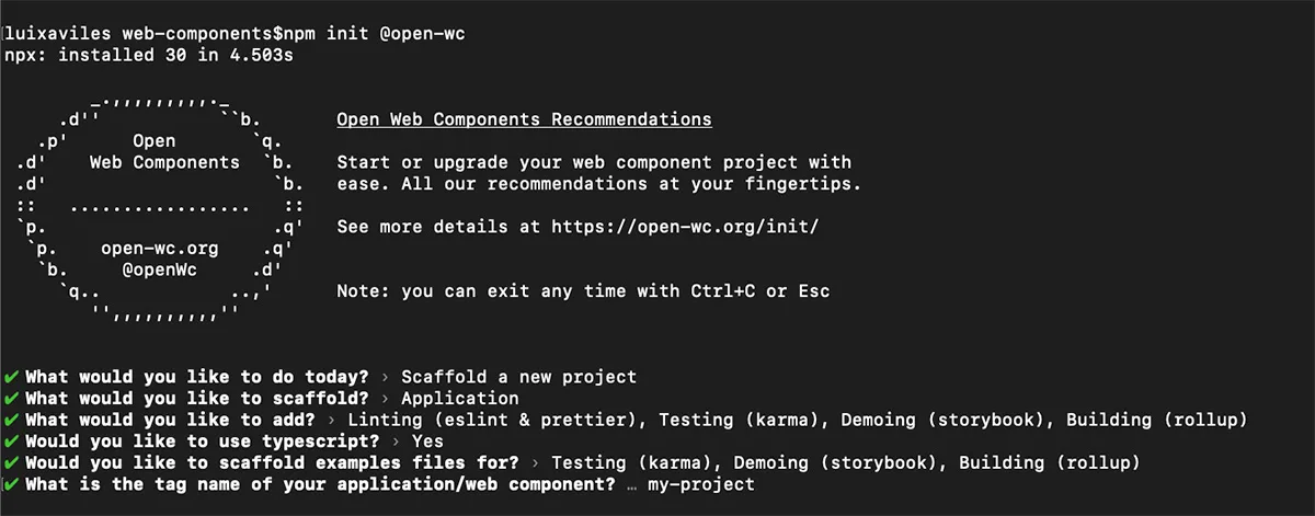
You got covered by a project generator from the open-wc initiative, and you can create your first project with TypeScript support and common tooling in just a few seconds:

Run the open-wc project generator:

npm init @open-wc
# Select "Scaffold a new project" (What would you like to do today?)
# Select "Application" (What would you like to scaffold?)
# Mark/Select "Linting", "Testing", "Demoing" and "Building" (What would you like to add?)
# Yes (Would you like to use TypeScript?)
# Mark/Select "Testing", "Demoing" and "Building" (Would you like to scaffold examples files for?)
# my-project (What is the tag name of your application/web component?)
# Yes (Do you want to write this file structure to disk?)
# Yes, with npm (Do you want to install dependencies?)

You'll have this output:

output-open-wc

The next project structure will be generated:

./
├── my-project/
│   ├── .storybook/
│   │   ├── main.js
│   │   └── preview.js
│   ├── src/
│   │   ├── my-project.ts
│   │   ├── MyProject.ts
│   │   └── open-wc-logo.ts
│   ├── stories/
│   │   └── my-project.stories.ts
│   ├── test/
│   │   └── my-project.test.ts
│   ├── .editorconfig
│   ├── .eslintrc.js
│   ├── .gitignore
│   ├── custom-elements.json
│   ├── index.html
│   ├── karma.conf.js
│   ├── LICENSE
│   ├── package.json
│   ├── README.md
│   ├── rollup.config.js
│   └── tsconfig.json

This project has the support of many tools like lit-element, typescript, eslint, prettier, karma(Testing), storybook(Demoing) and rollup(Building)

Finally, run npm run start command to give a development preview of the application.

Extensions for Visual Studio Code

I found the following Visual Studio Code extensions very useful to build web components with TypeScript:

  • lit-html. This extension adds syntax highlighting and IntelliSense for html code inside of TypeScript tagged template strings.
lit-html
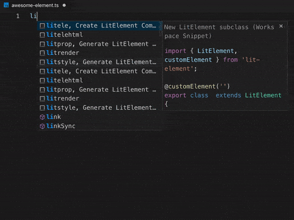
  • LitElement Snippet. This extension provides LitElement code snippets to autogenerate a class with the @customElement() decorator, autogenerate properties, the render function and much more.
litelement-snippet
  • LitElement and Polymer v2/v3 Snippets. Alternatively to the previous one, you can install this extension that contains several JavaScript and HTML Snippets for LitElement and Polymer.

Conclusion

LitElement is an excellent alternative to build lightweight web applications since it's based on the Web Components standard, with the addition of being compatible with any JavaScript-based framework or library. Of course, it's feasible to use these components for building a SPA (Single Page Application) or even add the PWA (Progressive Web Application) capability.

With the help of TypeScript, we can see more possibilities to build Web Components faster with a good developer experience.

This Dot Labs is a development consultancy that is trusted by top industry companies, including Stripe, Xero, Wikimedia, Docusign, and Twilio. This Dot takes a hands-on approach by providing tailored development strategies to help you approach your most pressing challenges with clarity and confidence. Whether it's bridging the gap between business and technology or modernizing legacy systems, you’ll find a breadth of experience and knowledge you need. Check out how This Dot Labs can empower your tech journey.

You might also like

Understanding Vue's Reactive Data cover image

Understanding Vue's Reactive Data

Introduction Web development has always been about creating dynamic experiences. One of the biggest challenges developers face is managing how data changes over time and reflecting these changes in the UI promptly and accurately. This is where Vue.js, one of the most popular JavaScript frameworks, excels with its powerful reactive data system. In this article, we dig into the heart of Vue's reactivity system. We unravel how it perfectly syncs your application UI with the underlying data state, allowing for a seamless user experience. Whether new to Vue or looking to deepen your understanding, this guide will provide a clear and concise overview of Vue's reactivity, empowering you to build more efficient and responsive Vue 3 applications. So, let’s kick off and embark on this journey to decode Vue's reactive data system. What is Vue's Reactive Data? What does it mean for data to be ”'reactive”? In essence, when data is reactive, it means that every time the data changes, all parts of the UI that rely on this data automatically update to reflect these changes. This ensures that the user is always looking at the most current state of the application. At its core, Vue's Reactive Data is like a superpower for your application data. Think of it like a mirror - whatever changes you make in your data, the user interface (UI) reflects these changes instantly, like a mirror reflecting your image. This automatic update feature is what we refer to as “reactivity”. To visualize this concept, let's use an example of a simple Vue application displaying a message on the screen: `javascript import { createApp, reactive } from 'vue'; const app = createApp({ setup() { const state = reactive({ message: 'Hello Vue!' }); return { state }; } }); app.mount('#app'); ` In this application, 'message' is a piece of data that says 'Hello Vue!'. Let's say you change this message to 'Goodbye Vue!' later in your code, like when a button is clicked. `javascript state.message = 'Goodbye Vue!'; ` With Vue's reactivity, when you change your data, the UI automatically updates to 'Goodbye Vue!' instead of 'Hello Vue!'. You don't have to write extra code to make this update happen - Vue's Reactive Data system takes care of it. How does it work? Let's keep the mirror example going. Vue's Reactive Data is the mirror that reflects your data changes in the UI. But how does this mirror know when and what to reflect? That's where Vue's underlying mechanism comes into play. Vue has a behind-the-scenes mechanism that helps it stay alerted to any changes in your data. When you create a reactive data object, Vue doesn't just leave it as it is. Instead, it sends this data object through a transformation process and wraps it up in a Proxy. Proxy objects are powerful and can detect when a property is changed, updated, or deleted. Let's use our previous example: `javascript import { createApp, reactive } from 'vue'; const app = createApp({ setup() { const state = reactive({ message: 'Hello Vue!' }); return { state }; } }); app.mount('#app'); ` Consider our “message” data as a book in a library. Vue places this book (our data) within a special book cover (the Proxy). This book cover is unique - it's embedded with a tracking device that notifies Vue every time someone reads the book (accesses the data) or annotates a page (changes the data). In our example, the reactive function creates a Proxy object that wraps around our state object. When you change the 'message': `javascript state.message = 'Goodbye Vue!'; ` The Proxy notices this (like a built-in alarm going off) and alerts Vue that something has changed. Vue then updates the UI to reflect this change. Let’s look deeper into what Vue is doing for us and how it transforms our object into a Proxy object. You don't have to worry about creating or managing the Proxy; Vue handles everything. `javascript const state = reactive({ message: 'Hello Vue!' }); // What vue is doing behind the scenes: function reactive(obj) { return new Proxy(obj, { // target = state and key = message get(target, key) { track(target, key) return target[key] }, set(target, key, value) { target[key] = value // Here Vue will trigger its reactivity system to update the DOM. trigger(target, key) } }) } ` In the example above, we encapsulate our object, in this case, “state”, converting it into a Proxy object. Note that within the second argument of the Proxy, we have two methods: a getter and a setter. The getter method is straightforward: it merely returns the value, which in this instance is “state.message” equating to 'Hello Vue!' Meanwhile, the setter method comes into play when a new value is assigned, as in the case of “state.message = ‘Hey young padawan!’”. Here, “value” becomes our new 'Hey young padawan!', prompting the property to update. This action, in turn, triggers the reactivity system, which subsequently updates the DOM. Venturing Further into the Depths If you have been paying attention to our examples above, you might have noticed that inside the Proxy` method, we call the functions `track` and `trigger` to run our reactivity. Let’s try to understand a bit more about them. You see, Vue 3 reactivity data is more about Proxy objects. Let’s create a new example: `vue import { reactive, watch, computed, effect } from "vue"; const state = reactive({ showSword: false, message: "Hey young padawn!", }); function changeMessage() { state.message = "It's dangerous to go alone! Take this."; } effect(() => { if (state.message === "It's dangerous to go alone! Take this.") { state.showSword = true; } }); {{ state.message }} Click! ` In this example, when you click on the button, the message's value changes. This change triggers the effect function to run, as it's actively listening for any changes in its dependencies__. How does the effect` property know when to be called? Vue 3 has three main functions to run our reactivity: effect`, `track`, and `trigger`. The effect` function is like our supervisor. It steps in and takes action when our data changes – similar to our effect method, we will dive in more later. Next, we have the track` function. It notes down all the important data we need to keep an eye on. In our case, this data would be `state.message`. Lastly, we've got the trigger` function. This one is like our alarm bell. It alerts the `effect` function whenever our important data (the stuff `track` is keeping an eye on) changes. In this way, trigger`, `track`, and `effect` work together to keep our Vue application reacting smoothly to changes in data. Let’s go back to them: `javascript function reactive(obj) { return new Proxy(obj, { get(target, key) { // target = state & key = message track(target, key) // keep an eye for this return target[key] }, set(target, key, value) { target[key] = value trigger(target, key) // trigger the effects! } }) } ` Tracking (Dependency Collection) Tracking is the process of registering dependencies between reactive objects and the effects that depend on them. When a reactive property is read, it's "tracked" as a dependency of the current running effect. When we execute track()`, we essentially store our effects in a Set object. But what exactly is an "effect"? If we revisit our previous example, we see that the effect method must be run whenever any property changes. This action — running the effect method in response to property changes — is what we refer to as an "Effect"! (computed property, watcher, etc.) > Note: We'll outline a basic, high-level overview of what might happen under the hood. Please note that the actual implementation is more complex and optimized, but this should give you an idea of how it works. Let’s see how it works! In our example, we have the following reactive object: `javascript const state = reactive({ showSword: false, message: "Hey young padawn!", }); // which is transformed under the hood to: function reactive(obj) { return new Proxy(obj, { get(target, key) { // target = state | key = message track(target, key) // keep an eye for this return target[key] }, set(target, key, value) { target[key] = value trigger(target, key) // trigger the effects! } }) } ` We need a way to reference the reactive object with its effects. For that, we use a WeakMap. Which type is going to look something like this: `typescript WeakMap>> ` We are using a WeakMap to set our object state as the target (or key). In the Vue code, they call this object `targetMap`. Within this targetMap` object, our value is an object named `depMap` of Map type. Here, the keys represent our properties (in our case, that would be `message` and `showSword`), and the values correspond to their effects – remember, they are stored in a Set that in Vue 3 we refer to as `dep`. Huh… It might seem a bit complex, right? Let's make it more straightforward with a visual example: With the above explained, let’s see what this Track` method kind of looks like and how it uses this `targetMap`. This method essentially is doing something like this: `javascript let activeEffect; // we will see more of this later function track(target, key) { if (activeEffect) { // depsMap` maps targets to their keys and dependent effects let depsMap = targetMap.get(target); // If we don't have a depsMap for this target in our targetMap`, create one. if (!depsMap) { depsMap = new Map(); targetMap.set(target, depsMap); } let dep = depsMap.get(key); if (!dep) { // If we don't have a set of effects for this key in our depsMap`, create one. dep = new Set(); depsMap.set(key, dep); } // Add the current effect as a dependency dep.add(activeEffect); } } ` At this point, you have to be wondering, how does Vue 3 know what activeEffect` should run? Vue 3 keeps track of the currently running effect by using a global variable. When an effect is executed, Vue temporarily stores a reference to it in this global variable, allowing the track` function to access the currently running effect and associate it with the accessed reactive property. This global variable is called inside Vue as `activeEffect`. Vue 3 knows which effect is assigned to this global variable by wrapping the effects functions in a method that invokes the effect whenever a dependency changes. And yes, you guessed, that method is our effect` method. `javascript effect(() => { if (state.message === "It's dangerous to go alone! Take this.") { state.showSword = true; } }); ` This method behind the scenes is doing something similar to this: `javascript function effect(update) { //the function we are passing in const effectMethod = () => { // Assign the effect as our activeEffect` activeEffect = effectMethod // Runs the actual method, also triggering the get` trap inside our proxy update(); // Clean the activeEffect after our Effect has finished activeEffect = null } effectMethod() } ` The handling of activeEffect` within Vue's reactivity system is a dance of careful timing, scoping, and context preservation. Let’s go step by step on how this is working all together. When we run our `Effect` method for the first time, we call the `get` trap of the Proxy. `javascript function effect(update) const effectMethod = () => { // Storing our active effect activeEffect = effectMethod // Running the effect update() ... } ... } effect(() => { // we call the the get` trap when getting our `state.message` if (state.message === "It's dangerous to go alone! Take this.") { state.showSword = true; } }); ` When running the get` trap, we have our `activeEffect` so we can store it as a dependency. `javascript function reactive(obj) { return new Proxy(obj, { // Gets called when our effect runs get(target, key) { track(target, key) // Saves the effect return target[key] }, // ... (other handlers) }) } function track(target, key) { if (activeEffect) { //... rest of the code // Add the current effect as a dependency dep.add(activeEffect); } } ` This coordination ensures that when a reactive property is accessed within an effect, the track function knows which effect is responsible for that access. Trigger Method Our last method makes this Reactive system to be complete. The trigger` method looks up the dependencies for the given target and key and re-runs all dependent effects. `javascript function trigger(target, key) { const depsMap = targetMap.get(target); if (!depsMap) return; // no dependencies, no effects, no need to do anything const dep = depsMap.get(key); if (!dep) return; // no dependencies for this key, no need to do anything // all dependent effects to be re-run dep.forEach(effect => { effect() }); } ` Conclusion Diving into Vue 3's reactivity system has been like unlocking a hidden superpower in my web development toolkit, and honestly, I've had a blast learning about it. From the rudimentary elements of reactive data and instantaneous UI updates to the intricate details involving Proxies, track and trigger functions, and effects, Vue 3's reactivity is an impressively robust framework for building dynamic and responsive applications. In our journey through Vue 3's reactivity, we've uncovered how this framework ensures real-time and precise updates to the UI. We've delved into the use of Proxies to intercept and monitor variable changes and dissected the roles of track and trigger functions, along with the 'effect' method, in facilitating seamless UI updates. Along the way, we've also discovered how Vue ingeniously manages data dependencies through sophisticated data structures like WeakMaps and Sets, offering us a glimpse into its efficient approach to change detection and UI rendering. Whether you're just starting with Vue 3 or an experienced developer looking to level up, understanding this reactivity system is a game-changer. It doesn't just streamline the development process; it enables you to create more interactive, scalable, and maintainable applications. I love Vue 3, and mastering its reactivity system has been enlightening and fun. Thanks for reading, and as always, happy coding!...

Angular 17: Continuing the Renaissance cover image

Angular 17: Continuing the Renaissance

Angular 17: A New Era November 8th marked a significant milestone in the world of Angular with the release of Angular 17. This wasn't just any ordinary update; it was a leap forward, signifying a new chapter for the popular framework. But what made this release truly stand out was the unveiling of Angular's revamped website, complete with a fresh brand identity and a new logo. This significant transformation represents the evolving nature of Angular, aligning with the modern demands of web development. To commemorate this launch, we also hosted a release afterparty, where we went deep into its new features with Minko Gechev from the Angular core team, and Google Developer Experts (GDEs) Brandon Roberts, Deborah Kurata, and Enea Jahollari. But what exactly are these notable new features in the latest version? Let's dive in and explore. The Angular Renaissance Angular has been undergoing a significant revival, often referred to as Angular's renaissance, a term coined by Sarah Drasner, the Director of Engineering at Google, earlier this year. This revival has been particularly evident in its recent versions. The Angular team has worked hard to introduce many new improvements, focusing on signal-based reactivity, hydration, server-side rendering, standalone components, and migrating to esbuild and Vite for a better and faster developer experience. This latest release, in particular, marks many of these features as production-ready. Standalone Components About a year ago, Angular began a journey toward modernity with the introduction of standalone components. This move significantly enhanced the developer experience, making Angular more contemporary and user-friendly. In Angular's context, a standalone component is a self-sufficient, reusable code unit that combines logic, data, and user interface elements. What sets these components apart is their independence from Angular's NgModule system, meaning they do not rely on it for configuration or dependencies. By setting a standalone: true` flag, you no longer need to embed your component in an NgModule and you can bootstrap directly off that component: `typescript // ./app/app.component.ts @Component({ selector: 'app', template: 'hello', standalone: true }) export class AppComponent {} // ./main.ts import { bootstrapApplication } from '@angular/platform-browser'; import { AppComponent } from './app/app.component'; bootstrapApplication(AppComponent).catch(e => console.error(e)); ` Compared to the NgModules way of adding components, as shown below, you can immediately see how standalone components make things much simpler. `ts // ./app/app.component.ts import { Component } from '@angular/core'; @Component({ selector: 'app-root', templateUrl: './app.component.html', styleUrls: ['./app.component.css'], }) export class AppComponent { title = 'CodeSandbox'; } // ./app/app.module.ts import { NgModule } from '@angular/core'; import { BrowserModule } from '@angular/platform-browser'; import { AppComponent } from './app.component'; @NgModule({ declarations: [ AppComponent ], imports: [ BrowserModule ], providers: [], bootstrap: [AppComponent] }) export class AppModule { } // .main.ts import { platformBrowserDynamic } from '@angular/platform-browser-dynamic'; import { AppModule } from './app/app.module'; platformBrowserDynamic() .bootstrapModule(AppModule) .catch((err) => console.error(err)); ` In this latest release, the Angular CLI now defaults to generating standalone components, directives, and pipes. This default setting underscores the shift towards a standalone-centric development approach in Angular. New Syntax for Enhanced Control Flow Angular 17 introduces a new syntax for control flow, replacing traditional structural directives like ngIf` or `ngFor`, which have been part of Angular since version 2. This new syntax is designed for fine-grained change detection and eventual zone-less operation when Angular completely migrates to signals. It's more streamlined and performance-efficient, making handling conditional or list content in templates easier. The @if` block replaces `*ngIf` for expressing conditional parts of the UI. `ts @if (a > b) { {{a}} is greater than {{b}} } @else if (b > a) { {{a}} is less than {{b}} } @else { {{a}} is equal to {{b}} } ` The @switch` block replaces `ngSwitch`, offering benefits such as not requiring a container element to hold the condition expression or each conditional template. It also supports template type-checking, including type narrowing within each branch. ```ts @switch (condition) { @case (caseA) { Case A. } @case (caseB) { Case B. } @default { Default case. } } ``` The @for` block replaces `*ngFor` for iteration and presents several differences compared to its structural directive predecessor, `ngFor`. For example, the tracking expression (calculating keys corresponding to object identities) is mandatory but offers better ergonomics. Additionally, it supports `@empty` blocks. `ts @for (item of items; track item.id) { {{ item.name }} } ` Defer Block for Lazy Loading Angular 17 introduces the @defer` block, a dramatically improving lazy loading of content within Angular applications. Within the `@defer` block framework, several sub-blocks are designed to elegantly manage different phases of the deferred loading process. The main content within the `@defer` block is the segment designated for lazy loading. Initially, this content is not rendered, becoming visible only when specific triggers are activated or conditions are met, and after the required dependencies have been loaded. By default, the trigger for a `@defer` block is the browser reaching an idle state. For instance, take the following block: it delays the loading of the calendar-imp` component until it comes into the viewport. Until that happens, a placeholder is shown. This placeholder displays a loading message when the `calendar-imp` component begins to load, and an error message if, for some reason, the component fails to load. `ts @defer (on viewport) { } @placeholder { Calendar placeholder } @loading { Loading calendar } @error { Error loading calendar } ` The on` keyword supports a wide a variety of other conditions, such as: - idle` (when the browser has reached an idle state) - interaction` (when the user interacts with a specified element) - hover` (when the mouse has hovered over a trigger area) - timer(x)` (triggers after a specified duration) - immediate` (triggers the deferred load immediately) The second option of configuring when deferring happens is by using the when` keyword. For example: `ts @defer (when isVisible) { } ` Server-Side Rendering (SSR) Angular 17 has made server-side rendering (SSR) much more straightforward. Now, a --ssr` option is included in the `ng new` command, removing the need for additional setup or configurations. When creating a new project with the `ng new` command, the CLI inquires if SSR should be enabled. As of version 17, the default response is set to 'No'. However, for version 18 and beyond, the plan is to enable SSR by default in newly generated applications. If you prefer to start with SSR right away, you can do so by initializing your project with the `--ssr` flag: `shell ng new --ssr ` For adding SSR to an already existing project, utilize the ng add` command of the Angular CLI: `shell ng add @angular/ssr ` Hydration In Angular 17, the process of hydration, which is essential for reviving a server-side rendered application on the client-side, has reached a stable, production-ready status. Hydration involves reusing the DOM structures rendered on the server, preserving the application's state, and transferring data retrieved from the server, among other crucial tasks. This functionality is automatically activated when server-side rendering (SSR) is used. It offers a more efficient approach than the previous method, where the server-rendered tree was completely replaced, often causing visible UI flickers. Such re-rendering can adversely affect Core Web Vitals, including Largest Contentful Paint (LCP), leading to layout shifts. By enabling hydration, Angular 17 allows for the reuse of the existing DOM, effectively preventing these flickers. Support for View Transitions The new View Transitions API, supported by some browsers, is now integrated into the Angular router. This feature, which must be activated using the withViewTransitions` function, allows for CSS-based animations during route transitions, adding a layer of visual appeal to applications. To use it, first you need to import withViewTransitions`: `ts import { provideRouter, withViewTransitions } from '@angular/router'; ` Then, you need to add it to the provideRouter` configuration: `ts bootstrapApplication(AppComponent, { providers: [ provideRouter(routes, withViewTransitions()) ] }) ` Other Notable Changes - Angular 17 has stabilized signals, initially introduced in Angular 16, providing a new method for state management in Angular apps. - Angular 17 no longer supports Node 16. The minimal Node version required is now 18.13. - TypeScript version 5.2 is the least supported version starting from this release of Angular. - The @Component` decorator now supports a `styleUrl` attribute. This allows for specifying a single stylesheet path as a string, simplifying the process of linking a component to a specific style sheet. Previously, even for a single stylesheet, an array was required under `styleUrls`. Conclusion With the launch of Angular 17, the Angular Renaissance is now in full swing. This release has garnered such positive feedback that developers are showing renewed interest in the framework and are looking forward to leveraging it in upcoming projects. However, it's important to note that it might take some time for IDEs to adapt to the new templating syntax fully. While this transition is underway, rest assured that you can still write perfectly valid code using the old templating syntax, as all the changes in Angular 17 are backward compatible. Looking ahead, the future of Angular appears brighter than ever, and we can't wait to see what the next release has in store!...

How to Manage Breakpoints using BreakpointObserver in Angular cover image

How to Manage Breakpoints using BreakpointObserver in Angular

Defining Breakpoints is important when you start working with Responsive Design and most of the time they're created using CSS code. For example: `css .title { font-size: 12px; } @media (max-width: 600px) { .title { font-size: 14px; } } ` By default, the text size value will be 12px, and this value will be changed to 14px when the viewport gets changed to a smaller screen (a maximum width of 600px). That solution works. However, what about if you need to listen_ for certain breakpoints to perform changes in your application? This may be needed to configure third-party components, processing events, or any other. Luckily, Angular comes with a handy solution for these scenarios: the BreakpointObserver. Which is a utility for checking the matching state of @media queries. In this post, we will build a sample application to add the ability to configure certain breakpoints, and being able to listen_ to them. Project Setup Prerequisites You'll need to have installed the following tools in your local environment: - Node.js**. Preferably the latest LTS version. - A package manager**. You can use either NPM or Yarn. This tutorial will use NPM. Creating the Angular Project Let's start creating a project from scratch using the Angular CLI tool. `bash ng new breakpointobserver-example-angular --routing --prefix corp --style css --skip-tests ` This command will initialize a base project using some configuration options: - --routing`. It will create a routing module. - --prefix corp`. It defines a prefix to be applied to the selectors for created components(`corp` in this case). The default value is `app`. - --style scss`. The file extension for the styling files. - --skip-tests`. it avoids the generations of the `.spec.ts` files, which are used for testing Adding Angular Material and Angular CDK Before creating the breakpoints, let's add the Angular Material components, which will install the Angular CDK` library under the hood. `bash ng add @angular/material ` Creating the Home Component We can create a brand new component to handle a couple of views to be updated while the breakpoints are changing. We can do that using the ng generate` command. `bash ng generate component home ` Pay attention to the output of the previous command since it will show you the auto-generated files. Update the Routing Configuration Remember we used the flag --routing` while creating the project? That parameter has created the main routing configuration file for the application: `app-routing.module.ts`. Let's update it to be able to render the `home` component by default. `ts // app-routing.module.ts import { NgModule } from '@angular/core'; import { RouterModule, Routes } from '@angular/router'; import { HomeComponent } from './home/home.component'; const routes: Routes = [ { path: '', component: HomeComponent } ]; @NgModule({ imports: [RouterModule.forRoot(routes)], exports: [RouterModule] }) export class AppRoutingModule { } ` Update the App Component template Remove all code except the router-outlet` placeholder: `html ` This will allow rendering the home` component by default once the routing configuration is running. Using the BreakpointObserver The application has the Angular CDK installed already, which has a layout` package with some utilities to build responsive UIs that _react_ to screen-size changes. Let's update the HomeComponent`, and inject the `BreakpointObserver` as follows. `ts //home.component.ts import { Component, OnInit } from '@angular/core'; import { BreakpointObserver, Breakpoints } from '@angular/cdk/layout'; @Component({ selector: 'corp-home', templateUrl: './home.component.html', styleUrls: ['./home.component.css'] }) export class HomeComponent implements OnInit { readonly breakpoint$ = this.breakpointObserver .observe([Breakpoints.Large, Breakpoints.Medium, Breakpoints.Small, '(min-width: 500px)']) .pipe( tap(value => console.log(value)), distinctUntilChanged() ); constructor(private breakpointObserver: BreakpointObserver) { } ngOnInit(): void { } } ` Once the BreakpointObserver` is injected, we'll be able to evaluate media queries to determine the current screen size, and perform changes accordingly. Then, a breakpoint$` variable references an _observable_ object after a call to the `observe` method. The observe** method gets an observable of results for the given queries, and can be used along with predetermined values defined on `Breakpoints` as a constant. Also, it's possible to use custom breakpoints such as (min-width: 500px)`. Please refer to the documentation to find more details about this. Next, you may need to subscribe_ to the `breakpoint$` observable to see the emitted values after matching the given queries. Again, let's update the home.component.ts` file to do that. `ts // home.component.ts // .... other imports import { distinctUntilChanged, tap } from 'rxjs/operators'; @Component({ //.... }) export class HomeComponent implements OnInit { Breakpoints = Breakpoints; currentBreakpoint:string = ''; // ... readonly breakpoint$ = this.breakpointObserver constructor(private breakpointObserver: BreakpointObserver) { } ngOnInit(): void { this.breakpoint$.subscribe(() => this.breakpointChanged() ); } private breakpointChanged() { if(this.breakpointObserver.isMatched(Breakpoints.Large)) { this.currentBreakpoint = Breakpoints.Large; } else if(this.breakpointObserver.isMatched(Breakpoints.Medium)) { this.currentBreakpoint = Breakpoints.Medium; } else if(this.breakpointObserver.isMatched(Breakpoints.Small)) { this.currentBreakpoint = Breakpoints.Small; } else if(this.breakpointObserver.isMatched('(min-width: 500px)')) { this.currentBreakpoint = '(min-width: 500px)'; } } } ` In the above code, the ngOnInit` method is used to perform a _subscription_ to the `breakpoint$` observable and the method `breakpointChanged` will be invoked every time a breakpoint match occurs. As you may note, the breakpointChanged` method verifies what Breakpoint value has a match through `isMatched` method. In that way, the current component can perform changes after a match happened (in this case, it just updates the value for the `currentBreakpoint` attribute). Using Breakpoint values on the Template Now, we can set a custom template in the home.component.html` file and be able to render a square according to the `currentBreakpoint` value. `html {{ currentBreakpoint }} Large Medium Small Custom ` The previous template will render the current media query value at the top along with a rectangle according to the size: Large, Medium, Small or Custom. Live Demo and Source Code Want to play around with this code? Just open the Stackblitz editor or the preview mode in fullscreen. Find the complete angular project in this GitHub repository: breakpointobserver-example-angular. Do not forget to give it a star ⭐️ and play around with the code. Feel free to reach out on Twitter if you have any questions. Follow me on GitHub to see more about my work....

Nuxt DevTools v1.0: Redefining the Developer Experience Beyond Conventional Tools cover image

Nuxt DevTools v1.0: Redefining the Developer Experience Beyond Conventional Tools

In the ever-evolving world of web development, Nuxt.js has taken a monumental leap with the launch of Nuxt DevTools v1.0. More than just a set of tools, it's a game-changer—a faithful companion for developers. This groundbreaking release, available for all Nuxt projects and being defaulted from Nuxt v3.8 onwards, marks the beginning of a new era in developer tools. It's designed to simplify our development journey, offering unparalleled transparency, performance, and ease of use. Join me as we explore how Nuxt DevTools v1.0 is set to revolutionize our workflow, making development faster and more efficient than ever. What makes Nuxt DevTools so unique? Alright, let's start delving into the features that make this tool so amazing and unique. There are a lot, so buckle up! In-App DevTools The first thing that caught my attention is that breaking away from traditional browser extensions, Nuxt DevTools v1.0 is seamlessly integrated within your Nuxt app. This ensures universal compatibility across browsers and devices, offering a more stable and consistent development experience. This setup also means the tools are readily available in the app, making your work more efficient. It's a smart move from the usual browser extensions, making it a notable highlight. To use it you just need to press Shift + Option + D` (macOS) or `Shift + Alt + D` (Windows): With simple keystrokes, the Nuxt DevTools v1.0 springs to life directly within your app, ready for action. This integration eliminates the need to toggle between windows or panels, keeping your workflow streamlined and focused. The tools are not only easily accessible but also intelligently designed to enhance your productivity. Pages, Components, and Componsables View The Pages, Components, and Composables View in Nuxt DevTools v1.0 are a clear roadmap for your app. They help you understand how your app is built by simply showing its structure. It's like having a map that makes sense of your app's layout, making the complex parts of your code easier to understand. This is really helpful for new developers learning about the app and experienced developers working on big projects. Pages View lists all your app's pages, making it easier to move around and see how your site is structured. What's impressive is the live update capability. As you explore the DevTools, you can see the changes happening in real-time, giving you instant feedback on your app's behavior. Components View is like a detailed map of all the parts (components) your app uses, showing you how they connect and depend on each other. This helps you keep everything organized, especially in big projects. You can inspect components, change layouts, see their references, and filter them. By showcasing all the auto-imported composables, Nuxt DevTools provides a clear overview of the composables in use, including their source files. This feature brings much-needed clarity to managing composables within large projects. You can also see short descriptions and documentation links in some of them. Together, these features give you a clear picture of your app's layout and workings, simplifying navigation and management. Modules and Static Assets Management This aspect of the DevTools revolutionizes module management. It displays all registered modules, documentation, and repository links, making it easy to discover and install new modules from the community! This makes managing and expanding your app's capabilities more straightforward than ever. On the other hand, handling static assets like images and videos becomes a breeze. The tool allows you to preview and integrate these assets effortlessly within the DevTools environment. These features significantly enhance the ease and efficiency of managing your app's dynamic and static elements. The Runtime Config and Payload Editor The Runtime Config and Payload Editor in Nuxt DevTools make working with your app's settings and data straightforward. The Runtime Config lets you play with different configuration settings in real time, like adjusting settings on the fly and seeing the effects immediately. This is great for fine-tuning your app without guesswork. The Payload Editor is all about managing the data your app handles, especially data passed from server to client. It's like having a direct view and control over the data your app uses and displays. This tool is handy for seeing how changes in data impact your app, making it easier to understand and debug data-related issues. Open Graph Preview The Open Graph Preview in Nuxt DevTools is a feature I find incredibly handy and a real time-saver. It lets you see how your app will appear when shared on social media platforms. This tool is crucial for SEO and social media presence, as it previews the Open Graph tags (like images and descriptions) used when your app is shared. No more deploying first to check if everything looks right – you can now tweak and get instant feedback within the DevTools. This feature not only streamlines the process of optimizing for social media but also ensures your app makes the best possible first impression online. Timeline The Timeline feature in Nuxt DevTools is another standout tool. It lets you track when and how each part of your app (like composables) is called. This is different from typical performance tools because it focuses on the high-level aspects of your app, like navigation events and composable calls, giving you a more practical view of your app's operation. It's particularly useful for understanding the sequence and impact of events and actions in your app, making it easier to spot issues and optimize performance. This timeline view brings a new level of clarity to monitoring your app's behavior in real-time. Production Build Analyzer The Production Build Analyzer feature in Nuxt DevTools v1.0 is like a health check for your app. It looks at your app's final build and shows you how to make it better and faster. Think of it as a doctor for your app, pointing out areas that need improvement and helping you optimize performance. API Playground The API Playground in Nuxt DevTools v1.0 is like a sandbox where you can play and experiment with your app's APIs. It's a space where you can easily test and try out different things without affecting your main app. This makes it a great tool for trying out new ideas or checking how changes might work. Some other cool features Another amazing aspect of Nuxt DevTools is the embedded full-featured VS Code. It's like having your favorite code editor inside the DevTools, with all its powerful features and extensions. It's incredibly convenient for making quick edits or tweaks to your code. Then there's the Component Inspector. Think of it as your code's detective tool. It lets you easily pinpoint and understand which parts of your code are behind specific elements on your page. This makes identifying and editing components a breeze. And remember customization! Nuxt DevTools lets you tweak its UI to suit your style. This means you can set up the tools just how you like them, making your development environment more comfortable and tailored to your preferences. Conclusion In summary, Nuxt DevTools v1.0 marks a revolutionary step in web development, offering a comprehensive suite of features that elevate the entire development process. Features like live updates, easy navigation, and a user-friendly interface enrich the development experience. Each tool within Nuxt DevTools v1.0 is thoughtfully designed to simplify and enhance how developers build and manage their applications. In essence, Nuxt DevTools v1.0 is more than just a toolkit; it's a transformative companion for developers seeking to build high-quality web applications more efficiently and effectively. It represents the future of web development tools, setting new standards in developer experience and productivity....