Skip to content

Developer Tools & Debugging in NgRx

Developer Tools & Debugging in NgRx

When working on a complex software solution, we often find ourselves scratching our heads over a bug that was reported to us. It's essential to have proper tools to trace the issues which like to hide in our code execution paths. Luckily for the devs using NgRx in their project, the application state is kept in a single location and all the actions that can modify it are easily traceable with some great DevTools. As NgRx adheres to the redux pattern, we can use the same Redux DevTools as we would use for any other Redux base application. This tool is essential for me when debugging an NgRx based application.

If you haven't worked with NgRx yet, I recommend reading this post first where I introduced the NgRx pattern into a simple app.

Getting started

In order to make our NgRx store visible in the Redux DevTools, we need to pull in a module provided by NgRx platform - @ngrx/store-devtools. For the installation instructions, please visit the official installation guide.

After installing the Store Devtools using the AngularCLI schematics, the following code is automatically added to our AppModule:

@NgModule({
  /* other module properties */
  imports: [
    /* other imported modules */
    StoreDevtoolsModule.instrument({
      maxAge: 25, // Retains last 25 states
      logOnly: environment.production, // Restrict extension to log-only mode
    }),
  ],
})

maxAge property is limited to 25 by default for performance reasons - this is the limit of actions stored in the history tree.

logOnly is usually set to true on production build to limit the number of features used when connecting to Redux DevTools.

I suggest adding name property to our initial configuration to more easily find our state in the DevTools (as it will show all the other stores which might be used in other tabs open in the browser).

@NgModule({
  /* other module properties */
  imports: [
    /* other imported modules */
    StoreDevtoolsModule.instrument({
      name: 'DevTools & Debugging in NgRx'
      maxAge: 25, // Retains last 25 states
      logOnly: environment.production, // Restrict extension to log-only mode
    }),
  ],
})
Redux DevTools - state selector

With that minimal setup, we can already start using the Redux DevTools to start debugging our application.

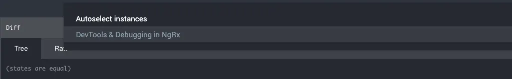
You can access the Redux DevTools in the Redux tab on your browser developers tools. Chrome DevTools - Redux

Tracking actions

The first thing you can do in the Redux DevTools is track all the actions that have been dispatched within the application. Redux DevTools - list of action

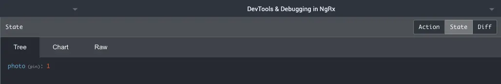
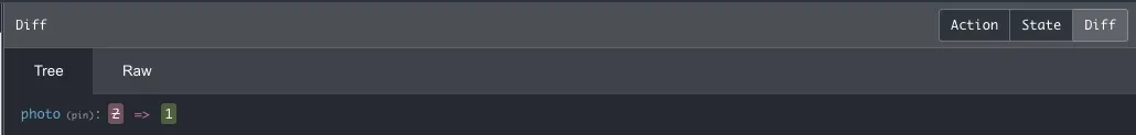
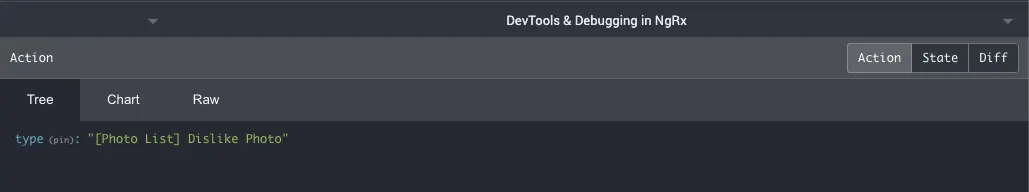
For every selected action, you can see the current state value, what exactly has changed in the state as a result of this action, and the content of action object.

Redux DevTools - current state
Redux DevTools - state diff
Redux DevTools - action

Moreover, the extension gives you the possibility to "time travel" your application and skip some of the actions to see how it would affect the end result of the state.

You can either manually select the point in time to jump to or replay the whole sequence of action using timeline at the bottom.

Redux DevTools - jump to action and player
Redux DevTools - state replay

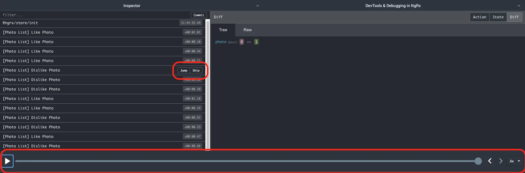
Those functionalities alone provide us with handful of possibilities on tracking how the state of our app is changing over time and pinpointing the possible issues.

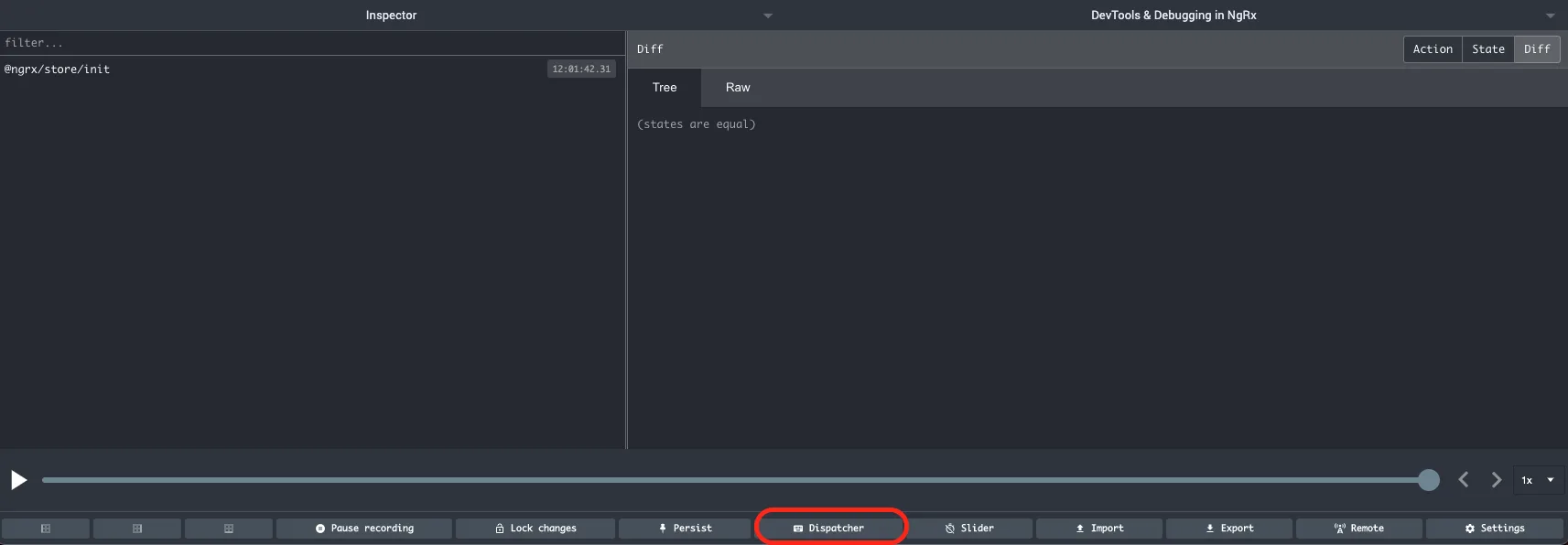
Replicating the app behavior

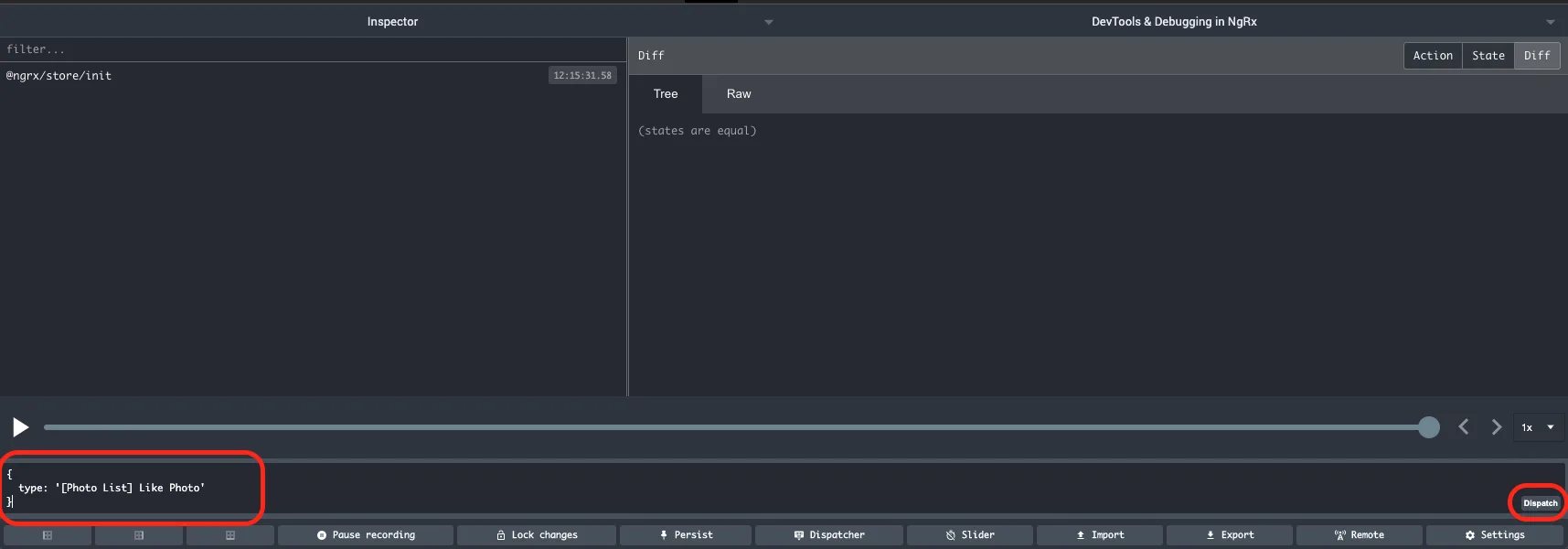
Another very powerful feature of the Redux DevTools is tha posibility to dispatch the actions without the need of interacting with the UI. It's available as one of the tabs in the bottom extension's menu:

Redux DevTools - dispatcher

By using this feature, we can dispatch any action we want. This is extremely useful if we find the exact course of actions that is leading to an error, but it's hard or long to replicate using the UI. We can enter and dispatch the desired sequence of actions and get to the troublesome point in the app state with ease and in a reproducible manner.

Redux DevTools - dispatching actions

There are a few features that combine well with the aforementioned dispatching technique:

  • Persisting the state
  • Commiting and reverting the state
Redux DevTools - Persist and commit

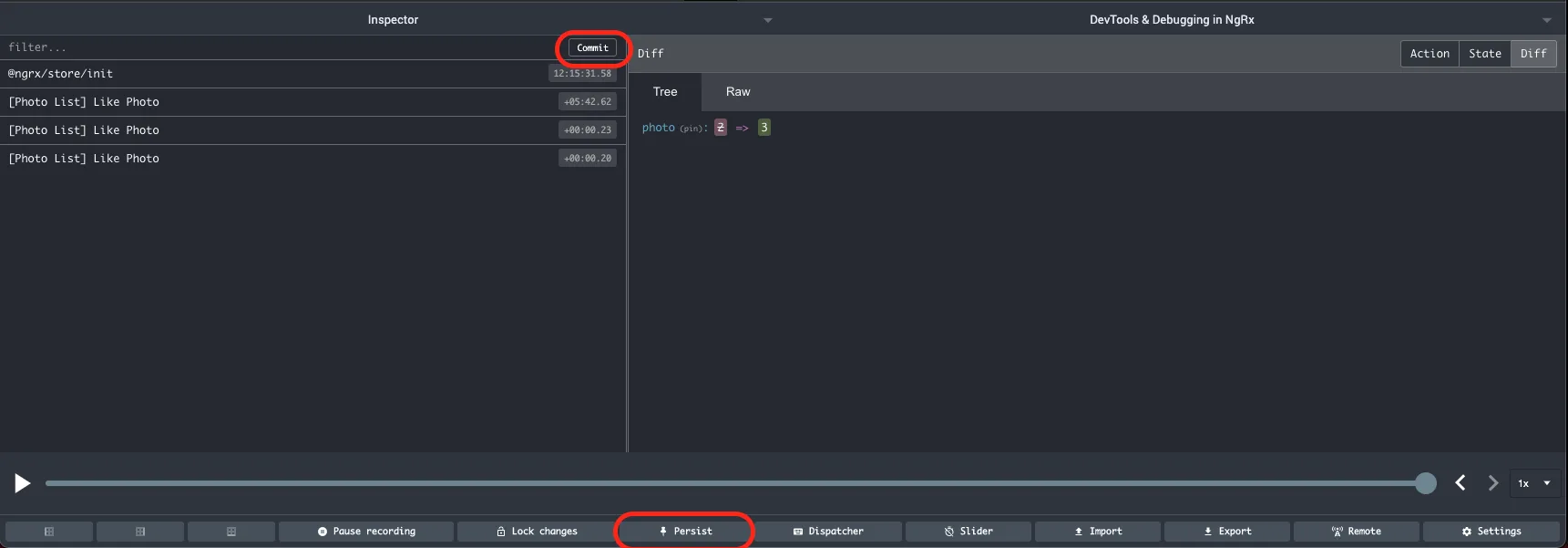
When we select the persist option, the extension makes sure that our state is persisted and restored even after we reload the page. The commit option allows us to store the state at the specific point in time and treat it as a starting point (it's like saving the game before going on to fight with the boss 🤓).

You can perform as many actions as you want from this point on, but you'll always be able to restore the state to a point in time at which you've done a last commit. The restore functionality is only available in the log monitor and not the inspector.

Redux DevTools - Log monitor

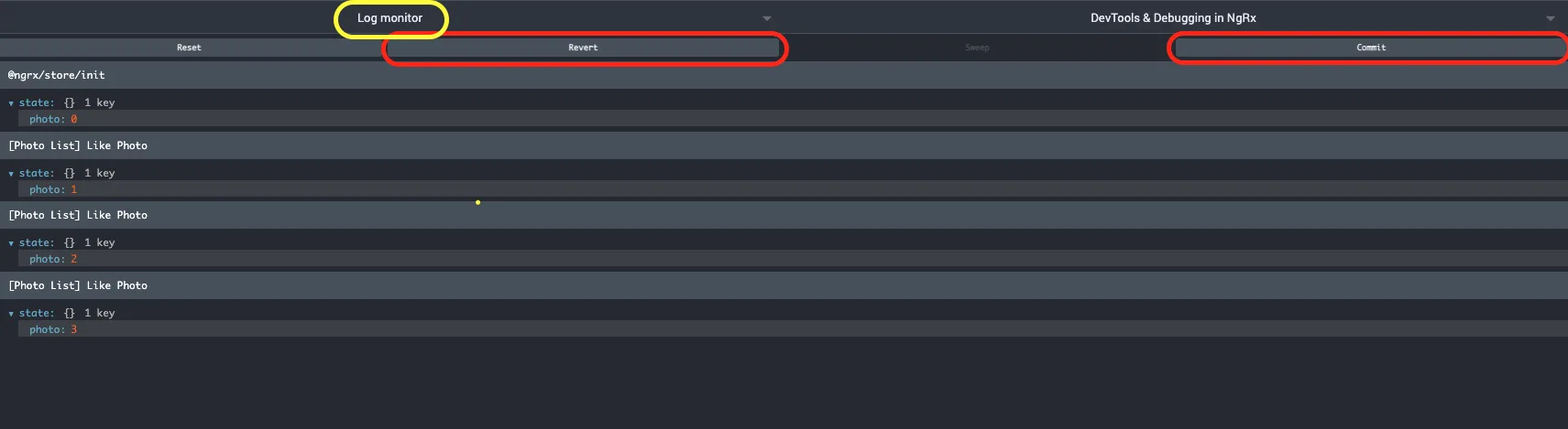
This plays really well with dispatching actions directly from the extension. We can test and debug how our application behaves (ie. via Effects) when dipatching a specific action with always exactly the same comitted state. Also, it's easy to repeat by reverting the state and dispatching the action again.

NgRx Store Dev Tools options

So far we've covered many use-cases of the Redux DevTools, but we can configure it's behavior to our needs when setting up the StoreDevtoolsModule.

In real life applications, our action log might consist of hundreds of actions which might pollute our view of what is happening in the app. We can filter them out directly in the extension but that doesn't solve the issue of the limit on number of actions visible at once. We're still limited by whatever the limit we set, and for performance reasons, we should not take this limit off or set it too high. For debugging purposes, we might only be interested in certain type of actions or definitely know that some actions (ie. the one dispatched by Angular Router) might not be useful to us at the given moment. When setting up our StoreDevtoolsModule we're given 3 ways to filter the actions that will be sent to the Redux DevTools extension:

  • actionBlocklist
  • actionSafelist
  • predicate

The first two are the most common ones to use. We can either block specific patters of actions (which we know that are not of interest to us) or we can allow only certain types of actions. Both of them take an array of strings as a value and act as a regex on action type property to filter out only the ones we're interested in.

If we want to do more specific filtering, we can use predicate. It takes current state and action as parameters and is called for each dispatched action. To allow action to be passed to the Redux DevTools extension, it must return true.

With those techniques, we can narrow the scope of actions visible in the extension and therefore make it easier to get the grasp of what is happening in the app.

Conclusion

With the tools and techniques mentioned above, you should be able to debug your NgRx based application with a bit more ease. It's important to know the tools you have available so that you can use them when the need arises.

In case you have any questions you can always tweet or DM at me @ktrz. I'm always happy to help!

This Dot Labs is a development consultancy that is trusted by top industry companies, including Stripe, Xero, Wikimedia, Docusign, and Twilio. This Dot takes a hands-on approach by providing tailored development strategies to help you approach your most pressing challenges with clarity and confidence. Whether it's bridging the gap between business and technology or modernizing legacy systems, you’ll find a breadth of experience and knowledge you need. Check out how This Dot Labs can empower your tech journey.

You might also like

Angular 17: Continuing the Renaissance cover image

Angular 17: Continuing the Renaissance

Angular 17: A New Era November 8th marked a significant milestone in the world of Angular with the release of Angular 17. This wasn't just any ordinary update; it was a leap forward, signifying a new chapter for the popular framework. But what made this release truly stand out was the unveiling of Angular's revamped website, complete with a fresh brand identity and a new logo. This significant transformation represents the evolving nature of Angular, aligning with the modern demands of web development. To commemorate this launch, we also hosted a release afterparty, where we went deep into its new features with Minko Gechev from the Angular core team, and Google Developer Experts (GDEs) Brandon Roberts, Deborah Kurata, and Enea Jahollari. But what exactly are these notable new features in the latest version? Let's dive in and explore. The Angular Renaissance Angular has been undergoing a significant revival, often referred to as Angular's renaissance, a term coined by Sarah Drasner, the Director of Engineering at Google, earlier this year. This revival has been particularly evident in its recent versions. The Angular team has worked hard to introduce many new improvements, focusing on signal-based reactivity, hydration, server-side rendering, standalone components, and migrating to esbuild and Vite for a better and faster developer experience. This latest release, in particular, marks many of these features as production-ready. Standalone Components About a year ago, Angular began a journey toward modernity with the introduction of standalone components. This move significantly enhanced the developer experience, making Angular more contemporary and user-friendly. In Angular's context, a standalone component is a self-sufficient, reusable code unit that combines logic, data, and user interface elements. What sets these components apart is their independence from Angular's NgModule system, meaning they do not rely on it for configuration or dependencies. By setting a standalone: true` flag, you no longer need to embed your component in an NgModule and you can bootstrap directly off that component: `typescript // ./app/app.component.ts @Component({ selector: 'app', template: 'hello', standalone: true }) export class AppComponent {} // ./main.ts import { bootstrapApplication } from '@angular/platform-browser'; import { AppComponent } from './app/app.component'; bootstrapApplication(AppComponent).catch(e => console.error(e)); ` Compared to the NgModules way of adding components, as shown below, you can immediately see how standalone components make things much simpler. `ts // ./app/app.component.ts import { Component } from '@angular/core'; @Component({ selector: 'app-root', templateUrl: './app.component.html', styleUrls: ['./app.component.css'], }) export class AppComponent { title = 'CodeSandbox'; } // ./app/app.module.ts import { NgModule } from '@angular/core'; import { BrowserModule } from '@angular/platform-browser'; import { AppComponent } from './app.component'; @NgModule({ declarations: [ AppComponent ], imports: [ BrowserModule ], providers: [], bootstrap: [AppComponent] }) export class AppModule { } // .main.ts import { platformBrowserDynamic } from '@angular/platform-browser-dynamic'; import { AppModule } from './app/app.module'; platformBrowserDynamic() .bootstrapModule(AppModule) .catch((err) => console.error(err)); ` In this latest release, the Angular CLI now defaults to generating standalone components, directives, and pipes. This default setting underscores the shift towards a standalone-centric development approach in Angular. New Syntax for Enhanced Control Flow Angular 17 introduces a new syntax for control flow, replacing traditional structural directives like ngIf` or `ngFor`, which have been part of Angular since version 2. This new syntax is designed for fine-grained change detection and eventual zone-less operation when Angular completely migrates to signals. It's more streamlined and performance-efficient, making handling conditional or list content in templates easier. The @if` block replaces `*ngIf` for expressing conditional parts of the UI. `ts @if (a > b) { {{a}} is greater than {{b}} } @else if (b > a) { {{a}} is less than {{b}} } @else { {{a}} is equal to {{b}} } ` The @switch` block replaces `ngSwitch`, offering benefits such as not requiring a container element to hold the condition expression or each conditional template. It also supports template type-checking, including type narrowing within each branch. ```ts @switch (condition) { @case (caseA) { Case A. } @case (caseB) { Case B. } @default { Default case. } } ``` The @for` block replaces `*ngFor` for iteration and presents several differences compared to its structural directive predecessor, `ngFor`. For example, the tracking expression (calculating keys corresponding to object identities) is mandatory but offers better ergonomics. Additionally, it supports `@empty` blocks. `ts @for (item of items; track item.id) { {{ item.name }} } ` Defer Block for Lazy Loading Angular 17 introduces the @defer` block, a dramatically improving lazy loading of content within Angular applications. Within the `@defer` block framework, several sub-blocks are designed to elegantly manage different phases of the deferred loading process. The main content within the `@defer` block is the segment designated for lazy loading. Initially, this content is not rendered, becoming visible only when specific triggers are activated or conditions are met, and after the required dependencies have been loaded. By default, the trigger for a `@defer` block is the browser reaching an idle state. For instance, take the following block: it delays the loading of the calendar-imp` component until it comes into the viewport. Until that happens, a placeholder is shown. This placeholder displays a loading message when the `calendar-imp` component begins to load, and an error message if, for some reason, the component fails to load. `ts @defer (on viewport) { } @placeholder { Calendar placeholder } @loading { Loading calendar } @error { Error loading calendar } ` The on` keyword supports a wide a variety of other conditions, such as: - idle` (when the browser has reached an idle state) - interaction` (when the user interacts with a specified element) - hover` (when the mouse has hovered over a trigger area) - timer(x)` (triggers after a specified duration) - immediate` (triggers the deferred load immediately) The second option of configuring when deferring happens is by using the when` keyword. For example: `ts @defer (when isVisible) { } ` Server-Side Rendering (SSR) Angular 17 has made server-side rendering (SSR) much more straightforward. Now, a --ssr` option is included in the `ng new` command, removing the need for additional setup or configurations. When creating a new project with the `ng new` command, the CLI inquires if SSR should be enabled. As of version 17, the default response is set to 'No'. However, for version 18 and beyond, the plan is to enable SSR by default in newly generated applications. If you prefer to start with SSR right away, you can do so by initializing your project with the `--ssr` flag: `shell ng new --ssr ` For adding SSR to an already existing project, utilize the ng add` command of the Angular CLI: `shell ng add @angular/ssr ` Hydration In Angular 17, the process of hydration, which is essential for reviving a server-side rendered application on the client-side, has reached a stable, production-ready status. Hydration involves reusing the DOM structures rendered on the server, preserving the application's state, and transferring data retrieved from the server, among other crucial tasks. This functionality is automatically activated when server-side rendering (SSR) is used. It offers a more efficient approach than the previous method, where the server-rendered tree was completely replaced, often causing visible UI flickers. Such re-rendering can adversely affect Core Web Vitals, including Largest Contentful Paint (LCP), leading to layout shifts. By enabling hydration, Angular 17 allows for the reuse of the existing DOM, effectively preventing these flickers. Support for View Transitions The new View Transitions API, supported by some browsers, is now integrated into the Angular router. This feature, which must be activated using the withViewTransitions` function, allows for CSS-based animations during route transitions, adding a layer of visual appeal to applications. To use it, first you need to import withViewTransitions`: `ts import { provideRouter, withViewTransitions } from '@angular/router'; ` Then, you need to add it to the provideRouter` configuration: `ts bootstrapApplication(AppComponent, { providers: [ provideRouter(routes, withViewTransitions()) ] }) ` Other Notable Changes - Angular 17 has stabilized signals, initially introduced in Angular 16, providing a new method for state management in Angular apps. - Angular 17 no longer supports Node 16. The minimal Node version required is now 18.13. - TypeScript version 5.2 is the least supported version starting from this release of Angular. - The @Component` decorator now supports a `styleUrl` attribute. This allows for specifying a single stylesheet path as a string, simplifying the process of linking a component to a specific style sheet. Previously, even for a single stylesheet, an array was required under `styleUrls`. Conclusion With the launch of Angular 17, the Angular Renaissance is now in full swing. This release has garnered such positive feedback that developers are showing renewed interest in the framework and are looking forward to leveraging it in upcoming projects. However, it's important to note that it might take some time for IDEs to adapt to the new templating syntax fully. While this transition is underway, rest assured that you can still write perfectly valid code using the old templating syntax, as all the changes in Angular 17 are backward compatible. Looking ahead, the future of Angular appears brighter than ever, and we can't wait to see what the next release has in store!...

A Guide to (Typed) Reactive Forms in Angular - Part II (Building Dynamic Superforms) cover image

A Guide to (Typed) Reactive Forms in Angular - Part II (Building Dynamic Superforms)

In the first blog post of the series, we learned about Angular reactive forms and the data structures behind them. When developing real-world applications, however, you often need to leverage dynamic forms, as writing boilerplate for every form and its specific cases can be tedious and time-consuming. In certain situations, it may even be necessary to retrieve information from an API to construct the forms. In this post, we will go over a convenient abstraction we can create to build dynamic and adaptable forms without repeating boilerplate. The trick is to create a "view model" for our data and use a service to transform that data into a reactive form. I was first introduced to this approach by my friend and former teammate Thomas Duft, and I've been using it ever since. The approach outlined in the linked article worked great with untyped forms, but since now we can get our forms strictly typed, we'll want to upgrade it. And here is where it gets a bit tricky. Remember how I mentioned you shouldn't predeclare your form groups earlier? If you want to recursively create a form from a config, you just have to. And it's a dynamic form, so you cannot easily type it. To solve the issue, I devised a trick inspired by a "Super Form" suggested by Bobby Galli. Assuming we will have interfaces defined for our data, using this approach, we can create dynamic type-safe forms. First, we'll create types for our form config: `TypeScript // this will be our ViewModel for configuring a FormGroup export class FormSection | FormField | (FormSection | FormField)[]; } = any > { public title?: string; public fields: T; constructor(section: { title?: string; fields: T; }) { this.title = section.title; this.fields = section.fields; } } // Let's define some editor types we'll be using in the templates later export type FormEditor = | 'textInput' | 'passwordInput' | 'textarea' | 'checkbox' | 'select'; // And this will be a ViewModel for our FormControls export class FormField { public value: T; public editor: FormEditor; public validators: Validators; public label: string; public required: boolean; public options?: T[]; constructor(field: { value: T; editor: FormEditor; validators: Validators; label: string; required: boolean; options?: T[]; }) { this.value = field.value; this.editor = field.editor; this.validators = field.validators; this.label = field.label; this.required = field.required; this.options = field.options; } } ` And then we'll create some type mappings: `TypeScript // We will use this type mapping to properly declare our form group export type ControlsOf> = { [K in keyof T]: T[K] extends Array ? FormArray> : T[K] extends Record ? FormGroup> : FormControl; }; // We will use this type mapping to type our form config export type ConfigOf = { [K in keyof T]: T[K] extends (infer U)[] ? U extends Record ? FormSection>[] : FormField[] : T[K] extends Record ? FormSection> : FormField; }; ` And now we can use our types in a service that will take care of creating nested dynamic forms: `TypeScript import { Injectable } from '@angular/core'; import { AbstractControl, FormArray, FormControl, FormGroup, } from '@angular/forms'; import { ConfigOf, ControlsOf, FormField, FormSection } from './forms.model'; @Injectable({ providedIn: 'root', }) export class FormsService { public createFormGroup>( section: FormSection> ): FormGroup> { // we need to create an empty FormGroup first, so we can add FormControls recursively const group = new FormGroup({}); Object.keys(section.fields).forEach((key: any) => { const field = section.fields[key]; if (Array.isArray(field)) { group.addControl(key, this.createFormArray(field)); } else { if (field instanceof FormSection) { group.addControl(key, this.createFormGroup(field)); } else { group.addControl(key, new FormControl(field.value, field.validators)); } } }); // and we need to cast the group to the correct type before returning return group as unknown as FormGroup>; } public createFormArray>( fields: unknown[] ): FormArray> { const array: FormArray> = new FormArray( [] ) as unknown as FormArray>; fields.forEach((field) => { if (field instanceof FormSection) { array.push(this.createFormGroup(field)); } else { const { value, validators } = field as FormField; array.push(new FormControl(value, validators)); } }); return array as unknown as FormArray>; } } ` And that's it. Now we can use our FormService` to create forms. Let's say we have the following User model: `TypeScript export type User = { email: string; name: string; } ` We can create a form for this user from config in the following way: `TypeScript const userFormConfig = new FormSection>({ title: 'User Form', fields: { email: new FormField({ value: '', validators: [Validators.required, Validators.email], label: 'Email', editor: 'textInput', required: true, }), name: new FormField({ value: '', validators: [Validators.required], label: 'Name', editor: 'textInput', required: true, }) } }); const userForm = this.formsService.createFormGroup(userFormConfig); ` If we would check the type of userForm.value` now, we would see that it's correctly inferred as: `TypeScript Partial ` Outputting the Dynamic Forms To display the dynamic forms, we can write a simple component that takes the FormSection` or `FormField` as an `Input()` along with our `FormGroup` and displays the form recursively. We can use a setter to assign either field` or `section` property when the view model is passed into the component, so we can conveniently use them in our template. Our form component's TypeScript code will look something like this: `TypeScript import { Component, Input } from '@angular/core'; import { FormField, FormSection } from '../forms.model'; import { FormArray, FormGroup } from '@angular/forms'; @Component({ selector: 'app-form', templateUrl: './form.component.html', styleUrls: ['./form.component.scss'], }) export class FormComponent { private fieldConfig?: FormField; private sectionConfig?: FormSection; private arrayConfig?: (FormSection | FormField)[]; private sectionFieldsArray?: [string, FormField][]; @Input() public set config( config: | FormField | FormSection | (FormSection | FormField)[] ) { this.fieldConfig = config instanceof FormField ? config : undefined; this.arrayConfig = Array.isArray(config) ? config : undefined; this.sectionConfig = config instanceof FormSection ? config : undefined; this.sectionFieldsArray = Object.entries(this.sectionConfig?.fields || {}); } public get sectionFields(): [string, FormField][] { return this.sectionFieldsArray || []; } public get field(): FormField | undefined { return this.fieldConfig; } public get section(): FormSection | undefined { return this.sectionConfig; } public get array(): (FormSection | FormField)[] | undefined { return this.arrayConfig; } ngAfterViewInit() { console.log(this.arrayConfig); } @Input() public key!: string; @Input() public group!: FormGroup; public get sectionGroup(): FormGroup { return this.group.get(this.key) as FormGroup; } public get formArray(): FormArray { return this.group.get(this.key) as FormArray; } } ` And our template will reference a new form component for each section field in case we have passed in a FormSection` and it will have a switch case to display the correct control in case a `FormField` has been passed in: `HTML {{ field.label }} {{ section.title }} ` That way, we can display the whole form just by referencing one component, such as `HTML ` Check out an example on StackBlitz. In the next (and last) post of the series, we will learn about building custom Form Controls....

How to Create a Bot That Sends Slack Messages Using Block Kit and GitHub Actions cover image

How to Create a Bot That Sends Slack Messages Using Block Kit and GitHub Actions

Have you ever wanted to get custom notifications in Slack about new interactions in your GitHub repository? If so, then you're in luck. With the help of GitHub actions and Slack's Block Kit, it is super easy to set up automated workflows that will send custom messages to your Slack channel of choice. In this article, I will guide you on how to set up the Slack bot and send automatic messages using GH actions. Create a Slack app Firstly, we need to create a new Slack application. Go to Slack's app page. If you haven't created an app before you should see: otherwise you might see a list of your existing apps: Let's click the Create an App` button. Frpm a modal that shows up, choose `From scratch` option: In the next step, we can choose the app's name (eg. My Awesome Slack App`) and pick a workspace that you want to use for testing the app. After the app is created successfully, we need to configure a couple of additional options. Firstly we need to configure the OAuth & Permissions` section: In the Scopes` section, we need to add a proper scope for our bot. Let's click `Add an OAuth Scope` in the `Bot Token Scopes` section, and select an `incoming-webhook` scope: Next, in OAuth Tokens for Your Workspace` section, click `Install to Workspace` and choose a channel that you want messages to be posted to. Finally, let's go to Incoming Webhooks page`, and activate the incoming hooks toggle (if it wasn't already activated). Copy the webhook URL (we will need it for our GitHub action). Create a Github Action Workflow In this section, we will focus on setting up the GitHub action workflow that will post messages on behalf of the app we've just created. You can use any of your existing repositories, or create a new one. Setting Up Secrets In your repository, go to Settings` -> `Secrets and variables` -> `Actions` section and create a `New Repository Secret`. We will call the secret SLACK_WEBHOOK_URL` and paste the url we've previously copied as a value. Create a workflow To actually send a message we can use slackapi/slack-github-action GitHub action. To get started, we need to create a workflow file in .github/workflows` directory. Let's create `.github/workflows/slack-message.yml` file to your repository with the following content and commit the changes to `main` branch. `yaml name: 'Send Slack notification' on: workflowdispatch: jobs: send-slack-notification: runs-on: ubuntu-latest steps: - name: Send message to Slack workflow id: slack uses: slackapi/slack-github-action@v1.24.0 with: payload: | { "text": "Hello Slack", "blocks": [ { "type": "section", "text": { "type": "mrkdwn", "text": "GitHub Action (${{ github.runid }}) posted this message" } } ] } env: SLACKWEBHOOK_URL: ${{ secrets.SLACK_WEBHOOK_URL }} SLACKWEBHOOK_TYPE: INCOMING_WEBHOOK ` In this workflow, we've created a job that uses slackapi/slack-github-action` action and sends a basic message with an action run id. The important thing is that we need to set our webhook url as an env variable. This was the action can use it to send a message to the correct endpoint. We've configured the action so that it can be triggered manually. Let's trigger it by going to Actions` -> `Send Slack notification` We can run the workflow manually in the top right corner. After running the workflow, we should see our first message in the Slack channel that we've configured earlier. Manually triggering the workflow to send a message is not very useful. However, we now have the basics to create more useful actions. Automatic message on pull request merge Let's create an action that will send a notification to Slack about a new contribution to our repository. We will use Slack's Block Kit to construct our message. Firstly, we need to modify our workflow so that instead of being manually triggered, it runs automatically when a pull requests to main` branch is merged. This can be configured in the `on` section of the workflow file: `yaml on: pullrequest: branches: - main types: - closed ` Secondly, let's make sure that we only run the workflow when a pull request is merged and not eg. closed without merging. We can configure that by using if` condition on the `job`: `yaml - name: Send message to Slack workflow id: slack uses: slackapi/slack-github-action@v1.24.0 with: payload: | { "blocks": [ { "type": "header", "text": { "type": "plaintext", "text": "A PR was just merged into ${{ github.repo }} :tada:", "emoji": true } }, { "type": "divider" }, { "type": "section", "text": { "type": "mrkdwn", "text": "${{ github.event.pull_request.user.login }}* has just contributed to ${{ github.repository }} :partying_face:" } } ] } ` We've used a repository name (github.repository`) as well as the user login that created a pull request (`github.event.pull_request.user.login`), but we could customize the message with as many information as we can find in the `pull_request` event. If you want to quickly edit and preview the message template, you can use the Slack's Block Kit Builder. Now we can create any PR, eg. add some changes to README.md, and after the PR is merged, we will get a Slack message like this. Summary As I have shown in this article, sending Slack messages automatically using GitHub actions is quite easy. If you want to check the real life example, visit the starter.dev project where we are using the slackapi/slack-github-action` to get notifications about new contributions (send-slack-notification.yml) If you have any questions, you can always Tweet or DM me at @ktrz. I'm always happy to help!...

Nuxt DevTools v1.0: Redefining the Developer Experience Beyond Conventional Tools cover image

Nuxt DevTools v1.0: Redefining the Developer Experience Beyond Conventional Tools

In the ever-evolving world of web development, Nuxt.js has taken a monumental leap with the launch of Nuxt DevTools v1.0. More than just a set of tools, it's a game-changer—a faithful companion for developers. This groundbreaking release, available for all Nuxt projects and being defaulted from Nuxt v3.8 onwards, marks the beginning of a new era in developer tools. It's designed to simplify our development journey, offering unparalleled transparency, performance, and ease of use. Join me as we explore how Nuxt DevTools v1.0 is set to revolutionize our workflow, making development faster and more efficient than ever. What makes Nuxt DevTools so unique? Alright, let's start delving into the features that make this tool so amazing and unique. There are a lot, so buckle up! In-App DevTools The first thing that caught my attention is that breaking away from traditional browser extensions, Nuxt DevTools v1.0 is seamlessly integrated within your Nuxt app. This ensures universal compatibility across browsers and devices, offering a more stable and consistent development experience. This setup also means the tools are readily available in the app, making your work more efficient. It's a smart move from the usual browser extensions, making it a notable highlight. To use it you just need to press Shift + Option + D` (macOS) or `Shift + Alt + D` (Windows): With simple keystrokes, the Nuxt DevTools v1.0 springs to life directly within your app, ready for action. This integration eliminates the need to toggle between windows or panels, keeping your workflow streamlined and focused. The tools are not only easily accessible but also intelligently designed to enhance your productivity. Pages, Components, and Componsables View The Pages, Components, and Composables View in Nuxt DevTools v1.0 are a clear roadmap for your app. They help you understand how your app is built by simply showing its structure. It's like having a map that makes sense of your app's layout, making the complex parts of your code easier to understand. This is really helpful for new developers learning about the app and experienced developers working on big projects. Pages View lists all your app's pages, making it easier to move around and see how your site is structured. What's impressive is the live update capability. As you explore the DevTools, you can see the changes happening in real-time, giving you instant feedback on your app's behavior. Components View is like a detailed map of all the parts (components) your app uses, showing you how they connect and depend on each other. This helps you keep everything organized, especially in big projects. You can inspect components, change layouts, see their references, and filter them. By showcasing all the auto-imported composables, Nuxt DevTools provides a clear overview of the composables in use, including their source files. This feature brings much-needed clarity to managing composables within large projects. You can also see short descriptions and documentation links in some of them. Together, these features give you a clear picture of your app's layout and workings, simplifying navigation and management. Modules and Static Assets Management This aspect of the DevTools revolutionizes module management. It displays all registered modules, documentation, and repository links, making it easy to discover and install new modules from the community! This makes managing and expanding your app's capabilities more straightforward than ever. On the other hand, handling static assets like images and videos becomes a breeze. The tool allows you to preview and integrate these assets effortlessly within the DevTools environment. These features significantly enhance the ease and efficiency of managing your app's dynamic and static elements. The Runtime Config and Payload Editor The Runtime Config and Payload Editor in Nuxt DevTools make working with your app's settings and data straightforward. The Runtime Config lets you play with different configuration settings in real time, like adjusting settings on the fly and seeing the effects immediately. This is great for fine-tuning your app without guesswork. The Payload Editor is all about managing the data your app handles, especially data passed from server to client. It's like having a direct view and control over the data your app uses and displays. This tool is handy for seeing how changes in data impact your app, making it easier to understand and debug data-related issues. Open Graph Preview The Open Graph Preview in Nuxt DevTools is a feature I find incredibly handy and a real time-saver. It lets you see how your app will appear when shared on social media platforms. This tool is crucial for SEO and social media presence, as it previews the Open Graph tags (like images and descriptions) used when your app is shared. No more deploying first to check if everything looks right – you can now tweak and get instant feedback within the DevTools. This feature not only streamlines the process of optimizing for social media but also ensures your app makes the best possible first impression online. Timeline The Timeline feature in Nuxt DevTools is another standout tool. It lets you track when and how each part of your app (like composables) is called. This is different from typical performance tools because it focuses on the high-level aspects of your app, like navigation events and composable calls, giving you a more practical view of your app's operation. It's particularly useful for understanding the sequence and impact of events and actions in your app, making it easier to spot issues and optimize performance. This timeline view brings a new level of clarity to monitoring your app's behavior in real-time. Production Build Analyzer The Production Build Analyzer feature in Nuxt DevTools v1.0 is like a health check for your app. It looks at your app's final build and shows you how to make it better and faster. Think of it as a doctor for your app, pointing out areas that need improvement and helping you optimize performance. API Playground The API Playground in Nuxt DevTools v1.0 is like a sandbox where you can play and experiment with your app's APIs. It's a space where you can easily test and try out different things without affecting your main app. This makes it a great tool for trying out new ideas or checking how changes might work. Some other cool features Another amazing aspect of Nuxt DevTools is the embedded full-featured VS Code. It's like having your favorite code editor inside the DevTools, with all its powerful features and extensions. It's incredibly convenient for making quick edits or tweaks to your code. Then there's the Component Inspector. Think of it as your code's detective tool. It lets you easily pinpoint and understand which parts of your code are behind specific elements on your page. This makes identifying and editing components a breeze. And remember customization! Nuxt DevTools lets you tweak its UI to suit your style. This means you can set up the tools just how you like them, making your development environment more comfortable and tailored to your preferences. Conclusion In summary, Nuxt DevTools v1.0 marks a revolutionary step in web development, offering a comprehensive suite of features that elevate the entire development process. Features like live updates, easy navigation, and a user-friendly interface enrich the development experience. Each tool within Nuxt DevTools v1.0 is thoughtfully designed to simplify and enhance how developers build and manage their applications. In essence, Nuxt DevTools v1.0 is more than just a toolkit; it's a transformative companion for developers seeking to build high-quality web applications more efficiently and effectively. It represents the future of web development tools, setting new standards in developer experience and productivity....