Skip to content

VueJS Updates - October 2021

🌱  Introduction

What’s new in Vue?

What new frameworks are available for software developers building futuristic products?

How is Vue catching up to changes in the technological ecosystem, and improving on processes, systems, and experience?

If you are curious to know what’s new in the Vue ecosystem, read on to discover new updates, developments and high-level plans discussed in this edition of Vue Contributor Days, hosted by Tracy Lee, Evan You, and Simone Cuomo. If you would rather watch the full event, you can find it here.

First off, let’s have a quick glance at the cool panellists featured in this edition.

The Panelists Highlight:

Now let’s dive in!

🌱  Vue 3.2

  1. 3.2 Released in August
  • (Script setup) is out of experimental
  • (style) v-bind
  • Define custom element ()
  • Reactivity performance ++
  • Effect scope API
  • ESM build + improved streaming API for @vue/server - renderer
  • V-memo for advanced performance optimization
  1. NEW RFCs
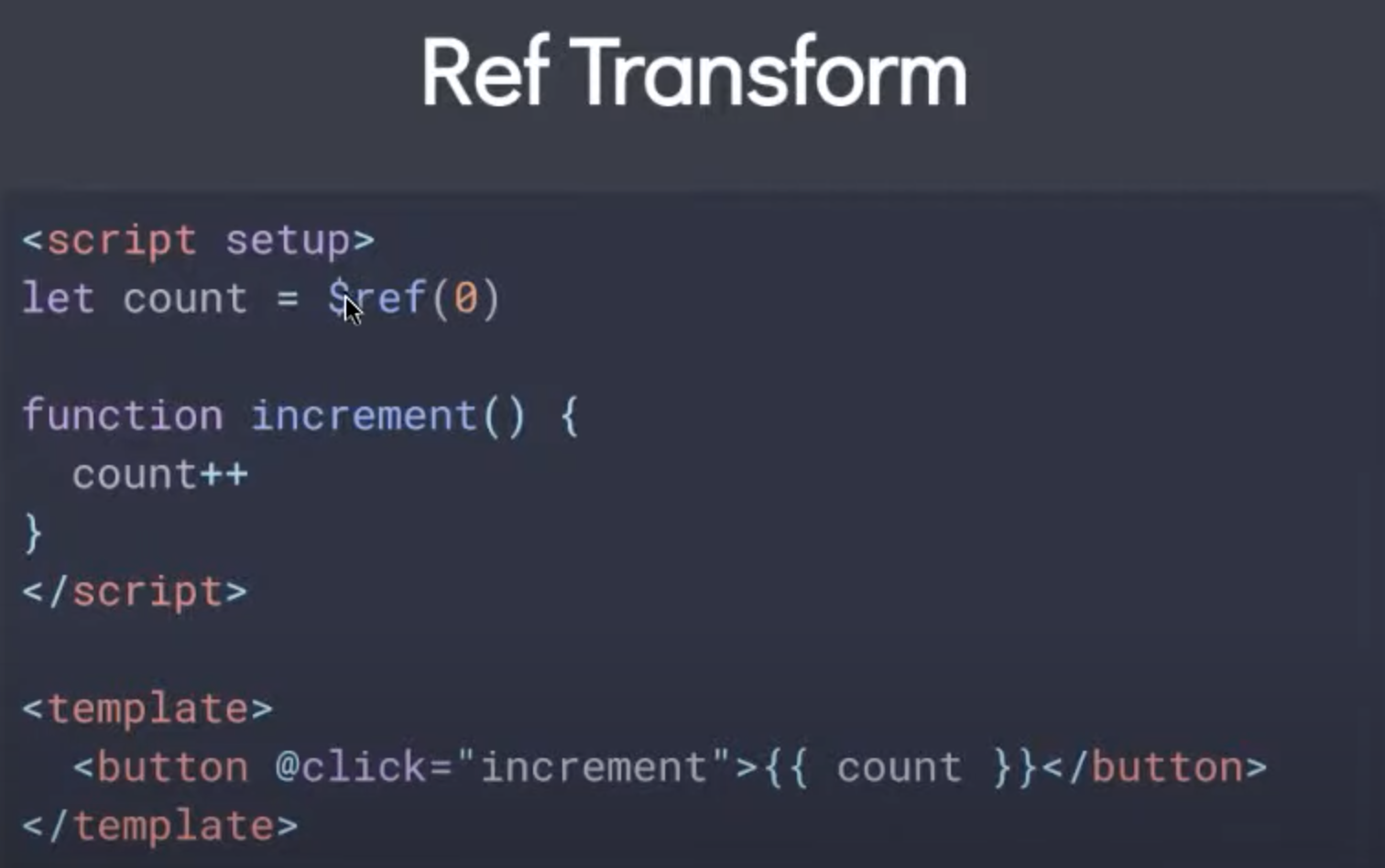
  • Ref Transform Vuejs/rfcs/discussions/369 Ref Transform
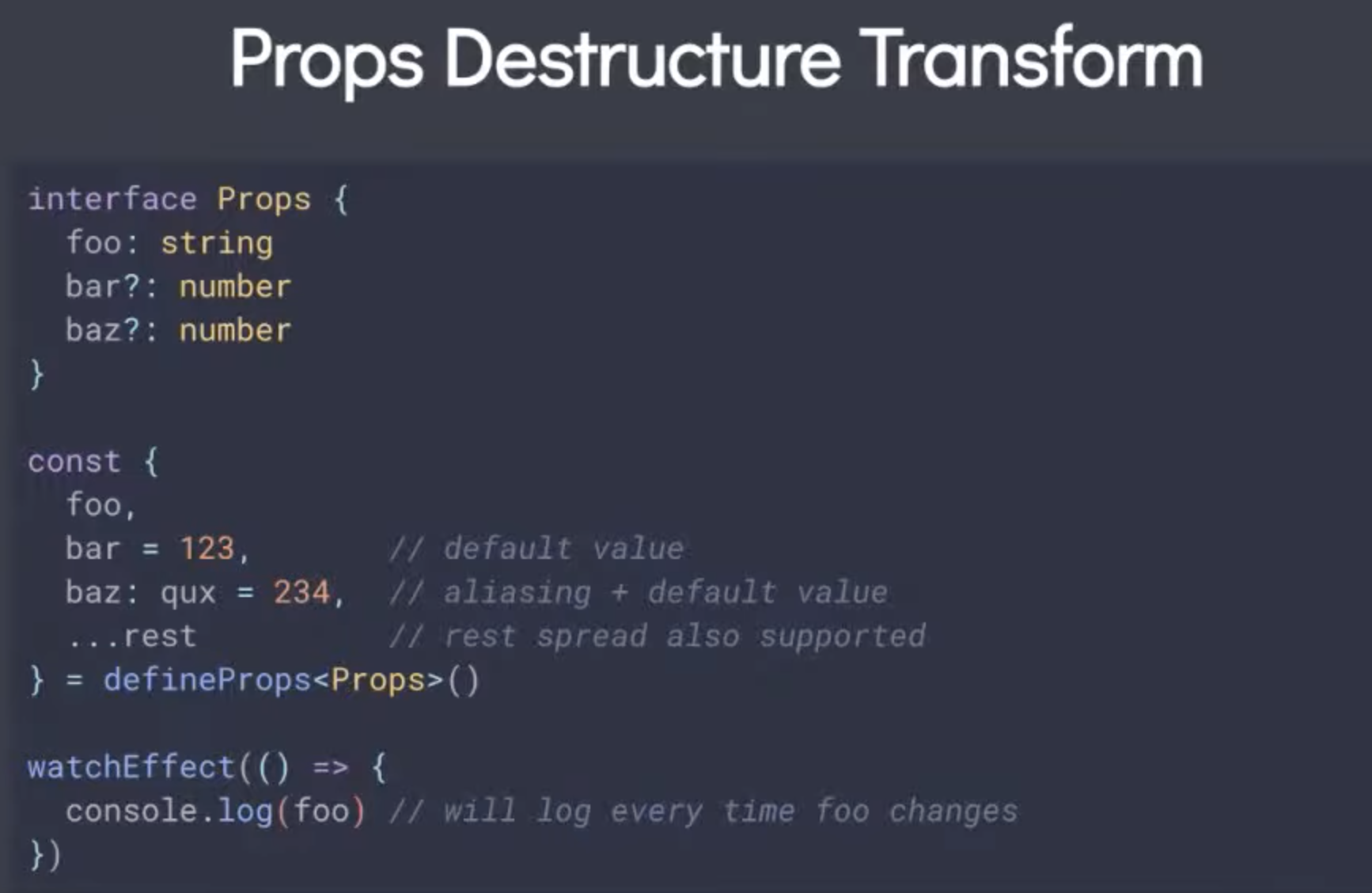
  • Props Destructure Transform Vuejs/rcfs/discussions/394 Vuejs/vue-next/pu11/4690 Props destructure transform
  1. New documentation (WIP)
  • https://github.com/vuejs/docs/free/next
  • Staging Deployment is available at https://vue-docs-preview.netlify.app/guide/introduction.html
  • Dark mode is now available
  • More User focus
  • A new introduction: Vue as a framework
  • Better Learning path
  • Single-file component and different API preferences
  1. New Default Recommendations
  • Vue-cli => create-vue (vite based)
  • Vetur => Velar
  • State Management: consolidate Vuex-next, Pina, core
  1. SSR Focused
  • Async Component Hydration Strategies
  • Other Hydration / Payload Improvements
  • Suspense Finalization## 👩‍💻 

🌱  Comunity updates

👩‍💻  IONIC VUE(Liam DeBeasi - Lead Developer, Ionic Framework)

  • Updates to Ionic/Vue V6
  • New Components, example: Accordions, Breadcrumbs, etc
  • Updated to new IOS designs
  • Added support for Vite
  • updates to CapacitorJS
  • Updates to StencilJS

👩‍💻  Vue i18n (Kazuya Kawaguchi - Software Engineer, PLAID, Inc & Author of Vue i18n)

  • Current stable version is 9.1.9
  • It supports Vue 3
  • Typescript support

👩‍💻  Astro (Fred Schott - Creator of Astro)

Checkout https://astro.build/. It supports Vue.

👩‍💻  QUASAR (Luke Diebold - Lead developer, Agripath & Quasar Core Team)

  • Vue 3 Support
  • Volar Support
  • Vite Support in progress
  • Core App Extensions Migration are nearly complete, A Popular example is Qcalendar.
  • Static Site Generator(SSG) Freddy38510/quasar-app-extension-ssg
  • Cypress component testing integration, still in Alpha.
  • Visit Quasarcast.com to learn about version 2. Everything is free.
  • QuasarNews.com (Podcast) Coming soon.
  • 72+ component series in Quasar Components(QuasarComponents.com).

👩‍💻  VUE Storefront (Filip Rakowski - Co-founder/CTO, Vue StoreFront)

  • Building high-quality tools to help developers build an amazing e-commerce storefront.
  • Vue Storefront Middleware and UI.
  • Vue Storefront Platform to host and analyze on the storefront.

👩‍💻  Nuxt (Daniel Roe - Framework Architect, Nuxt)

  • Nuxt 3 Public beta https://v3.nuxtjs.org/
  • Nuxt Cli
  • Nuxt ecosystem is now ESM

👩‍💻  VUETIFY (John Leider - Author & Founder, Vuetify)

  • Updates to the Form component.
  • New validation system, selection controls, checkboxes, different filtering methods on different types of data.
  • Update to Autocomplete component.
  • New component for Nested functionality.
  • Vite plugin.
  • SAAS Interfacing: updated from import to modules so it’s more intuitive for modification of the frameworks or utility classes.
  • It supports the different compile methods for overriding variables.
  • It works with Vue CLI.
  • A new vite SSR documentation.

👩‍💻  CHAKRA U.I (Jonathan Bakebwa - Creator of Chakra UI & UI Engineer rct.ai)

CHAKRA U.I/ VUE NEXT VI Alpha release is out and in use for production and mostly relies on the theme API

  • Base style overrides and custom variants.
  • Partial back-port to @^0.10.2
  • Mode utility.
  • V2 early development with UI machines.
  • State machines to write Vue composition API hooks.
  • CHAKRA U.I Extract for Zero- runtime styling API.

👩‍💻  Nuxt (Anthony Fu - Core team member, Vue & Vite)

  • Vue 3 Syntax in Vue 2.
  • https://github.com/vuejs/composition-api
  • https://github.com/antfu/unplugin-vue2-script-setup
  • https://github.com/antfu/unplugin-auto-import
  • https://github.com/antfu/unplugin-vue-components

🧠  Have Any Questions

🙋‍♀️  If you have any questions or things to share? Use #VueContributorDays on Twitter and talk with us!

📺  View the replay here for the full update on the Vue Ecosystem! 🤝

This Dot Labs is a development consultancy that is trusted by top industry companies, including Stripe, Xero, Wikimedia, Docusign, and Twilio. This Dot takes a hands-on approach by providing tailored development strategies to help you approach your most pressing challenges with clarity and confidence. Whether it's bridging the gap between business and technology or modernizing legacy systems, you’ll find a breadth of experience and knowledge you need. Check out how This Dot Labs can empower your tech journey.

You might also like

Getting Started with Vuetify in Vue 3 cover image

Getting Started with Vuetify in Vue 3

If you're here to learn about Vuetify and how to use it with Vue 3, you've come to the right place. In this article, we'll introduce Vuetify, a Material Design component framework for Vue.js, and walk you through setting it up in a Vue 3 project. We will also build a simple web app that allows us to create and vue jokes. Oh, sorry, view jokes! What is Vuetify? Vuetify is a VueJS Material Design component framework. That is to say that Vuetify provides us with prebuilt components and features (e.g. internationalization, tree shaking, theming, etc.) to help us build Vue applications faster. Additionally, Vuetify components have built-in standard functionality, such as validation in form inputs, or various disabled states in buttons. You can check out a full list of components supported by Vuetify on their official documentation website. Setting things up Before we get started, you will need the following on your machine: - NodeJS installed - A NodeJS package manager e.g. yarn or npm installed - Intermediate knowledge of Vue 3.x with the composition API If you’d like to follow along, feel free to clone the github repository for this article. `shell git clone https://github.com/thisdot/blog-demos.git or `git@github.com:thisdot/blog-demos.git` for ssh then cd into the project directory cd getting-started-with-vuetify ` Installing Vuetify We will be using yarn` to install and setup Vuetify 3 (the version that supports Vue 3) in this case. First, let's create a new Vuetify project. You can do this by running the following command in your terminal or command prompt: `shell yarn create vuetify ` This will create a new Vuetify project. For our jokes app, we will use the Essentials (Vuetify, VueRouter, Pinia)` preset when creating our app. We will also be using TypeScript for our app, but this is not necessary. Since VueJS allows us to build incrementally, if you would like to instead add Vuetify to an existing project, you can use the manual steps provided by the Vuetify team. Testing our application Once we have installed and configured our application, cd` into the project's directly, and run the app using the following command: `shell yarn dev #or npm run dev` (if using npm instead) ` Visit localhost:3000/` to see your app in action. Vuetify project folder structure Our Vuetify project is generally structured as follows: - public` - Contains static assets that do not need preprocessing eg. our application `favicon` - src` - Contains our VueJS source code. We'll mostly be working here. - assets` - Assets that need to be preprocessed eg. our images that may need to be compressed when building for production - components` - layouts` - Layouts - plugins` - Everything gets wired up here (registration of our app as well as vuetify, our router & pinia) - router` - Vue router-related functionality - store` - Pinia store - styles` - views` - our web app's "pages" Worth noting before building It is worth noting that all components in Vuetify start with a v-` for example: - v-form` is a form - v-btn` is a button component - v-text-field` is an input field and so on and so forth. When creating your own components, it is recommended to use a different naming approach so that it is easier to know which components are Vuetify components, and which ones are your components. Building our Vuetify application We will build a web app that allows us to add, view and delete jokes. Here are the steps we will take to build our app: - Delete unnecessary boilerplate from generated Vuetify app - Add a joke` pinia store - we'll be using this to store our jokes globally using Pinia - Create our joke components - components/jokes/CreateJokeForm.vue` - the form that allows us to add jokes - components/jokes/JokeList.vue` - Lists our jokes out. - Add our components to our Home.vue` to view them in our home page Setting up the jokes pinia store In the src/store/` directory, create a new file called `joke.ts` that will serve as our Pinia store for storing our jokes. The file content for this will be as follows: `ts import { defineStore } from "pinia"; export interface Joke { id: number; title: string; punchline: string; } export const useJokeStore = defineStore({ id: "joke", state: () => ({ jokes: [] as Joke[], }), actions: { addJoke(joke: Joke) { this.jokes.push(joke); }, removeJoke(id: number) { this.jokes = this.jokes.filter((joke) => joke.id !== id); }, }, }); ` This code defines a special storage space called a "store" for jokes in our Vue.js app. This store keeps track of all the jokes we've added through our app's form. Each joke has an ID, title, and punchline. The addJoke` function in the store is used to add a new joke to the store when a user submits the form. The `removeJoke` function is used to delete a joke from the store when a user clicks the delete button. By using this store, we can keep track of all the jokes that have been added through the app, and we can easily add or remove jokes without having to manage the list ourselves. Creating the joke components CreateJokeForm.vue Create a file in src/components/jokes/` called `CreateJokeForm.vue`. This file defines a Vue.js component that displays a form for adding new jokes. The file should have the following contents: Template section `html Submit Joke ` In the template section, we define a form using the v-form component from Vuetify. We bind the form's submit event to the submitJoke method, which will be called when the form is submitted. Inside the form, we have two text fields" one for the joke title, and one for the punchline. These text fields are implemented using the v-text-field component from Vuetify. The label prop sets the label for each text field, and the outlined prop creates an outlined style for each text field. The required prop sets the fields as required, meaning that they must be filled in before the form can be submitted. Finally, we have a submit button implemented using the v-btn component from Vuetify. The button is disabled until both the title and punchline fields are filled in, which is accomplished using the :disabled prop with a computed property that checks if both fields are empty. Script section `ts import { computed, ref } from "vue"; import { Joke, useJokeStore } from "@/store/joke"; const jokeStore = useJokeStore(); const jokeTitle = ref(""); const jokePunchline = ref(""); const joke = computed(() => ({ id: jokeStore.jokes.length + 1, title: jokeTitle.value, punchline: jokePunchline.value, })); function submitJoke() { jokeStore.addJoke(joke.value); jokeTitle.value = ""; jokePunchline.value = ""; } ` In the script section, we import some functions and types from Vue.js and the joke` store. We then define a `jokeStore` variable that holds the instance of the `useJokeStore` function from the `joke` store. We also define two ref`s, `jokeTitle`, and `jokePunchline`, which hold the values of the form's title and punchline fields, respectively. We then define a computed property, joke`, which creates a new `Joke` object using the `jokeTitle` and `jokePunchline` refs, as well as the length of the `jokes` array in the `jokeStore` to set the `id` property. Finally, we define a submitJoke` function that calls the `addJoke` method from the `jokeStore` to add the new `joke` object to the store. We also reset the `jokeTitle` and `jokePunchline` refs to empty strings. JokeList.vue Template section This one looks bulky. But in essence, all we are doing is displaying a list of jokes when they are found, and a message that lets us know that there are no jokes if we have none that have been added. `html My Jokes {{ joke.title }} {{ joke.punchline }} mdi-delete You have no jokes. Add some! ` In the template section, we define a v-card` component, which is a container component used to group related content in Vuetify. The card contains a title, which includes an excited emoticon icon from the `mdi-emoticon-excited-outline` icon set from Material Design Icons, displayed using the `v-icon` component. The jokes are displayed in a v-list`, which is a component used to display lists in Vuetify. Each joke is represented by a `v-list-item` containing a title and subtitle. The `v-row` and `v-col` components from Vuetify are used to divide each list item into two columns: one column for the joke title and punchline, and another column for the delete button. The delete button is implemented using the v-btn` component from Vuetify. The button is red, and outlined using the `color="error"` and `variant="outlined"` props, respectively. The `@click` event is used to call the `deleteJoke` function when the button is clicked. If there are no jokes in the jokeStore`, the component displays an `v-alert` component with a message to add some jokes. Script section `ts import { Joke, useJokeStore } from "@/store/joke"; const jokeStore = useJokeStore(); function deleteJoke(joke: Joke) { jokeStore.removeJoke(joke.id); } ` In the script section, we import some functions and types from the joke` store. We then define a `jokeStore` variable that holds the instance of the `useJokeStore` function from the `joke` store. We also define a deleteJoke` function that takes a `joke` object as an argument and calls the `removeJoke` method from the `jokeStore` to remove the joke from the store. This component is called JokeList.vue` and displays a list of jokes using Vuetify components like `v-card`, `v-list`, `v-list-item`, `v-row`, `v-col`, and `v-btn`. The component includes a `deleteJoke` function to remove a joke from the `jokeStore` as well. Wiring it up To display our form as well as list of jokes, we will go to the src/views/Home.vue` file and change its contents to the following: `html import CreateJokeForm from "@/components/jokes/CreateJokeForm.vue"; import JokeList from "@/components/jokes/JokeList.vue"; ` The Home.vue` file defines a Vue.js view that displays the home page of our app. The view contains a `v-container` component, which is a layout component used to provide a responsive grid system for our app. Inside the v-container`, we have a `v-row` component, which is used to create a horizontal row of content. The `v-row` contains two `v-col` components, each representing a column of content. The `cols` prop specifies that each column should take up 12 columns on small screens (i.e. the entire row width), while on medium screens, each column should take up 6 columns (i.e. half the row width). The first v-col` contains the `CreateJokeForm` component, which displays a form for adding new jokes. The second `v-col` contains the `JokeList` component, which is used to display a list of jokes that have been added through the form. In the script` section of the file, we import the `CreateJokeForm` and `JokeList` components, and register them as components for use in the template. This view provides a simple and responsive layout for our app's home page, with the CreateJokeForm` and `JokeList` components displayed side by side on medium screens and stacked on small screens. Bonus: Layouts & Theming Layouts Even though we had no need to adjust our layouts in our current jokes application, layouts are an important concept in Vuetify. They allow us to pre-define reusable layouts for our applications. These could include having a different layout for when users are logged in, and when they are logged out or layouts for different types of users. In our application, we used the default Layout (src/layouts/default/Default.vue`) but Vuetify offers us the flexibility to build different layouts for the different domains in our applications. Vuetify also supports nested layouts. You can learn more about layouts in Vuetify in the official Vuetify documentation. Theming If you have specific brand needs for your application. Vuetify has a built-in theming system that allows you to customize the look and feel of your application. You can learn more about theming in the official Vuetify theming documentation. Conclusion In this article, we introduced Vuetify, and covered how to set it up with Vue 3. We built a VueJS app that allows us to add and manage jokes. We also discussed how to use various Vuetify components to compose our UI, from v-form` for declaring forms to `v-row` for creating a row/column layout, and `v-list` for displaying a list of items among others. With this knowledge, you can start using Vuetify in your Vue 3 projects and create stunning user interfaces. Also, if you'd like to start your own VueJS project but need help with how to structure it or would like to skip the tedious setup steps of setting up a VueJS project, you can use the Vue 3 Starter.dev kit to skip the boilerplate and start building! Next steps for learning Vuetify and Vue 3 development Now that you have an understanding of Vuetify, it's time to dive deeper into its features, and explore more advanced use cases. To continue your learning journey, consider the following resources: 1. Official Vuetify documentation: The Vuetify documentation is an excellent resource for learning about all the features and components Vuetify offers. 2. Vue 3 documentation: To get the most out of Vuetify, it's essential to have a solid understanding of Vue 3. Read the official Vue 3 documentation and practice building Vue applications. Happy coding, and have fun exploring the world of Vuetify and Vue 3!...

Introducing the Vue 3 and XState kit for starter.dev cover image

Introducing the Vue 3 and XState kit for starter.dev

Starter.dev is an open source community resource developed by This Dot Labs that provides code starter kits in a variety of web technologies, including React, Angular, Vue, etc. with the hope of enabling developers to bootstrap their projects quickly without having to spend time configuring tooling.* Intro Today, we’re delighted to announce a new starter kit featuring Vue and XState! In this blog post, we’ll dive into what’s included with the kit, how to get started using it, and what makes this kit unique. What’s included All of our kits strive to provide you with popular and reliable frameworks and libraries, along with recommended tooling all configured for you, and designed to help you spin your projects up faster. This kit includes: - Vue as the core JS framework - XState for managing our application’s state - CSS for styling - Cypress component testing - Vue Router to manage navigation between pages - Storybook for visual prototyping - ESlint and Prettier to lint and format your code How to get started using the kit To get started using this kit, we recommend the starter CLI tool. You can pass in the kit name directly, and the tool will guide you through naming your project, installing your dependencies, and running the app locally. Each kit comes with some sample components, so you can see how the provided tooling works together right away. `js // npm npm create @this-dot/create-starter -- --kit vue3-xstate-css // yarn yarn create @this-dot/create-starter --kit vue3-xstate-css ` Now let’s dive into some of the unique aspects of this kit. Vue 3 Vue is a very powerful JS framework. We chose to use Vue directly to highlight some of the features that make it such a joy to work with. One of our favorite features is Vue’s single file components (SFC). We can include our JavaScript, HTML, and CSS for each component all in the same file. This makes it easier to keep all related code directly next to each other, making it easier to debug issues, and allowing less file flipping. Since we’re in Vue 3, we’re also able to make use of the new Composition API, which looks and feels a bit more like vanilla JavaScript. You can import files, create functions, and do most anything you could in regular JavaScript within your component’s script tag. Any variable name you create is automatically available within your HTML template. Provide and Inject Another feature we got to use specifically in this starter kit is the new provide and inject functionality. You can read more details about this in the Vue docs, but this feature gives us a way to avoid prop drilling and provide values directly where they’re needed. In this starter kit, we include a “greeting” example, which makes an API call using a provided message, and shows the user a generated greeting. Initially, we provided this message as a prop through the router to the greeting component. This works, but it did require us to do a little more legwork to provide a fallback value, as well as needing our router to be aware of the prop. Using the provide / inject setup, we’re able to provide our message through the root level of the app, making it globally available to any child component. Then, when we need to use it in our `GreetView``` component, we inject the “key” we expect (our message), and it provides a built-in way for us to provide a default value to use as a fallback. Now our router doesn’t need to do any prop handling! And our component consistently works with the provided value or offers our default if something goes wrong. ` // src/main.ts const app = createApp(App); app.provide('query', 'from This Dot Labs!'); ` ` // src/views/GreetView.vue import { inject } from 'vue'; const providedQuery = inject('query', ''); const { state } = useMachine(greetMachine(providedQuery)); ` Using XState If you haven’t had a chance to look into XState before, we highly recommend checking out their documentation. They have a great intro to state machines and state charts that explains the concepts really well. One of the biggest mindset shifts that happens when you work with state machines is that they really help you think through how your application should work. State machines make you think explicitly through the different modes or “states” your application can get into, and what actions or side effects should happen in those states. By thinking directly through these, it helps you avoid sneaky edge cases and mutations you don’t expect. Difference between Context and State One of the parts that can be a little confusing at first is the difference between “state” and “context” when it comes to state machines. It can be easy to think of state as any values you store in your application that you want to persist between components or paths, and that can be accurate. However, with XState, a “state” is really more the idea of what configurations your app can be in. A common example is a music player. Your player can be in an “off” state, a “playing” state, or a “paused” state. These are all different modes, if you will, that can happen when your music player is interacted with. They can be values in a way, but they’re really more like the versions of your interface that you want to exist. You can transition between states, but when you go back to a specific state, you expect everything to behave the same way each time. States can trigger changes to your data or make API calls, but each time you enter or leave a state, you should be able to see the same actions occur. They give you stability and help prevent hidden edge cases. Values that we normally think of as state, things like strings or numbers or objects, that might change as your application is interacted with. These are the values that are stored in the “context” within XState. Our context values are the pieces of our application that are quantitative and that we expect will change as our application is working. ` export const counterMachine = createMachine( { id: 'Counter', initial: 'active', context: { count: 0, }, states: { active: { on: { INC: { actions: 'increment' }, DEC: { actions: 'decrement' }, RESET: { actions: 'reset' }, }, }, }, }, { actions: { increment: assign({ count: (context) => context.count + 1 }), decrement: assign({ count: (context) => context.count - 1 }), reset: assign({ count: (context) => (context.count = 0) }), }, } ); ` Declaring Actions and Services When we create a state machine with XState, it accepts two values- a config object and an options object. The config tells us what the machine does. This is where we define our states and transitions. In the options object, we can provide more information on how the machine does things, including logic for guards, actions, and effects. You can write your actions and effect logic within the state that initiates those calls, which can be great for getting the machine working in the beginning. However, it’s recommended to make those into named functions within the options object, making it easier to debug issues and improving the readability for how our machine works. Cypress Testing The last interesting thing we’d like to talk about is our setup for using component testing in Cypress! To use their component testing feature, they provide you with a mount command, which handles mounting your individual components onto their test runner so you can unit test them in isolation. While this works great out of the box, there’s also a way to customize the mount command if you need to! This is where you’d want to add any configuration your application needs to work properly in a testing setup. Things like routing and state management setups would get added to this function. Since we made use of Vue’s provide and inject functions, we needed to add the provided value to our `mount``` command in order for our greeting test to properly work. With that set up, we can allow it to provide our default empty string for tests that don’t need to worry about injecting a value (or when we specifically want to test our default value), and then we can inject the value we want in the tests that do need a specific value! ` // cypress/support/component.ts Cypress.Commands.add('mount', (component, options = {}) => { options.global = options.global || {}; options.global.provide = options.global.provide || {}; return mount(component, options); }); ` Conclusion We hope you enjoy using this starter kit! We’ve touched a bit on the benefits of using Vue 3, how XState keeps our application working as we expect, and how we can test our components with Cypress. Have a request or a question about a [starter.dev] project? Reach out in the issues to make your requests or ask us your questions. The project is 100% open sourced so feel free to hop in and code with us!...

Testing Vue Composables with Jest cover image

Testing Vue Composables with Jest

In this post, we will take a look at how to test Vue composables with Jest. What Are Composables? When developing large scale frontend applications, we reuse logic for repetitive tasks. With composables, we are able to resuse logic in a stateful manner with the help of the composition API. Testing For this example, we create a composable to handle changes in screen size. Depending on how complex your composable is, you can simply test the reactivity directly or load it into a wrapper component, and then test the wrapper component. `js import { computed, ref } from 'vue'; const defaultBreakpoints = { MOBILE: 320, TABLET: 720, DESKTOP: 1000, DESKTOPWIDE: 1200, DESKTOPEXTRAWIDE: 2000 } // return the largest breakpoint that matches the current screen width export function useBreakpoints( breakpoints ) { breakpoints = breakpoints || defaultBreakpoints; const windowWidth = ref( window.innerWidth ); const onWidthChange = () => { windowWidth.value = window.innerWidth; }; Vue.onMounted( () => { window.addEventListener( 'resize', onWidthChange ); } ); Vue.onUnmounted( () => { window.removeEventListener( 'resize', onWidthChange ); } ); const currentBreakpoint = Vue.computed( () => { for ( var breakpoint in breakpoints ) { if ( windowWidth.value >= breakpoints[ breakpoint ] ) { return breakpoint; } } return null } ); return { current: currentBreakpoint }; }; ` Let's write the following tests for this composable. - check currect value of screen size - check currect value of screen size after resize event is fired To test that the resize event changes the current value when fired, we need to load our composable in a component. `js import { createApp } from 'vue'; function mockLoadComposableInApp( composable ) { let result; const app = createApp( { setup() { result = composable(); // suppress missing template warning return () => {}; } } ); app.mount( document.createElement( 'div' ) ); return [ result, app ]; } describe( 'useBreakpoints', () => { describe( 'when innerWidth is 1200 pixel', () => { beforeEach( () => { global.innerWidth = 1200; } ); it( 'return current value as "DESKTOPWIDE"', () => { const result = useBreakpoints(); expect( result.current.value ).toBe( 'DESKTOPWIDE' ); } ); it( 'update current value when resize event is triggered', () => { const result = mockLoadComposableInApp( () => useBreakpoints() )[ 0 ]; global.innerWidth = 800; global.dispatchEvent( new Event( 'resize' ) ); expect( result.current.value ).toBe( 'TABLET ); } ); } ); }) ` From the implementation we completed above, the core logic of our breakpoint method is in an external function called "composable", and we can simply reuse it across our frontend code. Any manipulation to the state of a composable should be done directly within the composable to avoid bugs and make it easier to read. I hope this article has been helpful. If you have any questions or run into any trouble, feel free to reach out on Twitter or Github....

Nuxt DevTools v1.0: Redefining the Developer Experience Beyond Conventional Tools cover image

Nuxt DevTools v1.0: Redefining the Developer Experience Beyond Conventional Tools

In the ever-evolving world of web development, Nuxt.js has taken a monumental leap with the launch of Nuxt DevTools v1.0. More than just a set of tools, it's a game-changer—a faithful companion for developers. This groundbreaking release, available for all Nuxt projects and being defaulted from Nuxt v3.8 onwards, marks the beginning of a new era in developer tools. It's designed to simplify our development journey, offering unparalleled transparency, performance, and ease of use. Join me as we explore how Nuxt DevTools v1.0 is set to revolutionize our workflow, making development faster and more efficient than ever. What makes Nuxt DevTools so unique? Alright, let's start delving into the features that make this tool so amazing and unique. There are a lot, so buckle up! In-App DevTools The first thing that caught my attention is that breaking away from traditional browser extensions, Nuxt DevTools v1.0 is seamlessly integrated within your Nuxt app. This ensures universal compatibility across browsers and devices, offering a more stable and consistent development experience. This setup also means the tools are readily available in the app, making your work more efficient. It's a smart move from the usual browser extensions, making it a notable highlight. To use it you just need to press Shift + Option + D` (macOS) or `Shift + Alt + D` (Windows): With simple keystrokes, the Nuxt DevTools v1.0 springs to life directly within your app, ready for action. This integration eliminates the need to toggle between windows or panels, keeping your workflow streamlined and focused. The tools are not only easily accessible but also intelligently designed to enhance your productivity. Pages, Components, and Componsables View The Pages, Components, and Composables View in Nuxt DevTools v1.0 are a clear roadmap for your app. They help you understand how your app is built by simply showing its structure. It's like having a map that makes sense of your app's layout, making the complex parts of your code easier to understand. This is really helpful for new developers learning about the app and experienced developers working on big projects. Pages View lists all your app's pages, making it easier to move around and see how your site is structured. What's impressive is the live update capability. As you explore the DevTools, you can see the changes happening in real-time, giving you instant feedback on your app's behavior. Components View is like a detailed map of all the parts (components) your app uses, showing you how they connect and depend on each other. This helps you keep everything organized, especially in big projects. You can inspect components, change layouts, see their references, and filter them. By showcasing all the auto-imported composables, Nuxt DevTools provides a clear overview of the composables in use, including their source files. This feature brings much-needed clarity to managing composables within large projects. You can also see short descriptions and documentation links in some of them. Together, these features give you a clear picture of your app's layout and workings, simplifying navigation and management. Modules and Static Assets Management This aspect of the DevTools revolutionizes module management. It displays all registered modules, documentation, and repository links, making it easy to discover and install new modules from the community! This makes managing and expanding your app's capabilities more straightforward than ever. On the other hand, handling static assets like images and videos becomes a breeze. The tool allows you to preview and integrate these assets effortlessly within the DevTools environment. These features significantly enhance the ease and efficiency of managing your app's dynamic and static elements. The Runtime Config and Payload Editor The Runtime Config and Payload Editor in Nuxt DevTools make working with your app's settings and data straightforward. The Runtime Config lets you play with different configuration settings in real time, like adjusting settings on the fly and seeing the effects immediately. This is great for fine-tuning your app without guesswork. The Payload Editor is all about managing the data your app handles, especially data passed from server to client. It's like having a direct view and control over the data your app uses and displays. This tool is handy for seeing how changes in data impact your app, making it easier to understand and debug data-related issues. Open Graph Preview The Open Graph Preview in Nuxt DevTools is a feature I find incredibly handy and a real time-saver. It lets you see how your app will appear when shared on social media platforms. This tool is crucial for SEO and social media presence, as it previews the Open Graph tags (like images and descriptions) used when your app is shared. No more deploying first to check if everything looks right – you can now tweak and get instant feedback within the DevTools. This feature not only streamlines the process of optimizing for social media but also ensures your app makes the best possible first impression online. Timeline The Timeline feature in Nuxt DevTools is another standout tool. It lets you track when and how each part of your app (like composables) is called. This is different from typical performance tools because it focuses on the high-level aspects of your app, like navigation events and composable calls, giving you a more practical view of your app's operation. It's particularly useful for understanding the sequence and impact of events and actions in your app, making it easier to spot issues and optimize performance. This timeline view brings a new level of clarity to monitoring your app's behavior in real-time. Production Build Analyzer The Production Build Analyzer feature in Nuxt DevTools v1.0 is like a health check for your app. It looks at your app's final build and shows you how to make it better and faster. Think of it as a doctor for your app, pointing out areas that need improvement and helping you optimize performance. API Playground The API Playground in Nuxt DevTools v1.0 is like a sandbox where you can play and experiment with your app's APIs. It's a space where you can easily test and try out different things without affecting your main app. This makes it a great tool for trying out new ideas or checking how changes might work. Some other cool features Another amazing aspect of Nuxt DevTools is the embedded full-featured VS Code. It's like having your favorite code editor inside the DevTools, with all its powerful features and extensions. It's incredibly convenient for making quick edits or tweaks to your code. Then there's the Component Inspector. Think of it as your code's detective tool. It lets you easily pinpoint and understand which parts of your code are behind specific elements on your page. This makes identifying and editing components a breeze. And remember customization! Nuxt DevTools lets you tweak its UI to suit your style. This means you can set up the tools just how you like them, making your development environment more comfortable and tailored to your preferences. Conclusion In summary, Nuxt DevTools v1.0 marks a revolutionary step in web development, offering a comprehensive suite of features that elevate the entire development process. Features like live updates, easy navigation, and a user-friendly interface enrich the development experience. Each tool within Nuxt DevTools v1.0 is thoughtfully designed to simplify and enhance how developers build and manage their applications. In essence, Nuxt DevTools v1.0 is more than just a toolkit; it's a transformative companion for developers seeking to build high-quality web applications more efficiently and effectively. It represents the future of web development tools, setting new standards in developer experience and productivity....