Skip to content

Declarative Canvas with Svelte

This article was written over 18 months ago and may contain information that is out of date. Some content may be relevant but please refer to the relevant official documentation or available resources for the latest information.

The <canvas> element and the Canvas API let us draw graphics via JavaScript. However, its Imperative API can be converted into a Declarative one using Svelte.

The technique to achieve this will require you to use what is sometimes called Renderless Components.

Renderless Components

In Svelte, all the sections of a .svelte file are optional, including the template.

This allows us to create a component that will not be rendered, but can contain some logic in the <script> section.

Let's create a new project. I'll be using Vite and Svelte for this tutorial.

npm init vite

✔ Project name: canvas-svelte
✔ Select a framework: › svelte
✔ Select a variant: › svelte-ts

cd canvas-svelte
npm i

Now that our project is ready, let's create a new component.

<!-- src/lib/Renderless.svelte -->
<script>
    console.log("No template");
</script>

We will be printing a message to the console when the component is initialized.

Let's see how it works by making some changes to the entry point of our application.

// src/main.ts
// import App from './App.svelte'
import Renderless from './lib/Renderless.svelte'

const app = new Renderless({
  target: document.getElementById('app')
})

export default app

If we start our server and open the developer tools in our browser, we will see the message printed.
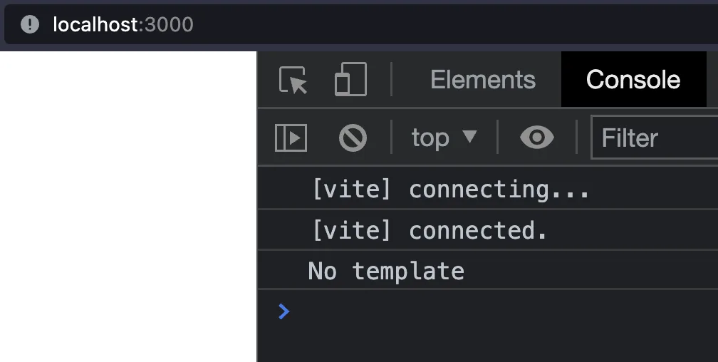
Screen Shot 2022-06-30 at 00.05.30

It's working.

Note that this component, even if it doesn't have a template, still behaves as a regular component instance, and you will still have access to the component Lifecycle methods.

Let's test it.

<!-- src/lib/Renderless.svelte -->
<script>
    import { onMount } from "svelte";
    console.log("No template");
    onMount(() => {
        console.log("Component mounted");
    });
</script>

We added a second message to be shown after the component is mounted.

Both messages are now printed in the expected order.

Screen Shot 2022-06-30 at 00.08.33

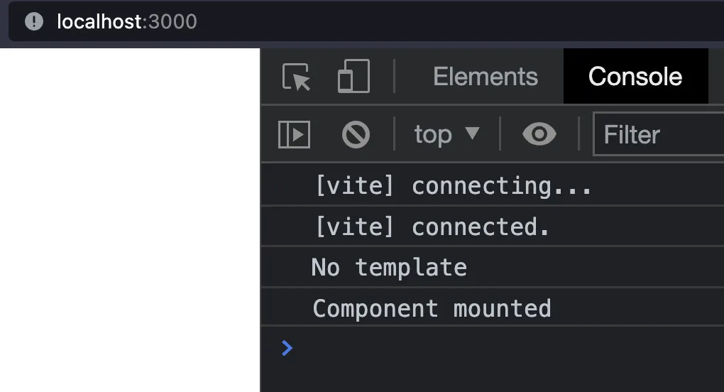
This means that we can use our Renderless Component just as any other Svelte Component.

Let's revert the changes to the main.ts file, and "render" the component inside the App component.

// src/main.ts
import App from './App.svelte'

const app = new App({
  target: document.getElementById('app')
})

export default app
<!-- src/App.svelte -->
<script lang="ts">
  import { onMount } from "svelte";

  import Renderless from "./lib/Renderless.svelte";
  console.log("App: initialized");
  onMount(() => {
    console.log("App: mounted");
  });
</script>

<main>
  <Renderless />
</main>

Finally, let's also modify our Renderless component to log more meaningful messages.

<!-- src/lib/Renderless.svelte -->
<script>
    import { onMount } from "svelte";
    console.log("Renderless: initialized");
    onMount(() => {
        console.log("Renderless: mounted");
    });
</script>

Screen Shot 2022-06-30 at 00.24.48

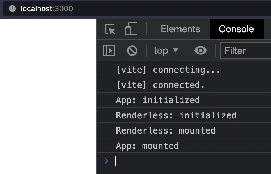
It's important to note the order of initialization and mounting of the components. This will be important when we create our Canvas and renderless Components.

There's a third way to mount our component and that's passing it as a child of another component. This is also called content projection. And the way that we do this is by using slots.

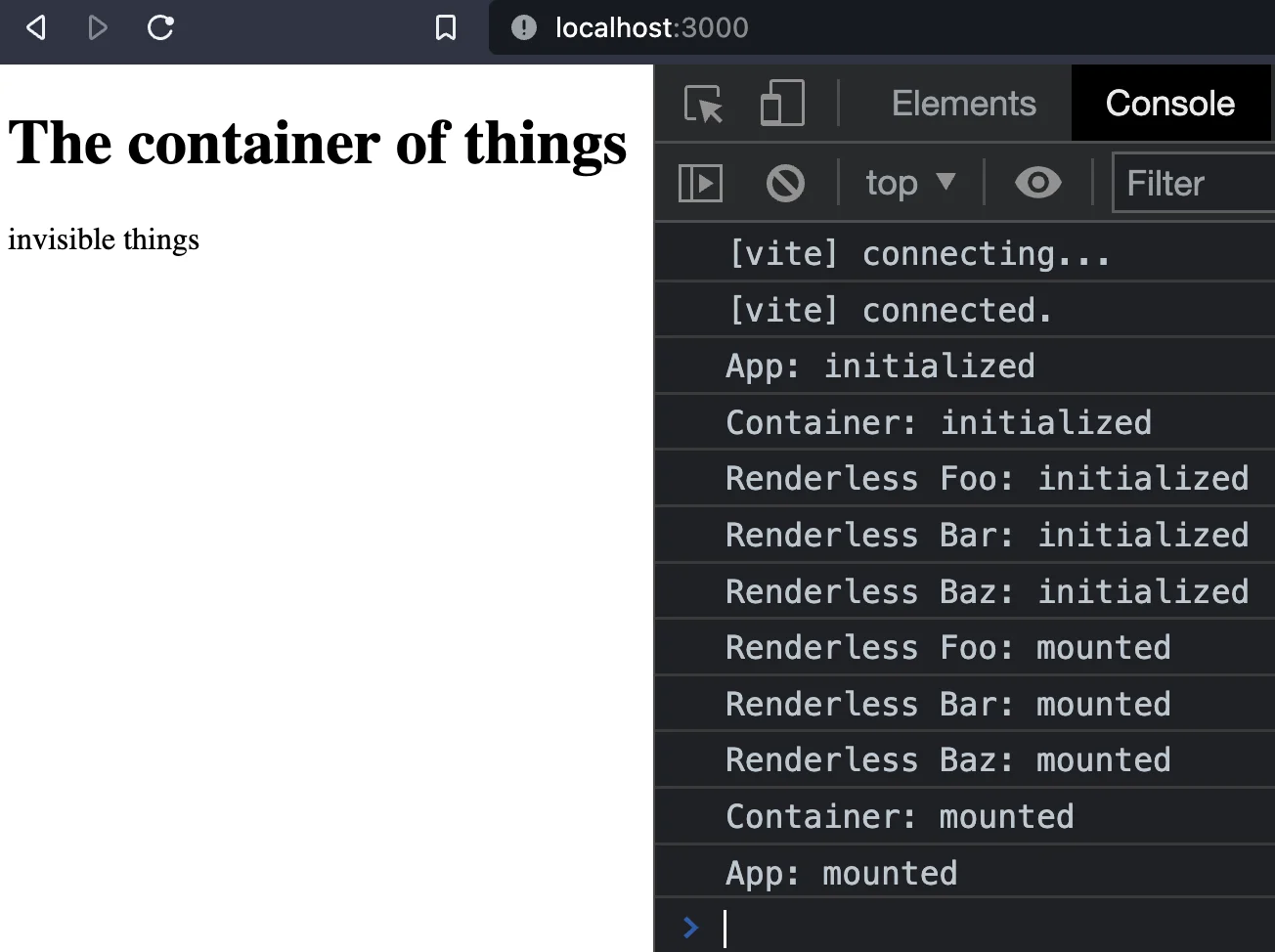
Let's create a container component that will render elements in a slot. I will also add more elements that will live along with the element.

<!-- src/lib/Container.svelte -->
<script>
    import { onMount } from "svelte";
    console.log("Container: initialized");
    onMount(() => {
        console.log("Container: mounted");
    });
</script>

<h1>The container of things</h1>
<slot />
<p>invisible things</p>

Let's also add a prop to the Renderless component to add some kind of identifier to it.

<!-- src/lib/Renderless.svelte -->
<script lang="ts">
    import { onMount } from "svelte";
    export let id:string = "NoId"
    console.log(`Renderless ${id}: initialized`);
    onMount(() => {
        console.log(`Renderless ${id}: mounted`);
    });
</script>

Finally, in our App, we update the template to use the container, and pass multiple instances of Renderless to it.

<!-- src/App.svelte -->
<script lang="ts">
  import { onMount } from "svelte";
  import Container from "./lib/Container.svelte";

  import Renderless from "./lib/Renderless.svelte";
  console.log("App: initialized");
  onMount(() => {
    console.log("App: mounted");
  });
</script>

<main>
  <Container>
    <Renderless id="Foo"/>
    <Renderless id="Bar"/>
    <Renderless id="Baz"/>
  </Container>
</main>

Now, we can see the rendered Container and the renderless components logging when they are initialized and mounted.

Screen Shot

Now that we've learned about renderless components, let's use them with the <canvas> element.

<canvas> and the Canvas API

The canvas element cannot contain any children, except for a fallback element to render. Anything that you may want to render inside the canvas must be done using its imperative API.

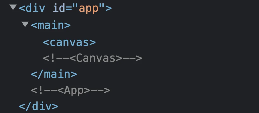
Let's create a new Canvas component and render an empty canvas.

<!-- src/lib/Canvas.svelte -->
<script>
    import { onMount } from "svelte";

    console.log("Canvas: initialized");
    onMount(() => {
        console.log("Canvas: mounted");
    });
</script>

<canvas />

Update the App component to import and use Canvas.

<!-- src/App.svelte -->
<script lang="ts">
  import { onMount } from "svelte";
  import Canvas from "./lib/Canvas.svelte";

  console.log("App: initialized");
  onMount(() => {
    console.log("App: mounted");
  });
</script>

<main>
 <Canvas />
</main>

If we open the browser dev tools, we should see a canvas element rendered now.

Screen Shot 2022-07-01 at 06.30.15

Rendering elements inside canvas

As mentioned previously, we cannot add elements to draw inside our canvas. We have to use the API to do it.

To get a reference to the element, we will use the bind:this directive. It's important to understand that, to use the API, we need the element to be available. This means that we will have to draw after the component is mounted.

<script lang="ts">
    import { onMount } from "svelte";
    let canvasElement: HTMLCanvasElement
    console.log("1", canvasElement) // undefined!!!
    console.log("Canvas: initialized");
    onMount(() => {
        console.log("2", canvasElement) // OK!!!
        console.log("Canvas: mounted");
    });
</script>

<canvas bind:this={canvasElement}/>

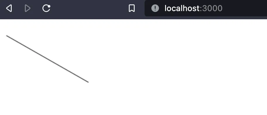
Now let's draw a line (I'm removing all the logging from the component for clarity).

<script lang="ts">
    import { onMount } from "svelte";
    let canvasElement: HTMLCanvasElement
    onMount(() => {
        // get canvas context
        let ctx = canvasElement.getContext("2d")

        // draw line
        ctx.beginPath();
        ctx.moveTo(10, 20); // line will start here
        ctx.lineTo(150, 100); // line ends here
        ctx.stroke(); // draw it
    });
</script>

<canvas bind:this={canvasElement}/>

To draw, we need the canvas context. So we must do it after mounting the component. Then, we can start drawing using the canvas API.

Screen Shot

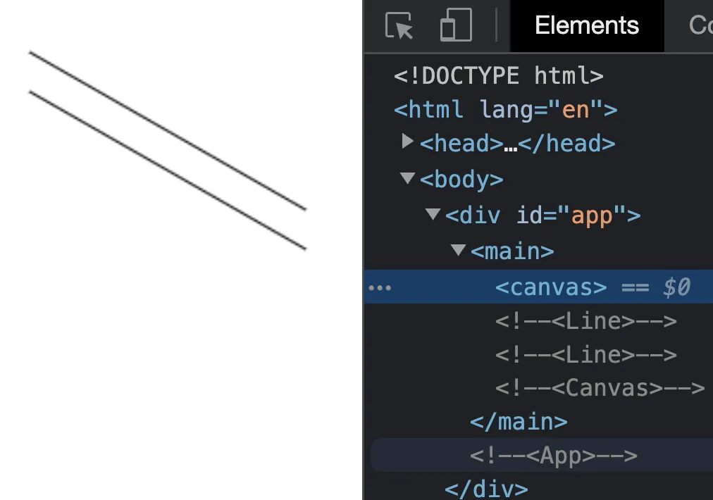
If we want to add a second line, we would have to add a new block of code.

<script lang="ts">
    import { onMount } from "svelte";
    let canvasElement: HTMLCanvasElement
    onMount(() => {
        // get canvas context
        let ctx = canvasElement.getContext("2d")

        // draw first line
        ctx.beginPath();
        ctx.moveTo(10, 20); // line will start here
        ctx.lineTo(150, 100); // line ends here
        ctx.stroke(); // draw it

       // draw second line
        ctx.beginPath();
        ctx.moveTo(10, 40); // line will start here
        ctx.lineTo(150, 120); // line ends here
        ctx.stroke(); // draw it
    });
</script>

We can see that we are starting to add more and more code to our component just by drawing simple shapes. This can get out of hand quickly. We can create helper functions to draw the lines.

<script lang="ts">
    import { onMount } from "svelte";
    let canvasElement: HTMLCanvasElement;
    onMount(() => {
        // get canvas context
        let ctx = canvasElement.getContext("2d");

        // draw first line
        drawLine(ctx, [10, 20], [150, 100]);

        // draw second line
        drawLine(ctx, [10, 40], [150, 120]);
    });

    type Point = [number, number];
    function drawLine(ctx: CanvasRenderingContext2D, start: Point, end: Point) {
        ctx.beginPath();
        ctx.moveTo(...start); // line will start here
        ctx.lineTo(...end); // line ends here
        ctx.stroke(); // draw it
    }
</script>

<canvas bind:this={canvasElement} />

The code becomes more readable, but we are still delegating all the responsibility to the Canvas component, which will translate into having a very complex component.

We can avoid this by using renderless components and the Context API.

We know a few things so far:

  • We require the Canvas context to draw.
  • We can get the context after the component is mounted.
  • Child components are mounted before the parent component.
  • Parent components are initialized before child components.
  • We can use to mount child components.

We want to split our component into multiple. For this example, we want the Line component to draw itself.

Canvas and Line are coupled. A Line component cannot be drawn without a Canvas, and it needs the canvas context. The problem is that the context is not available when we mount the Child component (Line is mounted before Canvas), so we need a different approach.

Instead of passing the context to draw itself, we will let the parent component know that a child component needs to be drawn.

We'll communicate the Canvas and Line components using Context.

Context is a way for two or more components to communicate. Context can only be set or retrieved during initialization, which is what we need in our case. Remember that Canvas is initialized before our Line component.

Let's start by moving the line rendering to its own component. I will also move some types to their own file to be shared across components.

// src/types.ts
export type Point = [number, number];
export type DrawFn = (ctx: CanvasRenderingContext2D) => void;
export type CanvasContext = {
  addDrawFn: (fn: DrawFn) => void;
  removeDrawFn: (fn: DrawFn) => void;
};
<!-- src/lib/Line.svelte -->
<script lang="ts">
    import type { Point } from "./types";

    export let start: Point;
    export let end: Point;

    function draw(ctx: CanvasRenderingContext2D) {
        ctx.beginPath();
        ctx.moveTo(...start);
        ctx.lineTo(...end);
        ctx.stroke();
    }
</script>

This is very similar to what we had in our Canvas component, but abstracted to a reusable component. Now we need a Communicate Canvas and Line components.

Our Canvas will work as the orchestrator of all the rendering.

It will initialize all the Child components, gather the rendering functions, and draw them when required.

<script lang="ts">
  import { onMount, setContext } from "svelte";
  import type { DrawFn } from "./types";

  let canvasElement: HTMLCanvasElement;
  let fnsToDraw = [] as DrawFn[];

  setContext("canvas", {
    addDrawFn: (fn: DrawFn) => {
      fnsToDraw.push(fn);
    },
    removeDrawFn: (fn: DrawFn) => {
        let index = fnsToDraw.indexOf(fn);
        if (index > -1){
        fnsToDraw.splice(index, 1);
        }
    },
  });

  onMount(() => {
    // get canvas context
    let ctx = canvasElement.getContext("2d");
    draw(ctx);
  });

  function draw(ctx){
    fnsToDraw.forEach(draw => draw(ctx));
  }
</script>

<canvas bind:this={canvasElement} />
<slot />

The first thing to note is that our template has changed and now we have a <slot> element beside our canvas. It will be used to mount any children that we pass into our canvas-- in our case, the Line components. These will not add any HTML element.

In the script section, we added an array to hold all the render functions to draw.

We also set a new context. This has to be done during initialization. Our Canvas is initialized before Line, so we set two methods here. These are methods to add and remove a function from our array that holds them. Then any Child component can have access to this context, and call its methods.

That's exactly what we'll do next in the Line component.

<script lang="ts">
  import { getContext, onDestroy, onMount } from "svelte";
  import type { Point, CanvasContext } from "./types";

  export let start: Point;
  export let end: Point;

  let canvasContext = getContext("canvas") as CanvasContext;

  onMount(() => {
    canvasContext.addDrawFn(draw);
  });

  onDestroy(() => {
    canvasContext.removeDrawFn(draw);
  });

  function draw(ctx: CanvasRenderingContext2D) {
    ctx.beginPath();
    ctx.moveTo(...start);
    ctx.lineTo(...end);
    ctx.stroke();
  }
</script>

We register the function using the context previously set by Canvas when we mount this component. We could do it on initialization too because we know that context will be available anyway. But I prefer doing it after the component is mounted. And when the element is destroyed, it removes itself from the list of rendering functions.

Finally, let's update our App to use the new Canvas and Line components.

<script lang="ts">
  import Canvas from "./lib/Canvas.svelte";
  import Line from "./lib/Line.svelte";
</script>

<main>
  <Canvas>
    <Line start={[10, 20]} end={[150, 100]} />
    <Line start={[10, 40]} end={[150, 120]} />
  </Canvas>
</main>
Screen Shot 2022-07-01

We've successfully updated our Canvas component to use a declarative approach. A few things are missing though. We are only drawing once when the Canvas component is mounted.

We need to make the canvas render frequently to update itself when changes happen (unless you only want to render once). Note that we would have to do it with or without the approach we've taken. And it's a common way of updating the canvas contents.

<script lang="ts">
  // NOTE: some code removed for readability 
  // ...
  let frameId: number

  // ...

  onMount(() => {
    // get canvas context
    let ctx = canvasElement.getContext("2d");
    frameId = requestAnimationFrame(() => draw(ctx));
  });

  onDestroy(() => {
    if (frameId){
        cancelAnimationFrame(frameId)
    }
  })

  function draw(ctx: CanvasRenderingContext2D) {
	if (clearFrames) {
	    ctx.clearRect(0,0,canvasElement.width, canvasElement.width)
	}
    fnsToDraw.forEach((fn) => fn(ctx));
    frameId = requestAnimationFrame(() => draw(ctx))
  }
</script>

We achieve this rerendering of the canvas using the requestAnimationFrame method. The callback passed in will be run before the browsers' repaint. First, we create a new variable to assign the current frameId (required for canceling the animation). Then, when we mount the component, we invoke requestAnimationFrame and assign the returned id to our variable. So far, the end result is as before. The difference is now in our draw function that will request a new animation frame each time after being drawn. We will also clear our canvas by default. Otherwise, when we are animating, each frame would be drawn on top of each other (This might be the desired effect. In that case the clearFrame prop can be set to false). Our canvas will update each frame until we destroy our component and cancel any current animation using the id previously stored.

Adding more features

The basic functionality for the components is working, but we may want to add more features.

For this example, we will be exposing two events: onmousemove and onmouseleave. To do this, we need to add a few things two our Canvas component. In the template, change the canvas element to this:

<canvas on:mousemove on:mouseleave bind:this={canvasElement} />

Now, the events can be handled in our App:

<script lang="ts">
  import Canvas from "./lib/Canvas.svelte";
  import Line from "./lib/Line.svelte";
  import type { Point } from "./lib/types";

  function followMouse(e) {
    let rect = e.target.getBoundingClientRect();
    end = [e.clientX - rect.left, e.clientY - rect.top];
  }
  let start = [0, 0] as Point;
  let end = [0, 0] as Point;
</script>

<main>
  <Canvas
    on:mousemove={(e) => followMouse(e)}
    on:mouseleave={() => {
      end = [0, 0];
    }}
  >
    <Line {start} {end} />
  </Canvas>
</main>

Svelte is responsible for updating the end position of the line. But our Canvas component is the one used to update the canvas content (using requestAnimationFrame).

animated canvas

Wrapping up

I hope this tutorial helps you as an introduction to use canvas in Svelte, but also to understand how we can turn a library with an Imperative API into a more declarative one.

There are a few examples of these ideas with more complex examples using a similar approach, like svelte-cubed or svelte-leaflet.

From the svelte-cubed docs:

This ...

import * as THREE from 'three';

function render(element) {
	const scene = new THREE.Scene();
	const camera = new THREE.PerspectiveCamera(
		45,
		element.clientWidth / element.clientHeight,
		0.1,
		2000
	);

	const renderer = new THREE.WebGLRenderer();
	renderer.setSize(element.clientWidth / element.clientHeight);
	element.appendChild(renderer.domElement);

	const geometry = new THREE.BoxGeometry();
	const material = new THREE.MeshNormalMaterial();
	const box = new THREE.Mesh(geometry, material);
	scene.add(box);

	camera.position.x = 2;
	camera.position.y = 2;
	camera.position.z = 5;

	camera.lookAt(new THREE.Vector3(0, 0, 0));

	renderer.render(scene, camera);
}

becomes...

<script>
	import * as THREE from 'three';
	import * as SC from 'svelte-cubed';
</script>

<SC.Canvas>
	<SC.Mesh geometry={new THREE.BoxGeometry()} />
	<SC.PerspectiveCamera position={[1, 1, 3]} />
</SC.Canvas>

We just scratched the surface of the Canvas API, but you can extend it for your own needs, or even create a library for it!

This Dot is a consultancy dedicated to guiding companies through their modernization and digital transformation journeys. Specializing in replatforming, modernizing, and launching new initiatives, we stand out by taking true ownership of your engineering projects.

We love helping teams with projects that have missed their deadlines or helping keep your strategic digital initiatives on course. Check out our case studies and our clients that trust us with their engineering.

You might also like

Svelte 4 Launch Party Recap cover image

Svelte 4 Launch Party Recap

In this Svelte 4 Launch Party event, our panelists discussed the release of Svelte 4. In this wrap-up, we will talk about panel discussions with Svelte core team members, which is an in-depth exploration of the Svelte 4 release, highlighting its key features and performance enhancements. You can watch the full Svelte 4 Launch Party event on the This Dot Media's YouTube channel. Here is a complete list of the host and panelists that participated in this online event: Hosts: - Tracy Lee, CEO, This Dot, @ladyleet - Rob Ocel, Team Lead & Software Architect, This Dot, @robocell Panelists: - Geoff Rich, Svelte Core Team, @geoffrich_ - Simon Holthausen, Full-time Svelte maintainer, @dummdidumm_ - Puru Vijay, Svelte Core Team, @puruvjdev - Benn McCann, SvelteKit Maintainer, @BenjaminMcCann Introductions Geoff, one of the Svelte maintainers, started the introductions. He expressed his excitement about the new major version of Svelte and shared his years of experience using the framework. In his day job, Geoff is a Senior Software Engineer at Ordergroove. Simon, a full-time Svelte maintainer working at Vercel, was busy preparing and finally releasing Svelte 4. He happily noted that there were very few bugs, and everything seemed to be working smoothly. Simon's dedication to maintaining the framework has contributed significantly to its success. Puru, a college student, showcased his impressive skills by working on the website and the REPL for Svelte. Balancing his studies with web development, Puru demonstrated his passion for Svelte and his contributions to its ecosystem. Ben primarily focuses on Svelte Kit, but also pitched in with Svelte 4. Besides his work on Svelte, Ben is an entrepreneur, adding an extra dimension to his diverse skill set. His contributions to the Svelte community have been invaluable. What Should Everyone Be Excited About in Svelte 4? Svelte 4 has arrived, and while it may not be packed with mind-blowing features, there are several neat little improvements that are worth getting excited about. The main focus of this release was on maintenance and cleaning up the framework to pave the way for the big Svelte 5 release. So don't worry, there are bigger things in the pipeline! One of the first things to note is that file sizes in Svelte 4 have significantly decreased by about 10 to 12 fold. This means that your website will load much faster, thanks to the reduced bundle size. Additionally, improvements have been made in hydration, which affects the speed at which pages hydrate. The core around hydration has become smaller, resulting in improved performance. Another noteworthy enhancement in Svelte 4 is the complete overhaul of custom element support. This change, although technically a breaking one, introduces a new wrapper approach. Previously, in Svelte 3, you had to use every Svelte component as a custom element, even if you wanted to keep certain components as internal implementation details. With the wrapper approach, you now have the flexibility to use components as regular Svelte components internally, fixing a range of bugs and fulfilling numerous feature requests. This change proved to be a tremendous success, resolving multiple issues in one fell swoop. Svelte 4 brings value to your day-to-day development experience. For example, the improved type generation and autocomplete have made working with Svelte components a lot smoother. The autocomplete feature now grabs the correct import, eliminating the frustrations of navigating to the wrong files. Additionally, the introduction of declaration maps allows you to see the actual source code, providing a better understanding of the inner workings of Svelte. There's also good news for those who want to contribute to the Svelte codebase. In Svelte 4, the entire codebase has been converted from TypeScript to JavaScript with JS Docs. While type checking is still in place to ensure error-free development, this change simplifies the process of working with the source code. Developers can now directly edit the source and test changes without worrying about the mapping between TypeScript and JavaScript. In terms of performance, the reduction in bundle sizes has made a significant impact. Although the size reduction percentage may have been misunderstood by some, primarily referring to the compiler size rather than the runtime bundle, it has tangible benefits in scenarios like online tutorials and interactive experiences. Beyond the technical improvements, Svelte 4 also brings updates to the documentation site and the main website. The team has put in considerable effort to enhance the user experience, making it easier to navigate and find the information you need. Puru Does a Run Through of the Updates to the Svelte.dev Site Puru shares exciting news to share about the overhaul of the svelte.dev website. First things first, let's talk about the star of the show: dark mode. It's finally here, and it's a game-changer. They’ve given the entire site a fresh redesign, taking inspiration from the sleek look of kit.svelte.dev. You'll notice some similarities, but they’ve added their own unique touch to make it shine. They’re now linking to the improved tutorial on learn.svelte.dev, which is definitely worth checking out. Now, let's dive into the docs. They've made some significant changes to make your browsing experience a breeze. Instead of a single page, they've divided everything into multiple pages, making it super easy to find what you're looking for. Each component, logic block, and style module has its own dedicated page. It's all organized and up-to-date, thanks to the auto-generation from the source code. Say goodbye to outdated information and hello to hassle-free browsing. They've introduced some fantastic new features that you're going to love. In the REPL, they've added multiple cursors, making coding even more efficient. Plus, they've created a REPL User Guide, packed with handy shortcuts and nifty tips and tricks. And here's the best part: our code snippets now support TypeScript. Just a simple click, and you'll have the TypeScript equivalent at your fingertips. It couldn't get any easier to level up your coding game! So, head over to the new website, immerse yourself in the revamped docs, and enjoy all the fantastic updates we've made. And don't forget to check out the blog section for more in-depth information. Happy browsing, and get ready to experience the best of the new and improved website! Upgrading from Svelte 3 to Svelte 4 Well there are a few things you need to know. But don't worry, it's not too complicated. First off, you'll find all the breaking changes highlighted and summarized on the migration Doc Page. So, if something breaks, you can check it out there. If you're still on Svelte 3, the best way to start is by using the migration script. Just type in npx svelte-migrate svelte-4 in your command line, and it will go through your code base and automatically update things like tightened up types and local transitions. The migration script will even ask you if you want to migrate your global transitions or not. It's like a little questionnaire to make sure everything goes smoothly. The migration script does a lot of the heavy lifting for you, updating dependencies in your package.json and ensuring peer dependency versions match up. It takes care of most things, but there might be a few other changes you'll need to handle. That's where the migration guide comes in handy. It covers all the other changes and helps you navigate through them. Now keep in mind that upgrading to Svelte 4 might require at least Node 16. So, if you're using older dependencies that are holding you back from upgrading Node, it's time to poke your manager or tech lead and emphasize the need to stay current. After all, using outdated versions can pose security vulnerabilities. So make a strong case for the upgrade and let them know it's time to invest in keeping things up to date. Geoff talked about how he has already upgraded a few sites to Svelte 4, and honestly, just upgraded the dependencies, and it worked like a charm. He didn't even bother running the migration script himself. Different projects may have different needs, so it's always good to be aware of any potential obstacles. Stay up to date and remember, keeping things secure is a top priority! Svelte 4 and How It Works with Svelte Kit If you're using Svelte Kit and thinking about upgrading to Svelte 4, here's what you need to know. The good news is that you can stick with your current version of Svelte Kit if you want, but there will be a warning about the peer dependencies not matching up. We made a small change to officially support Svelte 4 within Svelte Kit. But other than that, not much else has changed. One important thing to remember is to upgrade the plugins file that Svelte Kit uses. You can do this by updating your lock file or simply upgrading to the latest Svelte Kit, which will take care of it for you. The migration script handles all the necessary updates, so running it will ensure everything works smoothly. When it comes to impact, Svelte 4 brings some improvements. Your hydration code will be smaller, and the hydration speed will be faster, which means your final app bundle could be around 10% smaller. We've been working on even more performance enhancements, and using the Chrome performance tab in the developer tools can help you identify areas that need improvement. So, in a nutshell, upgrading to Svelte 4 is optional for Svelte Kit users. But, it brings benefits like smaller code and faster hydration. Just remember to update the plugins file and use the migration script to handle any necessary changes. Keep an eye on the Chrome performance tab for optimization opportunities. Are Svelte and Svelte Kit Going to be Paired in the Future in Updates or Stay Independent? When it comes to updates for Svelte and Svelte Kit, there's a relationship between the two, but they also have their own focuses. The development of Svelte and Svelte Kit is somewhat interconnected, with learnings and improvements transferring between them. While the maintainers tend to focus on one major project at a time to gather feedback and make meaningful changes, they do draw lessons from both and apply them accordingly. For example, the decision to make transitions local by default in Svelte 4 stemmed from insights gained during the development of Svelte Kit. Although there may be periods of emphasis on either Svelte or Svelte Kit, they are designed to complement each other and take advantage of each other's features. The development teams work on both code bases, ensuring a coordinated approach. While there may be a Svelte Kit 2 in the future, it's important to note that the release of Svelte 5 doesn't automatically mean a corresponding major update for Svelte Kit. The decision to introduce a new version depends on various factors, such as API changes and compatibility with the latest versions of Svelte, Node.js, and bundlers. Ultimately, the goal is to provide a seamless and optimized experience for developers using Svelte and Svelte Kit. By developing them in tandem and leveraging the benefits of each, the teams behind these projects ensure continuous improvements and adaptability to the evolving needs of the community. Svelte Dev Tools Repo and Funding for Svelte So, regarding the Svelte Dev Tools repo, it used to be a community-maintained project led by a contributor named Red Hatter. She developed and published it independently. But more recently, she transferred the repository to the Svelte team so that they could also contribute and provide support. Currently, the team hasn't been able to publish new versions of the extension to the store, so there might still be the Svelte 3 version available. However, they are working on publishing a new version and may ask users to switch over to it for Svelte 4. Now, let's talk about funding for Svelte. While financial support is definitely appreciated, the team also values something equally important—time. Companies can make a significant impact by allowing their employees to work on Svelte or Svelte Kit, fixing bugs, and contributing their time and expertise to improving the projects. Donations are welcome, of course, but finding skilled developers like Pooria (one of the Svelte team members) can be challenging even with funding available. So, giving employees the time and freedom to work on Svelte-related projects is highly appreciated and can have a significant positive impact. It's not just about money; it's about investing resources, whether financial or human, into the growth and development of the Svelte community. Getting Involved in Open Source If you're interested in getting involved in open source for Svelte, the journey can take different paths. One way to start is by creating projects or contributing to existing ones in the Svelte ecosystem. For example, Peru mentioned that he initially created a Svelte version of a tool called MacOS, which gained attention and led to him becoming a Svelte ambassador. Being active in the community, showcasing your work, and advocating for Svelte through speaking engagements or participating in events like Svelte Summit can also help raise your profile. Becoming a Svelte ambassador or being recognized by the core team doesn't necessarily require direct contributions to the Svelte codebase. You can contribute in various ways, such as creating engaging content like videos or blog posts that benefit the community, maintaining popular Svelte libraries, assisting users on platforms like Discord or Stack Overflow, and participating in GitHub discussions. The core team and community value not only code contributions but also the positive impact and dedication you bring to the Svelte community. It's worth noting that the journey can be unique for each person. Even if you haven't contributed to the Svelte codebase directly, like the ambassadors Hunter Byte and Joy of Code, you can still make a significant impact and be recognized for your contributions. For instance, Pooria mentioned that his first contribution was focused on creating the Svelte website rather than working on the core Svelte codebase. So, anyone with a passion for Svelte and a willingness to contribute can become a Svelte ambassador and actively participate in the open-source community. Contributing to Open Source Contributing to open-source projects like Svelte may seem daunting, but you don't have to understand the entire codebase from the start. Start by looking for beginner-friendly issues labeled as "good first issue" or similar tags. These provide a starting point to dive into the codebase. Follow the code path, use failing tests as guidance, and utilize features like control-clicking to navigate to relevant implementations. Documentation and contribution guides are valuable resources for newcomers. Svelte Kit, for instance, has focused on making its codebase beginner-friendly. If you encounter difficulties, join the project's Discord channel and seek guidance from experienced contributors. Providing feedback on areas where more documentation is needed can help improve the contributor experience. You can also contribute to adjacent tools related to Svelte, such as Prettier or ESLint plugins, which are maintained by the core team. These projects are often smaller in size and provide a manageable entry point. Additionally, non-coding contributions like improving project workflows or setting up testing and CI processes are also valuable. Remember that contributions, regardless of their scale, have a positive impact on the project and the open-source community. Focus on understanding the specific area you want to work on, leverage available resources, engage with the community, and consider contributing to adjacent projects. With these steps, you can jump into contributing to open source and start making a difference. Closing Thoughts from Panelists Simon shared his enthusiasm for the future of Svelte, particularly the highly anticipated Svelte 5. The recent addition of Dominic to the team has already made a significant impact, and the brainstorming sessions have been rewarding. Exciting things are on the horizon for Svelte users. Geoff encouraged everyone to give Svelte 4 a try and welcomes feedback and issue reports as they continue to refine and improve the framework. He emphasized that they are still in the early stages after the release and appreciate the community's support in upgrading their apps and providing valuable insights. Peru gave a special shout-out to Paulo Ricca, who has been instrumental in resolving issues with the new REPL. With Paulo's assistance, the REPL is now as stable and impressive as before. Peru expresses his gratitude for the collaboration. Ben extended his appreciation to the ecosystem integrations, mentioning the Storybook team and Jesse Beech, who contributed to optimizing file sizes and ensuring Svelte's compatibility with other JavaScript projects. The Svelte team is open to supporting and collaborating with anyone seeking to integrate Svelte with other tools in the ecosystem. Overall, the panelists were thankful, excited about the future, and grateful for the community's contributions and collaborations. The energy and positive feedback drove their motivation, and they encouraged everyone to continue exploring and pushing the boundaries of what Svelte can achieve. Conclusion In this Svelte 4 Launch Party, the panelists express their gratitude to the vibrant Svelte community for their unwavering support and positive energy. The launch of Svelte 4 and the promising developments of Svelte 5 have generated excitement and anticipation among developers. The core team's commitment to continuous improvement, collaboration with ecosystem integrations, and dedication to addressing user feedback are evident. As Svelte evolves, the contributions of individuals, whether through code, documentation, or community engagement, are valued and celebrated. With the momentum and enthusiasm surrounding Svelte, the future looks bright for this innovative framework and its passionate community....

State of Svelte Wrap-up cover image

State of Svelte Wrap-up

In this State of Svelte event, our panelists discussed updates, LTS releases, and APIs, with Node.js maintainers, technical steering committee members, and collaborators. In this wrap-up, we will take a deeper look into these latest developments, and explore what is on the horizon for Svelte. You can watch the full State of Svelte event on the This Dot Media YouTube Channel. Here is a complete list of the host and panelists that participated in this online event. Hosts: - Tracy Lee, CEO, This Dot Labs, @ladyleet - Rob Ocel, Team Lead & Software Architect, @robocell Panelists: - Scott Spence, Svelte Society, Developer Relations Engineer at Storyblok, @spences10 - Brittney Postma, Founder Svelte Sirens & Software Engineer Design Systems at Provi, @BrittneyPostma - Geoff Rich, Senior Software Engineer, Ordergroove | Svelte Core Team, @geoffrich_ - Simon Holthausen, Software Engineer at Vercel | Full-time Svelte maintainer, @dummdidumm_ - Kevin Åberg Kultalahti, Co-founder & Technical Community Builder at Svelte Society, Main Organizer at Svelte Summit, @kevmodrome Svelte 4 The chat got off to a great start with a discussion about Svelte 4, and what we can expect with that release. Simon spoke about how it will be more of a maintenance update than anything else. This version of Svelte will raise the minimum required Node version and use newer versions of Typescript as well. There will also be other minor breaking changes, but the release will mainly be focused on internally updating the repository by converting it to a mono-repo. As soon as these updates are done, Simon said they will immediately begin work on Svelte 5. Typescript and Svelte Scott brings up the reasons for not using Typescript in Svelte. Simon said a decision was made to transition the Svelte repository from using Typescript to using Javascript. There were questions about why types and type safety were being taken away from the repository. Simon clarified that the repository will be getting rid of .TS files, but they are not getting rid of type checking with Typescript, and the code will still be fully typed checked at the same level as before. The plan is to do it through JS Docs. JS Docs provides the same level of type safety you get through Typescript, but there is no longer a need for a compile step when using JS Docs. There is also no need to ship any Source Maps, and it should be easier to debug. Kevin also wanted to be clear that Typescript can still be used when building a Svelte app. Why Svelte? Rob notes that the official release of Svelte happened about 4 months ago, and asks the panelists how the launch has been going so far. Kevin goes first, talking about how everyone with whom he has talked about it has been very excited about it. He talks about how the form actions and data loading are very popular. In other frameworks, you have to attach event listeners, and then do the fetching on clients. Svelte simplifies all of that, and allows you to get rid of a lot of code by using the features in Svelte. Svelte REPL Kevin talks about the Svelte REPL, and how it plays into why Svelte is getting so big. Svelte isn’t just easy, it’s the fact that it is social in the fact that you can share a REPL and show someone how to do something with Svelte. If you have an issue, you can usually find a solution in the Svelte REPL. Server and Client Geoff talks about this aspect of Svelte. He says that they were treated as two separate entities, and there was talk about how to make them more interconnected so that it’s easier to use the server data, and get it into components. In SvelteKit, you have a load function in a separate file that defines how that data is loaded. Svelte also calls a JSON endpoint and then that component in the JSON data. State Management Geoff brings up the simple state management model that Svelte has, and they really don’t want to give that up by implementing too many things like short syntax. Simon adds that there is no real reason to bloat the syntax in the Svelte files. He doesn’t want the interoperability that Svelte currently offers. Signals vs Store A question is brought up about Signals vs Store, and if they are the same. Simon talks more about how they are related, but they are not necessarily the same. He explains that the API for Store is a little more settled right now where the API for Signals is a little more in exploration. Usability is also different because Signals is more primitive, and everything is composed of functions which you call in a certain way. With Stores, you wrap a store and map the values that are pushed into something different. How the panelists found out about Svelte The latter part of this event focused on how each panelist found Svelte and got involved with it. It was a very interesting part of the conversation to hear the backgrounds of each panelist, and why they got more and more involved with Svelte and everything that was going with it. It went very in depth, and would be worth exploring more by watching the conversation unfold on the event video. Conclusion The panelists were very engaged, and there was a lot of dialogue about Svelte and the exciting things being done. The panelists also finished by bringing up ways to get involved with the Svelte community. You can watch the full State of Svelte event on the This Dot Media Youtube Channel....

Exploring Open Props and its Capabilities cover image

Exploring Open Props and its Capabilities

Exploring Open Props and its Capabilities With its intuitive approach and versatile features, Open Props empowers you to create stunning designs easily. It has the perfect balance between simplicity and power. Whether you're a seasoned developer or just starting, Open Props makes styling websites a breeze. Let's explore how Open Props can help your web development workflow. What is Open Props Open Props is a CSS library that packs a set of CSS variables for quickly creating consistent components using “Sub-Atomic” Styles. These web design tokens are crafted to help you get great-looking results from the start using consistent naming conventions and providing lots of possibilities out-of-the-box. At the same time, it's customizable and can be gradually adopted. Installing open props There are many ways to get started with open props, each with its advantages. The library can be imported from a CDN or installed using npm. You can import all or specific parts of it, and for greater control of what's bundled or not, you can use PostCSS to include only the variables you used. From Zero to Open Props Let's start with the simplest way to test and use open props. I'll create a simple HTML file with some structure, and we'll start from there. Create an index.html file. ` Edit the content of your HTML file. In this example, we’ll create a landing page containing a few parts: a hero section, a section for describing the features of a service, a section for the different pricing options available and finally a section with a call to action. We’ll start just declaring the document structure. Next we’ll add some styles and finally we’ll switch to using open props variables. ` To serve our page, we could just open the file, but I prefer to use serve, which is much more versatile. To see the contents of our file, let's serve our content. ` This command will start serving our site on port 3000. Our site will look something like this: Open-props core does not contain any CSS reset. After all, it’s just a set of CSS variables. This is a good start regarding the document structure. Adding open props via CDN Let's add open-props to our project. To get started, add: ` This import will make the library's props available for us to use. This is a set of CSS variables. It contains variables for fonts, colors, sizes, and many more. Here is an excerpt of the content of the imported file: ` The :where pseudo-class wraps all the CSS variables declarations, giving them the least specificity. That means you can always override them with ease. This imported file is all you need to start using open props. It will provide a sensible set of variables that give you some constraints in terms of what values you can use, a palette of colors, etc. Because this is just CSS, you can opt-out by not using the variables provided. I like these constraints because they can help with consistency and allow me to focus on other things. At the same time, you can extend this by creating your own CSS variables or just using any value whenever you want to do something different or if the exact value you want is not there. We should include some styles to add a visual hierarchy to our document. Working with CSS variables Let's create a new file to hold our styles. ` And add some styles to it. We will be setting a size hierarchy to headings, using open props font-size variables. Additionally, gaps and margins will use the size variables. ` We can explore these variables further using open-props’ documentation. It's simple to navigate (single page), and consistent naming makes it easy to learn them. Trying different values sometimes involves changing the number at the end of the variable name. For example: font-size-X, where X ranges from 0 to 8 (plus an additional 00 value). Mapped to font-sizes from 0.5rem up to 3.5rem. If you find your font is too small, you can add 1 to it, until you find the right size. Colors range from 0-12: –red-0 is the lightest one (rgb(255, 245, 245)) while –red-12 is the darkest (rgb(125, 26, 26)). There are similar ranges for many properties like font weight, size (useful for padding and margins), line height and shadows, to name a few. Explore and find what best fits your needs. Now, we need to include these styles on our page. ` Our page looks better now. We could keep adding more styles, but we'll take a shortcut and add some defaults with Open Props' built in normalized CSS file. Besides the core of open props (that contains the variables) there’s an optional normalization file that we can use. Let's tweak our recently added styles.css file a bit. Let’s remove the rules for headings. Our resulting css will now look like this. ` And add a new import from open-props. ` Open props provides a normalization file for our CSS, which we have included. This will establish a nice-looking baseline for our styles. Additionally, it will handle light/dark mode based on your preferences. I have dark mode set and the result already looks a lot better. Some font styles and sizes have been set, and much more. More CSS Variables Let's add more styles to our page to explore the variables further. I'd like to give the pricing options a card style. Open Props has a section on borders and shadows that we can use for this purpose. I would also like to add a hover effect to these cards. Also, regarding spacing, I want to add more margins and padding when appropriate. ` With so little CSS added and using many open props variables for sizes, borders, shadows, and easing curves, we can quickly have a better-looking site. Optimizing when using the CDN Open props is a pretty light package; however, using the CDN will add more CSS than you'll probably use. Importing individual parts of these props according to their utility is possible. For example, import just the gradients. ` Or even a subset of colors ` These are some options to reduce the size of your app if using the CDN. Open Props with NPM Open Props is framework agnostic. I want my site to use Vite. Vite is used by many frameworks nowadays and is perfect to show you the next examples and optimizations. ` Let's add a script to our package.json file to start our development server. ` Now, we can start our application on port 5173 (default) by running the following command: ` Your application should be the same as before, but we will change how we import open props. Stop the application and remove the open-props and normalize imports from index.html. Now in your terminal install the open-props package from npm. ` Once installed, import the props and the normalization files at the beginning of your styles.css file. ` Restart your development server, and you should see the same results. Optimizing when using NPM Let's analyze the size of our package. 34.4 kb seems a bit much, but note that this is uncompressed. When compressed with gzip, it's closer to 9 kb. Similar to what we did when using the CDN, we can add individual sections of the package. For example in our CSS file we could import open-props/animations or open-props/sizes. If this concerns you, don't worry; we can do much better. JIT Props To optimize our bundled styles, we can use a PostCSS plugin called posts-jit-props. This package will ensure that we only ship the props that we are using. Vite has support for PostCSS, so setting it up is straightforward. Let's install the plugin: ` After the installation finishes, let's create a configuration file to include it. ` The content of your file should look like this: ` Finally, remove the open-props/style import from styles.css. Remember that this file contains the CSS variables we will add "just in time". Our page should still look the same, but if we analyze the size of our styles.css file again, we can see that it has already been reduced to 13.2kb. If you want to know where this size is coming from, the answer is that Open Props is adding all the variables used in the normalize file + the ones that we require in our file. If we were to remove the normalize import, we would end up with much smaller CSS files, and the number of props added just in time would be minimal. Try removing commenting it out (the open-props/normalize import) from the styles.css file. The page will look different, but it will be useful to show how just the props used are added. 2.4kB uncompressed. That's a lot less for our example. If we take a quick look at our generated file, we can see the small list of CSS variables added from open props at the top of our file (those that we use later on the file). Open props ships with tons of variables for: - Colors - Gradients - Shadows - Aspect Ratios - Typography - Easing - Animations - Sizes - Borders - Z-Index - Media Queries - Masks You probably won't use all of these but it's hard to tell what you'll be using from the beginning of a project. To keep things light, add what you need as you go, or let JIT handle it for you. Conclusion Open props has much to offer and can help speed your project by leveraging some decisions upfront and providing a sensible set of predefined CSS Variables. We've learned how to install it (or not) using different methods and showcased how simple it is to use. Give it a try!...

The simplicity of deploying an MCP server on Vercel cover image

The simplicity of deploying an MCP server on Vercel

The current Model Context Protocol (MCP) spec is shifting developers toward lightweight, stateless servers that serve as tool providers for LLM agents. These MCP servers communicate over HTTP, with OAuth handled clientside. Vercel’s infrastructure makes it easy to iterate quickly and ship agentic AI tools without overhead. Example of Lightweight MCP Server Design At This Dot Labs, we built an MCP server that leverages the DocuSign Navigator API. The tools, like `get_agreements`, make a request to the DocuSign API to fetch data and then respond in an LLM-friendly way. ` Before the MCP can request anything, it needs to guide the client on how to kick off OAuth. This involves providing some MCP spec metadata API endpoints that include necessary information about where to obtain authorization tokens and what resources it can access. By understanding these details, the client can seamlessly initiate the OAuth process, ensuring secure and efficient data access. The Oauth flow begins when the user's LLM client makes a request without a valid auth token. In this case they’ll get a 401 response from our server with a WWW-Authenticate header, and then the client will leverage the metadata we exposed to discover the authorization server. Next, the OAuth flow kicks off directly with Docusign as directed by the metadata. Once the client has the token, it passes it in the Authorization header for tool requests to the API. ` This minimal set of API routes enables me to fetch Docusign Navigator data using natural language in my agent chat interface. Deployment Options I deployed this MCP server two different ways: as a Fastify backend and then by Vercel functions. Seeing how simple my Fastify MCP server was, and not really having a plan for deployment yet, I was eager to rewrite it for Vercel. The case for Vercel: * My own familiarity with Next.js API deployment * Fit for architecture * The extremely simple deployment process * Deploy previews (the eternal Vercel customer conversion feature, IMO) Previews of unfamiliar territory Did you know that the MCP spec doesn’t “just work” for use as ChatGPT tooling? Neither did I, and I had to experiment to prove out requirements that I was unfamiliar with. Part of moving fast for me was just deploying Vercel previews right out of the CLI so I could test my API as a Connector in ChatGPT. This was a great workflow for me, and invaluable for the team in code review. Stuff I’m Not Worried About Vercel’s mcp-handler package made setup effortless by abstracting away some of the complexity of implementing the MCP server. It gives you a drop-in way to define tools, setup https-streaming, and handle Oauth. By building on Vercel’s ecosystem, I can focus entirely on shipping my product without worrying about deployment, scaling, or server management. Everything just works. ` A Brief Case for MCP on Next.js Building an API without Next.js on Vercel is straightforward. Though, I’d be happy deploying this as a Next.js app, with the frontend features serving as the documentation, or the tools being a part of your website's agentic capabilities. Overall, this lowers the barrier to building any MCP you want for yourself, and I think that’s cool. Conclusion I'll avoid quoting Vercel documentation in this post. AI tooling is a critical component of this natural language UI, and we just want to ship. I declare Vercel is excellent for stateless MCP servers served over http....

Let's innovate together!

We're ready to be your trusted technical partners in your digital innovation journey.

Whether it's modernization or custom software solutions, our team of experts can guide you through best practices and how to build scalable, performant software that lasts.

Prefer email? hi@thisdot.co