Anyone who embarks on a journey to develop apps for the Stripe dashboard will need to grasp the concepts of frontend development using the Stripe UI Extension SDK. While a backend for your Stripe app may not always be necessary, a frontend is most certainly needed. In this blog, I will provide you with some tips & tricks that you might want to consider if you plan to develop more complex UIs.
The Basics
Stripe's UI Extension SDK is React-based. This means that you will need to have some React experience if you want to create Stripe apps. While Stripe apps are web apps, you will never touch HTML or CSS directly. In fact, you're forbidden to. This experience feels almost like developing in React Native. You use the provided UI primitives or components to scaffold your UI.
When you open your app on the Stripe dashboard, you will see one of your app's views. Depending on where you are in the dashboard, you can open a view that is customer-related, payment-related, etc. Or, in the default case, you will open the default view if you are on the main dashboard page.
A typical drawer view will have a ContextView component as its first child, and any other components from the UI toolkit as necessary.
The main building block for your components is a Box. It's a plain block-level container, so you can think of it as a div. The Box, just like most other components, has a css property where you can apply styling.
As mentioned before, you can't use real CSS though. Instead, you'll need to rely on the predefined CSS properties, most of which are very similar to real CSS properties in both naming and functionality.
Just like we have a block-level container, we also have inline containers similar to span. In Stripe's case, this component is called Inline.
All other components provide some additional functionality. Some of them are meant to be containers as well, while others are usually standalone.
Navigating Within Views
When you navigate through the Stripe dashboard, the dashboard will be opening different views in your app. On the Customers page, it will open a view for customers, for example (if such view is defined in stripe-app.json). However, what if you are on a view, but wish to navigate somewhere else within the view? Or maybe have functionality where you need to go back and forth between components? A typical scenario is having a widget, which, when clicked, opens more details, but within the same dashboard view.
For this scenario, you can utilize React Router, specifically its MemoryRouter. Install it first:
npm install react-router-dom@6
Since we don't have access to the DOM, and we cannot manipulate the browser location either, using MemoryRouter is good enough for our needs. It will store the current location as well as history in an internal memory array. You use it just like you would use the regular router.
Let's assume that you need to authenticate your user before using the app. Let's also assume that, once logged in, you are shown an FAQ component with multiple questions. Once you click a FAQ question, you are directed to a FAQ answer within the view, as shown below:
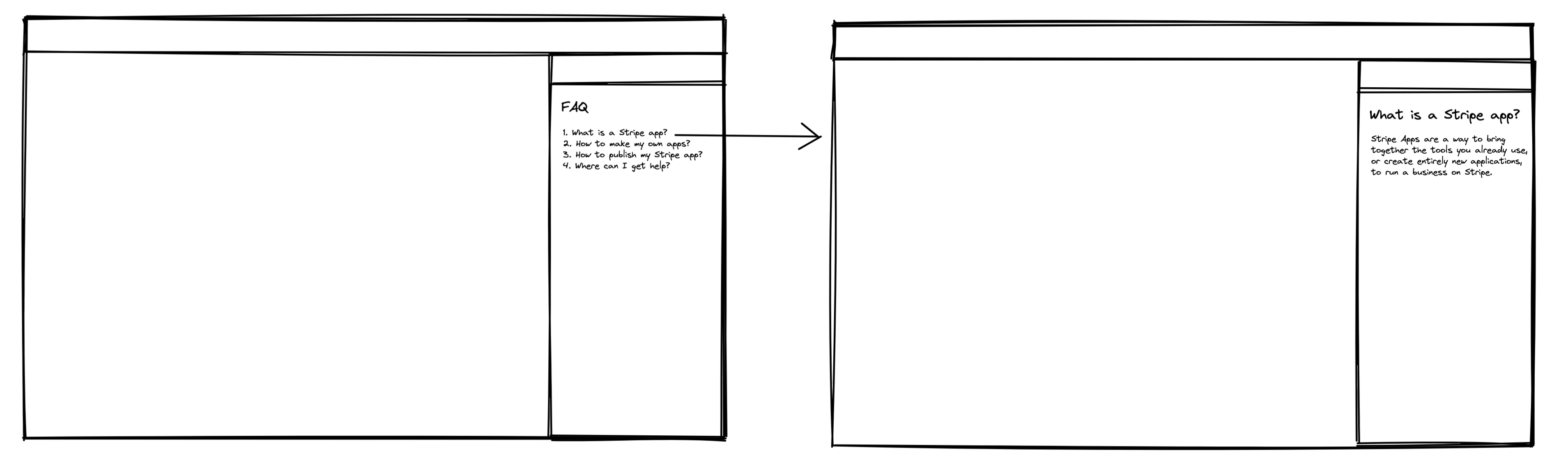
To model such transitions, you would use the React Router. The default view could have the following implementation:
import type { ExtensionContextValue } from '@stripe/ui-extension-sdk/context';
import { ContextView } from '@stripe/ui-extension-sdk/ui';
import {
  APP_BRANDING_COLOR,
  APP_BRANDING_LOGO,
} from './constants/branding.constants';
import { Route, Routes } from 'react-router-dom';
import { MemoryRouter as Router } from 'react-router';
// ... other imports
const DefaultView = ({ userContext, environment }: ExtensionContextValue) => {
  const viewId = environment?.viewportID; // stripe.dashboard.drawer.default for default view
  return (
    <ContextView
      title=" "
      description=" "
      brandIcon={APP_BRANDING_LOGO}
      brandColor={APP_BRANDING_COLOR}
    >
      <Router basename="/" initialEntries={['/init']}>
        <Routes>
          <Route path="/init" element={<AuthInit />} />
          <Route path="/login" element={<Login />} />
          <Route path="/faq-entries/:id" element={<FaqEntry />} />
          <Route path="/" element={<Faq />} />
        </Routes>
      </Router>
    </ContextView>
  );
};
export default DefaultView;
There are several things of note here.
The ContextView is the root component in our DefaultView component. When we don't want to provide title and description of the ContextView, we use a space. You can't use an empty string, or leave out title and description all together.
The first child of the ContextView is a Router. This is where our components will render, depending on our route. Remember that we use a MemoryRouter, and the route is an internal property of the router. It's not reflected in the window's location.
When you open the view for the first time, you are presented with the AuthInit component. This component could check if you are authenticated, and if so, redirect you to /, and consequently the React Router will render the Faq component.
Within the Faq component, we can use the useNavigate hook to navigate to a FaqEntry component to show the expanded question, and answer for a FAQ entry. For example:
import React from 'react';
import { useNavigate } from 'react-router-dom';
export const Faq: React.FC = () => {
  const navigate = useNavigate();
  const onClickFaqEntry = (id: string) => {
    navigate(`/faq-entries/${id}`);
  };
  return <>{/* Display a list of FAQ entries here */}</>;
};
You can even try to extract the Router part into its own component, e.g. NavigationWrapper, and re-use it across views. In that case, you might consider including view IDs in the route to distinguish between different views. Following our example, this means our routes would become:
<Router basename="/" initialEntries={['/init']}>
  <Routes>
    <Route path="/init" element={<AuthInit />} />
    <Route path="/login" element={<Login />} />
    <Route path="stripe.dashboard.drawer.default/faq-entries/:id" element={<FaqEntry />} />
    <Route path="stripe.dashboard.drawer.default" element={<Faq />} />
    <Route path="stripe.dashboard.customer.detail" element={<SomeCustomerRelatedComponent />} />
  </Routes>
</Router>
The current view ID is always available in the environment?.viewportID property, should you ever need it.
Using UserContext and Environment Everywhere
The UserContext and Environment are so useful and so commonly used that it makes sense to store them in React context. Otherwise, you'd need to pass them down from your view component all the way to the components that need them. This is a technique known as "prop drilling" in the React world.
First, define your context object:
export const GlobalContext = createContext<{
  userContext: ExtensionContextValue['userContext'] | null;
  environment: ExtensionContextValue['environment'] | null;
}>({ userContext: null, environment: null });
Now, simply wrap your view component in a context provider, and initialize it with the userContext and environment that are passed to your view:
import type { ExtensionContextValue } from '@stripe/ui-extension-sdk/context';
import { ContextView } from '@stripe/ui-extension-sdk/ui';
import { NavigationWrapper } from './authentication/NavigationWrapper';
import { GlobalContext } from './common/global-context';
import {
  APP_BRANDING_COLOR,
  APP_BRANDING_LOGO,
} from './constants/branding.constants';
const DefaultView = ({ userContext, environment }: ExtensionContextValue) => {
  return (
    <GlobalContext.Provider value={{ userContext, environment }}>
      <ContextView
        title=" "
        description=" "
        brandIcon={APP_BRANDING_LOGO}
        brandColor={APP_BRANDING_COLOR}
      >
        <NavigationWrapper /> {/* Routes go here */}
      </ContextView>
    </GlobalContext.Provider>
  );
};
export default DefaultView;
Now, you can use the useContext hook to retrieve properties from userContext and environment anywhere in your component tree. For example, this is how we would retrieve the payment object if we were on the payments page:
const globalContext = useContext(GlobalContext);
const objectContextId = globalContext.environment?.objectContext?.id;
const objectContextType = globalContext.environment?.objectContext?.object;
useEffect(() => {
  if (!objectContextId) {
    return;
  }
  if (objectContextType === 'payment_intent') {
    const request = stripeApi.paymentIntents.retrieve(
      objectContextId
    ) as Promise<Stripe.PaymentIntent>;
    // Do something with Promise<Stripe.PaymentIntent>
}, [objectContextId, objectContextType]);
Updating Title and Description Dynamically
title and description are properties on the view level, but more often than not, you might want to update them dynamically as they are very context-dependant. In one of the above examples, we might want to display the FAQ answer in the title as we navigate to individual FAQ entries.
In such cases, we can use React context again. Let's extend our GlobalContext with title and description properties, as well as setters for them.
export const GlobalContext = createContext<{
  userContext: ExtensionContextValue['userContext'] | null;
  environment: ExtensionContextValue['environment'] | null;
  title: string | null;
  description: string | null;
  setTitle: (newTitle: string) => void;
  setDescription: (newDescription: string) => void;
}>({
  userContext: null,
  environment: null,
  title: null,
  description: null,
  setTitle: (newTitle: string) => {},
  setDescription: (newDescription: string) => {},
});
The DefaultView component now becomes:
import type { ExtensionContextValue } from '@stripe/ui-extension-sdk/context';
import { ContextView } from '@stripe/ui-extension-sdk/ui';
import { NavigationWrapper } from './authentication/NavigationWrapper';
import { GlobalContext } from './common/global-context';
import {
  APP_BRANDING_COLOR,
  APP_BRANDING_LOGO,
} from './constants/branding.constants';
import { useState } from 'react';
const DefaultView = ({ userContext, environment }: ExtensionContextValue) => {
  const [title, setTitle] = useState(' ');
  const [description, setDescription] = useState(' ');
  return (
    <GlobalContext.Provider
      value={{
        userContext,
        environment,
        title,
        description,
        setTitle,
        setDescription,
      }}
    >
      <ContextView
        title={title}
        description={description}
        brandIcon={APP_BRANDING_LOGO}
        brandColor={APP_BRANDING_COLOR}
      >
        <NavigationWrapper /> {/* Routes go here */}
      </ContextView>
    </GlobalContext.Provider>
  );
};
export default DefaultView;
Now, any child component can update title and/or description, using the following snippet:
const { setTitle } = useContext(GlobalContext);
setTitle('My new title');
Layout Options
Before starting to model different type of layouts, it is highly recommended to learn the concept of "stacks". Stacks are Stripe's way of modelling flexbox-like layouts.
It's not exactly the same as flexbox, but once you get the hang of it, you will find it to be very similar. You can stack up elements horizontally (on the "x" axis) or vertically (on the "y" axis). Furthermore, elements can be distributed in a different way along the axis, or aligned in a certain way, giving you the ability to make any kind of layout you can imagine. You can even stack up elements on top of each other.
Whenever you want to align your content in any way, you need to use a stack.
Key-Value Two-Column Layout
Let's assume that you want to show key-value pairs in a two-column layout. This can be accomplished easily using stacks:
<Box
  css={{
    stack: 'x',
    gap: 'xxsmall',
    width: 'fill',
    marginBottom: 'xxsmall',
  }}
>
  <Box
    css={{
      keyline: 'neutral',
      padding: 'small',
      fontWeight: 'bold',
      width: '1/2',
    }}
  >
    App Version:
  </Box>
  <Box
    css={{
      keyline: 'neutral',
      padding: 'small',
      stack: 'x',
      alignX: 'end',
      width: '1/2',
    }}
  >
    1.0.0
  </Box>
</Box>
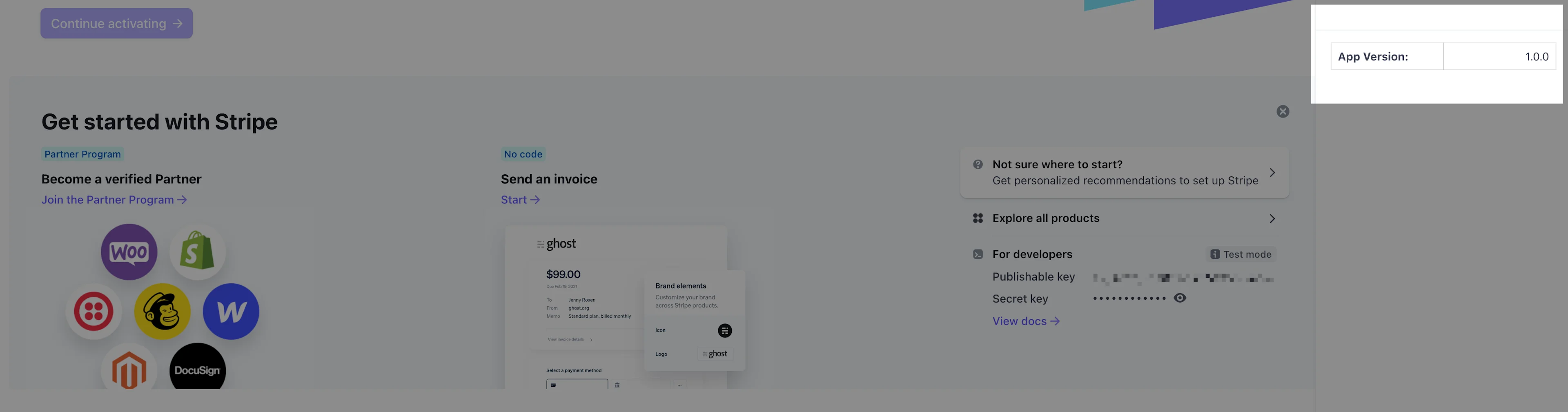
The above code is for one row in the two-column layout. To add more, just add more blocks like these (or better, extract the above component in its own component). This is how it would be displayed in the app:
The above code snippet has several things of note:
- Whenever you use a width on a
Box, make sure its parent has agapdefined. The reason is the way how the width is calculated - it takesgapinto calculation, and if thegapis 0, the calculation will produce invalid width (which will just fit the content). - To align content of a
Box(we usedalignX: 'end'), theBoxshould be a stack. - In addition to using
margin, you can also usemarginTop,marginBottom,marginLeft, andmarginRightto specify margin only on one (or more sides).
Vertically Aligning Elements
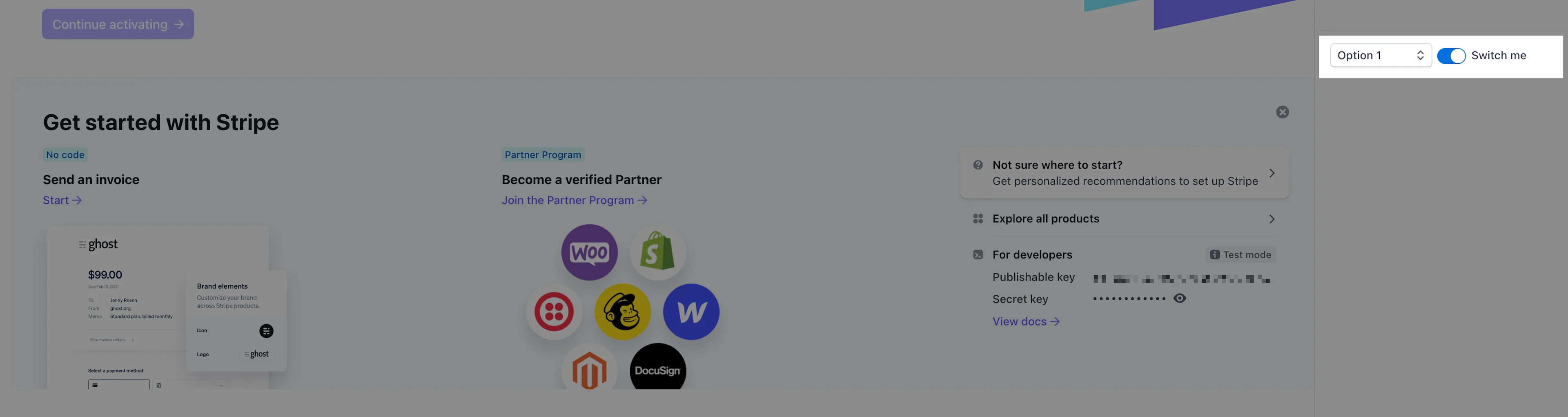
Stacks are not only helpful for horizontal alignments. You can align vertically too, and this can come in handy if you want to nicely align an icon with a text label, or if you want to have form elements displayed in a straight line. For example:
<Box css={{ stack: 'x', alignY: 'center', gap: 'small' }}>
  <Select name="options">
    <option value="option-1">Option 1</option>
    <option value="option-2">Option 2</option>
    <option value="option-3">Option 3</option>
    <option value="option-4">Option 4</option>
  </Select>
  <Switch label="Switch me" checked />
</Box>
Wizards
Whenever you need to have confirmation modals, or wizard-like flows, it's best to use the FocusView component. A focus view slides from the right and allows the user to have a dedicated space to perform a specific task, such as entering details to create a new entry in a database, or going through a wizard.
A wizard can be implemented using two or more FocusView components. Here is an example of having a wizard with two components:
import { Button, FocusView } from '@stripe/ui-extension-sdk/ui';
import { useState } from 'react';
const DefaultView = () => {
  const [step1Shown, setStep1Shown] = useState<boolean>(false);
  const [step2Shown, setStep2Shown] = useState<boolean>(false);
  const onPressStart = () => {
    setStep1Shown(true);
  };
  const onPressStep2 = () => {
    setStep1Shown(false);
    setStep2Shown(true);
  };
  const onPressFinish = () => {
    setStep2Shown(false);
  };
  const onPressBack = () => {
    setStep2Shown(false);
    setStep1Shown(true);
  };
  return (
    <>
      <Button type="primary" onPress={onPressStart}>
        Start Wizard
      </Button>
      <FocusView
        title="Step 1"
        shown={step1Shown}
        primaryAction={
          <Button type="primary" onPress={onPressStep2}>
            Next Step
          </Button>
        }
        secondaryAction={
          <Button onPress={() => setStep1Shown(false)}>Cancel</Button>
        }
        onClose={() => setStep1Shown(false)}
      >
        Step 1 content
      </FocusView>
      <FocusView
        title="Step 2"
        shown={step2Shown}
        primaryAction={
          <Button type="primary" onPress={onPressFinish}>
            Finish
          </Button>
        }
        secondaryAction={<Button onPress={onPressBack}>Back</Button>}
        onClose={onPressBack}
      >
        Step 2 content
      </FocusView>
    </>
  );
};
export default DefaultView;
Conclusion
Stripe really did fantastic work to provide an amazing UI Extensions for developing custom Stripe apps. We hope this blog post provided you with some guidance on how to set solid foundations if you want to make more complex UIs using the Stripe UI Extension SDK. Stripe is continuously upgrading the UI Extension SDK, and you can definitely expect some new widgets to play with in the future!