Skip to content

Carga de Componentes Dinámica en Angular con Ivy

This article was written over 18 months ago and may contain information that is out of date. Some content may be relevant but please refer to the relevant official documentation or available resources for the latest information.

Este artículo te mostrará cómo comenzar a cargar componentes dinámicamente usando Angular con Ivy. Esto no es exactamente nuevo y exclusivo de Angular 9+, ya que ahora podemos tener componentes sin módulo y al hacer que se carguen dinámicamente obtenemos los beneficios de la carga diferida(lazy loading).

Para abreviar, reduciremos el tamaño del paquete principal(bundle size) cargando solo los componentes que necesitamos.

Imagina que tienes un módulo muy grande que consta de varios componentes. Cada usuario tiene necesidades únicas, lo que significa que solo usará un subconjunto de todos los componentes disponibles. El objetivo de este artículo es explorar una posible solución para abordar este problema.

Para hacerlo más fácil, trabajemos en un caso de uso conocido.

Si deseas ir directamente al código, se ha creado un repositorio con la versión final de la aplicación. Se ve como sigue:

representacion visual de la aplicacion que se va a desarrollar

El Problema

Supongamos que tenemos esta aplicación, con la que los usuarios pueden iniciar sesión y realizar algunas acciones. Independientemente de si el usuario es un invitado o un usuario registrado, ambos tienen una página de perfil. Cada tipo de usuario tiene diferentes acciones que puede realizar.

La Solución

Una forma de resolver este problema sería usando condicionales con la ayuda de la directiva estructural ngIf. Esto permite tener un diseño diferente para cada uno. Funciona, pero ¿Es la mejor solución? Recuerda que ahora ambos usuarios tienen que descargar todo el componente junto a las acciones, tanto si las utilizan como si no.

Una aclaración, se ha utilizado la estrategia ngIf en aplicaciones que llevan años en producción.

Hagamos algo diferente esta vez. Vamos a crear un componente para cada tipo de usuario y los cargaremos dinámicamente. De esta manera, el paquete principal no tendrá ninguno de ellos y se descargarán bajo demanda.

Implementación

Es hora de la diversión. Antes de comenzar, asegúrate de instalar Angular CLI. Si necesitas ayuda en este paso, simplemente deje un comentario. Una vez tengas Angular CLI instalado, sigue estos pasos:

  • Abre la terminal de tu elección.
  • Ejecuta el comando ng new {your-app-name}
  • Abre el nuevo proyecto en el editor de tu preferencia.

Comencemos con la carga de componentes. Vamos a crear un nuevo servicio llamado AppService. Una vez que lo hayas creado, abre el archivo src/app/app.service.ts en tu editor y pega lo siguiente:

import {
  Injectable,
  ComponentFactoryResolver,
  ViewContainerRef
} from '@angular/core';
import { from } from 'rxjs';
import { map } from 'rxjs/operators';

export interface ComponentLoader {
  loadChildren: () => Promise<any>;
}

@Injectable({
  providedIn: 'root'
})
export class AppService {
  constructor(private cfr: ComponentFactoryResolver) {}

  forChild(vcr: ViewContainerRef, cl: ComponentLoader) {
    return from(cl.loadChildren()).pipe(
      map((component: any) => this.cfr.resolveComponentFactory(component)),
      map(componentFactory => vcr.createComponent(componentFactory))
    );
  }
}

A primera vista se ve ComponentFactoryResolver, ViewContainerRef, ComponentLoader y piensas:

¿Qué clase de brujería es esta?

Es más simple de lo que puedas pensar. Es solo que hay algunas cosas nuevas. Estamos inyectando ComponentFactoryResolver, el cual, dado un Componente, retorna un Factory(fábrica) que se puede usar para crear nuevas instancias del mismo. ViewContainerRef es una referencia a un elemento en el que vamos a insertar el componente recién creado. ComponentLoader es una interfaz sencilla, la cual define una función loadChildren que retorna un Promise(promesa). Esta promesa, una vez resuelta, retorna un Component.

Finalmente, estamos uniendo todo. Usando la función from de RxJS, se puede transformar la promesa en un Observable. Luego, este componente se mapea en un Factory(fábrica), y finalmente se inyecta el componnte y retorna la instancia.

Ahora creamos otro servicio llamado ProfileService que usará AppService para cargar el componente respectivo. También mantiene el estado de inicio de sesión. Crea un archivo en src/app/profile/profile.service.ts:

import { Injectable, ViewContainerRef } from '@angular/core';
import { BehaviorSubject } from 'rxjs';
import { AppService } from '../app.service';

@Injectable({ providedIn: 'root' })
export class ProfileService {
  private isLoggedIn = new BehaviorSubject(false);
  isLoggedIn$ = this.isLoggedIn.asObservable();

  constructor(private appService: AppService) {}

  private guestProfile() {
    return () =>
      import('./guest-profile/guest-profile.component').then(
        m => m.GuestProfileComponent
      );
  }

  private clientProfile() {
    return () =>
      import('./client-profile/client-profile.component').then(
        m => m.ClientProfileComponent
      );
  }

  login() {
    this.isLoggedIn.next(true);
  }

  logout() {
    this.isLoggedIn.next(false);
  }

  loadComponent(vcr: ViewContainerRef, isLoggedIn: boolean) {
    vcr.clear();

    return this.appService.forChild(vcr, {
      loadChildren: isLoggedIn ? this.clientProfile() : this.guestProfile()
    });
  }
}

Este servicio es más simple que el anterior. Se crea un Subject para manejar el estado dado por isLoggedIn junto a dos métodos para eventos relacionados. Se definen dos métodos privados que retornan una función que devuelve un Promise(promesa) de un Component(component).

Sí, al igual que la interfaz ComponentLoader.

Finalmente, un método mágico: loadComponent toma un ViewContainerRef y el estado isLoggedIn. Limpia ViewContainerRef, vaciándolo por completo. Entonces se llama al método forChild desde AppService con el ViewContainerRef que acabamos de limpiar, y para el ComponentLoader, tiene una expresión ternaria que determina qué Component cargar.

Para facilitar la carga de los componentes, vamos a crear una directiva que ayuda con este proceso. Crea un archivo src/app/profile/profile-host.directive.ts:

import { Directive, ViewContainerRef } from '@angular/core';

@Directive({ selector: '[appProfileHost]' })
export class ProfileHostDirective {
  constructor(public viewContainerRef: ViewContainerRef) {}
}

Esto es solo un truco para facilitar la obtención del ViewContainerRef que estamos buscando. Ahora crea un archivo src/app/profile/profile.component.ts:

import { Component, OnInit, OnDestroy, ViewChild } from '@angular/core';
import { ProfileHostDirective } from './profile-host.directive';
import { ProfileService } from './profile.service';
import { mergeMap, takeUntil } from 'rxjs/operators';
import { Subject } from 'rxjs';

@Component({
  selector: 'app-profile-container',
  template: `
    <ng-template appProfileHost></ng-template>
  `
})
export class ProfileComponent implements OnInit, OnDestroy {
  @ViewChild(ProfileHostDirective, { static: true })
  profileHost: ProfileHostDirective;
  private destroySubject = new Subject();

  constructor(private profileService: ProfileService) {}

  ngOnInit() {
    const viewContainerRef = this.profileHost.viewContainerRef;

    this.profileService.isLoggedIn$
      .pipe(
        takeUntil(this.destroySubject),
        mergeMap(isLoggedIn =>
          this.profileService.loadComponent(viewContainerRef, isLoggedIn)
        )
      )
      .subscribe();
  }

  ngOnDestroy() {
    this.destroySubject.next();
    this.destroySubject.complete();
  }
}

Todo lo que estamos haciendo aquí es crear una plantilla vía ng-template en la que adjuntamos la directiva ProfileHostDirective, para que se pueda usar el decorador ViewChild y obtener el objeto viewContainerRef. En la función OnInit se obtiene el viewContainerRef, y usamos el observable isLoggedIn$ de ProfileService para saber cada vez que cambia el estado de isLoggedIn. Luego, usando el operador mergeMap, se invoca a la función loadComponent que está haciendo la verdadera magia.

Si observas el archivo src/app/profile/profile.service.ts, notarás que se hace referencia a los components GuestProfileComponent y ClientProfileComponent. Ahora es el momento de crearlos.

Primero, ve al archivo a src/styles.scss e incluye:

html,
body {
  margin: 0;
  padding: 0;
}

Para facilitar los estilos, se ha creado una carpeta de estilos dentro del directorio de assets, en el que se encuentran dos archivos .scss:

  • _variables.scss
  • _mixins.scss

Ambos contienen todos los estilos compartidos, para que sea más fácil de mantener:

// _variables.scss
$card-width: 400px;
$avatar-width: 80px;
$container-margin: 20px;
// _mixins.scss
@import './variables.scss';

@mixin button($color) {
  display: inline-block;
  padding: 0.5rem 1rem;
  border: 1px solid $color;
  border-bottom-color: darken($color, 10);
  border-radius: 5px;
  background: linear-gradient(180deg, $color, darken($color, 10));
  color: white;
  cursor: pointer;
  font-family: Arial, Helvetica, sans-serif;
  box-shadow: 1px 2px 4px rgba(0, 0, 0, 0.2);
  font-size: 1rem;

  &:hover {
    background: $color;
    box-shadow: 1px 4px 6px rgba(0, 0, 0, 0.2);
  }

  &:active {
    background: darken($color, 10);
  }
}

@mixin card {
  box-shadow: 0 4px 8px 0 rgba(0, 0, 0, 0.2);
  border: 1px solid #eee;
  width: $card-width;
  padding: 1rem;
}

También se crea una carpeta de imágenes y se incluye una imagen de nombre profile.png. Puedes usar cualquier imagen siempre que sea cuadrada.

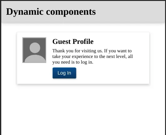
Vayamos a crear el componente GuestProfileComponent. Para esto necesitaremos tres archivos; una plantilla, una hoja de estilos y un archivo TypeScript. Empecemos con la plantilla: crea un archivo src/app/profile/guest-profile/guest-profile.component.html con lo siguiente:

<section class="card">
  <div class="card__avatar">
    <div class="card__avatar__head"></div>
    <div class="card__avatar__body"></div>
  </div>

  <div class="container">
    <h2 class="card__title">Guest Profile</h2>

    <p class="card__subtitle">
      Thank you for visiting us. If you want to take your experience to the next
      level, all you need is to log in.
    </p>

    <div class="card__toolbar">
      <button (click)="login()">Login</button>
    </div>
  </div>
</section>

Ahora creamos la hoja de estilos en src/app/profile/guest-profile/guest-profile.component.scss:

@import '~src/assets/styles/mixins.scss';

.card {
  display: flex;
  @include card();

  &__title {
    margin: 0 0 0.5rem 0;
  }

  &__subtitle {
    margin: 0 0 0.5rem 0;
  }

  &__toolbar button {
    @include button(#145092);
  }

  &__avatar {
    height: 80px;
    width: $avatar-width;
    border: 2px solid #bbb;
    background: #666;
    position: relative;
    overflow: hidden;

    &__head {
      position: absolute;
      border-radius: 50%;
      background: #bbb;
      width: 35px;
      height: 35px;
      top: 15px;
      left: 22px;
    }

    &__body {
      position: absolute;
      border-radius: 50%;
      background: #bbb;
      width: 70px;
      height: 50px;
      top: 55px;
      left: 5px;
    }
  }
}

.container {
  width: $card-width - $avatar-width - $container-margin;
  margin: 0 $container-margin;
}

Finalmente, el archivo TypeScript en src/app/profile/guest-profile/guest-profile.component.ts:

import { Component } from '@angular/core';
import { ProfileService } from '../profile.service';

@Component({
  selector: 'app-guest-profile',
  templateUrl: './guest-profile.component.html',
  styleUrls: ['./guest-profile.component.scss']
})
export class GuestProfileComponent {
  constructor(private profileService: ProfileService) {}

  login() {
    this.profileService.login();
  }
}

Todo lo que tenemos que hacer ahora es crear el compoente ClientProfileComponent. Necesitaremos los mismos archivos que el componente GuestProfileComponent. Empecemos con la plantilla src/app/profile/client-profile/client-profile.component.html:

<section class="card">
  <figure class="card__avatar">
    <img src="assets/images/profile.png" />
  </figure>

  <h2 class="card__title" contenteditable="true">Daniel Marin</h2>

  <p class="card__subtitle" contenteditable="true">
    Senior Software Engineer at This Dot Labs, a company specializing in Modern
    Web Technologies, designing, and developing software to help companies
    maximize efficiency in their processes.
  </p>

  <div class="card__toolbar">
    <button (click)="logout()">Logout</button>
  </div>
</section>

Ahora creamos la hoja de estilos en src/app/profile/client-profile/client-profile.component.scss:

@import '~src/assets/styles/mixins.scss';

.card {
  @include card();

  &__avatar {
    height: $avatar-width;
    width: $avatar-width;
    margin: 0 auto;
    border-radius: 50%;
    overflow: hidden;

    img {
      width: 100%;
      height: 100%;
      object-fit: cover;
    }
  }

  &__title {
    margin: 1rem 0 0.5rem 0;
    text-align: center;
  }

  &__subtitle {
    margin: 0 0 1rem 0;
    text-align: center;
  }

  &__toolbar {
    display: flex;
    justify-content: center;

    button {
      @include button(#a80000);
    }
  }
}

Y finalmente, el archivo TypeScript en src/app/profile/client-profile/client-profile.component.ts:

import { Component } from '@angular/core';
import { ProfileService } from '../profile.service';

@Component({
  selector: 'app-client-profile',
  templateUrl: './client-profile.component.html',
  styleUrls: ['./client-profile.component.scss']
})
export class ClientProfileComponent {
  constructor(private profileService: ProfileService) {}

  logout() {
    this.profileService.logout();
  }
}

Ahora, todo lo que se tiene que hacer es actualizar el component principal AppComponent. Ve al archivo src/app/app.component.html, elimina todo su contenido y pega el siguiente código en su lugar:

<h1 class="header">Dynamic components</h1>
<main class="container">
  <app-profile-container></app-profile-container>
</main>

Ve al archivo src/app/app.component.scss y agrega lo siguiente:

.header {
  background: #ddd;
  border-bottom: 1px solid #ccc;
  margin: 0;
  padding: 1rem;
  box-shadow: 0 4px 8px 0 rgba(0, 0, 0, 0.2);
}

.container {
  display: flex;
  justify-content: center;
  margin-top: 2rem;
}

Ahora, lo único que no podemos olvidar es agregar el componente ProfileComponent y la directiva ProfileHostDirective al arreglo de declaraciones en AppModule. Ve al archivo src/app/app.module.ts:

import { BrowserModule } from '@angular/platform-browser';
import { NgModule } from '@angular/core';

import { AppRoutingModule } from './app-routing.module';
import { AppComponent } from './app.component';
import { ProfileHostDirective } from './profile/profile-host.directive';
import { ProfileComponent } from './profile/profile.component';

@NgModule({
  declarations: [AppComponent, ProfileHostDirective, ProfileComponent],
  imports: [BrowserModule, AppRoutingModule],
  providers: [],
  bootstrap: [AppComponent]
})
export class AppModule {}

Y estamos listos.

Conclusion

Espero te hayas divertido tanto como el autor mientras escribía este código. Ahora sabes cómo cargar componentes dinámicamente considerando una carga diferida. Con este conocimiento, puedes reducir el tamaño del paquete principal(main bundle size) y mejorar la experiencia de tus usuarios.


Este artículo es una traducción al español de su versión en inglés

This Dot is a consultancy dedicated to guiding companies through their modernization and digital transformation journeys. Specializing in replatforming, modernizing, and launching new initiatives, we stand out by taking true ownership of your engineering projects.

We love helping teams with projects that have missed their deadlines or helping keep your strategic digital initiatives on course. Check out our case studies and our clients that trust us with their engineering.

You might also like

Exploring Angular Forms: A New Alternative with Signals cover image

Exploring Angular Forms: A New Alternative with Signals

Exploring Angular Forms: A New Alternative with Signals In the world of Angular, forms are essential for user interaction, whether you're crafting a simple login page or a more complex user profile interface. Angular traditionally offers two primary approaches: template-driven forms and reactive forms. In my previous series on Angular Reactive Forms, I explored how to harness reactive forms' power to manage complex logic, create dynamic forms, and build custom form controls. A new tool for managing reactivity - signals - has been introduced in version 16 of Angular and has been the focus of Angular maintainers ever since, becoming stable with version 17. Signals allow you to handle state changes declaratively, offering an exciting alternative that combines the simplicity of template-driven forms with the robust reactivity of reactive forms. This article will examine how signals can add reactivity to both simple and complex forms in Angular. Recap: Angular Forms Approaches Before diving into the topic of enhancing template-driven forms with signals, let’s quickly recap Angular's traditional forms approaches: 1. Template-Driven Forms: Defined directly in the HTML template using directives like ngModel, these forms are easy to set up and are ideal for simple forms. However, they may not provide the fine-grained control required for more complex scenarios. Here's a minimal example of a template-driven form: ` ` 2. Reactive Forms: Managed programmatically in the component class using Angular's FormGroup, FormControl, and FormArray classes; reactive forms offer granular control over form state and validation. This approach is well-suited for complex forms, as my previous articles on Angular Reactive Forms discussed. And here's a minimal example of a reactive form: ` ` Introducing Signals as a New Way to Handle Form Reactivity With the release of Angular 16, signals have emerged as a new way to manage reactivity. Signals provide a declarative approach to state management, making your code more predictable and easier to understand. When applied to forms, signals can enhance the simplicity of template-driven forms while offering the reactivity and control typically associated with reactive forms. Let’s explore how signals can be used in both simple and complex form scenarios. Example 1: A Simple Template-Driven Form with Signals Consider a basic login form. Typically, this would be implemented using template-driven forms like this: ` ` This approach works well for simple forms, but by introducing signals, we can keep the simplicity while adding reactive capabilities: ` ` In this example, the form fields are defined as signals, allowing for reactive updates whenever the form state changes. The formValue signal provides a computed value that reflects the current state of the form. This approach offers a more declarative way to manage form state and reactivity, combining the simplicity of template-driven forms with the power of signals. You may be tempted to define the form directly as an object inside a signal. While such an approach may seem more concise, typing into the individual fields does not dispatch reactivity updates, which is usually a deal breaker. Here’s an example StackBlitz with a component suffering from such an issue: Therefore, if you'd like to react to changes in the form fields, it's better to define each field as a separate signal. By defining each form field as a separate signal, you ensure that changes to individual fields trigger reactivity updates correctly. Example 2: A Complex Form with Signals You may see little benefit in using signals for simple forms like the login form above, but they truly shine when handling more complex forms. Let's explore a more intricate scenario - a user profile form that includes fields like firstName, lastName, email, phoneNumbers, and address. The phoneNumbers field is dynamic, allowing users to add or remove phone numbers as needed. Here's how this form might be defined using signals: ` > Notice that the phoneNumbers field is defined as a signal of an array of signals. This structure allows us to track changes to individual phone numbers and update the form state reactively. The addPhoneNumber and removePhoneNumber methods update the phoneNumbers signal array, triggering reactivity updates in the form. ` > In the template, we use the phoneNumbers signal array to dynamically render the phone number input fields. The addPhoneNumber and removePhoneNumber methods allow users to reactively add or remove phone numbers, updating the form state. Notice the usage of the track function, which is necessary to ensure that the ngFor directive tracks changes to the phoneNumbers array correctly. Here's a StackBlitz demo of the complex form example for you to play around with: Validating Forms with Signals Validation is critical to any form, ensuring that user input meets the required criteria before submission. With signals, validation can be handled in a reactive and declarative manner. In the complex form example above, we've implemented a computed signal called formValid, which checks whether all fields meet specific validation criteria. The validation logic can easily be customized to accommodate different rules, such as checking for valid email formats or ensuring that all required fields are filled out. Using signals for validation allows you to create more maintainable and testable code, as the validation rules are clearly defined and react automatically to changes in form fields. It can even be abstracted into a separate utility to make it reusable across different forms. In the complex form example, the formValid signal ensures that all required fields are filled and validates the email and phone numbers format. This approach to validation is a bit simple and needs to be better connected to the actual form fields. While it will work for many use cases, in some cases, you might want to wait until explicit "signal forms" support is added to Angular. Tim Deschryver started implementing some abstractions around signal forms, including validation and wrote an article about it. Let's see if something like this will be added to Angular in the future. Why Use Signals in Angular Forms? The adoption of signals in Angular provides a powerful new way to manage form state and reactivity. Signals offer a flexible, declarative approach that can simplify complex form handling by combining the strengths of template-driven forms and reactive forms. Here are some key benefits of using signals in Angular forms: 1. Declarative State Management: Signals allow you to define form fields and computed values declaratively, making your code more predictable and easier to understand. 2. Reactivity: Signals provide reactive updates to form fields, ensuring that changes to the form state trigger reactivity updates automatically. 3. Granular Control: Signals allow you to define form fields at a granular level, enabling fine-grained control over form state and validation. 4. Dynamic Forms: Signals can be used to create dynamic forms with fields that can be added or removed dynamically, providing a flexible way to handle complex form scenarios. 5. Simplicity: Signals can offer a simpler, more concise way to manage form states than traditional reactive forms, making building and maintaining complex forms easier. Conclusion In my previous articles, we explored the powerful features of Angular reactive forms, from dynamic form construction to custom form controls. With the introduction of signals, Angular developers have a new tool that merges the simplicity of template-driven forms with the reactivity of reactive forms. While many use cases warrant Reactive Forms, signals provide a fresh, powerful alternative for managing form state in Angular applications requiring a more straightforward, declarative approach. As Angular continues to evolve, experimenting with these new features will help you build more maintainable, performant applications. Happy coding!...

Overview of the New Signal APIs in Angular cover image

Overview of the New Signal APIs in Angular

Overview of the New Signal APIs in Angular Google's Minko Gechev and Jeremy Elbourn announced many exciting things at NG Conf 2024. Among them is the addition of several new signal-based APIs. They are already in developer preview, so we can play around with them. Let's dig into it, starting with signal-based inputs and the new matching outputs API. Signal Based Inputs Discussions about signal-based inputs have been taking place in the Angular community for some time now, and they are finally here. Until now, you used the @Input() decorator to define inputs. This is what you'd have to write in your component to declare an optional and a required input: ` With the new signal-based inputs, you can write much less boilerplate code. Here is how you can define the same inputs using the new syntax: ` It's not only less boilerplate, but because the values are signals, you can also use them directly in computed signals and effects. That, effectively, means you get to avoid computing combined values in ngOnChanges or using setters for your inputs to be able to compute derived values. In addition, input signals are read-only. The New Output I intentionally avoid calling them signal-based outputs because they are not. They still work the same way as the old outputs. The Angular team has just introduced a new output API that is more consistent with the latest inputs API and allows you to write less boilerplate, similar to the new input API. Here is how you would define an output until now: ` Here is how you can define the same output using the new syntax: ` The thing I like about the new output API is that sometimes it happens to me that I forget to instantiate the EventEmitter because I do this instead: ` You won't forget to instantiate the output with the new syntax because the output function does it for you. Signal Queries I am sure most readers know the @ViewChild, @ViewChildren, @ContentChild, and @ContentChildren decorators very well and have experienced the pain of triggering the infamous ExpressionChangedAfterItHasBeenCheckedError or having the values unavailable when needed. Here is a refresher on how you would use these decorators until now: ` With the new signal queries, similar to the new input API, the values are signals, and you can use them directly in computed signals and effects. You can define the same queries using the new syntax: ` Jeremy Elbourn mentioned that the new signal queries have better type inference and are more consistent with the new input and output APIs. He also showcased a brand new feature not available with the old queries. You can now define a query as required, and the Angular compiler will throw an error if the query has no result, guaranteeing that the value won't be undefined. Here is how you can define a required query: ` Model Inputs Jeremy and Minko announced the last new feature is the model inputs. The name is vague, but the feature is cool—it simplifies the definition of two-way bindings. Until now, to achieve two-way binding, you would have to define an input and an output following a given naming convention. @Input and @Output had to be defined with the same name (followed by "Change" in the case of the output). Then, you could use the template's [()] syntax. ` ` That way, you could keep the value in sync between the parent and the child component. With the new model inputs, you can define a two-way binding with a single line of code. Here is how you can define the same two-way binding using the new syntax: ` The html template stays the same: ` The model function returns a writable signal that can be updated directly. The value will be propagated back to any two-way bindings. Conclusion The new signal-based APIs are a great addition to Angular. They allow you to write less boilerplate code and make your components more reactive. The new APIs are already in developer preview, so you can start playing around with them today. I look forward to seeing how the community will adopt these new features and what other exciting things the Angular team has in store for us, such as zoneless apps by default....

How to Update the Application Title based on Routing Changes in Angular cover image

How to Update the Application Title based on Routing Changes in Angular

Have you tried to update the document's title of your application? Maybe you're thinking that applying interpolation should be enough: ` That solution is not going to work since the element is outside of the scope of the Angular application. In fact, the root component of your app is within tag, and the title is part of the element. Luckily, Angular provides the Title service with the methods to read the current title of the application, and a setTitle(title) to update that value. However, what happens if you need to update the title on routing changes? Also, you may consider updating it on certain components for Analytics purposes. In this blog post, I'll explain step-by-step how to create a custom Title service to have full control over the title of the current HTML document for your application. Project Setup Prerequisites You'll need to have installed the following tools in your local environment: - Node.js. Preferably the latest LTS version. - A package manager. You can use either NPM or Yarn. This tutorial will use NPM. Creating the Angular Project Let's assume we'll need to build an application with the following routes as requirements: ` Now, let's create the project from scratch using the Angular CLI tool. ` This command will initialize a base project using some configuration options: - --routing. It will create a routing module. - --prefix corp. It defines a prefix to be applied to the selectors for created components(corp in this case). The default value is app. - --style css. The file extension for the styling files. - --skip-tests. it avoids the generations of the .spec.ts files, which are used for testing Creating the Modules and Components Once we got the initial structure of the app, we'll continue running the following commands to create a separate module for /home and /products, which are the main paths of the project: ` * The --routing flag can be using also along with ng generate module to create a routing configuration file for that module. Creating the Title Service Similar to the previous section, we will create a shared module to hold the Title service. Both can be generated with the following commands: ` * The --module app flag is used to "link" the brand new module to the pre-existing app.module.ts file. The Routing Configuration Open the app-routing.module.ts file, and create the initial routes. ` * By default, the application will redirect to the home path. * When the router loads the home path, a HomeComponent will be rendered. * The products path will be loaded using the _lazy loading_ feature. Pay attention to the data provided to the home path. It contains the configured title through pageTitle string. Next, open the products-routing.module.ts file to enable an additional configuration to load the _Products_ and the _Product Detail_ page. ` * The router will render the ProductsComponent by default when the path matches to /products. This route also defines custom data to be rendered as titles later. * When the path also adds an Id on /products/:id, the router will render the ProductDetailComponent. The Title Service Implementation It's time to implement the custom Title Service for our application. ` The above service implementation could be understood in just a few steps. * First, we'll need to make sure to inject the Router, ActivatedRoute and Title services in the constructor. * The title$ attribute contains the initial value for the title("Corp"), which will be emitted through a _BehaviorSubject_. * The titleRoute$ is an Observable ready to emit any pageTitle value defined in the current route. It may use the parent's _pageTitle_ otherwise. * The titleState$ is an Observable ready to _listen_ to either title$ or titleRoute$ values. In case incoming value is defined, it will call the Angular Title service to perform the update. * The getPageTitle method will be in charge of obtaining the pageTitle of the current route if it is defined or the title of the parent otherwise. Injecting the Title Service One easy way to apply the custom Title Service in the whole application is by updating the app.module.ts file and injecting it into the constructor. ` In that way, once the default component gets rendered, the title will be displayed as Corp - Home. If you click on _Go to Products_ link, then a redirection will be performed and the Title service will be invoked again to display Corp - Products at this time. However, we may need to render a different title according to the product detail. In this case, we'll show Corp - Product Detail - :id where the Id matches with the current route parameter. ` Let's explain the implementation of this component: * The constructor injects the ActivatedRoute and the custom TitleService. * The productId$ is the _Observable_ which is going to emit the Id parameter every time it changes in the URL. * Once the component gets initialized, we'll need to _subscribe_ to the productId$ _Observable_ and then emit a new value for the title after creating a new string using the id. That's possible through the titleService.title$.next() method. * When the component gets _destroyed_, we'll need to _unsubscribe_ from the productIdSubscription. We're ready to go! Every time you select a product, the ProductDetail component will be rendered, and the title will be updated accordingly. Live Demo and Source Code Want to play around with the final application? Just open the following link in your browser: https://luixaviles.github.io/angular-update-title. Find the complete angular project in this GitHub repository: angular-update-title-service. Do not forget to give it a star ⭐️, and play around with the code. Feel free to reach out on Twitter if you have any questions. Follow me on GitHub to see more about my work....

The simplicity of deploying an MCP server on Vercel cover image

The simplicity of deploying an MCP server on Vercel

The current Model Context Protocol (MCP) spec is shifting developers toward lightweight, stateless servers that serve as tool providers for LLM agents. These MCP servers communicate over HTTP, with OAuth handled clientside. Vercel’s infrastructure makes it easy to iterate quickly and ship agentic AI tools without overhead. Example of Lightweight MCP Server Design At This Dot Labs, we built an MCP server that leverages the DocuSign Navigator API. The tools, like `get_agreements`, make a request to the DocuSign API to fetch data and then respond in an LLM-friendly way. ` Before the MCP can request anything, it needs to guide the client on how to kick off OAuth. This involves providing some MCP spec metadata API endpoints that include necessary information about where to obtain authorization tokens and what resources it can access. By understanding these details, the client can seamlessly initiate the OAuth process, ensuring secure and efficient data access. The Oauth flow begins when the user's LLM client makes a request without a valid auth token. In this case they’ll get a 401 response from our server with a WWW-Authenticate header, and then the client will leverage the metadata we exposed to discover the authorization server. Next, the OAuth flow kicks off directly with Docusign as directed by the metadata. Once the client has the token, it passes it in the Authorization header for tool requests to the API. ` This minimal set of API routes enables me to fetch Docusign Navigator data using natural language in my agent chat interface. Deployment Options I deployed this MCP server two different ways: as a Fastify backend and then by Vercel functions. Seeing how simple my Fastify MCP server was, and not really having a plan for deployment yet, I was eager to rewrite it for Vercel. The case for Vercel: * My own familiarity with Next.js API deployment * Fit for architecture * The extremely simple deployment process * Deploy previews (the eternal Vercel customer conversion feature, IMO) Previews of unfamiliar territory Did you know that the MCP spec doesn’t “just work” for use as ChatGPT tooling? Neither did I, and I had to experiment to prove out requirements that I was unfamiliar with. Part of moving fast for me was just deploying Vercel previews right out of the CLI so I could test my API as a Connector in ChatGPT. This was a great workflow for me, and invaluable for the team in code review. Stuff I’m Not Worried About Vercel’s mcp-handler package made setup effortless by abstracting away some of the complexity of implementing the MCP server. It gives you a drop-in way to define tools, setup https-streaming, and handle Oauth. By building on Vercel’s ecosystem, I can focus entirely on shipping my product without worrying about deployment, scaling, or server management. Everything just works. ` A Brief Case for MCP on Next.js Building an API without Next.js on Vercel is straightforward. Though, I’d be happy deploying this as a Next.js app, with the frontend features serving as the documentation, or the tools being a part of your website's agentic capabilities. Overall, this lowers the barrier to building any MCP you want for yourself, and I think that’s cool. Conclusion I'll avoid quoting Vercel documentation in this post. AI tooling is a critical component of this natural language UI, and we just want to ship. I declare Vercel is excellent for stateless MCP servers served over http....

Let's innovate together!

We're ready to be your trusted technical partners in your digital innovation journey.

Whether it's modernization or custom software solutions, our team of experts can guide you through best practices and how to build scalable, performant software that lasts.

Prefer email? hi@thisdot.co