Component-based apps make it much easier to build independent components and share them across projects. With broken-down units as small as a button or user interactions, project iterations tend to become faster and more developer friendly.
For this article, we will use Lit to build web components for our front-end apps.
What is Lit?
According to the docs, Lit is a simple library for building fast, lightweight web components.
Using Lit, you can build highly reusable components with the following features:
- Native component for the browser aka Web Component
- Framework agnostic, sharable and usable across multiple web frameworks
- Lightweight, not requiring too much JavaScript code to implement
- Flexible and can easily be plugged into any future project and still work as expected.
Prerequisites
To follow along with this article, I recommend you have:
- Basic knowledge of JavaScript and a frontend framework (React, Angular or Vue)
- Code Editor
For this, we will be using the Lit JavaScript starter kit.
Clone the repo to your local machine
git clone https://github.com/lit/lit-element-starter-js.git
And change directory
cd lit-element-starter-js.git
Install dependencies.
npm install
Open the project with a code editor, and navigate to the file list-element.js:
import {LitElement, html, css} from "lit";
import {map} from 'lit/directives/map.js';

export class ListElement extends LitElement {
  static styles = css`
      :host {
        display: block;
        border: solid 1px gray;
        padding: 16px;
        max-width: 800px;
      }
    `;

  static properties = {
    todoList: {state: true}
  }

  constructor() {
    super();
    this.todoList = []
  }

  render() {
    return html`
    <div>
      <input id="fullname" type="text"><button @click=${() => this._pushTodo(this._input.value)}>Add</button>
    </div>
    <div>
      <h2>A Few ToDo list</h2>
      <ul>
      ${map(this.todoList, (todo, index) => html`
        <li>${todo} <button @click=${() => this._removeTodo(index)}>x</button></li>
      `)}
      </ul>
    </div>
    `
  }

  _pushTodo(todo){
    this.todoList.push(todo)
    this.requestUpdate()
  }

  _removeTodo(index) {
    this.todoList = this.todoList.filter((_, i) => i !== index)
  }

  get _input() {
    return this.renderRoot?.querySelector("#fullname") ?? null
  }
}

window.customElements.define('list-element', ListElement)
Our web component ListElememt is a class that extends to the LitElement base class with the styles() and property() methods.
The styles() method returns the CSS for the component that uses the css method imported from Lit to define component-scoped CSS in a template literal.
The properties() method returns the properties which expose the component's reactive variables.
We declare an internal state of todoList to hold the list of todos. Then, we assign default values to properties in the constructor method. todoList is an empty array.
The render() method returns the view using the html imported from Lit to define the html elements in a template literal.
In the rendered html, we added an input element with id of fullname and a button with a click event triggering the custom method _pushTodo to push new Todo to the todoList array.
Then, we map through the list of todos with map directives imported from Lit and attach a button to each item with an event to remove the item when clicked, calling a custom method _removeTodo that filters through the array, and returns items that satisfy our condition.
The getter method _input() returns the input element we created to give access to the input value so we can pass it to the _pushTodo method.
Now, to render the component, we will modify the index.html head section.
<title><my-element> Demo</title>
<script src="../node_modules/@webcomponents/webcomponentsjs/webcomponents-loader.js"></script>
<script src="../node_modules/lit/polyfill-support.js"></script>
<script type="module" src="../list-element.js"></script>
We will also need to modify the body element of our index.html file.
  <body>
    <my-element>
      <p>This is child content</p>
    </my-element>
  </body>
Now, run the app to see our modification, run:
npm run serve
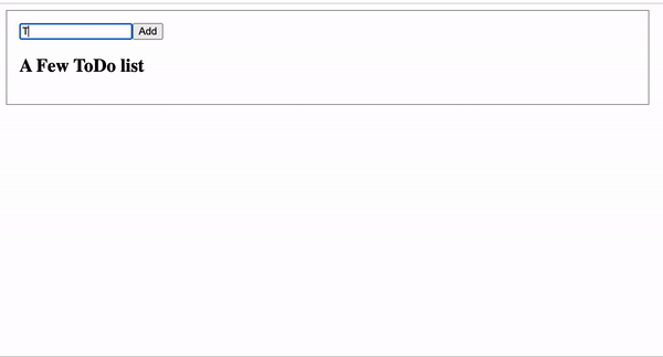
From the browser, navigate to localhost:8000, and you should see the element rendered below.
Benefits of Lit Components
Now we have a running app with a reusable component. Let's explore the Lit benefits of this component, and what differentiates it from other tools for building components.
Native: Lit is built on top of the Web Components standards and you are able to extend just what you need for productivity: reactivity, declarative templates, and a handful of thoughtful features to reduce boilerplate and make your job easier.
In our ListElement code, we defined the custom HTML element with window.customElements.define which defines and registers a new custom element to the browser DOM and associates it with an element name list-element, making our component native. Every Lit component is built with web platform evolution in mind.
Fast and Small: Lit has a 5 kb compressed size and a minified bundle which allows your application to load faster without the need to rebuild a virtual tree (No virtual DOM). Lit batches updates to maximize performance and efficiency. Setting multiple properties at once triggers only one update, performed asynchronously at microtask timing.
Interoperable & future-ready: Every Lit component is a native web component with the superpower of interoperability. Web components work anywhere you use HTML with any framework, or none at all. This makes Lit ideal for building shareable components, design systems, or maintainable, future-ready sites and apps.
Here is how you can quickly make our ListElement component usable and shareable across any project built with any framework or without one.
For the dev/index.html head, we simply imported the JavaScript module of list-element.js and quickly add the custom HTML element to the body:
    <script type="module" src="../list-element.js"></script>
    <style>
      p {
        border: solid 1px blue;
        padding: 8px;
      }
    </style>
  </head>
  <body>
    <list-element>
      <p>This is child content</p>
    </list-element>
  </body>
Reactivity with Lit: Lit components receive input and store their state as JavaScript class fields or properties. Reactive properties are properties that can trigger the reactive update cycle when changed, re-rendering the component, and optionally be read or written to attributes.
  static properties = {
    todoList: {state: true}
  }

  constructor() {
    super();
    this.todoList = []
  }
All JavaScript properties in Lit are defined inside this properties object, and then we used the constructor method in our App component class to set an initial value for the properties we created.
Events: In addition to the standard addEventListener API, Lit introduces a declarative way to add event listeners. You will notice we used @ expressions in our template to add event listeners to elements in our component's template. We added the @click event and bind it into the template. Declarative event listeners are added when the template is rendered.
<button @click=${() => this._pushTodo(this._input.value)}>Add</button>
Lifecycle
Lit components use the standard custom element lifecycle methods. In addition, Lit introduces a reactive update cycle that renders changes to DOM when reactive properties change.
Lit components are standard custom elements and inherit the custom element lifecycle methods.
In our ListElement class, we have the constructor() method which is called when an element is created. Also, it’s invoked when an existing element is upgraded, which happens when the definition for a custom element is loaded after the element is already in the DOM.
You will notice in our _pushTodo() method we initiated a Lifecycle update by calling requestUpdate() method to perform an update immediately.
Lit saves any properties already set on the element. This ensures values set before the upgrade are maintained and correctly override defaults set by the component. This is so we can push new items to the array and immediately re-render the component.
Conclusion
Congratulations! You`ve learned how to build lightweight components with Lit.dev, and explore some of the benefits of using native web components which can be used across frameworks and non-frameworks apps.
What is the exciting thing you will be building with Lit? Let us know on Twitter!