Skip to content

Apply SVG filters on HTML using Vue.js

This article was written over 18 months ago and may contain information that is out of date. Some content may be relevant but please refer to the relevant official documentation or available resources for the latest information.

SVG is a powerful format, based on XML and is well known for its scalability.

This image format is usually known for its application on logos, icons and graphs, but in this article, we are going to use it with the help of VueJs to create a dynamic styled HTML container.

Prologue

The idea of this project occurred to me while listening to Syntax FM podcast with Sara Soueidan. I never had a chance to use SVG before and I was astonished to hear the countless possibilities that lie within this image format, and I wanted to see it with my own eyes.

The article is going to walk through all the steps necessary to produce a full working component. A full version of the code can be found in this codepen:

vuejs-svg-component-with-filter-and-html-slot-bnejy

The CSS filter property already offers us the possibility to apply a great set of filters to our elements, and even load SVG filter directly with the use of the URL filter function. But in this article we are going to use plain SVGs.

The component

Our first step requires the creation of a Vue component:

<template>
</template>

<script>
export default {};
</script>

Next, we will add a very simple SVG within our Template tags. Our object will include four main parts: basic structure, shape, filter and foreignObject.

Basic structure

First we will create the structure of the SVG. For the purpose of our example we are going to create a simple SVG with a fixed size ViewBox:

<svg 
    width="600" 
    height="600" 
    viewBox="0 0 250 250" 
    xmlns="http://www.w3.org/2000/svg">
</svg>

Shape

SVGs are well known for the multitude of simple shape elements available within its standards. If you have worked with HTML before, SVG elements will look quite familiar, as they exhibit the same features of a normal HTML element, with the addition of specific XML attributes.

In our example we are going to create a simple Polygon. This shape is described as:

Polygons are made of straight lines, and the shape is "closed" (all the lines connect up).

https://www.w3schools.com/graphics/svg_polygon.asp

The next code will define a polygon made of 4 lines and filled with the colour blue:

<polygon points="5,5 225,15 205,180 10,195" fill="blue"/>

Filter

There are a great number of filter primitives that can be used within an SVG document. Their power comes from the possibility to merge multiple primitives together, to create very complex results, and the ability for the filters to be applied to a single shape/ object within an SVG document. The actual definition of filters is:

The filter SVG element defines a custom filter effect by grouping atomic filter primitives. It is never rendered itself, but must be used by the filter attribute on SVG elements, or the filter CSS property for SVG/HTML elements.

https://developer.mozilla.org/en-US/docs/Web/SVG/Element/filter

In our example we are going to apply two different filters: feTurbulence and feDisplacementMap. This will provide a distorted effect to all elements in which it is applied.

<filter id="turbulence">
  <feTurbulence
    type="turbulence"
    baseFrequency="0.20"
    numOctaves="2"
    result="turbulence"></feTurbulence>
  <feDisplacementMap
    in2="turbulence"
    in="SourceGraphic"
    scale="25"
    xChannelSelector="R"
    yChannelSelector="G"></feDisplacementMap>
</filter>

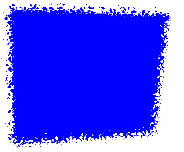
As described above, the filter needs to be used within another object with the use of the filter attribute. In our case, we will have to apply the ID of turbulence to our polygon:

  <polygon
    points="5,5 225,15 205,180 10,195"
    fill="blue"
    filter="url(#turbulence)"></polygon>

A rendered version of our component will look like this:

image alt text

HTML object

Our SVG is finally getting shape. The last step required involves the use of the foreignObject element. This element will allow us to include normal HTML elements within our SVG.

Our first step requires us to add the element within the SVG. This is going to be added alongside the shape, but it is going to be completely independent to it. This means that the filter that we have applied to the polygon will bleed into this SVG element.

<foreignObject
  x="5%"
  y="10%"
  width="90%"
  height="90%">
  ...HTML CODE HERE
</foreignObject>

Now that we have defined our element, we are able to add any HTML we want within its tags. It is important to note that this approach may produce unwanted behaviour across different browsers, and on site performance.

Because of the nature of SVG, all elements within foreignObject element are going to be readable by a screen reader and can be used for accessibility purposes.

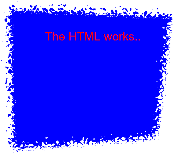
For the purpose of our example, we are going to add a few simple elements within our SVG:

<foreignObject
  x="5%"
  y="10%"
  width="90%"
  height="90%">
    <div style="color:red" xmlns="http://www.w3.org/1999/xhtml">
      <p>The HTML works..</p>
    </div>
</foreignObject>

TIPS: We are able to use any CSS declaration within the SVG itself and we can even use an existing declaration. For example, we would have defined the <p> to be green globally, this declaration would have been applied to our element too.

Our component will render like this:

image alt text

Make it dynamic

The component above works perfectly, but it is still static. In the following section we are going to make it more dynamic by using features available within the VueJs framework.

Slot

First, we are going to modify the code, so that the content of the foreignObject is actually going to be a slot. These are very useful when you want to provide the flexibility of passing any HTML to the component.

<foreignObject x="5%" y="10%" width="90%" height="90%">
 <div style="color:red" xmlns="http://www.w3.org/1999/xhtml">
   <slot>
     <p>The HTML works..</p>
   </slot>
 </div>
</foreignObject>

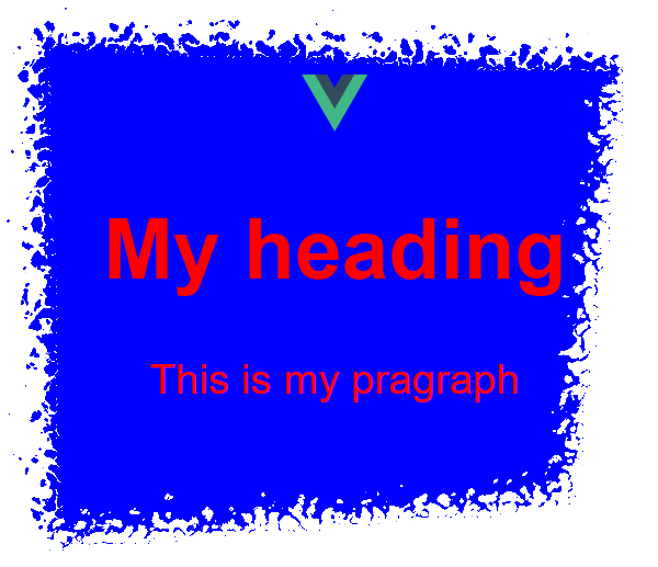
Then we are going to pass some HTML in the parent component that is using our newly introduced slot:

<finalComponent>
 <img 
    src="./assets/logo.png" 
    width="25px" 
    height="25px" 
    alt="Example logo" />
 <h1>My heading</h1>
 <p>This is my paragraph</p>
</finalComponent>

Running this code in the browser will produce the following design:

image alt text

Summary

Our fully working VueJs SVG component is now completed. The code can be found at the following codesandbox: vueJs Svg component with HTML slot

Using SVG within a framework, could be a bit tricky, as reactivity and virtual DOM, produce unwanted results, and this example may not be used in production, without the right set of tests.

The article just covers a couple of examples and introduces a few topics, but the possibilities are endless. We could provide a set of shapes as props, introduce SVG animations and finally create a set of filters that can easily be applied to the passed HTML.

I hope this proof of concept turns out to be helpful, and I look forward to seeing different permutations and applications of this approach online.

References

SyntaxFM: https://syntax.fm/show/154/svgs-with-sara-soueidan

SVG definition: https://en.wikipedia.org/wiki/Scalable_Vector_Graphics

CSS filters: https://css-tricks.com/almanac/properties/f/filter/

SVG filters explained: https://tympanus.net/codrops/2019/01/15/svg-filters-101/

SVG filters: https://developer.mozilla.org/en-US/docs/Web/SVG/Element/filter

VUE slots: https://vuejs.org/v2/guide/components-slots.html

This Dot is a consultancy dedicated to guiding companies through their modernization and digital transformation journeys. Specializing in replatforming, modernizing, and launching new initiatives, we stand out by taking true ownership of your engineering projects.

We love helping teams with projects that have missed their deadlines or helping keep your strategic digital initiatives on course. Check out our case studies and our clients that trust us with their engineering.

You might also like

Awesome 3D experience with VueJS and TresJS: a beginner's guide cover image

Awesome 3D experience with VueJS and TresJS: a beginner's guide

Awesome 3D experience with VueJS and TresJS: a beginner's guide Vue.js developers are renowned for raving about the ease, flexibility, and speed of development their framework offers. Tres.js builds on this love for Vue by becoming the missing piece for seamless 3D integration. As a Vue layer for Three.js, Tres.js allows you to leverage the power of Three.js, a popular 3D library, within the familiar and beloved world of Vue components. This means you can create stunning 3D graphics and animations directly within your Vue applications, all while maintaining the clean and efficient workflow you've come to expect. TresJS is a library specifically designed to make incorporating WebGL (the web's 3D graphics API) into your Vue.js projects a breeze. It boasts several key features that make 3D development with Vue a joy: - Declarative Approach: Build your 3D scenes like you would any other Vue component, leveraging the power and familiarity of Vue's syntax. This makes it intuitive and easy to reason about your 3D elements. - Powered by Vite: Experience blazing-fast development cycles with Vite's Hot Module Replacement (HMR) that keeps your scenes updated in real-time, even as your code changes. - Up-to-date Features: Tres.js stays on top of the latest Three.js releases, ensuring you have immediate access to the newest features and functionality. - Thriving Ecosystem: The Tres.js ecosystem offers many resources to enhance your development experience. This includes: - Cientos: A collection of pre-built components and helpers that extend the capabilities of Tres.js, allowing you to focus on building your scene's functionality rather than reinventing the wheel (https://cientos.tresjs.org/). - TresLeches: A powerful state management solution specifically designed for 3D applications built with Tres.js (https://tresleches.tresjs.org/). You can try TresJS online using their official Playground or on their StackBlitz starter. But now, let's dive into a quick code example to showcase the simplicity of creating a 3D scene with TresJS. Setup First, install the package: npm install @tresjs/core three And then, if you are using Typescript, be sure to install the types: npm install @types/three -D If you are using Vite, now you need to modify your vite.config.ts file in this way to make the template compiler work with the custom renderer: ` Create our Scene Imagine a 3D scene as a virtual stage. To bring this stage to life, we need a few key players working together: 1. Scene: Think of this as the container that holds everything in your 3D world. It acts as the canvas where all the objects, lights, and the camera reside, defining the overall environment. 2. Renderer: This is the magician behind the curtain, responsible for taking all the elements in your scene and translating them into what you see on the screen. It performs the complex calculations needed to transform your 3D scene into 2D pixels displayed on your browser. 3. Camera: Like a real camera, this virtual camera defines the perspective from which you view your scene. You can position and adjust the camera to zoom in, zoom out, or explore different angles within your 3D world. - To make our camera dynamic and allow canvas exploration, we are going to leverage the client's OrbitControls component. Below are our examples. You will see that we just include the component in our canvas, and it just works. 4. Objects: These actors bring your scene to life. They can be anything from simple geometric shapes like spheres and cubes to complex models like characters or buildings. You create the visual elements that tell your story by manipulating and animating these objects. Starting from the beginning: to create our Scene with TresJS we just need to use our component TresCanvas in our Vue component's template: ` The TresCanvas component is going to do some setup work behind the scenes: - It creates a WebGLRenderer that automatically updates every frame. - It sets the render loop to be called on every frame based on the browser refresh rate. Using the window-size property, we force the canvas to take the width and height of our full window. So with TresCanvas component we have created our Renderer and our Scene. Let's move to the Camera: ` We just have to add the TresPerspectiveCamera component to our scene. NOTE: It's important that all scene-related components live between the TresCanvas component. Now, only the main actor is missing, let's add some styles and our object inside the scene. Our Vue component will now look like: ` And our scene will be: A Mesh is a basic scene object in three.js, and it's used to hold the geometry and the material needed to represent a shape in 3D space. As we can see, we can achieve the same with TresJS using the TresMesh component, and between the default slots, we are just passing our object (a Box in our example). One interesting thing to notice is that we don't need to import anything. That's because TresJS automatically generates a Vue Component based on the three objects you want to use in PascalCase with a Tres prefix. Now, if we want to add some color to our object the Three.js Material class comes to help us. We need to add: ` Conclusion Tres.js not only supercharges Vue.js applications with stunning 3D graphics, but it also integrates seamlessly with Nuxt.js, enabling you to harness the performance benefits of server-side rendering (SSR) for your 3D creations. This opens the door to building exceptional web experiences that are both interactive and performant. With Tres.js, Vue.js developers can leverage a declarative approach, cutting-edge features, and a vast ecosystem to bring their immersive web visions to life. If you want to elevate your Vue.js projects with a new dimension, Tres.js is an excellent choice to explore....

How to add Dark Mode in your Web Application  cover image

How to add Dark Mode in your Web Application

How to Create Dark/Light Mode in your JavaScript project? Providing our visitors with the ability to toggle between white and dark themes has become one of the most important features of all time. In this article, we will cover the requirements to develop a persistent theme for your website successfully. The code provided as part of this article will be technology agnostic and can be used with all major front-end frameworks such as Vue, React, or Svelte. TL;DR If you are in a rush and just want access to the code, you can grab it from this Stackblitz: Light / Dark theme functionality in Vanilla JS. What is White/Dark Mode Before we jump into the code, we should first explain what the meaning behind the feature name "White/Dark Mode is". This feature was first introduced in our Operating system by allowing users to change their default theme into Dark Mode, After this, Dark Mode has slowly made its way into our most used applications and websites as users expected to have a consistent look from their native application to Web App equivalent. Providing "White/Dark mode" in your site means giving the user the ability to toggle their theme to either align to the Operating system theme settings or override it from the Web App UI. The above example shows the feature on thisdot.co triggered by the little toggle button available within the main navbar. Implementing Dark Mode with Javascript This feature has two main implementation levels. The first is the ability to assign the theme directly from the Operating System preferences, while the second combines the feature of the first plus the ability to override that feature from the UI. Some websites just offer the first option and allow the site to emulate the OS preferences, even if this is mostly fine for most users, in this post, we will develop the second option as it is the most complicated approach and, therefore the most complete. The development of this feature is going to be divided into the following steps: - Ensure CSS variables drive our application - Create a second set of variables for a dark theme - Create logic to read user preferences - Create logic to override the theme preference - Make our theme selection persistent Let's dive into the code with our first step and initialize our application. Move all styles into CSS variables We are going to start our application by initializing a plain VanillaJs Stackblitz. This creates a simple project with an index.js file that includes our HTML and a style.css file that includes our global styles. To be able to have a good starting point for our post, we are going to add some more elements on the main page of the app and then define some CSS variables to make our example more appealing. First, we are going to clean our index.js and just leave the style import: ` Then, we are going to change our index.html with the following content: ` And finally, define some CSS variables and styles in style.css: ` If you are new to CSS variables, you can read more about them in the MDN docs: Using CSS custom properties. There is one point to clarify regarding CSS variables and their naming convention. Because the color held within our variables will change (for example from red to blue), the variable name should be based on the color "role" (eg primary, shadow, border") and not on the actual color "blue, green". In our example, we can see this naming convention in action as the variables are called "primary", "secondary" and "background". The above should output a very simple but colorful design: Create a second set of variables for the dark theme Now that our basic application is set, it is time to create a second set of variables to be able to define the difference between the light and dark theme. As you may notice, the CSS variables are not a must for this to work, but having all the variables set makes the maintenance of the site much easier than having to update color and styles scattered around. We are returning to our style.css file and updating a few of the CSS properties. These variables will just be updated if the body has a specific class dark associated with it: ` As the above code shows, because we are just overriding the variables, we do not actually need to redeclare them all and we can just declare the variables that we wish to update. If we would go back and add a class of "dark" to our body in index.html we would see the following output: As you can see, both white themes are fully set up and working. All that is left is creating the logic that can handle the theme toggle, but before we do so, there is one more change to add to our CSS. In fact, some components, such as form controls and scrollbar, use a property called "color-scheme" to change their theme, to give this a try, we will add an in our HTML: ` Then, let's see how this would look in our design: The input is showing a white theme even if the dark theme is selected, and this is happening because we are not changing the "color-scheme" that is what is used for the form input. Let's fix this by adding another CSS variable and a CSS declaration within our body: ` With the above code, the "color-scheme" variable will be changed to align with our overall theme, as shown below: Note that settings can be overridden on a component-by-component level. In fact, if you would like to always display the white theme for a button or field, you can just redeclare the "color-scheme" and apply it to the CSS selection of your choice. It is now time to move forward and include some JS to make the toggling automatic. Create logic to read user preferences It is now time to write some JavaScript and make our application dynamic. In this first logical step, we are going to read our Operating System color preference and use it to toggle the class assigned to our body. To do so, we are going to use the "matchMedia" method to read the "prefer-color-scheme" just like shown in the code below: ` The next step is to assign or remove the class from our body depending on the preferred scheme: ` Let's see if this works. If you are on Mac you can change the preferences by following the following steps: 1) System settings 2) Appearance 3) Change the appearance If you change the preferences and refresh your application, you should be able to see the application changing on the fly. Create logic to override the theme preference Having to change the full OS just for a single Website theme preference may be a little bit too much. So, in this step, we are going to enhance our logic to be able to override the preferences. First, we are going to add a simple button in the HTML called Toggle Theme: ` Now, it is time to update the logic. First, we need to allow a way to override the preferences. We can do this by adding an argument to our updateScheme function: ` The above code just adds a global variable called selectedTheme and then, as we previously mentioned, adds a parameter of overrideScheme to our method and finally makes sure we use this variable if available selectedTheme = overriddenScheme || preferredScheme. The next step requires us to be able to update our selectedTheme on a button click: ` With the above code added to our application, we could override the system preferences, but unfortunately, our work is not completed. The logic we wrote above is not persistent, and the theme selection will be lost if we refresh the page. Make our theme selection persistent In this last step, we are going to save our selectedTheme in localStorage using the documentation provided in the MDN documentation: Local Storage. First, let's save the selectedTheme into local storage by using localStorage.setItem: ` Then make sure we read this value on load using localStorage.getItem: ` After the above changes, you should be able to toggle the theme, refresh the page and be able to see the correct theme loaded up for you. NOTE: Due to the way StackBlitz loads the JS, there will be a small flash, but if you would place this code in the head that flash should be extremely minimal. What about the images You may have noticed that we have left the image unchanged between the different themes. This was, unfortunately not by choice, as there is no native way to swap images when using class-based theming. If you were just to implement the theme based on System Preference, you could declare different images using the media query (prefers-color-scheme: dark). This would allow you to declare images like this: ` The above code will show day.jpg if your theme settings are light or night.jpg if dark. If you would like to implement something similar with a class-based theme, you will have to create a custom image component in your framework of choice that loads the correct theme, but this is outside this tutorial's scope. Conclusion It is now time to conclude this post and leave you to go and apply what we learned in your Web applications. Implementing this feature is quite simple, and it helps to improve your user's experience. The code we have written above is available on StackBlitz: Light / Dark theme functionality in Vanilla JS. But let's see it in action in: So, in this article, we have introduced CSS variables and ensured our design colors were driven solely by them. We created an override for this variable using a class-based approach; we then learned how some elements, such as input fields, can change the theme using the "color-theme" property. We then moved into the JS, where we used the media query "prefers-color-scheme" to read the user Operating System theme preferences and, last but not least, created a live toggle that would create and save a personal preference in LocalStorage....

History of Mobile Web Development and the rise of PWA cover image

History of Mobile Web Development and the rise of PWA

If you're in your thirties, like me, or older, you know that mobile phones have not always been so ubiquitous. In this article, we are going to cover the history of the mobile phone, and more specifically "Web Development", by focusing on the rise and benefits of PWAs. The article is going to be divided in the following sections: - History of the Mobile Phone - The evolution of Mobile Web Development - The Rise of PWA (Progressive Web App) History of the Smart Phone It is hard to remember a time when we all lived without smart phones in our pockets. How about when mobile phones could not be called "smart" since they had a single purpose: to make calls? Let's travel in time, and cover the main milestones that shaped our beloved handsets. March 1991 Even if it feels like ancient history, the story of mobile phones starts just shy of the millenium's turn. Phones started to become everyday accessories in the last decade of the 20th Century, with the first ever phone call on GSM network being made on March 1991. 1996 During their first few years of existence, phones rapidly advanced. In 1996, Nokia released the first phone with access to the "mobile web". 1998 1998 did not have any specific technological breakthroughs, but in my opinion, it marks the creation of a new industry: premium downloadable content. You may be curiuous to know which app was the first to be downloaded, but here, we are not talking about any app, as the phones did not even have web browsers yet. The first content to be sold were ringtones. This is one of the most succesful (and annoying) ringtone of the early 2000s "crazy frog": {% youtube awAKzaGrrbY %} 1999 Right before the end of the decade, phones reached another very important milesone. In this year, the first version of a mobile specific web browser was created, and our handsets were connected to the World Wide Web. 2000-2007 If I would have to list all the great phones and enhancements of these few years, this blogpost would become a book. Phones started to get much smarter. There were multiple improvements, from the size of the devices, to the signal coverage, all the way up to improved services, such as colored screens and cameras. All of the above made consumers interested in the products, and more and more people started to use them. Making it a very profitable market to invest in. 2007 The fast growth of this market made Apple decide to move into this growing sector. In the year 2007 Steve Jobs release the company's first mobile device: the Iphone. The Iphone was the first mobile interface to be completely touch-based. This was a big evolution, not only in terms of user experience, but also on the web development side. 2007+ Following the Iphone, all major companies of the time, such as Blackberry, and Nokia, started to emulate the success of Apple, and consumers were inundated with different devices every year. By the end of this decade, Mobile Phones were common devices for adults and teenagers, and have since developed and improved to what we have today. The evolution of Mobile Web Development Now that we have covered the actual evolution of our beloved handsets in terms of hardware, it is time to go back in time again to analyze the evolution of "mobile web development". As shown from the above section, the "web" made its first apprearance on Mobile phones in 1999. WML - 1999 I never had a chance to develop a mobile site in the late 90s. If I had, I would have had to use WML (Wireless Markup Language). This language (now obsolete), started to provide powerful features (link, forms, image, etc..), and was based on XML. Mobile development was specific, as this language was specific to devices that implemented the WAP (Wireless Application Protocol). The use of these sites on desktop was limited, or required the use of browser extensions. cHTML / iHTML - 1999 The browser capabilities on mobile phones developed quite quickly. Devices started to have access to subsets of HTML (cHTML and iHTML). This allowed developers to be able to create one asset (HTML) and serve a multitude of users, both on mobile and desktop. M.dot Mobile phone resolution was quite low, and phones in this period did not have touchscreens, making it difficult to surf the wed. To help in this matter, the industry respondend by utilizing what was called M.Dot methodology. This allowed a website to have two different entities, on two separate Urls. For example, if your site was myShop.com, when accessed from a mobile phone, you would have redirected users to m.myShop.com. Having different websites, allowed the developer to "eliminate" surplus content, and create a design that was more suited for the hardware of the time. This "duplication" came, of course, with a big development cost price tag. Native - 2008 The App store, and the Google Play store, were release in 2008. These events marked the beginning of a completely new industry. Internet speed on phones was very slow, and the price of data usage was still quite high. This enabled many companies to specialize in Native App development. These apps provided a quick and smooth experience to users, but with a great cost factor in terms of development and specialization. The distinct programming languages, and methodology needed to create Native Apps, was so wide across different devices, that many companies decided to specialize in a specific platform (Android, Apple or Windows). Native applications had the possibility to "connect" with the device, in unique ways, by having access to a huge set of APIs (eg. Push notification, background sync, use device space, etc..) Responsive Web design - 2008 But with the rise of Native App, another methodology started to gain traction: Responsive Web Design. This approach allowed the same website to render well on a variety of devices. Using this approach made the use of M.Dot methodology obsolete, and helped many companies save thousands of dollars in Native development. Unfortunately, "web apps" built this way would just be simple websites, and would require the user to access the internet, and specifically access the site URL. Hybrid App development - 2010 Responsive web design never managed to fully respond to customer requests. This was most likely due to the look and feel of the app being somehow different from a Native app. As phones developed, the gap between Native and Web Based widened, as the latter was not able to use many of the in-built features. In 2010, PhoneGap was revealed (currently known as Apache Cordova). This sofware enabled the development of applications using known web skills (html, css, javascript) to build Native Applications. More software followed this trend, enabling companies to start in-house development of Native Apps, without the need to incur high costs. PWA - NOW The last decade has been a roller coaster, as companies were torn among the use of Native app, Hybrid solutions, and responsive designs. In recent years, a new contender, or more precisely described as an upgrade of the Web App, entered the ring. This is known as the Progressive Web App (PWA). The primary intent of PWAs is to reduce the gap between web development and Native apps, by enchancing the user experience. In the next section, we are going to cover why the industry is responsing so positively to PWAs, and provide you useful insight to help you get up to speed with this methodology. The Rise of PWA (Progressive Web App) As you may have probably noticed from the way I speak about PWAs, I am personally really excited about this methodology, and in this section, we are going to explain the reason behind my interest in this technology. Feels like "home" First and foremost, the main advantage of PWAs is the ability for our websites/web application to be downloaded as real applications. When a website is fully setup as a PWA, mobile users are prompted with a "install now" action. Doing this will allow specific content (manually set as part of the PWA setting) to be downloaded directly on the phone, by allowing extremely quick load times and more. Furthermore, installing a PWA will also add it directly to the main mobile interface (homescreen), making it feel like a Native App. Be connected If you own a business, you are fully aware that connecting with the customer is essential. Therefore, if your customers are using your services online, being able to interact, and catch their attention, is vital. One of the main benefits of Native and Hybrid apps, as previously mentioned, was the ability to access the multitude of APIs offered by our handset. Thanks to PWAs, and more specifically to the use of a service worker, we will be able to make use of this powerful feature. Two of the most important features available on Web applications are: - Sync notification: Ability to sync your data, even if the app is not running. This is essential to provide quick content to your user. - Push notification: Ability to provide an alert to the customer, even if the app is not running ( eg. New notification in a specific app, or a reminder to use the app) It is true that the list of avaialble APIs is still small compared to that of Native implementation, but the community is working extremely hard to reduce this gap. Write for Web, serve on mobile When we previously covered RWD, we highlighted one ot its biggest advantages: being able to develop one single interface to serve a multitude of devices. PWAs offer the same advantages, with the added feature of providing the ability to display fullscreen like a "real app". This feature (part of the display setting of PWA) allows your app to take the full screen. This not only increases the space available to your app, but it also enhances the User Experience, by making sure the customer is not distracted by the "url" bar, by providing a "native look and feel". Additionally, we should highlight that the front end industry has seen a big rise in the use of frameworks, such as Vue, React, and Angular. The development of applications with "component based" architectures has supported the rise of theUI component library which is: > A cloud-based folder that consists of all the designed/styled parts of a website or piece of software. It helps designers to work in a consistent way and becomes very time efficient when executed correctly. The use of these libraries (most available for free), have supported the development of nice looking applications across multiple devices, without the need to develop all individual elements from scratch. Ready for shopping In recent months, the Google Play Store has supported PWAs as shown by this article. This service, though still in its early stages of implementation, provides a reassuring signal for the future of PWAs. You may be thinking, what about the Apple Store? Unfortuantely, Apple has not disclosed any information about PWA adoptation, but recent signals, highlighted in this medium article, show Apple's support of PWA development. At a fraction of the cost Unfortuantely, when it comes to business, cost is usually the most important factor. To further emphasise the above point, where we shared the introduction and use of "component based" architecture for speed, we also need to talk about development cost. There are three main aspects of PWAs that help reduce cost: - Existing skills - Development speed - Re-usability Existing skills Apart from some tinkering, and the introduction of the service worker, PWAs are just simple websites. They would allow a multitude of in-house development teams to be able to carry out development and/or support mobile apps, reducing the need to pay third party companies. Development speed As already mentioned above, component based achitectures, and the multitude of available community based components, have provided frontend developers the ability to quickly build performant PWAs in record time. Re-usability Many companies fail to quantify the financial savings produced by being able to re-use existing features. In a recent project I was involved with, we were able to transition from a Native App (supported by a third party company), to a fully in-house build PWA in record time, all thanks to the reusability of their Vue domponents! Versioning I have read many different articles that introduced PWAw, but I have personally learned this last point though experience. Until now, you would have never associated the word "versioning" with a website, but thanks to PWAs, this ability is also possible for web based applications. The main reason behind the need for versioning is purely technical, but its existence within PWAs is surely favorable to the many "Native" developers wanting to swap. Conclusion The war for Mobile Application domination is still on, but I personally believe that PWAs will hold a big share of the market within the next few years. Most of the advantages that support Native and Hybrid development, such as APIs, Native-look and feel, and the ability to publish within the big stores, are slowly being added to Web App. Even if Native applications are not going anytime soon, as there are many use cases that require its full control of the handset API,I believe that in the next few years, PWAs will become the standard choice for most in the mobile industry....

The simplicity of deploying an MCP server on Vercel cover image

The simplicity of deploying an MCP server on Vercel

The current Model Context Protocol (MCP) spec is shifting developers toward lightweight, stateless servers that serve as tool providers for LLM agents. These MCP servers communicate over HTTP, with OAuth handled clientside. Vercel’s infrastructure makes it easy to iterate quickly and ship agentic AI tools without overhead. Example of Lightweight MCP Server Design At This Dot Labs, we built an MCP server that leverages the DocuSign Navigator API. The tools, like `get_agreements`, make a request to the DocuSign API to fetch data and then respond in an LLM-friendly way. ` Before the MCP can request anything, it needs to guide the client on how to kick off OAuth. This involves providing some MCP spec metadata API endpoints that include necessary information about where to obtain authorization tokens and what resources it can access. By understanding these details, the client can seamlessly initiate the OAuth process, ensuring secure and efficient data access. The Oauth flow begins when the user's LLM client makes a request without a valid auth token. In this case they’ll get a 401 response from our server with a WWW-Authenticate header, and then the client will leverage the metadata we exposed to discover the authorization server. Next, the OAuth flow kicks off directly with Docusign as directed by the metadata. Once the client has the token, it passes it in the Authorization header for tool requests to the API. ` This minimal set of API routes enables me to fetch Docusign Navigator data using natural language in my agent chat interface. Deployment Options I deployed this MCP server two different ways: as a Fastify backend and then by Vercel functions. Seeing how simple my Fastify MCP server was, and not really having a plan for deployment yet, I was eager to rewrite it for Vercel. The case for Vercel: * My own familiarity with Next.js API deployment * Fit for architecture * The extremely simple deployment process * Deploy previews (the eternal Vercel customer conversion feature, IMO) Previews of unfamiliar territory Did you know that the MCP spec doesn’t “just work” for use as ChatGPT tooling? Neither did I, and I had to experiment to prove out requirements that I was unfamiliar with. Part of moving fast for me was just deploying Vercel previews right out of the CLI so I could test my API as a Connector in ChatGPT. This was a great workflow for me, and invaluable for the team in code review. Stuff I’m Not Worried About Vercel’s mcp-handler package made setup effortless by abstracting away some of the complexity of implementing the MCP server. It gives you a drop-in way to define tools, setup https-streaming, and handle Oauth. By building on Vercel’s ecosystem, I can focus entirely on shipping my product without worrying about deployment, scaling, or server management. Everything just works. ` A Brief Case for MCP on Next.js Building an API without Next.js on Vercel is straightforward. Though, I’d be happy deploying this as a Next.js app, with the frontend features serving as the documentation, or the tools being a part of your website's agentic capabilities. Overall, this lowers the barrier to building any MCP you want for yourself, and I think that’s cool. Conclusion I'll avoid quoting Vercel documentation in this post. AI tooling is a critical component of this natural language UI, and we just want to ship. I declare Vercel is excellent for stateless MCP servers served over http....

Let's innovate together!

We're ready to be your trusted technical partners in your digital innovation journey.

Whether it's modernization or custom software solutions, our team of experts can guide you through best practices and how to build scalable, performant software that lasts.

Prefer email? hi@thisdot.co