In the third major release of Vue js, we have seen many new features and improvements land on our remote working computers.
In this article, we are going to cover the $attrs attribute. We will explain what it is used for, how its implementation differs from Vue 2's (former $attrs, class, @listener), and build a code example to help understand its power.
Understanding this feature can really support your skills in developing easy to use and scalable components advanced components.
What is $attrs?
The definition of $attrs, varies between the two major versions of the framework, but in this article, we are going to mainly cover Vue 3, where @attrs can be seen as:
A component property that holds all of the attribute, property, and custom events that are not currently defined within the component.
$attrs can also be seen as a safety net, that captures anything that you may not have declared within a component. Let's consider a component that has just a single property and event handler, like the following example:
<template>
  <h1 @click="$emit('custom', 'change title')>{{title}}</h1>
</template>
<script>
export default {
  name: 'Example',
  props: ['title'],
  emits: ['custom'] //This is the new way to declare custom events in vue 3.
}
</script>
If we would instantiate our component like so:
<example
  id="myId"
  class="myClass"
  data-cy="cypress-testing"
  @blur="...."
  title="this was expected"
  description="non declared props"
  @custom="..."
/>
Our example component would have access to a $attrs property with the following information:
$attrs = {
  id: "myId"
  class: "myClass"
  data-cy: "cypress-testing"
  @blur: "...."
  description: "non declared props"
}
If the above is not yet making sense, it is absolutely fine. In the next few sections, we will cover, in more granular details, how to actually make use of this feature.
$attrs V3 vs $attrs V2
Even if I do not want this article to be a comparison between V2 and V3, it is essential that we touch base on the differences that the $attrs feature offers betweent the two major versions.
If you have used VueJs in the past (version 2), there is a significant chance that you have already used $attrs before. The main reason is that almost all the attributes included in the $attrs property were already present in the previous version of the framework. Just split it into different properties.
If we take into consideration the example proposed above, the $attrs object is going to appear as follows:
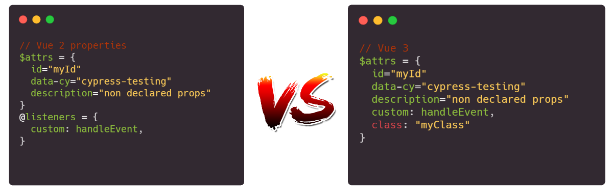
Main differences to notice in V2 are:
- custom events go into a
@listernerbucket - the class is not available (using class in this way requires you to set a property).
Most of the content provided in the following chapter can still be applied in V2, as long as we adhere to the above differences and define the extra properties ($listners and a class property).
Real Life example
As with most of my content, I like to always cover a real life example. Building something from the bottom up, can really help in understanding the reason beind a feature, and help you introduce its usage within your codebase.
In the following sections, we are going to build a nice slider (or more precisely a few of them). The complete code can be found on Stackblitz following the following link (stackblitz-vue-example).
Let's start from scratch
The first step requires us to create a simple component. This is going to be plain Vue and will have nothing to do with the $attrs feature (yet).
// Slider-1.vue

<template>
  <input
    class="slider__input"
    type="range"
    :value="modelValue"
    @input="$emit('update:modelValue', $event.target.value)" />
</template>

<script>
export default {
  name: "Slider",
  props: {
    modelValue: [Number, String]
  }
};
</script>

<style lang="scss">
  // The style of this slider have been taken from the W3School website. Link available here: https://www.w3schools.com/howto/howto_js_rangeslider.asp
  // See the Stackblitz link for the full CSS.
</style>
The above code will create a slider that includes single HTML element at the root, and a simple two way binding for a property called value.
To use the above component we would do something like this:
<Slider-1 v-model="value" />
The result should be something like this:

Let's add some attributes
The above "hello world" example, would never stand the real web development industry.
As we know, our components are always full of requirements and specifications, and are never this simple. So to make it a bit more realistic, let's add a couple of attributes (min, max, class, id, data-cy, @keydown and aria-label).
    <Slider-1
      v-model="value"
      min="0"
      max="50"
      class="blue_slider"
      id="special_id"
      data-cy="cypress-slider"
      @keydown="() => true"
      aria-label="Example slider"
    />
If we would run the app with the above changes, we would see that all changes take effect. In fact, analysing the app will show the following UI and HTML:

As we can notice, all the information has already been applied to our HTML.
WAIT A SECOND... Why did I make such a big introduction to $attrs, when all the "non property/event" attributes are already automatically applied to the inner HTML element?
Do not worry, I have not wasted your time.. In the next section, we will shake things a bit, because as we know, requirements always change.. :)
Change request: Add a title and value
In this section we are going to apply some further changes to our component. More precisely, our product owner has assigned us the following ticket:
As a user of the slider, I would like to be able to see a title, and its value in numerical form being shown on screen.
The modified component will look like this:
// Slider-2.vue

<template>
  <div class="slider">
    <h1>{{ title }}</h1>
    <input
      type="range"
      :value="modelValue"
      @input="$emit('update:modelValue', $event.target.value)"
      class="slider__input" />
      <div>Value: {{ value }}</div>
  </div>
</template>

<script>
export default {
  name: "Slider-2",
  props: {
    modelValue: [Number, String]
    title: [String],
    value: [Number, String],
  }
};
</script>
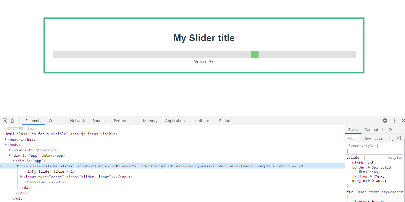
At first glance, everthing seemed to work, but if we look closely, we can see that something is not right.
First, the slider is not blue. Second, the value is going way over 50, and lastly if we look at the html, we'll notice that all of our extra attributes (min, max, data-cy) are assigned to the root element, and not our input element anymore!
The best way to solve the above problem would be to find a way to "apply" all the properties, classes, arguments, and events directly to the input field, without them needing to manually declare them- something like a "bucket" of data.. !$ATTRS!
Let's jump in the next section and see how we can use $atts to accomplish our goals.
$attrs to the rescue
At the start of this article, we introduced $attrs as a bucket of information. It is a place that holds all the "undeclared" properties and events, and this is precisely what we need to solve our issue.
To use this feature, we can just apply the $attrs property to one or more HTML element, using the v-bind operator:
<template>
  <div class="slider">
    <h1>{{ title }}</h1>
    <input
      type="range"
      v-bind="$attrs"
      :value="modelValue"
      @input="$emit('update:modelValue', $event.target.value)"
      class="slider__input" />
      <div>Value: {{ modelValue }}</div>
  </div>
</template>
As we can see, the above change will make things much better. The use of attrs in our component will act as bridge that copies all out attributes (class, attribute, property and custom events) to one or more elements:
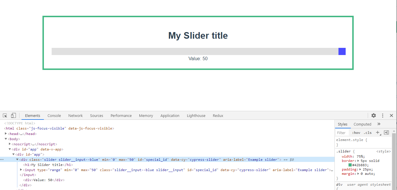
The slider thumb is back to being blue. The max value is set to 100, and our extra attributes are set correctly... almost.
There is only one problem- our extra attributes have not only been assigned to the input element, but also to the root element!
In this case, there is no visual change to show us this issue (and usually there isn't one in real life either. That is why I have not created any). But these extra variables can really create some side effects. Let's fix this.
inheritAttrs: false
By default, any extra argument being passed to a component is automatically applied to the root element (and to all elements that have the $attrs binding).
To switch this feature off, and get control of what elements receive this extra attribute, we can use a flag called inheritAttrs, and set it to false.
Our script tag will look like this:
export default {
  name: "Slider",
  inheritAttrs: false,
  props: {
    title: [String],
    modelValue: [Number, String],
  }
};
After this change, our HTML is nice and clean. All the extra properties are applied to the Input element only.
Conclusion
Before we wrap up, there are a couple of extra points that I want to share, so that you can make furhter use of this feature and understand it more deeply.
- I prefer not to use the v-model so that I can actually also omit the
update:modelValueevent (you can see at the file name Slider.vue in the stackblitz code) - You can access, and play with the individual properties of the $attrs. So for example, you could apply the
$attrs.classto one element, and the$attrs['aria-label]'to another. - It is always best to declare property and events, and just use this when you have an element that emits a native event and/or accepts many attributes (like video tag, or all Input fields).
Time to say goodbye
I have personally taken some time to fully understand this feature, but I really hope that this article may help you in understanding this feature, and helps you define complex but very readable components.
About the author