Why Should I Create Reusable react-hook-form Input Components?
Like many in the React community, you've decided to use react-hook-form. While not every situation calls for creating wrapper components around react-hook-form, there are some situations where doing exactly that may be ideal. One such example might be creating a reusable component library for your organization. You might want to reuse the same validation logic and error styling in multiple projects. Maybe your project contains many large forms and in this case, reusable react-hook-form components can save you a lot of time. If you've decided reusable react-hook-form components are what's right for you and your team, it can be hard to understand how to make these components especially if you and/or your team have also decided to use Typescript.
Step 1: Create An Input Component
The first step is to create an input component. Creating an isolated component can be a good way to provide consumers of your component with a way to use inputs that aren't directly tied to validation or react-hook-form. It can also help consolidate styles and isolate input logic for easier unit testing. You can also use this component to enforce good accessibility practices by ensuring that inputs have a label, type, and name.
Step 2: Creating a Form
Before we move forward, we need a form. Let's imagine a registration form.
import React, { FC } from 'react';
import { Input } from '../atoms/input';

export const RegistrationForm: FC = () => {
  return (
    <form>
      <Input
        id="firstName"
        type="text"
        name="firstName"
        label="First Name"
        placeholder="First Name"
      />
    </form>
  );
};
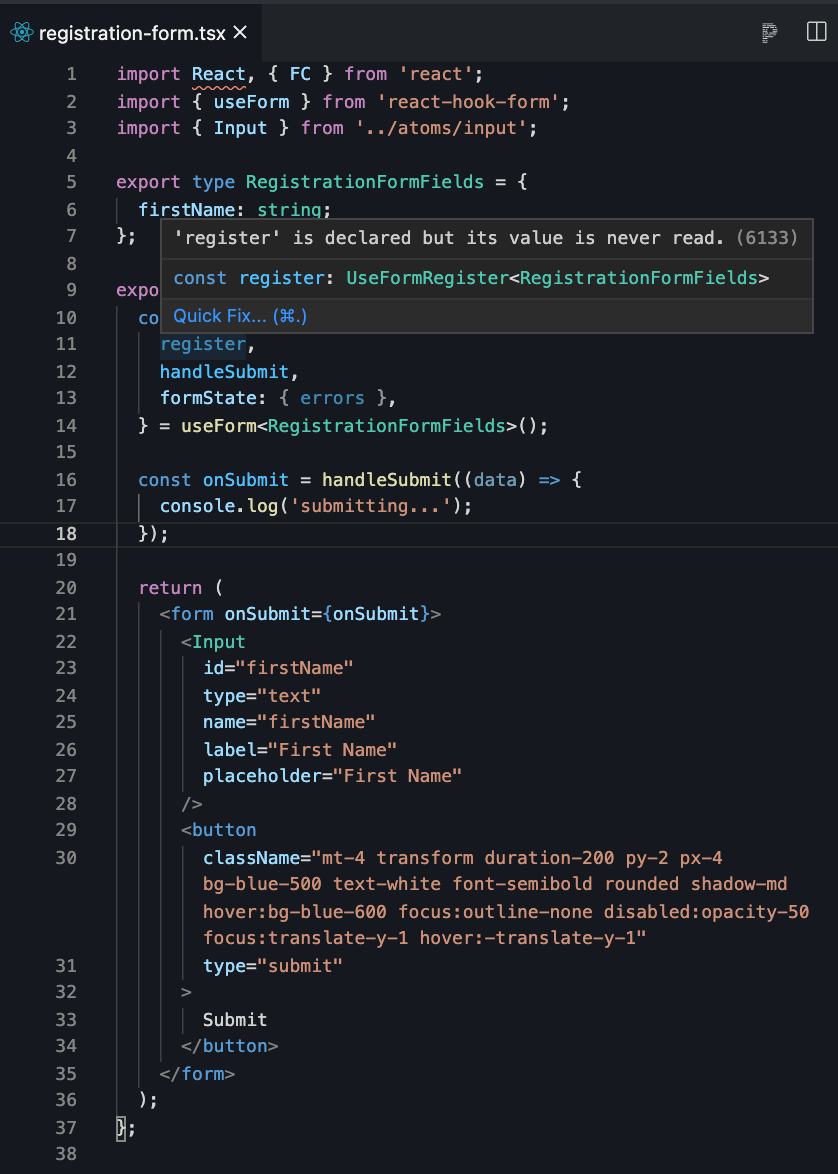
Eventually, we'll want to make the first name field in this form a required field and display an error if that field is not provided, but before we can add any validation and see errors, we'll need to add a way to submit the form.
In our <RegistrationForm>, let's destructure the handleSubmit function off of our call to useForm, then use that to create an onSubmit function we'll call for our form submission:
import React, { FC } from 'react';
import { useForm } from 'react-hook-form';
import { Input } from '../atoms/input';

export type RegistrationFormFields = {
  firstName: string;
};

export const RegistrationForm: FC = () => {
  const {
    register,
    handleSubmit,
    formState: { errors },
  } = useForm<RegistrationFormFields>();

  const onSubmit = handleSubmit((data) => {
    console.log('submitting...');
  });

  return (
    <form onSubmit={onSubmit}>
      <Input
        id="firstName"
        type="text"
        name="firstName"
        label="First Name"
        placeholder="First Name"
      />
      <button
        className="mt-4 transform duration-200 py-2 px-4 bg-blue-500 text-white font-semibold rounded shadow-md hover:bg-blue-600 focus:outline-none disabled:opacity-50 focus:translate-y-1 hover:-translate-y-1"
        type="submit"
      >
        Submit
      </button>
    </form>
  );
};
We should have something that looks like this:
Step 3: Create a Validated Input Component
We want create a wrapper component that uses both our <Input> component and react-hook-form to create a reusable component that can be passed any validation rules and any potential errors. Let's make a new component called <FormInput>.
import React from 'react';
import { Input, InputProps } from '../atoms/input';

export type FormInputProps = InputProps;

export const FormInput = ({
  className,
  ...props
}: FormInputProps): JSX.Element => {
  return (
    <div className={className} aria-live="polite">
      <Input {...props} />
    </div>
  );
};
Registering Our Input with react-hook-form
Next, we need to register our input with react-hook-form. Errors and rules won't work until we do this. It may seem like our first step is to pass a register property given to us by react-hook-form to our generic <FormInput> component. When we attempt to do this, we'll encounter an issue. When defining our register property, what type should we assign to register?
import React from 'react';
import { InputProps } from '../atoms/input';

export type FormInputProps = {
  register: ???;
} & InputProps;
Let's take a look at what react-hook-form says is the type of register:
We can see that the type of register is UserFormRegister<RegistrationFormFields>, but passing in a register property of type UserFormRegister<RegistrationFormFields> wouldn't help us keep our <FormInput> component generic. Not every form will have inputs that belong to our registration form. Each form will likely have different validation rules and errors. Now what?
The answer lies in generics. We need our <FormInput> to have a register property that can take in any type of form. Let's change the type for our <FormInput>'s properties.
import React from 'react';
import { InputProps } from '../atoms/input';

export type FormInputProps<TFormValues> = {
  register: ???;
} & InputProps;
<TFormValues> is a generic type that represents any potential form. In this case, our form type is RegistrationFormFields, but using <TFormValues> means that this component can be used in any form. Next, let's take a look at how we can pass the register property to our input.
import React from 'react';
import { UseFormRegister } from 'react-hook-form';
import { InputProps } from '../atoms/input';

export type FormInputProps<TFormValues> = {
  register?: UseFormRegister<TFormValues>;
};
Now, we can register an input used in a form of any type with react-hook-form. We aren't quite done with register yet, however. We still need to tell react-hook-form which input/field in the form we are trying to register. We'll need to do this with a name property that we will pass into the register function.
Defining the Name Property
It may seem like our new name property should be a string, because it represents the name of one of the fields in our form. Upon close inspection, we can see that the type of parameter register is expecting is a Path to one of the fields in our TFormValues.
The reason name is a Path is because our form type, TFormValues could potentially have nested fields, like objects, or arrays. For example, imagine that for some reason, instead of registering just one person, we had a list of people to register. Our RegistrationFormFields might look something like this instead:
export type RegistrationFormFields = {
  people: { firstName: string }[];
};
If the name property of our input field was just a string, we couldn't reference the name of the first or second person in our form. When name is of type Path, however we can access the fields of any nested object or array. For example, name could be people[0].firstName or people.[1].firstName.
The properties for our <FormInput> component should now look like:
import React from 'react';
import { UseFormRegister, Path } from 'react-hook-form';
import { InputProps } from '../atoms/input';

export type FormInputProps<TFormValues> = {
  name: Path<TFormValues>;
  register?: UseFormRegister<TFormValues>;
} & InputProps;
But wait! Now both InputProps and our FormInputProps have a name. These names are not the same thing either! The name in InputProps represents the native name on an HTML input element. The name in FormInputProps is a Path to the field in our form. We still want to be able to pass other native HTML attributes to our input. We'd just like to exclude name from InputProps because we are defining name as a Path FormInputProps`.
import React from 'react';
import { UseFormRegister, Path } from 'react-hook-form';
import { InputProps } from '../atoms/input';

export type FormInputProps<TFormValues> = {
  name: Path<TFormValues>;
  register?: UseFormRegister<TFormValues>;
} & Omit<InputProps, 'name'>;
The last thing we need to register our input with our react-hook form is validation rules. We will need to pass our validation rules to this <FormInput>, and then into the register function.
Defining the Rules Property
Remember, we want to be able to pass in any rules to our <FormInput> component, not just rules that apply to our registration form. Thankfully, this one is a bit easier.
import React from 'react';
import { UseFormRegister, Path, RegisterOptions } from 'react-hook-form';
import { InputProps } from '../atoms/input';

export type FormInputProps<TFormValues> = {
  name: Path<TFormValues>;
  rules?: RegisterOptions;
  register?: UseFormRegister<TFormValues>;
} & Omit<InputProps, 'name'>;
Let's use these properties to actually register, apply rules, and render our <FormInput> component. We also want to replace the <Input> component we were using with our new <FormInput> component in our <RegistrationForm>. We should have something that looks like this:
Sweet! We're still missing something though. No errors are actually displayed when we don't enter a first name. Let's fix that.
Defining the Errors Property
When defining our errors property, what type should we assign to errors? Let's take a look at what react-hook-form says the type of errors is.

We can see that the type of errors is:
{
  firstName?: FieldError;
}
Like before, passing in an errors property of type { firstName?: FieldError; } wouldn't help us keep our <FormInput> component generic. Not every form will have errors for a registration form. Each form will likely have errors. We'll have to use our <TFormValues> generic again:
import React from 'react';
import {
  RegisterOptions,
  DeepMap,
  FieldError,
  UseFormRegister,
  Path,
} from 'react-hook-form';
import { InputProps } from '../atoms/input';

export type FormInputProps<TFormValues> = {
  name: Path<TFormValues>;
  rules?: RegisterOptions;
  register?: UseFormRegister<TFormValues>;
  errors?: DeepMap<TFormValues, FieldError>;
} & Omit<InputProps, 'name'>;
You might be wondering how we could conclude that the type of errors should be DeepMap<TFormValues, FieldError>. This one was a bit tricky, but eventually we can find the type by looking for FieldErrors in the TS documentation for react-hook-form.
Let's pass the errors we're getting from react-hook-form in our <RegistrationForm> into the errors property of the <FormInput>.
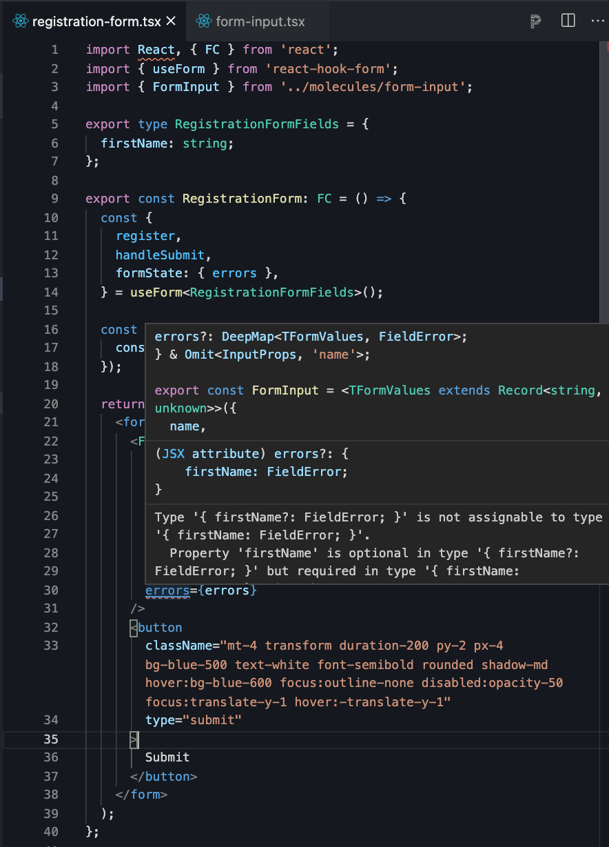
Looks like the errors type we are passing in from useForm does not match the errors type we are expecting in our <FormInput>.
The errors type we are passing in from useForm has a type that looks like this:


The errors property we are expecting in our <FormInput> looks like this:
...
export type FormInputProps<TFormValues> = {
  ...
  errors?: DeepMap<TFormValues, FieldError>;
} & Omit<InputProps, 'name'>;
It looks like our errors property on our <FormInput> is of type DeepMap<TFormValues, FieldError>. It requires that either errors are completely empty, errors?, or that every property in our TFormValues exists on our errors. This isn't quite accurate.
There won't always be an error for every single field in our form. Our errors will dynamically change as the user inputs data. There might be an error for the firstName field, but if the firstName field is valid, there won't be an error for it. So although our RegistrationFormFields says that firstName is not optional, our errors must declare that any firstName errors are optional.
We can achieve this by making our errors property on our <FormInput> a <Partial>.
...
export type FormInputProps<TFormValues> = {
  ...
  errors?: Partial<DeepMap<TFormValues, FieldError>>;
} & Omit<InputProps, 'name'>;
This means that the errors don't have to include all of the fields in our TFormValues, and with that our errors Typescript error is now gone!

Displaying Errors
To make sure that our error styling is consolidated, and the same across our inputs, we'll want to put the code to display these errors in our <FormInput> component.
Remember, errors contains all the errors for our form, not just the errors for one field. To render our errors, we'll want the get the errors relevant to this specific input. Your first instinct might be to get the errors by the name of our input, like so:
export const FormInput = <TFormValues extends Record<string, unknown>>({
  name,
  register,
  rules,
  errors,
  className,
  ...props
}: FormInputProps<TFormValues>): JSX.Element => {
  const errorMessages = errors[name];
  const hasError = !!(errors && errorMessages);

  return (
    <div className={className} aria-live="polite">
      <Input name={name} {...props} {...(register && register(name, rules))} />
      {hasError && <p>{errorMessages}</p>}
    </div>
  );
};
However, name is a Path. It could reference a field on a nested object or in an array. For example, we'd need to get errors.people[0].firstName and not errors['people[0].firstName'].
To do this, we can make use of lodash.get to retrieve the value of errors via a Path;
export const FormInput = <TFormValues extends Record<string, unknown>>({
  name,
  register,
  rules,
  errors,
  className,
  ...props
}: FormInputProps<TFormValues>): JSX.Element => {
  // If the name is in a FieldArray, it will be 'fields.index.fieldName' and errors[name] won't return anything, so we are using lodash get
  const errorMessages = get(errors, name);
  const hasError = !!(errors && errorMessages);

  return (
    <div className={className} aria-live="polite">
      <Input name={name} {...props} {...(register && register(name, rules))} />
      {hasError && <p>{errorMessages}</p>}
    </div>
  );
};
We're still missing something, though. Currently, errorMessages is an object representing each violated rule for our input.
For example, let's imagine that we had an email field in addition to our firstName field. This email field should not only be required, but should have a minimum of 4 chars entered, and match a valid email format.
If more than one rule was violated, like in the case that the email entered was both too short and didn't match the email format, our errorMessages would have multiple keys called pattern and minLength. Pattern would indicate that the email format was not valid. minLength would indicate that the email entered was not long enough.
However, most of the time, we only want to display only error message at a time. But how do we know which error message to display in an generic input component? Every form's type will be structured completely differently. We don't know what the shape of errors will be. How can we display specific error messages when the type could look like anything?
Fortunately, there's another package we can use that contains a component that can do this for us. That component is called ErrorMessage, and it is provided by @hookform/error-message. Using yarn or npm, install this package.
npm install @hookform/error-message
or
yarn add @hookform/error-message
Once that package is added, we can use it in our <FormInput>:
import React from 'react';
import classNames from 'classnames';
import get from 'lodash.get';

import {
  RegisterOptions,
  DeepMap,
  FieldError,
  UseFormRegister,
  Path,
} from 'react-hook-form';
import { ErrorMessage } from '@hookform/error-message';
import { Input, InputProps } from '../atoms/input';

export type FormInputProps<TFormValues> = {
  name: Path<TFormValues>;
  rules?: RegisterOptions;
  register?: UseFormRegister<TFormValues>;
  errors?: Partial<DeepMap<TFormValues, FieldError>>;
} & Omit<InputProps, 'name'>;

export const FormInput = <TFormValues extends Record<string, unknown>>({
  name,
  register,
  rules,
  errors,
  className,
  ...props
}: FormInputProps<TFormValues>): JSX.Element => {
  // If the name is in a FieldArray, it will be 'fields.index.fieldName' and errors[name] won't return anything, so we are using lodash get
  const errorMessages = get(errors, name);
  const hasError = !!(errors && errorMessages);

  return (
    <div className={className} aria-live="polite">
      <Input
        name={name}
        aria-invalid={hasError}
        className={classNames({
          'transition-colors focus:outline-none focus:ring-2 focus:ring-opacity-50 border-red-600 hover:border-red-600 focus:border-red-600 focus:ring-red-600':
            hasError,
        })}
        {...props}
        {...(register && register(name, rules))}
      />
      <ErrorMessage
        errors={errors}
        // eslint-disable-next-line @typescript-eslint/no-explicit-any
        name={name as any}
        render={({ message }) => (
          <p className="mt-1 font-serif text-sm text-left block text-red-600">
            {message}
          </p>
        )}
      />
    </div>
  );
};
The <ErrorMessage> component takes in an errors property. This is the same as the errors we passed into our <FormInput>, and represents all errors for all fields in the form.
The second property we are passing into <ErrorMessage> is name. The type of name on <ErrorMessage> does not match the name property we are taking into <FormInput>. For some reason, the name is of type FieldName<FieldValuesFromFieldErrors<DeepMap<TFormValues, FieldError>>> on the <ErrorMessage> component, but is of type Path<TFormValues> in the register call, even though both name properties represent are both the Path of a field in the form. Because the FieldValuesFromFieldErrors type isn't exported, I couldn't cast name to FieldName<FieldValuesFromFieldErrors<DeepMap<TFormValues, FieldError>>> and therefore had to cast it to any.
The last property we are passing into <ErrorMessage> is a render function. This render function gives you access to the single error message you'd like to display. You can use this function to display the message in any way you'd like.
Conclusion
You now know a bit more about extracting validation logic from react-hook-forms to create reusable components in Typescript. You can continue to use this pattern to create more form components like checkboxes, phone number inputs, select boxes and more. In my next blog, I'll cover how to use a different schema validation resolver, like yup, and how to display server side validation errors using the same components. Take a look at the demo below to see a closer to real life example.