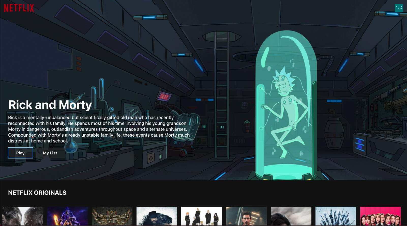
Hello folks. Welcome to this tutorial. We will build a Netflix UI clone with React.js, Tailwind CSS, and Styled Components that looks like this:

What is Tailwind CSS?
Tailwind CSS is a utility-first CSS framework. Rather than focusing on the functionality of the item being styled, Tailwind is concerned with how it should be displayed. This makes it easier for developers to test out new styles, and change the layout.
What are Styled-Components?
Styled Components are one of the new ways to use CSS in modern JavaScript. It is meant to be a successor to CSS Modules,and is a way to write CSS that's scoped to a single component without leaking to any other element on the page.
Can we use Tailwind with Styled-Components at the same time?!
Yes, of course, thanks to the Twin.macro package! It allow us to use both of them at the same time. 😎
Let’s start
First, before you start this project, you have to know JavaScript basics and install Node.js on your machine.
Let’s start by creating an empty React project!
Go to where you want to save your project with the terminal, and type npx create-react-app netflix-ui
After it finishes, type code netflix-ui to open the project in your VSCode

Open a new terminal in VScode and type yarn start. This will open your browser automatically.

Okay now, let's clean up!
Go to src/App.js, delete all the code, and replace all the code with this:
function App() {
  return (
    <>
      <h1>Hello world!</h1>
    </>
  );
}

export default App;
Now it will look like this:

Great! Let's add Netflix's colors. Go to src/index.css, and add these style properties in the body.
background-color: #111;
color: white;
Let's install the twin.macro
- Open a new terminal in VSCode and enter this command
yarn add tailwindcss twin.macro @emotion/core @emotion/styled @emotion/react
- Next up, we initialize Tailwind.
npx tailwindcss init --full
- Add a new
babelMacroskey to thepackage.jsonfile
"babelMacros": {
  "twin": {
    "config": "tailwind.config.js"
  }
},
Congratulations! You did it🎉
TMDB APIs
TMDb.org is a crowd-sourced movie information database used by many film-related consoles, sites, and apps! We will use their APIs to get the movie’s data, and to use their APIs we need to get an API key!
Go to themoviedb.org/signup, and create an account.

After creating an account log in, go to settings:

Then select 'API':

And you will find your API key there! Save it, because we will need it in the next step:

Get movies data and save it in state
In this step, we will get all the data we need from TMDB servers, and save it in our app to use it.
- First, we need to install Axios. This is the library that will handle the API requests for us.
Open a new terminal and type:
yarn add axios
- Importing
axios,useStateanduseEffectGo tosrc/App.js, and add the next line at the top of it.
import { useState, useEffect } from 'react';
import axios from 'axios';
- Next, we need the API URL, key (We got this in the previous step), and the movies endpoints
const URL = "https://api.themoviedb.org/3";
const API_KEY = "Put your API key here";

const endpoints = {
  originals: "/discover/tv",
  trending: "/trending/all/week",
  now_playing: "/movie/now_playing",
  popular: "/movie/popular",
  top_rated: "/movie/top_rated",
  upcoming: "/movie/upcoming",
};
We are getting the movies data from TMDB of 6 categories!
- Initializing the states
We will use
useStateto initialize a state for each movies category.
const [originals, setOriginals] = useState([]);
const [trending, setTrending] = useState([]);
const [nowPlaying, setNowPlaying] = useState([]);
const [popular, setPopular] = useState([]);
const [topRated, setTopRated] = useState([]);
const [upcoming, setUpcoming] = useState([]);
Now, our file will look like this:

Okay Let's get the data for each category
In the App component, we will add useEffect with the next pattern for each movie category.
useEffect(() => {
  // Load Originals
  axios
    .get(`${URL}${endpoints.originals}`, {
      params: {
        api_key: API_KEY,
      },
    })
    .then((res) => setOriginals(res.data.results));

  // Get other categories with the same pattern here

}, []);
Use the same pattern to get the other categories inside the useEffect.
Important note: Use only one useEffect for getting data
App Components
So in this project, we will need to build only three components.

- Header
- Hero (Which is the banner with a random movie)
- Movies (Which is the Movies slider)
Let's start with the Movies component
Movies component is simple. It's made from three styled components.

1- Go to src folder, and create a new folder in it called components.
2- Inside src/components create new 2 files Movies.js and Movies.styles.js.
3- Go to Movies.styles.js.
Let's talk a little bit about using twin.macro
We need to import 2 things from twin.macro
styledto use Styled componentstwto use Tailwind CSS classes
You can import them with the next line.
import tw, { styled } from "twin.macro";
How we will use both of them at the same time? We will use this simple pattern to mix both of them.
export const YourStyledComponent = styled.div`

  // Put your pure CSS here.

  ${tw`

    // Put the Tailwind CSS classes here.

  `}

`;
Now Let's back to the Movies component!
- MoviesContainer: It only needs the top and bottom margin
mywith 1 rem.
export const MoviesContainer = styled.div`
  ${tw`
    my-8
  `}
`;
- MoviesTitle: It's h2 with bigger font size
text-2xl, font weightfont-bold, and uppercaseduppercasewith two rem left, and a right margin:mx-8.
export const MoviesTitle = styled.h2`
  ${tw`
      text-2xl
      font-bold
      uppercase
      mx-8
    `}
`;
Okay now let's import them in the Movies.js:
import { MoviesContainer, MoviesTitle } from "./Movies.styles";
Add the Movies component function. It accepts two values: title and movies.
function Movies({ title, movies }) {
  return (
    <MoviesContainer>
      <MoviesTitle>{title}</MoviesTitle>
    </MoviesContainer>
  );
}

export default Movies;
Go to src/App.js and import the Movie component.
import Movies from "./components/Movies";
And replace the hello world h1 with our movies component.

So we import the Movie component, and passed two props to it: the title, and the movie array state (We will use it later).
Now, save the file and look at the browser.

Great let's build the MoviesRow now, and render the movies.
Go to Movies.styles.js.
We need the MoviesRowto be
- Flexbox
flex - Scrolls left and right
overflow-x-auto - Has one rem of margin top
mt-4 - Has one rem of padding
p-4 - Also we want to hide the scrollbar (Not supported in Tailwind CSS so we will use pure CSS).
the result:
export const MoviesRow = styled.div`
  ${tw`
      flex
      overflow-x-auto
      mt-4
      p-4
    `}

  &::-webkit-scrollbar {
    display: none;
  }
`;
As you can see, we hide the scrollbar in a way that is similar to SCSS because styled components support it.
Inside MoviesRow we will put multiple MoviesPoster which is img styled component.
MoviesPoster should have:
- 0.5 rem margin
m-2 - 10 rem width
w-40 - Scale when user hover on it (We will use pure CSS)
The result:
export const MoviesPoster = styled.img`
  ${tw`
    m-2
    w-40
  `}

  // Scale the movie img when the user hovers on it.
  transition: all 0.2s;
  &:hover {
    transform: scale(1.09);
  }
`;
Next step, let's import the MoviesRow and 'MoviesPoster' styled components in the Movies.js component, and use .map to render the movies.
<MoviesRow>
  {movies.map((movie) => (
    <MoviesPoster
      key={movie.id}
      src={"https://image.tmdb.org/t/p/w300" + movie.poster_path}
      alt={movie.name}
    />
  ))}
</MoviesRow>
Your Movies.js file should look like this now

And if you go to the browser now, you should see this:

Let's copy the same Movies component in App.js for the other categories, and change the title and movies:

Great, we did it. 😎
Hero component
The Hero component is simple:

Go to src/components, and create two new files: Hero.js and Hero.styles.js.
Inside Hero.styles.js, we need to add the first styled component which is the HeroContainer.
HeroContainer should have
- Two rem of padding
p-8 - Height 80% of the screen's height (we will add it with pure CSS)
- Background image (we will add it from props)
- Background size cover important (pure CSS)
The result:
export const HeroContainer = styled.div`
  ${tw`
    p-8
  `}
  height: 80vh;
  background-size: cover !important;

  ${(props) =>
    `background: url('https://image.tmdb.org/t/p/original${props.background}');`}
`;
And we will pass a background prop to this styled component later.
HeroTitle is h1, should have
- Bigger text size
text-5xl - More font weight
font-bold - One rem of margin bottom
mb-4 - Margin top of 40% of the screen's height (pure CSS)
The result:
export const HeroTitle = styled.h1`
  ${tw`
    text-5xl
    font-bold
    mb-4
  `}

  margin-top: 40vh;
`;
HeroDescription is p, should have
- Bigger text size
text-lg - Medium font weight
font-medium - One rem with margin bottom
mb-4 - Width of 45 rem (pure CSS because 45 rem isn't supported in Tailwind CSS)
- Max width of 80% of the screen's width (pure CSS)
- Line height of 130%
The result:
export const HeroDescription = styled.p`
  ${tw`
    font-medium
    text-lg
    mb-4
  `}
  width: 45rem;
  max-width: 80vw;
  line-height: 1.3;
`;
And finally HeroButton.
export const HeroButton = styled.button`
  ${tw`
    cursor-pointer
    font-bold
    rounded
    px-8
    py-2
    mr-2
  `}

  background-color: rgba(51, 51, 51, 0.5);

  &:hover {
    background-color: #e6e6e6;
    color: black;
    transition: all 0.2s;
  }
`;
Let's go to Hero.js, and build everything.
import React from "react";
import {
  HeroButton,
  HeroContainer,
  HeroDescription,
  HeroTitle,
} from "./Hero.styles";

function Hero({ movie }) {
  console.log(movie);
  return (
    <HeroContainer background={movie?.backdrop_path}>
      <HeroTitle>{movie?.name}</HeroTitle>
      <HeroDescription>{movie?.overview}</HeroDescription>
      <HeroButton>Play</HeroButton>
      <HeroButton>My List</HeroButton>
    </HeroContainer>
  );
}

export default Hero;
Go to App.js, import it, and pass a random movie in the Hero component
<Hero movie={originals[Math.floor(Math.random() * originals.length)]} />
Now the Hero section is DONE🥳

Header component
The Header component is the last component in this project and it's so simple because it's only one styled component. When you scroll down the header background, it should change to black!
Go to src/components, and create two new files: Header.js and Header.styles.js.
Inside Header.styles.js we need to add the first styled component which is the HeroContainer.
HeaderContainer should have
- Flex & justify-between.
- Fixed to top of the screen.
- Z-index value bigger than other elements.
- Switch background color based on the dark prop.
- Images inside it should have height with two rem.
The result:
export const HeaderContainer = styled.div`
  ${tw`
    flex
    justify-between
    p-4
    fixed
    top-0
    w-full
    transition-all
    z-10
  `}

  ${(props) => (props.dark ? tw`bg-black` : tw`bg-transparent`)}

  img {
    ${tw`
      h-8
    `}
  }
`;
Let's go to Header.js, and put the Netflix logo and the Avatar in.
import React from "react";
import { HeaderContainer } from "./Header.styles";

function Header() {
  return (
    <HeaderContainer>
      <img
        src="https://upload.wikimedia.org/wikipedia/commons/6/67/NewNetflixLogo.png"
        alt=""
      />
      <img
        src="https://upload.wikimedia.org/wikipedia/commons/0/0b/Netflix-avatar.png"
        alt=""
      />
    </HeaderContainer>
  );
}

export default Header;
Finally, Let's add an event listener for the window.scroll using useEffect and useState.
const [isDark, setIsDark] = useState(false);

  useEffect(() => {
    window.addEventListener("scroll", () => {
      if (window.scrollY > 100) {
        setIsDark(true);
      } else setIsDark(false);
    });

    return () => {
      window.removeEventListener("scroll");
    };
  }, []);
Now, pass isDark to the Header component.
<HeaderContainer dark={isDark}>
Import the Header component in the App.js, and go to your browser.
Congratulations! We made it! 🥳
Source Code
Also, here is the Github repo.